-
Is British Road Signage a design classic?

The Design Museum has added a motorway sign to its collection. So is British road signage a design classic?

There is very little to like about motorway journeys. Endless black tarmac, blurry white lines and fuzzy green trees.
Motorways are about getting from A to B in the quickest – legal – possible time. But have you ever spared a thought for the signs dotted along Britain’s roads?
White lettering on blue signifies a motorway and white on green signals a primary route. Everyone knows that. And they’d recognise the lettering, regardless of where it was.
Then there are those familiar and friendly images for school children crossing the road and men at work.Britain’s roads look as they do because of Jock Kinneir and Margaret Calvert. The graphic designers standardised the road network, created many of its signs and produced two new typefaces, Transport and Motorway.
In the 1950s, road signs were a mess – a confusing and dangerous hotch potch of different symbols, colours and lettering. But more and more people were acquiring cars.As the government set about creating a brave new world of motorways, Kinneir and Calvert were given the job of making signs that could be clearly read in a split second.
Calvert, now 75, says they had to start from scratch.
"It required completely radical thinking. The information wasn’t there in terms of reading distance, clarity and letter spaces. We had to make up the signs and then test them. It was instinctive."
They were tested in an underground car park and in London’s Hyde Park, where they were propped up against trees to determine the most effective background colours and reading distances.One of their biggest decisions, which caused upset among conservative commentators at the time, was to opt for a combination of upper and lower case letters.
"The actual word shape was the most distinctive thing because if you had Birmingham in capitals, from a distance, it’s difficult to read but in caps and lower case you have word shape," says Calvert. "That was fundamental."
After the success of their big and bold motorway signs, the pair were commissioned in 1963 to overhaul the rest of Britain’s roads. They created new signs and remodelled existing ones, based on the European protocol of triangular signs to warn, circles for commands and rectangles for information.
They favoured pictograms rather than words on the signs, and Calvert drew most of them in the curvaceous style of the Transport typeface. Many of her illustrations were drawn from her own life.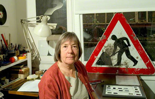
Very few people have heard of Calvert but her portrait is probably one of the most recognisable in the UK, after the Queen’s on stamps.
The girl in the school children crossing sign is based on a picture of herself. She didn’t like the grammar school overtones of the earlier sign, which featured a boy wearing a cap and carrying a satchel.Calvert thought this sign was like an "illustration from Enid Blyton"
"There was a different attitude to schooling coming in and I thought, wouldn’t it be nice to turn it around and have a girl leading a small boy."
The cow featured in the farm animals warning sign was based on Patience, a cow on her relatives’ Warwickshire farm. And Calvert is also responsible for the much-parodied men at work sign.
It has long been remarked upon that the man digging actually seems to be struggling with an umbrella, and Calvert wishes she had made the shovel more shovel-like.Kinneir and Calvert’s designs changed the British landscape and they became a role model for modern road signage all over the world.
The signs promote an image of Britain, says traffic sign designer Bryn Buck.
"Traffic signs are a brand like Armani suits. A sign for the M4 is the first thing visitors see when they leave Heathrow."
Design commentator Michael Czerwinski hails them as a success story of the modernist movement.
"We do not question them like modernist buildings and they have not been dabbled with as much as other things have. The fact they are still in use today says a lot about the success of the designs."
Spot the difference: A men at work sign in Berlin
The system has been added to and adjusted but the fundamentals haven’t changed, adds Buck.
"By keeping it simple, it stands out and doesn’t age. It is still informing people more than 50 years after it was created."
Transport and Motorway, which is used only for route numbers on motorways, are still the only two typefaces permitted on UK road signs. Transport is also used in several other countries, including Iceland, Ireland and Portugal, and in much of the Middle East.
Transport may not be pretty but it is one of the most effective and useful typefaces in the UK, says Simon Garfield who wrote Just My Type, a book dedicated to fonts.
"The last thing you want to do when you’re driving along at 77mph is think ‘look at that lovely L or T’. All you want to do is be told where you are and where you turn.
"The key is not noticing it. When you are designing a typeface for signage, you know you have done well when no-one comments on it."
Jock Kinneir, who died in 1994, was resigned to this fact. In 1965, he acknowledged that his and Calvert’s designs fulfilled their function so efficiently that the public would take them for granted.
"Direction signs and street names are as vital as a drop of oil in an engine, without which the moving parts would seize up."Margaret Calvert on Top gear explaining road signs (from 3 minutes)
]<embed width="500" height="399" quality="high" bgcolor="#000000" wmode="transparent" name="main" id="main" allowfullscreen="false" src="http://www.isigntube.com/player/vPlayer.swf?f=http://www.isigntube.com/player/vConfig_embed.php?vkey=d6f8c31474bd0764e6ac" type="application/x-shockwave-flash">Potted history of road signs
The Romans were probably the first to use traffic signs in Britain
A 1648 law required each parish to place guide posts or fingerposts at crossroads
During the second half of the 19th Century, caution signs were put up for cyclists ahead of steep hills and sharp bends
1896 heralded the era of the motor car and some motoring associations started putting up signs
A committee chaired by Sir Henry Maybury brought in more signs in 1933, including "No entry" and "Keep left"
The first major reform came with the new motorways. Jock Kinneir and Margaret Calvert, his pupil at the Chelsea School of Art, are asked to create signs by the Anderson Committee in 1957
The new signage is tested on Britain’s first motorway-standard road – the Preston bypass in Lancashire – in 1958
In 1963, the Worboys Committee commissions the pair to overhaul all of Britain’s road signs. The new system became law on 1 January 1965
Changes since then include electronic signs, additional colour coding for routes, and tourist signs
Source:
http://www.BBC.co.uk
Department for Transport; Design Museum
TopGear.
Sorry, there were no replies found.
Log in to reply.
