Activity Feed › Forums › Sign Making Discussions › Gallery › Infotone
-
Infotone
Posted by Tim Shaw on November 8, 2002 at 4:25 pmMartin Pearson replied 21 years, 8 months ago 5 Members · 7 Replies -
7 Replies
-
hi tim
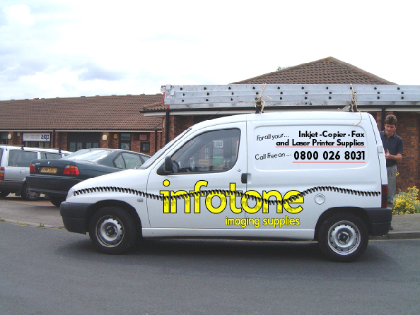
nice work as usual mate..quote :Our first job of next weeki take it, it is super imposed onto the vehicle…?
constructive critisism:
this is a tough one… not because theres much up with the job just some things dont feel right with the design.
i love the effect given by the shadow over “infotone” but i dont really know what it is. i take it, it is a phone wire. but other than they supply faxes i dont know why the wire would be used.. :-?… not being funny just dont see why it has been used.the text with numbers etc in the top panel doesnt really say much as far as designing is concerned. the design work seems to be focused on the name on the side and then stops. it seems to be just listed up there and little else.. i maybe getting this all wrong and there is a good reason for it, like the customer wants it there, and like that.. but on first looking at it this is my feelings. sorry to give negative veiws i hate to 😕
like i said lovely work mate and it does stand out well. but when i read into it i dont see the peices easily joining together…
-
Sorry for the late reply, got offered a week in New York, on the ale, so i grabbed it.
I am the same as you, I have know idea why they insist on the phone cable effect.
As for the side panel, they kept breaking it down to how they wanted it,
customers always right eh!! -
I have to agree with you both on the phone cable thing, if this van passed me my first thought would be that they were a communications company, as for the panel as you say the customer is always right !!
Having seen some of your work Tim jobs like this one must frustrate you. -
Gray, if I remember correctly this is not the first time Tim has used this van for a visual, as for the phone cable I think the customer is insisting on it.
-
Deleted User
Deleted UserNovember 22, 2002 at 11:27 pmit lOOK gOOD dONT Swet it!
-
Why not just make the cable less black and send it behind the text on the logo. It’d look good if it was a dark grey instead.
How long are those bleeding ladders?
-
As Mike says we need a little more detail, if its to go over scaffolding while the building is renovated I’m sure there was an article in one of the sign mags fairly reacently about a company that do this sort of thing. They used a material that was full of tiny holes which allowed the wind to pass through but the graphics still looked really good.
Log in to reply.


