Activity Feed › Forums › Sign Making Discussions › Graphic Design Help › Im Rebranding
-
Im Rebranding
Posted by Ruairi O'Boyle on April 19, 2010 at 11:43 amI have decided to change my name and rebrand. Now I am looking some advice from the experts!! 😉 😉
All comments good or bad greatly appreciated!
Attachments:
 Ruairi O'Boyle replied 14 years ago 16 Members · 54 Replies
 -
54 Replies
-

Seems a popular name.
http://www.signtimeinc.com/main.html
http://www.signtimesigns.com/
http://www.signtimellc.com/
http://www.signtime.com/sam/default.cfm
And lots who don’t have a website yet.
😉
Love….Jill -

I could only find the few you listed and one similar in the UK! all the other sign "somethings" and "something" signs seem done to death!
Given all the signmakers in the world its going to be hard to get something that includes the word signs that is unique. At least there werent many using signtime in the UK. Ill keep racking the brains here to see what else comes to me!
Thanks Jill
-
Yeah I didn’t mean to rain on your parade.
Sometimes I think it’s better to just use your own name.
There are loads of Vital Signs here, for example, even though it is a clever name.
The best sign company name I ever saw is my friend Jeff Lang’s.
"Olde Lang Signs"
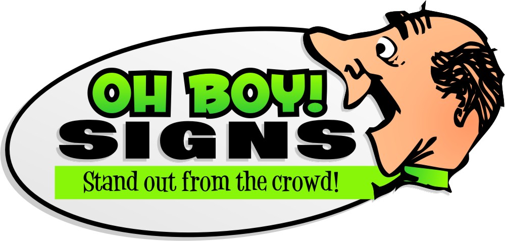
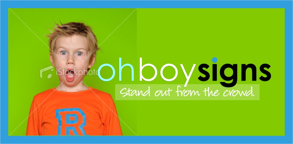
With your name I would make it "O Boy! Signs"
And make it a bit on the retro side as in the example posted below.
(your name probably already is that huh)
Attachments:
-
Thats not bad actually! Now you have got me thinking! Tea time so Ill stew over that one and see what comes to mind!
Thanks Jill
-

lol Jill,
Big Boy might get the wrong kind of custom or, possibly the right kind depending on whether the business plan is changing too!
Rauri,
I think Jill might be on to something with O’boy Signs, has a familiar ring to it.
Hugh
-
To be honest I kind of want to stay away from the use of my name and/or initials as we have a number of other family businesses all prefixed with OB.
Just a personal thing as this is my own venture that I want a unique identity! (Independence!!)
-

Hi, come on Ruairi you can do better than that javascript:emoticon(‘:)’)
Do some research and some scribbles on paper before you turn on PS, CDR etc
Think about what kind a business you are or what you want to be – professional or low cost etc etc
You say you want ‘Independence’ but you’ve used a generic image from Istock ! Draw your own !!
Think about colours and where the logo will be used – van, website etc
All of this is a good exercise for creating customers designs.
Come back here in a week a so with something that your’re proud of
javascript:emoticon(‘:lol1:’)John
-
John
Unfortunately I am not all that artistic! and definitely no use when it comes to pen and paper!! IStock etc all the way for me!!
I am in the middle of van layouts etc.
What does tmy current logo say to you low cost or cheap??
-
Ruairi,
Those istock images you are using are being increasingly used, but not as logos as a more short term promotional marketing tool. I would not use them in a logo, they will look ‘dated’ as a long term use-just my opinion!
I think what you have done otherwise is smart and gives a corporate impression….I am sure it means different thing to different people.
I think everything works just the images are a no no.
Hope this is helpful? -

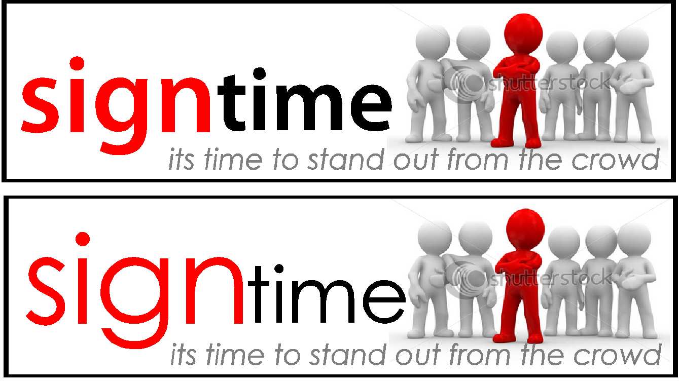
I like the sign time and the logo…this image can be changed fairly frequently for something else…sign time is what works for me
-
Cheryl/Luke
Thanks – all fair points. If I can settle on a name and colour scheme I can rework the image over the next few weeks as I want to get the van on the road to try and raise awareness locally.
I liked the message the image gave rather than the actual image.
-

I quite like the font weight in the second one and the name but the image is a bit overwhelming and as said generic / of the moment…but no big deal to change every few years to stay ‘on trend’…although I have been known to roll my eyes at sign companies who can’t stick with one image for an extended time period (one local company was different every year in the yellow pages – no continuity…looked like a new company every year).
ps. remember the apostrophe….
Dave
-
I wasn’t a fan of the computery looking graphic either but that is a matter of personal taste.
This is what I was thinking, but you might hate it.
Attachments:
-

Ruairi, is the process for changing your name difficult? Especially with banks etc?
I like the first logo btw. It may well be a common image but I’ve not seen it before. 🙂
-
Jill I like my haircut! I hope that isn’t meant to be a Caricature! Ill see what the others think. Its definetly not my usual style but I do like it!!
I a techy so computer images etc. are my forte!!David, appreciate the grammar correction- definitely my weak point! I am going to have a go at it again this evening and see what I come up with!!
Cheers so far guys
-
Oops.
😳
The guy is just a dingbat.
I didn’t draw him.
Attachments:
-
Kenny,
No, the paperwork is the easy part. Making sure you hit all your existing customers is the important part.
We recently rebranded our construction company and the paperwork more or less took care of itself. (although the Admin girls wouldn’t agree with me!!)
We are constantly marketing ourselves through exhibitions, flyers and telsales to ensure we dont miss out on any existing business and generate plenty more!!
If its a good business decision dont hesitate. If, like David referred to, its an annual thing then think carefully!
I still like my original design but the previous posts have left me asking myself did I take the easy way out!!
-
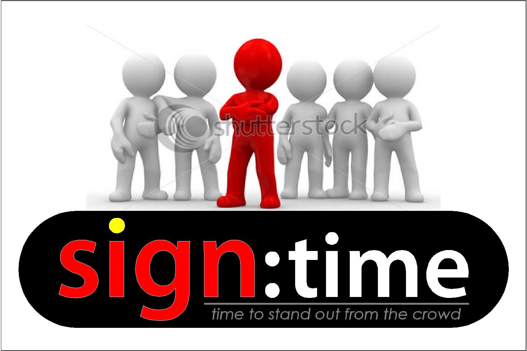
This is about as modern and computery as I get.
Of course you’d have to buy the iStock image.
(just trying to avoid working today)
But he even has an R on his chest.
Attachments:
-
Seriously Jill – you should get a bit computery more often!
REALLY like that as a business advertisement.
Possibly not got a long lifespan as a corporate identity – but liking the fun feel at lot.
In the words of one of my favourite movies of all time…
-
That’s a fave of mine too.
This is what I was thinking when I threw the last one together:
http://www.youtube.com/watch?v=WVNB9O5I … re=related -
..show off!
The digital one is really clever but I like the regular clock one.
There was some discussion recently on another forum I frequent, about using a clock face.
Someone said the hands should be at 10 and 2 to make the clock face look like a smile. -

😀 😀
yeh Jill, I remember being told that too and now I notice it in every jewelry shop I pass.
Couldn’t get it to work on the logo above though, I did try.*(note I said pass! 😀
-
Harry
I a few ideas similar to your clock face (but not as good to be honest) but I never thought of the digital one! it looks sharp!
This designing your own logo is a nightmare I cant make my mind up at all! My problem is, while I agree that the Shutterstock images may date and they are no substitute for a unique logo, I personally like the bold statement the image makes!
I am thinking of running with it (or a modified version based on everyone’s comments) as a marketing tool for the re-branding exercise and working on some of the suggestions to get the design of the logo spot on.
What are peoples opinions on colour? I prefer the type of colours Jill used last but I think the red and black is more striking?
Again thanks for all the great help so far!
-
The top one of Harry’s is simple and really excellent.
I would go with the istock image if you like it (joe public doesnt see it as often as us)…at the end of the day you are a signwriting company and you can change it as regularly as you feel necessary if you feel it is getting dated at all…a change is as good as a tonic someones grandma used to say, -
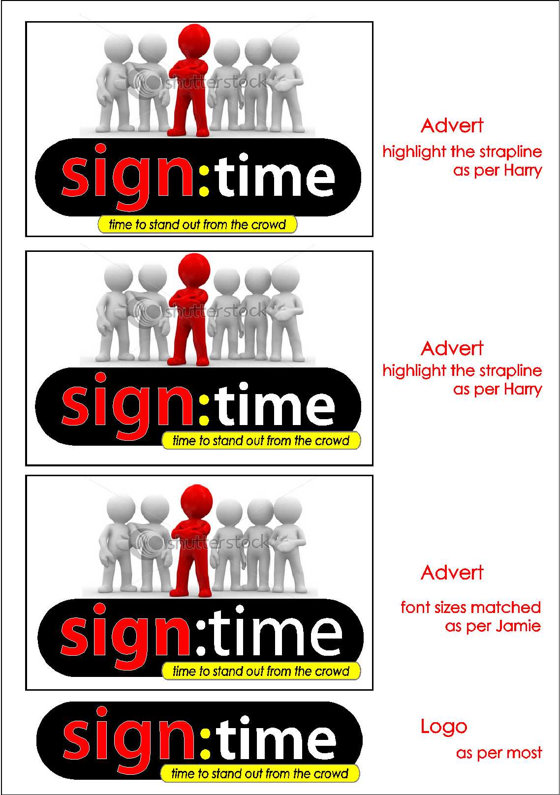
Jill – you might not be impressed with this one but I am finding it hard to change away from both the name and picture.
Harry/Cheryl – What do you think of this version. Bearing in mind I like the men and they will be easy dropped/replaced if I feel they have dated.
Attachments:
-

I like Harry’s bottom design. As a logo, it really works well, & even the stupids will ‘get’ it.
All the other designs shown look a bit billboardy to me – very temporary.
-

I think making ‘SIGN’ and ‘TIME’ different sizes, unbalances the design. I
would choose different weights in the same font to achieve the desired effect. -
I think the istock image would work as part of a campaign, I would have no problem with that…..but to be honest I think it lessens the impact of what a brand should be: ‘a mark that uniquely identifies you and what you do’.
My advice would be to concentrate on that first and don’t confuse advertising with branding….if that makes sense.
I also think if you are going with the digital dots to keep it to that ….don’t dot the ‘i’
The strapline is lost on your one as well Ruairi.
It’s always fascinating to watch these logo development threads. -
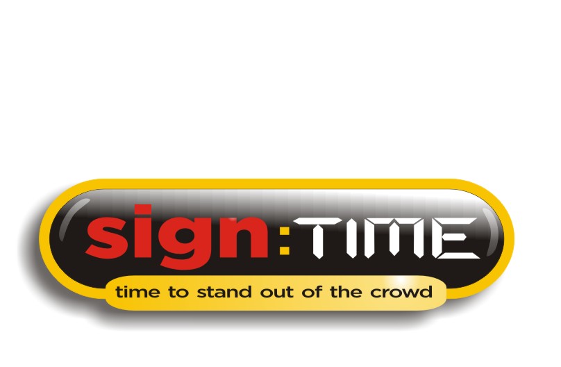
Another go.
You guys are right I am confusing an advert with my logo to a certain extent.
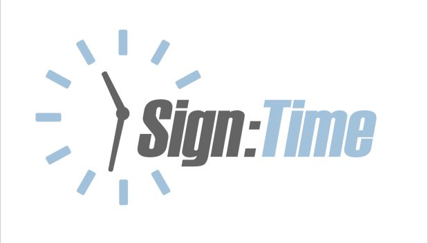
I thought by increasing the font size I emphasized the the sign part as it is obviously the most important. see what you think.
The strap line now stands out itself! what do you think?
Attachments:
-
I think it’s getting unnecessarily complicated & fiddly. I don’t like the outlines, I would use the contour tool if I wanted to outline as it doesn’t cut into the letter shapes.
The strapline also looks a bit ‘tacked on’.
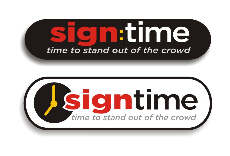
Here’s my take on it. Hope this is helping.
Attachments:
-

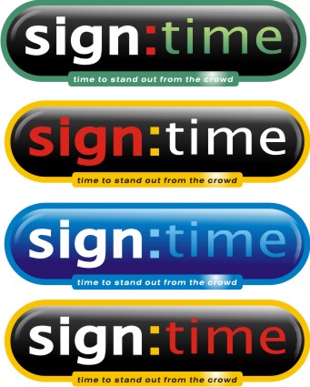
I really like harrys what about this font aswell might be a bit hard to read????
Attachments:
-
When designing logos these days I am always aware of how it might be adapted for web applications.
Attachments:
-
Harry
I like your last one! I wanted to add those types of effects but I am not on my own PC and I aint all that familiar with Adobe Illustrator!
Do you mind if I ask which font you are using? I prefer it to mine and what do you mean about outline/contour? Either I don’t understand the terminology or I am not familiar with the difference.
-
I’m working in Corel Ruairi. Not sure what the contour option is in Illy.
Outline sometimes works but I don’t like the way it can alter the integrity of the lettershapes….contour doesn’t do that.
The font is my current fav Gotham Bold and MediumMatthew: I like that idea…what’s the font called?
-
Thanks Matthew
That looks good too but I think I am emphasizing the time too much in that version.
-
Dunno….certainly has possibilities. I messed around with the shapes here…definetly worth playing around with.
Attachments:
-
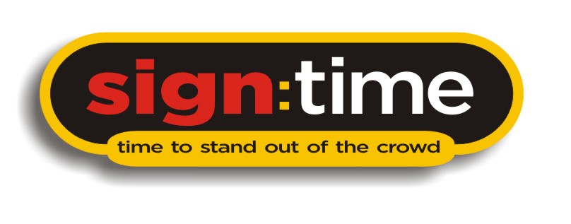
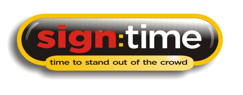
I like Harry’s on the last page with a more yellowy yellow.
The border needs more breathing room too, I think.
I would definitely avoid the digital looking font, it’s hard to read and it doesn’t flow well with the first font.The clipart thing, being grey and red, and a bit soft, may not reproduce well for every application.
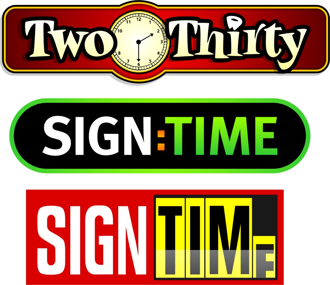
And the tagline (I will give up O Boy hahaha) is redundant as it also uses the word "time". I would suggest something like "Up to the minute design" or some such. My friend Pat has a shop called "Signs in Seconds" and his customers expected instant signs.I am showing the example I did for the other forum about the clock face, it was for boat lettering called Beer Thirty but I made mine be for a dentist’s boat. Just to show how I incorporated a clock face. Then I adapted Harry’s idea. Then I stole an idea from Carfax.
I have to get back to my real job now.
:lol1:
Attachments:
-

Just having a quick browse! Love the green ‘sign:time’ Jill… Very eye catching! Up to the minute design is a great tag line too… 🙂
-
Agree Jill….don’t like the 2 times myself, what about
‘Wake Up Your Signage’
‘If Your Signs Snooze, You Lose!’ 😀Like the green treatment too.
-
Don’t take this as purely a negative comment but…….
If someone on here is struggling with a logo / design what is the point of drawing one for him/her and posting it ! How are they going to learn any aspects of design for day to day work ?
Surely they should post their original idea and others ‘critique’ it – they then revise, revamp and the process goes on and hopefully they will learn from the process.
By the way, great deigns Jill & Harry
John
-
My idea, sorry to go off track from the others
Liam
Attachments:
-
quote John Hughes:How are they going to learn any aspects of design for day to day work ?
JohnLearning by ‘example’ is a good way in my opinion John…..so these ‘for example’ suggestions are teaching some of us something…..and that’s got to be a good thing.
Just my take on it… 😀
-
John,
The OP, Ruairi, did post his idea and did get some advice.
I like to give examples because it’s sometimes easier for me than explaining with words, and it’s good practice for me.
I think we all learn from threads like this one.
PS
Nice font choice Liam. -
quote Jillbeans:John,
The OP, Ruairi, did post his idea and did get some advice.
I like to give examples because it’s sometimes easier for me than explaining with words, and it’s good practice for me.
I think we all learn from threads like this one.
PS
Nice font choice Liam.Thanks Jill,
John, i am learning by reading and taking part in this thread. I don’t see too much difference from Ruairi posting here than discussing his ideas with work colleagues. He is not taking anyone’s ideas 100% and using them, he is just getting feedback and adapting his own design.
If someone was on here every day asking for design help that would be different, but people always say your own logo is the hardest one to come up with.
Liam
-
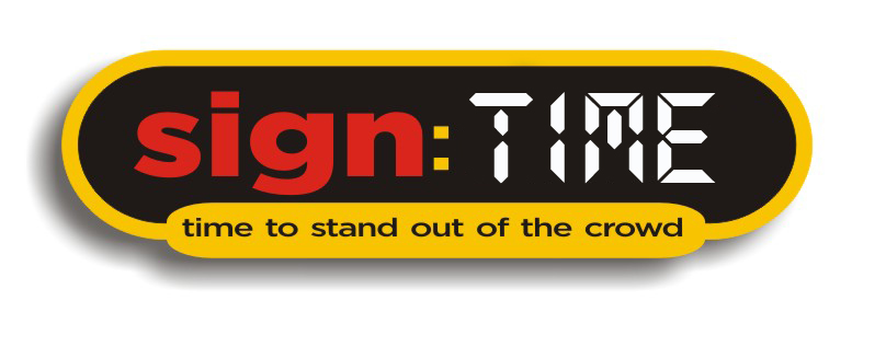
John
I have revised my logo throughout this process. Harry used a font in a similar style to the one I posted. He added a black background which I added a yellow bubble to the bottom. He then suggested an outline which I like and have adopted along with the lighting effects.
Since then Jill has sent through another option which I liked the colouring of and adapted my own as per below:
I think, to be fair, that it has been a two way interaction with worked examples and I really appreciate all the help I have got along the way!!!
Thanks guys (I think I am almost there!)
Ruairi
Attachments:
-
Liam
Thanks for the post! I like the colours and font in that one!
-
For me the strapline is out of proportion, it’s too small and the more I think about what Jill said I think you should maybe take on board the 2 ‘time’ problem.
The kerning needs serious attention too…’time’ is strung out for no apparent reason or effect, as is Sign.
Other than that it’s personal choice on the colours as all versions have something going for them.John: I see where you are coming from but I have learned more from taking part in these threads than I have from books. As long as it’s hands on for everybody involved…….and as long as it’s an honest two way thing it’s very beneficial.
-
Harry,
Im working on a new strap line as I agree with you Jill about the time appearing twice! You are right about the kerning I will sort it out later.
Cheers

Log in to reply.
