Activity Feed › Forums › Sign Making Discussions › Graphic Design Help › im re-doing my logo and would like some ideas please?
-
im re-doing my logo and would like some ideas please?
Posted by Hugh Potter on July 9, 2008 at 11:34 amHI all, i’m planning on re-doing my logo, I’m about to make myself some new shirts / hoodies, and will do the car in the near future too, so looking to modernise things a bit,
currently i’m using various designs, though i want to use something more permanent,
attached is the new, and a couple of the current logo’s,
would like some more idea’s / advice / comments on the new really, ie, is it too over the top? would you do something different? etc…
thanks in advance.
Hughps, have attached as a cdr as the file is too complicated when converted which makes it mega mb!
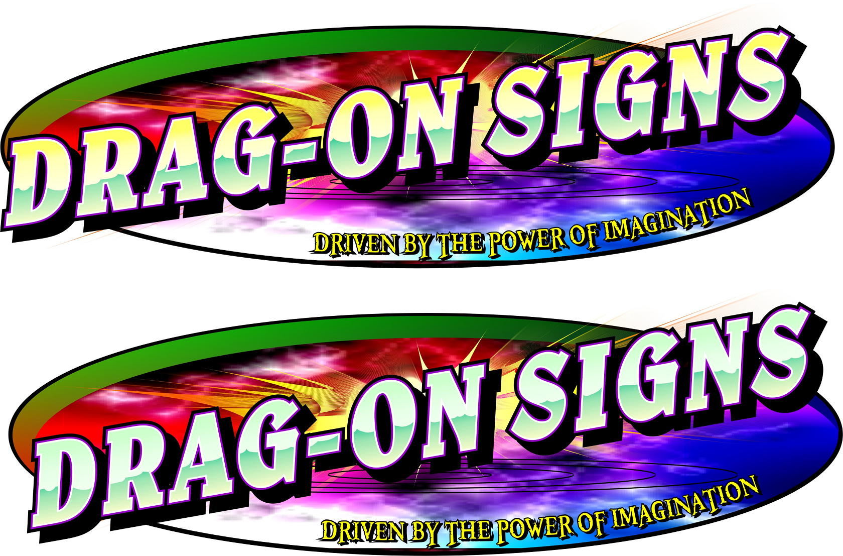
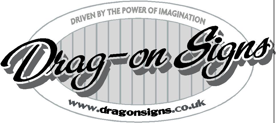
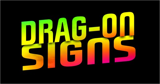
ok. pic 1, my preferred new logo,
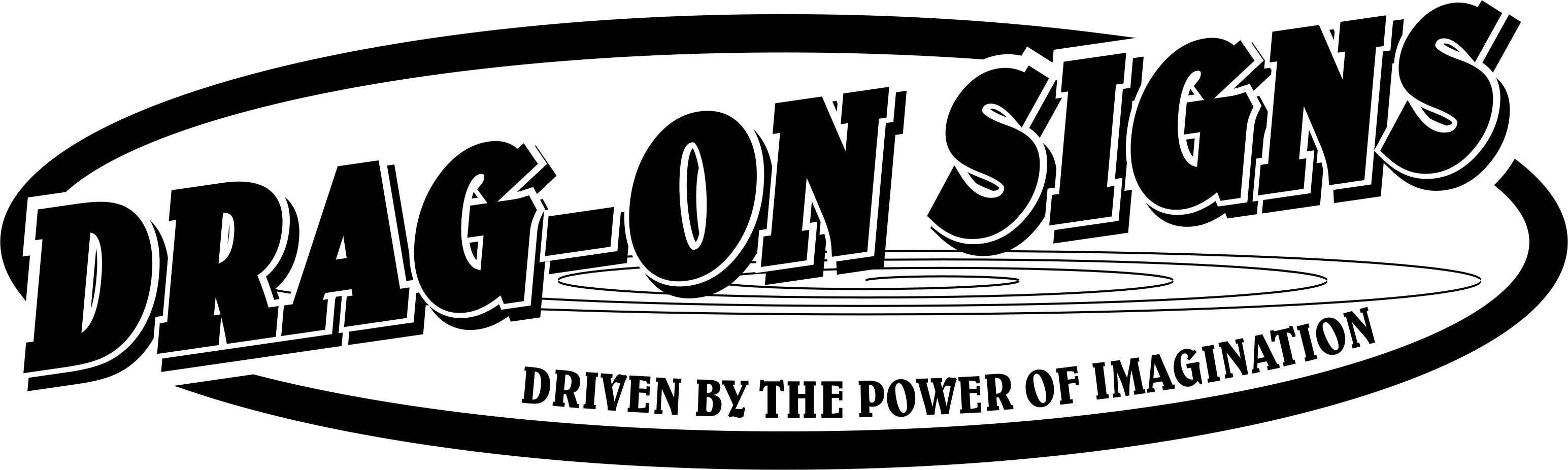
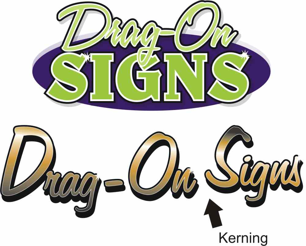
pic 2, the logo i use on letterheads, but it will be tricky to print for use on the car.
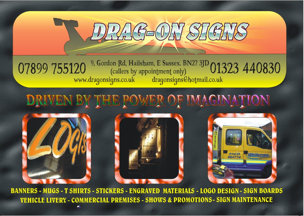
pic 3, my current flyer design (only 2000 left to get rid of!)Gavin MacMillan replied 15 years, 10 months ago 20 Members · 57 Replies -
57 Replies
-

Hate the font used for the strapline in the logo Hugh.
Keep it clear and simple I would say – Def. KISS.
I have 2 clients who are currently re branding small businesses. One has paid nearly 10K for a website and logo re vamp. Well the logo in my opinion was just average.
Find something you can live with and use for all purposes.
Consider single colour variations of the logo as well Hugh, your trying to create a brand – don’t keep chopping and changing as if it’s local business you want you will look like a new outfit in many peoples eyes at a glance if the design keeps changing.
Just my 2p’s worth.
Tim.
-

cheers Tim,
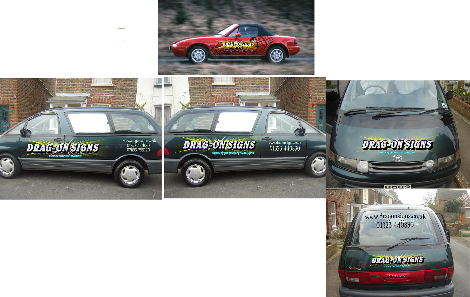
in the main, it’s only the backgrounds that have changed, or not been there, the main name / strapline (and fonts) have been like that for near 2yrs. however, i haven’t had anything on my vehicle for about a year, so people aren’t exactly used to seeing something, it’s really only my quote / invoice headers that have changed with any kind of regularity, maybe 3 times in 2yrs.
re single colour, when i tag a van or something, i have stickers made up from rainbow chrome, an oval design, but always use the same font for the main name ( think!)
i think single colour is ok?
Attachments:
-

Hugh, I think you tend to be over creative with the logo, there’s just so much going on.
As Tim says, the strapline font is horrid.The actual name intrigues me, why drag-on?
-
when i first started out (sideline to the race car parts) i was selling stickers / decals to the drag racers, half Welsh too, couldn’t use Dragon as the world and his mum do, so it became Drag-On, a name i’ve had boucing about for various business ideas since about 1992 when i was gonna move to Gower, Wales. it never came off, but the name had always been there for something!
re design, yes, i do try and cram too much i guess, hence asking for help in thinning it down a little, i actually like the single colour version a lot, but it’s too plain, i think? wanted something with depth.
trouble is, i think, is that it’s an amalgamation of many different idea’s.
the font i think is booter zero, it worked at the time, but it doesn’t go well on the coloured background, admittedly. i’ll junk it in favour of something else, it’s only ever been on printed stuff, it’s replaced with helvetica on cut decals.
Ta.
Hugh -

Not too keen on the fonts you use…. 🙁
How about something like this…… 😕
Attachments:
-
HI Neil,
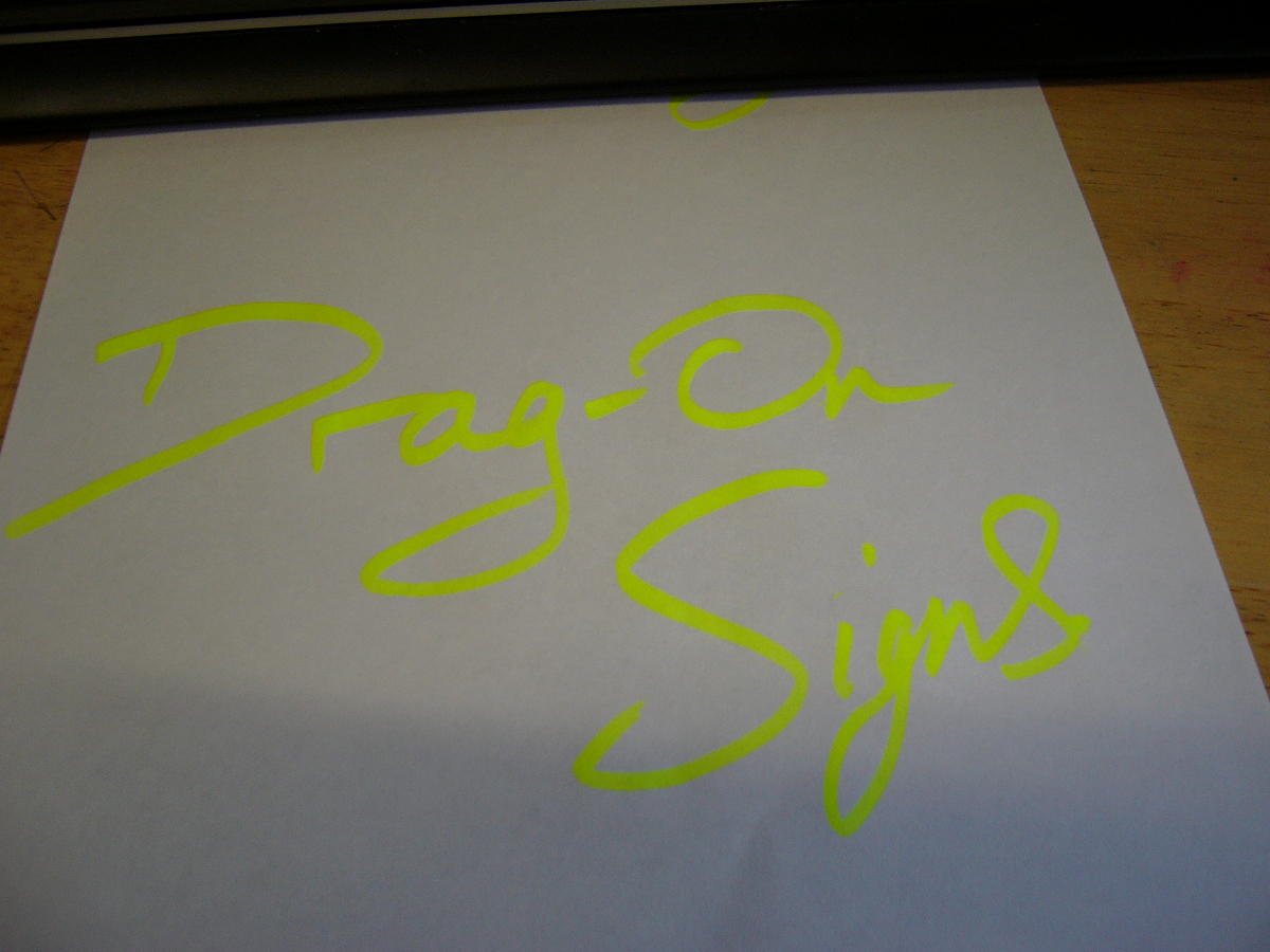
i had considered a script, but have yet to come across one i like enough to warrant my use of it, had considered digitising my own handwriting, but have never got around to it yet, i often sign off like the attached when writing to someone, so it’s an option,
can’t decide whether i want to go ultra simple (less is more) or bright / colourful / creative! needs to look modern too, i like what you’ve done, but it looks too traditional for what i want.
the other thing, i plan or wrapping the merc estate in black, so it needs to be flexible on the colours.
cheers.
Hugh
Attachments:
-
Hi Hugh, why not try some of the font sites for a script lettering…..OK you have to pay but they have some great fonts and alot are designed by signwriters so they have great character and a traditional look about them.
I am slowly replacing my computer fonts with bought fonts as I think it keeps my designs and layouts fresh.
http://www.letterheadfonts.com
Give them a try…..Neil 😀
-
quote Neil Davey:Hi Hugh, why not try some of the font sites for a script lettering…..OK you have to pay but they have some great fonts and alot are designed by signwriters so they have great character and a traditional look about them.
I am slowly replacing my computer fonts with bought fonts as I think it keeps my designs and layouts fresh.
http://www.letterheadfonts.com
Give them a try…..Neil 😀
Honestly? because i’m too tight! (you’d think i was Scots!). seriously though, i have had a look at some of the letterhead fonts in the past, and as nice as they are, i just haven’t yet had a customer who’s come alon with the kind of budget available to im, that would be prepared to spend the cash on something a bit special!
thanks though.re my logo, i can’t decide! i printed a quick hoodie off using the logo as above, and i think it works ok, though it is a little over creative, I just can’t seem to get away from the chrome / reflective looking text,
i’ll see if i can post an ai, ya’ll can have a play if so inclined!
thanks.
Hugh
Attachments:


-
hmmm, ok, maybe i’m going the wrong direction?
the car will soon be black, either paint of vinyl, so i’m looking to change this now, as mentioned, the original name with the sunburst thing behind it wold be difficult to print, so i was thinking of builfing the name / burst into something else, rather than trying to print the fades onto clear or black, which would look orrible when a big slab of vinyl is applied to the motor,
I want something that can be printed, as well as being able to be simplified for small stuff, hence the bright colours / effects, on this main logo, maybe i’m so far into my own idea’s that i can’t see beyond it!
help !!!! 🙁
have attached an editable pdf and a cdr (no ai as the fills murder the mb space! )
-

Hugh here is a quick re-work.
One thing I noticed is the kerning, it’s a bit wonky.
I can’t duplicate your effects as I am a total numpty, but I moved the words and a few letters about in this example.
I notice you don’t weld your scripts, is that normal? Because I always do.
It is worth buying one font you love for yourself, as we all need a treat now and then.
I like the Belwe but not the other fonts. I also never arch a script font.
Try to take as much time on correct letter placement as you do with effects and you will come out a winner.
Love….Jill -
thank you Jill, certainly some good points, and more food for thought,
Hugh
-
 quote Hugh Potter:Honestly? because i’m too tight! (you’d think i was Scots!). seriously though, i have had a look at some of the letterhead fonts in the past, and as nice as they are, i just haven’t yet had a customer who’s come along with the kind of budget available to im, that would be prepared to spend the cash on something a bit special!
thanks though.You’ve never had a customer that could absorb the £15 it costs for a sign DNA font?
any single font is only $25 works out about 15 quid, the only job I couldn’t lose that on is a T shirt!🙂
-

Hey mate, I’ll add my 10c worth if thats OK.
I agree its all in the font.
I’d lash out and buy a font frankly, one you like but also one you don’t see that often.
If people see you have used a font THEY have on their computer, its value is lowered in their view. But, if they see a new stylish font they’ve never seen before, and are unlikely to see often, that font will be more unique, and more stylish in their eyes.
I’ll go back to my TV now 😕
-
ok, i’ve not spent time looking thru the fonts, just assumed they were expensive, whenever i’ve searched a paticular font, it’s always come up as something daft like $120 / £60, not worth it on a £100 job!
i’ve often heard of other fonts, letterhead (?) costing $$$’s ? just assumed all were expensive.. i know what you’re all saying though, so will have a look into it.
problem i still have, is i dunno whether to stick with belwe, which i like (the blocky text) or a scripty font! i might like the look of a font on paper, but how do i know it’s gonna work around any logo design i might choose? surely the font is often chosen to go with the job, not the design fitted around the font?
cheers.
Hugh -
Well, I always choose the font for the job, not the other way round.
If Im doing a sign for a food place I would use the same font for a garage etc.
Theres stacks of fonts out there and theyre pretty cheap when in dollars, I got 15 fonts from one place for $99 which is 50 quid and ive made that back on the first Job anyway.
have a look about you cant have too many nice fonts
free ones are ok on T shirts and stuff, but quite often they let themselves down on signs, or have to be kerned and altered to look right. -
Hugh, the Letterhead Fonts-site has a Typetester to view your wording in any of their fonts.
-
ok, guys, thanks for the input on the fonts, i’ll have a look, honestly!
so that aside, i’m still not totally sure what to go for in a design, i want something that jumps out, that shows what we can do, the customer will know i can do basic stuff,so i want to advertise that i can do more, by making my logo something a bit ‘special’, i hate asking for help, but it looks like i really need it here!
thanks.
Hugh -

i hope it wasn’t posting your details on this thread that took your bandwidth over the limit!!!
just to let you know it’s showing as exceeded
-

Micky, what do you mean Bandwidth over limit, is that when you click on the pictures or as they appear on the thread they are being replaced with bandwidth overlimit? Never seen it but can you explain more? Some images are slow loading for me, atm.
Hugh, top Drag-on post looks good, simplify might make it better, not sure if I have seen a second best yet, not keen on DOS showing out but I think you should keep your theme a bit as it is your interest after all.
-

No Dave, it’s the message I’m also getting when I click on Hugh’s website!
-
quote Chris Dowd:No Dave, it’s the message I’m also getting when I click on Hugh’s website!
Me too.
Me thinks you need to upgrade to the next level with your hosting service Hugh…
-

Shane’s on the button there Hugh re your service bandwidth level.
I love your current logo, are you changing for a spring clean or something mate?
-
quote Andrew Bennett:Shane’s on the button there Hugh re your service bandwidth level.
I love your current logo, are you changing for a spring clean or something mate?
HI Guys,
yup, often goes over the bandwidth, have been working on upgrading the whole website to be honest, it’s been taking ages though, haven’t upgraded due to this, wanted to wait until it was all uploaded.
Andrew, which logo do you like? if you mean the original as on the flyer, I do like the effect, though i don’t really use the dragster anymore, not sure it’s all that relevent these days (other than giving a clue to where i came from).
the prob with that logo…
as much as i like it, the font and the starburst thingy i made behind it, it doesn’t lend well to print, i have a plan to possibly ‘wrap’ the whole car / van (which one depends on whether i change my vehicle soon.. fuel costs etc) in a black reflective, this is partly cos i think it’ll look pretty cool… even in sunlight… and partly cos i want to push the reflective side of things, of which i do quite a bit,
, if i print, i’d have to print a black background too, on clear i’m told it’d look washed out, but if i go onto a printed black it will be a different black to the vinyl it covers, also covering a huge amount of reflective material.
so, i was thinking of having an eye catching variation of my logo. if there’s a way to print the effect without losing the depth of colour, or covering a large wedge of reflective, then my printer and I would love to know, and i’ll stick to the original logo!!
hope that makes sense.
-
just a quick one that sprung to my mind when i first saw your logo
if you were changing things how about drag-on de-signs?
you get the drag racing (i know redundant)
but i initially thought it meant drag as in ‘drag and drop’ – ‘cut n paste’ with ref to design software
then the dragon for wales
designs and also signs -

Just had a dabble while watching BB Hugh..any good 😕
Attachments:
-
hi Mickey,
clever idea, thnkyou, but to be honest i’ve never been a big fan of the de-signs, d-signs, etc type wording, i think the name is well enough known aroud here that it’s not something i’m gonna change now. thanks though.hey Martin,
I can see where you’re coming from there, and i don’t dislike it, but it’s not jumping out at me, i seem drawn still to my first ‘busy’ idea!the other prob, is the prob i have with my current logo, and that’s how to print a transparency / fade in a way that works, without having to incorporate the whole thing into a wrap.
thanks for trying,
AAAAAAAARRRRRRGGGGGGGGGGGGGGGGGGGGGGGGh
😕 🙁 😮 😀 -
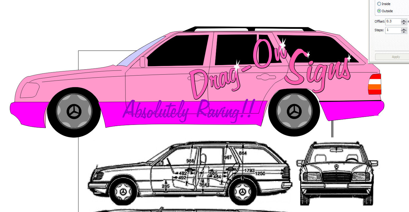
hmmmm,
have decided that until i can come up with the perfect idea, to have a play around with getting at least ‘something’ on the car asap,
was chatting with the mrs and she suggested i do something more subtle for the time being, having finally got aoround to drawing a merc outline, i tried this colour scheme but, she said i’d very soon be divorced if i do it, can’t think why!!! 😮 😕
constructive crit welcome :lol1: :lol1: 😉
Attachments:
-
quote Glenn::shutup:
speechless eh? she looks a stunner don’t she? 😀
reckon i’d get a job or three in brighton if i parked it down the lanes?
-
lol, that’d be quite cool actually!
or perhaps whip off the doors, sit everyone in there nice n still, take some picks then wrap the doors!!
-

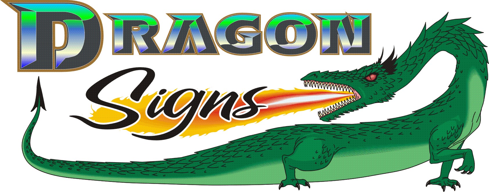
For what it’s worth Hugh, i quite liked the bottom layout on galactic drag-on, alt(1).jpg
I didn’t like the font so much but I liked the effect and the background
-
quote Glenn:For what it’s worth Hugh, i quite liked the bottom layout on galactic drag-on, alt(1).jpg
I didn’t like the font so much but I liked the effect and the background
thanks Glenn,
i like the background and effect too, i’ll have a play with different fonts and see what occurs, though i may go for a quick cut vinyl approach for the time being. i’m doing quite a bit of work for a body shop now, so i could prob wangle a cheap respray if i choose to go that route (rather than trying to wrap! )
Rich, ya reckon Cheryl would go for that then? lol!
-

havent read the thread yet mate… but i like neils layout, followed by jills first one then martins on simplicity… i know it is very difficult to come up with our own design, hell ive been trying to design wraps and stuff for us for months… however, you need to focus on a logo made up of your words. examples of this are the ones i have mentioned above. you need to forget all the bells and whistles and focus on a good font/logo.
as much as all your own examples are very creative. to me, seeing stuff like this says, "look what i can do with my software". i do not mean that in anyway bad mate, i mean it purely constructive. i just think you need to go back to basics and get something that looks right. once that has been established you can incorporate it into signs, vehicle livery, t-shirts- mugs… you name it…as has been said before, try working in black and white. in vector format and in flat colours. no blends, bevls etc
-
HI Rob,
i see what you’re saying, just soo hard! should i change at all? i dunno!
re the other designs, in their own right they’re fine, they’re just not ‘me’, can#’t explain why, Martins is prob the closest to something i think i could work with, but not sure where i’d take it.
my head hurts, i never have to think this hard on a customers job!
-
quote Dave Rowland:quote Glenn::shutup:
sorry, me too
lol.. twas a joke!
-
i do unstand hugh, i dont mean those designs are what i would select myself, taste wise, but i do think they work in their own way. more something you can identify a company with rather than words caught up within a picture. if thats how to explain it… 😕 im hopeless i know…
ide give it a go myself but my time is extremely limited this week. 🙄 -
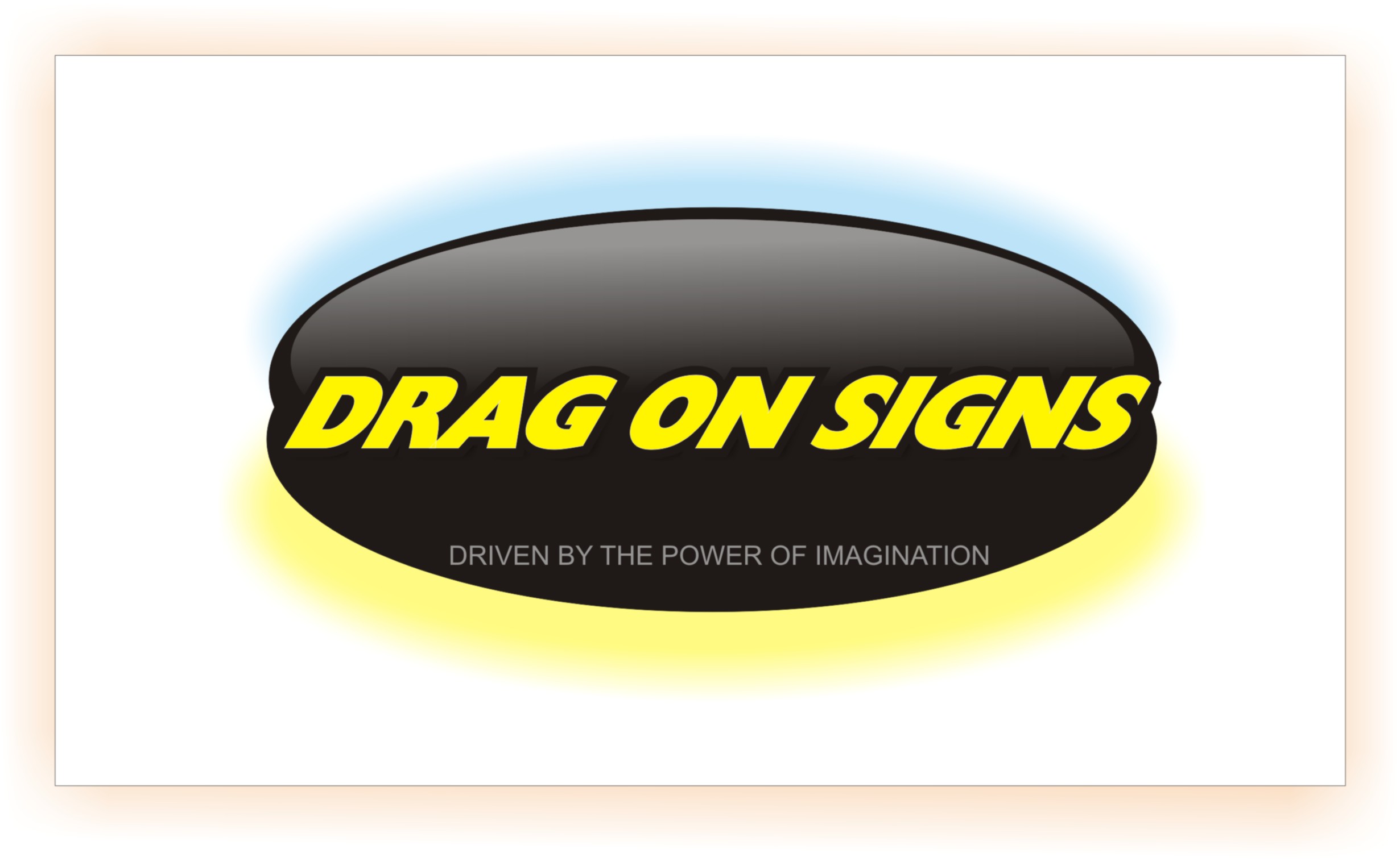
Hugh…..just been having a play
I was just messing about applying fills to the text rather than the background
I think what I was attempting to show was that you could still have fancy fills when you like but it would work with flat colour if you wanted to keep it simple
Attachments:
-

Thats one hell if a fiddle……….The depth and 3D effect is rather spectacular
-
thanks Glenn,
the first one didn’t strike a chord to be honest, but scrolling down and seeing it done in a slightly different way makes a huge difference! while i’m not stuck on the font or the fill colours, i love the 3d / reflection effects, i’m gonna be playing for hours now you’ve put that in my head, you do realise that!!
thanks dude.
Hugh -
no probs Hugh….
my fonts are so limited on my laptop I just went for something reasonably bold that would show the fill effectively
I think it was Jill that I first saw using the reflection effect and I’ve been dieing to try it ever since
best of luck anyhoos
-
I know you are just trying for a new look logo Hugh, but would you not consider a name change? i know how you came about using it etc just me thinking out loud. 😕 i know i know, shut up rob! :lol1:
-
 quote Robert Lambie:I know you are just trying for a new look logo Hugh, but would you not consider a name change? i know how you came about using it etc just me thinking out loud. 😕 i know i know, shut up rob! :lol1:
I hadn’t been going as long as you Hugh but have to say my business has turned around 10 fold since changing my name, as long as you let you existing and past customers know and redirect traffic to the new site it shouldn’t hurt much if at all. I don’t think the name is that bad but if it is limiting you then it might be something to think about.
Warren (Been there, done it and got 2 t-shirts from it 😉 )
-
not sure about the name change thing, would have to consider is very carefully, if nothing else i have about £500 worth of printed flyers, cards, stationary, stickers, etc, laying about here!
most people call me Dragon signs, but i’m not sure dropping the hyphen would do me many favours though,
the amount of workload i currently have is more to do with my lack of promotion than my name, hence wanting to do my vehicles again, simply by parking it in the high st (free parking here!) of on the industrial estate, both are only 5 mins walk, it used to generate pretty much 4-5 calls a week, haven’t done that in ages now,
the the re-design of the logo was / is more to get peoples attention, ith hundreds of signed vehicles running about, i need mine to stand out from the rest, do i not? surely we need to show what we can do?
Hugh ‘still undecided’ P
-

Its Neils design for me and I would drop the Hyphen and just go for the Dragon.
-
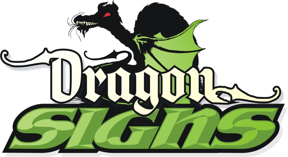
quote Mark Nihotte:just doodling 😳
that’s some doodle ! i like what you’ve done there, though a flash of red below the green in the text would finish off the Welsh touch!
James, Warren, Rob, thanks for the opinions think with regards the name you’re possibly right, as for Niels design, like i think i already said, i don’t dislike it, and it’s a nice design, just not me
I’m leaning towards Dragon rather than Drag-On now, i’ve just googled dragon signs and only myself and a north Walian business come up, so i guess i’m not gonna lose any more work to his than he to me,
dropping the hyphen won’t effect me much anyways, if at all, the flyers can all stay for now too, though they’re due for a bit of updating if i’m truthful!
i’ve not had that much time to play with it yet, so haven’t got anything fresh to put up, i’ll have a go later, still have the same question though, should I, as i want, go for a vibrant, colourful image with impact, or a quiet little "less is more" attitude. i think the former personally, gonna have to just make a decision at some point i guess.
ta all.
hugh
-
Totally respect your views mate, but the more i look at this thread the more i think "i" would change the name and image. drag-on means nothing to me, it honestly confuses me trying to think of the relevance. (not easy to confuse me i know) :lol1: anyway, as much as i know what a dragon etc is, again it has zero relevance to signs. so as i said, cant help but think, ditch it… of course you could go for the welsh connection in the logo but i think there is too much work being put into trying to connect that first name, whether its drag-on or dragon…. i know £500 worth of flyers kicking about is a waste, but long term… well… i recon i would cut my losses and go for a fresh start.
-
Agree 100% Rob.
You could incorporate a custom cartoon of a dragon with wheels or some such to go back to the "drag-on".
This guy is a friend and a great cartoonist:
http://www.thetoonfactory.com/home.html
Here is a lame attempt. I fear mine is too cliché.
But I think people would identify with something with a dragon.
Love….Jill -
thanks Jill, i like that Dragon! fonts are pretty cool too, quite medieval!
Rob,
I can see what you’re saying, but, when googling my name it comes up with only two possibles, me and a guy in n Wales, I could change the name to anything i please, but again, it’s the relevence to signs, if there’s a relevence, it’s probably been done already, like "the sign shop" "sign n design" "sign studio" etc, nothing wrong with them, but it needs to be a unique / little used name.
one prob of course, for me at least, is that i’ve always worked financially within my limits, buying things as i need them, not borrowing etc, Mr Brown and his old Pal Tony have seen to it that we have far less spare than previously, hence the new flyers, websites, domain names, etc would all be very difficult to suddenly fund, it would feel like starting all over again and that’s a scary thought.
realistically, what is it likely to cost to rebrand the whole business? i rarely advertise, so that can mainly be left aside, but all the other little odds and ends?
-
Hi Hugh
As I said and I’m sure you will remember the thread when I changed my name. I also threw away 100’s of bus cards and flyers, had to drive around replacing stickers I had left on empty shop doors and even some old jobs I did that had my name on I went and changed. Domain names are about £5 and you already have the hosting as you already have a website a name change for the net is cheap as chips, your biggest loss will be any printed matter and like Rob said in the long run worth changing sooner rather than later.
I know it is the hardest thing to do and is very very scarey but if it is going to improve business in the long run then it is worth it. After all, you do want to still be around in a few years time don’t you?
I have a few names if you are interested 😉 also check my old thread on name change.
cheers
Warren
-
HI Warren,
thanks, you can pm some idea’s if you don’t want to post them! i guess my worry is "is it going to drum more business" just by changing a name? is the name really that bad?
in my own view, it’s a little different, people remember it, and it’s been around for a few years now. will changing it really make a difference without lots of funds behind me to push it?
Hugh
-
Hi Hugh
As I said before I personally don’t think it’s that bad but Rob has a few points. As long as you email all you past and current customers and tell them then any new customers don’t know how long you have been trading so makes no difference. It took you a long time to build up your current customer base and they won’t leave you because you changed your name so as long as you let them all know then there will be no lost trade, so a better name will only attract more business without losing old business, it’s a win win in my eyes and from my experience. I sent my old named details to a local company twice and no response, only after my name change did they actually contact me with me sending them any details, it could have been coincidence but business has picked up massively since I changed my name.
The hardest thing for me was finding a good name, having the website name available and actually going through with it, I must have changed my name to change names about 100 times, then changed the new business name 100 times before I decided on Mint Signs, I have had so many comments about the name and how good and clever it is so am chuffed.
If is a very scary decision to make but do what’s best for the future of the business and don’t chose names because they have a personal meaning to you as they are usually not very good and emotionally you can’t detached from it and makes the change much much harder to accept.
If you have a look at that old thread regarding names I have some of those sites bought already, Rob also had a few nice ones he might be able to pass on to you 😉
cheers and good luck either way
Warren
-

Only a quick reply Hugh as there is loads of good advice here. To me the ‘drag-on’ sounds like your going to drag the job out and take ages about everything. I see the relevance now with the drag racing but does anyone else? I think even dropping the hyphen would be a good way to go if you can’t let go of the whole thing.
I like Jill’s idea.
G

Log in to reply.
