Activity Feed › Forums › Sign Making Discussions › Graphic Design Help › im in great need of a logo revamp please?
-
im in great need of a logo revamp please?
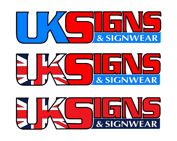
Posted by Kevin Flowers on December 6, 2003 at 2:35 pmMaking the step of moving into premises soon from being totally mobile for the last two years. Looking to revamp logo to be used on large sign boards and van, tried to post in the "ask Mike" section but could not load image. So all feel free to take a shot and Mike if you see this post anty help would be much appreciated. To my mind the image is to flat even with shadows it is very square etc have had various versions along the way but can’t seem to get it right.
Kevin
no9to5guy replied 20 years, 1 month ago 13 Members · 35 Replies -
35 Replies
-

I think there’s something wrong with your .ai file Kevin it shuts down Corel when I try to import it.
Alan
-
AI file okay, opens in Corel Draw 9 no problems 😕
Like the logo, just an idea here but why not outline the text with white, then extend the drop shadow around it? doing it atm, will post after.
Cheers, Dewi
Attachments:

-

Hi
Allen what corel are you using, if its 10 then it proably won’t open when ever i export an AI file from flexi it will not open in Corel 10. Did not have problem on earlier version tried service packs the lot just will not work. Can not copy and paste between Flexi & Corel orvice versaDewi
i like tried similar myself but applied union jack to uksigns complete just did look right, yours as a better look to it, but still has that very regular shape. May go with your idea if nothing else comes up many thanks for having a playKevin
-
Kevin
That probably explains the file not opening; I usually have no problems with other ai files.
I think you have to be careful using top block shadows? Viewed from above or on a level they look OK but if the sign’s mounted at some height e.g. on a fascia, they can look rather odd when you’re stood below the sign but the block shadow makes it appear you’re looking down on it, most confusing. Only my opinion.
Alan
-
If you want to load an .ai file in Corel (I use 11) back save it as Illustrator version 7 and you won’t have a problem. I am a CorelDraw nut I think it’s great.
Allan
-
.ai problem solved. I simply dragged and dropped the file onto an open Corel page. Now will I remember in the future? 😕
-
John, 😳 😳 😳 lets hope Mike doesn’t clobber me with a squeegee for jumping in and playing 😉
Alan, forgot to say that I imported it into an open Corel page, sorry 😳
Kevin, just like playing 🙂 glad you like it. Was thinking about it some more and taking on board what Alan said about the shadow effect. You may be able to try an extrude on it, with a sort of starry splash behind that. I tried it myself earlier on, but I couldn’t quite get it right… 😳 try and try again as they say. I’ll post it if I manage it.
Theres alot of 😳 in this post
Cheers, Dewi
-
Still can’t get the effect I’m thinking of, but played anyway 🙂
Cheers, Dewi
Attachments:

-
Hi kevin
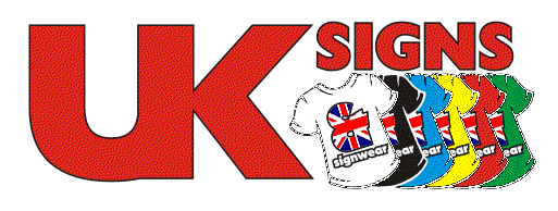
I’ve been playing with your logo, I was not sure if tee-shirts
is the sort of thing you do. It may give you some more ideasPatrick

-

You know the “signwear” bit? Should it not be spelt “signware”? Or is it just me being dumb? lol 😕
-

Hi Kevin,
I had a little time and re-jigged your logo to be more easily read. I’m not saying your approach is wrong,
its just my take on it (having taken an idea from Dewi’s version).Hope they help.
Attachments:
-
Less is more but not if you forget to post it 😳
Attachments:

-
Sorry Kevin, I just noticed you want something with a bit of depth to it.
If I get time this week I’ll have a look.That’ll teach me to read thoroughly! 👿
-
Hi boyz
nice to see you are having a playMagpie i can understand about the ” & SIGNWEAR” change but up to now have only had one person not understand it, sorry 2 with Jaggedpixel.
Patrick nothing showing up, but yes we are in to t-shirts as well
Jaggedpixel no it should be signwear we supply imprinted clothing not accessories for the sign industry.
Many thanks to all who have played or feel like playing you know what its like when its your own it just never seems right
Kevin
-
Hi Kevin
I’m not sure why its not showing
but if you go herehttp://www.geocities.com/mole_design2001/uksigns.jpg
Patrick
-
Patrick,
That one doesn’t seem to working either, you could try uploading it as a gif or in .ai format.
Cheers, Dewi
-
Kevin its probably worth thinking carefully about legibility over the aesthetic.
the logo is already distinctive enough without resorting to an iffy tweak.I find its best to avoid asking ppl to think, as they generally get it wrong,
or worse still, think that you’ve got it wrong.
If you showed this design to 10 ppl and 1 didn’t get it, then your potentially
alienating a 10th of your potential customers.One final thought; it’s probably worth avoiding the Union Jack too, as it makes
the design a bit to busy and hackneyed.Good luck with your final solution.
-
Still no see Patrick.
Have you tried using the Browse button to find the file on your Hard drive, then clicking add attatchment, then finally the submit button?
-

Patrick, you can’t show pictures hosted by geocities on other sites, so you are wasting your time posting a link to your geocities site! You are gonna be the only person able to see it!!
It’s called remote linking or something & geocities won’t allow it.
As Peter says, save it to your hard drive 1st and add it as an attachment.
-
Hi all
Lorraine thanks for posting Patricks design, Patrick nice idea may use certain themes from it. Signed up for the unit yesterday so heres hoping.
Will post pic of finished signKevin
-
Thanks Lorraine
I don’t know where I’m going wrong with posting image
Patrick
-

Hi guys, nice work here, I wanted some similar logo, how can I put the Union Jack into the letters, using PSP or Corel 9, might seem a daft question, but that’s just me….
-

If you use Corel9 you can either draw of import your flag and create your letters. Position the flag over the letters where you want it, then group the flag parts together, select the text hold shift and select the flag too and click the “intersect” icon or use the menu (Arrange > Shaping > Intersect). This will create a “clip” of the flag where it overlaps the letters.
Hope that helps 😀
Nigel
-

In Corel Draw use the Powerclip function, very powerful and flexible.
Alan -
Kev, it’s for printing, I had a go with the intersect function but can’t seem to work it when I click on both, letters and flag, nothing is happening when I try to intersect, didn’t have that much time, will try again later.
Thanks -
You can always send the files to me and I’ll play with them for you 😀
signsforthetimes@blueyonder.co.uk
Getting used to some of the functions in CorelDRAW can take some time, but once you’ve got used to them, you can produce some smart stuff at rocket speeds 😎 I’ve been using Corel products for a while but I still class myself as a learner, there is always a way of mixing different functions and doing some snazzy (even when its by accident 😉 )
Some demos on using some of CorelDRAWs functions could be a cool idea as lots of ppl have expressed interest in what Corel can do for the average bear 😀
Cheers, Dewi
-

There you go send the file over to super dewi,
He’ll sort it out and do a mini demo while he’s at it 😉
-
😆 😆 😆 😆
Super Dewi, I like it… can I have a cape and wear my underpants on the outside of my trousers? 😛 🙄
Cheers, Dewi
-
You can borrow mine if you like 😀 (Cape not underpants though !!)
-
This is what I came up with so far, but like the idea of having the Union Jack in the letters. Also wanted to add *Personalised T-Shirts & Gifts* somewhere. I also like the idea of the T-shirts, in the one Lorraine posted
Thanks


Log in to reply.
