Activity Feed Forums Sign Making Discussions Gallery illuminated signage: bombay dreams

  • illuminated signage: bombay dreams

    Posted by Robert Lambie on February 11, 2005 at 10:33 pm

    seeing as i have been very busy in the background of the site lately, i thought ide take a break and show some of the work i have been doing recently. sorry for my lack of participation on the boards folks 😕 😀

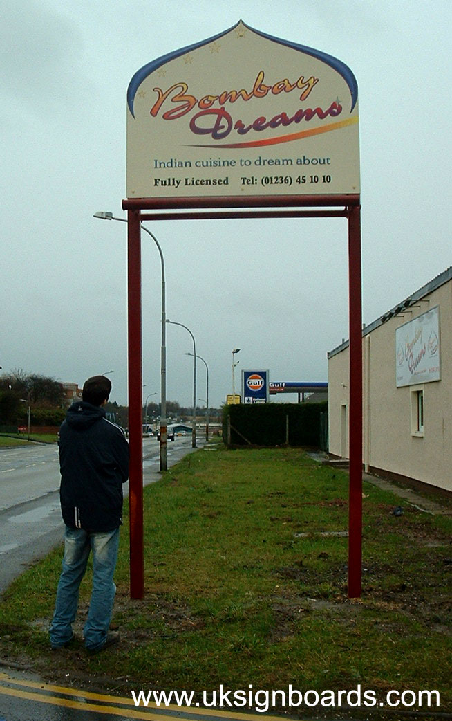
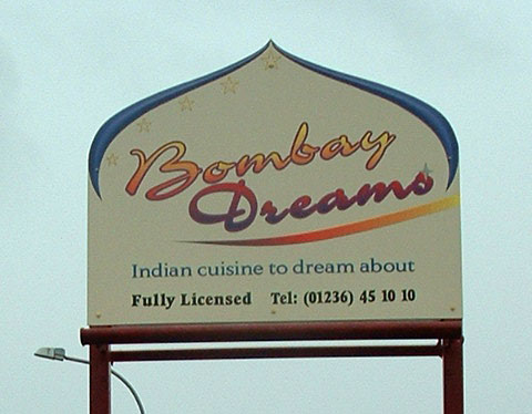
    the following job was for an Indian restaurant.
    they supplied architect drawings etc and we had to basically do the rest.
    the artwork was submitted by them & Andrew (vectorwise) recreated the lot in vector with signlab and the image work recreated in photoshop.
    he then produced the lot on our solvent printer and laminated, not so much for protection but to give an equal glossy shine on the printed area as the rest of the backing panel.

    the rest i created myself from 4inch x 4inch steel tubing. i chopped up and welded the complete frame structure as one.
    rynabond/alucolour? in cream…
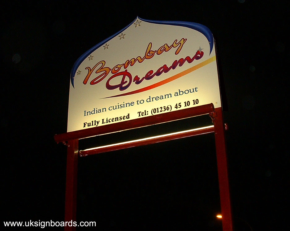
    trough lights we bought in and i wired up for illuminating the sign on both sides.
    after digging the holes and trenches for wiring we had a hiab lorry lower the sign into place and connect to the main building via underground cable.

    the entire sign is not really my taste, but as you all will know well, we can only do what the customer asks… and this one was particularly awkward.
    from the word go he chopped and changed to save money all down the line.
    below is the finished work….

    (click on pictures to enlarge)


    Attachments:

    Carrie Brown replied 19 years, 3 months ago 7 Members · 9 Replies
  • 9 Replies
  • Bill Dewison

    Member
    February 12, 2005 at 12:35 am

    Blimey! 😮 Thats a tall one! Nice work though, the artwork may not be to everyone’s taste as you say, but it looks the part for a curry house 😀

    How long did the frame take to put together? And how long did it take to fit it onsite?

    Cheers, Dewi

  • Andy Gorman

    Member
    February 12, 2005 at 12:47 am

    Maybe they knew what they were doing all along when they designed it. What I mean is, it’s as ugly as a cow’s arse on them big sticks during the day, but looks quite smart when illuminated and just the top is visible.

    I like it, but then I have no taste.

    Edit: I love the misuse of the word cuisine. Indian French cooking!

  • Robert Lambie

    Member
    February 12, 2005 at 1:50 am

    :lol1: :lol1: :lol1:
    couldn’t agree more… 😉

    if you look in pic 2 on the right you will see their existing signage on a white backing (we never did this) but had to replicate their bad artwork 😕 if you saw it in the flesh you would see what i mean by Andrew making a good job of a bloody bad one, :lol1:
    like i said though, this one was an architect drawing, the idea behind it with the big legs etc is because its on a huge carriage way stretch of road.
    we initially advised an illuminated lightbox in this shape, but because of cost they dropped this and that… that and this… then this was the outcome. 😕 :lol1:
    the idea was to catch the passing trade, a simple projecting sign from a building so far back from the road just wouldnt have worked. i think their inspiration came from the gulf petrol station further down the road but their wallet just didnt want to stretch that far. 😉

    as kev says though, illuminated and from the road you get the jist of it rather than the dull picture on a rainy day that i took it. :lol1:

    the job in itself was allot of work, my opionion on the work and cost was to spend a little more and get it right. 😉 rather than a half baked idea! 😀

  • Shane Drew

    Member
    February 12, 2005 at 9:16 am

    Well done Rob, as has been stated already, not really my cup of tea, but Andrew and you have done a good job with a poor concept. For the sake of saving a few bucks, they could have had something better I am sure.

    End of the day tho, we are paid to do what they want I suppose, and that is what you did.

    Thanks for the photos.

    Cheers

  • Robert Lambie

    Member
    February 12, 2005 at 11:59 am

    cheers shane, a few simple tweaks here and there could have made all the difference, a bit of dimension, different form of illumination. take the silly colour blend line out at least if the design had to be kept… 😕

  • Jill Marie Welsh

    Member
    February 12, 2005 at 1:26 pm

    😉
    At least it didn’t say “Bombay Trots”
    Which is probably what you’ll get from their cuisine!
    Love….Jill

  • Mike Grant

    Member
    February 12, 2005 at 3:19 pm

    Nice job under the conditions. I think we all get then type of jobs. Satisfying but not if you know what I mean…………I’ll get me coat! 😕

    Pity the posts were not in a silver or black colour and not that red oxide primer look.

  • Robert Lambie

    Member
    February 12, 2005 at 5:59 pm

    there interior is Burgundy mate, so after the red oxide coat we painted with gloss Burgundy, the trough lights came gloss white but those were painted too…

    although not apparent from the picture there was a great deal of work getting this sign together & in place. the sign was the least of the problem, the welding, digging, wiring and getting it into place was the main problems began. once you do all this and the result is still pretty bland you feel anything but over joyed with your work. but its paid for now and thats all we are interested in at the end of the day 😉

  • Carrie Brown

    Member
    February 12, 2005 at 11:56 pm

    Good job, lot of work put into it by the sounds. 😀

Log in to reply.