Activity Feed › Forums › Sign Making Discussions › Off Topic Chat › ideas on a new logo please? sorted thanks everyone :)
-
ideas on a new logo please? sorted thanks everyone :)
Posted by Patrick Donaghey on May 10, 2016 at 11:26 amhi folks ‘
Imlooking for new logo ideas for myself its P4t designsany ideas would be appricated as you all know we came anything look good for a customer but our own is alway left lacking or mine is any way
David Mitchell replied 7 years, 11 months ago 11 Members · 28 Replies -
28 Replies
-

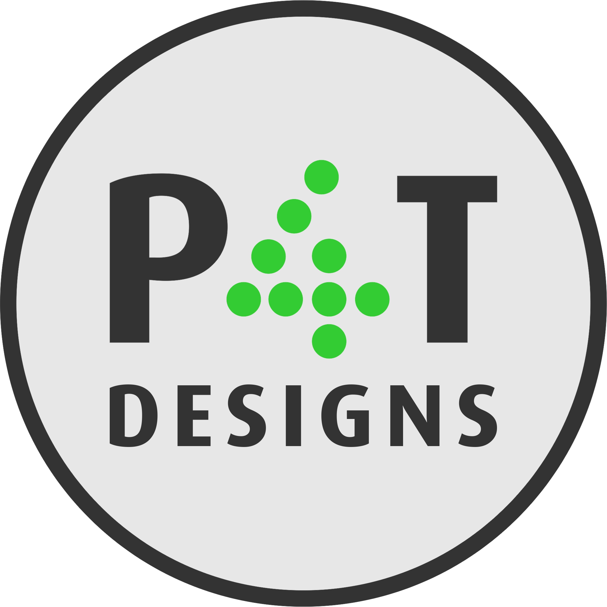
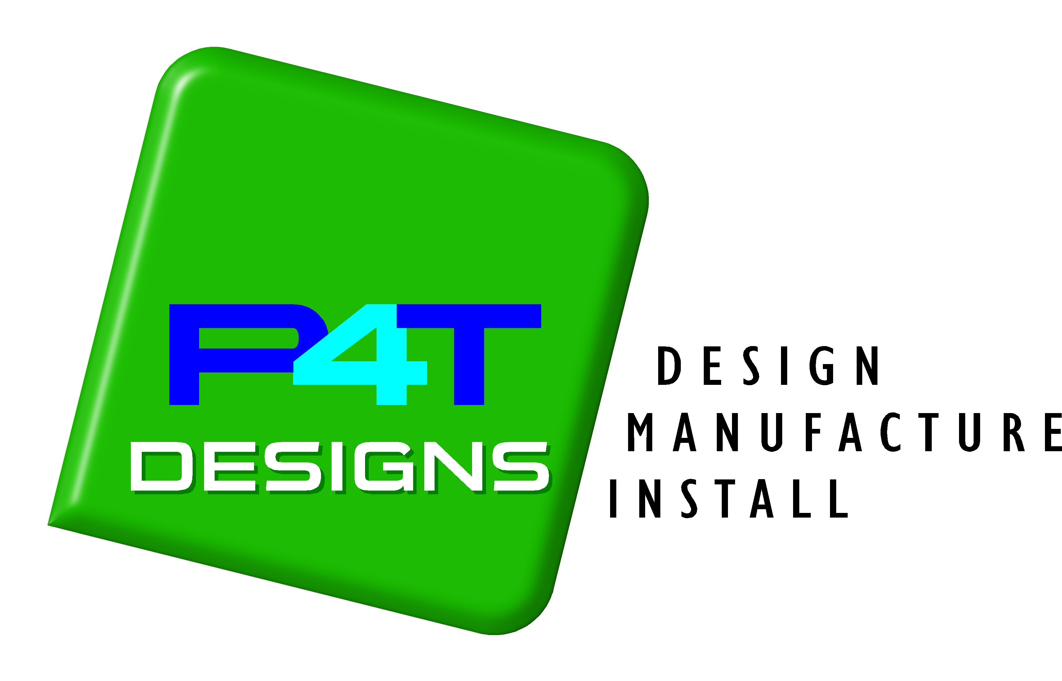
Quick attempt from me….not sure I totally like the 4 but it might give you some ideas
Attachments:
-

I like that Glenn, nice, clear, modern.
I agree with the 4 too, it looks to me like it’s missing a green dot from the leg below the apex at the top.
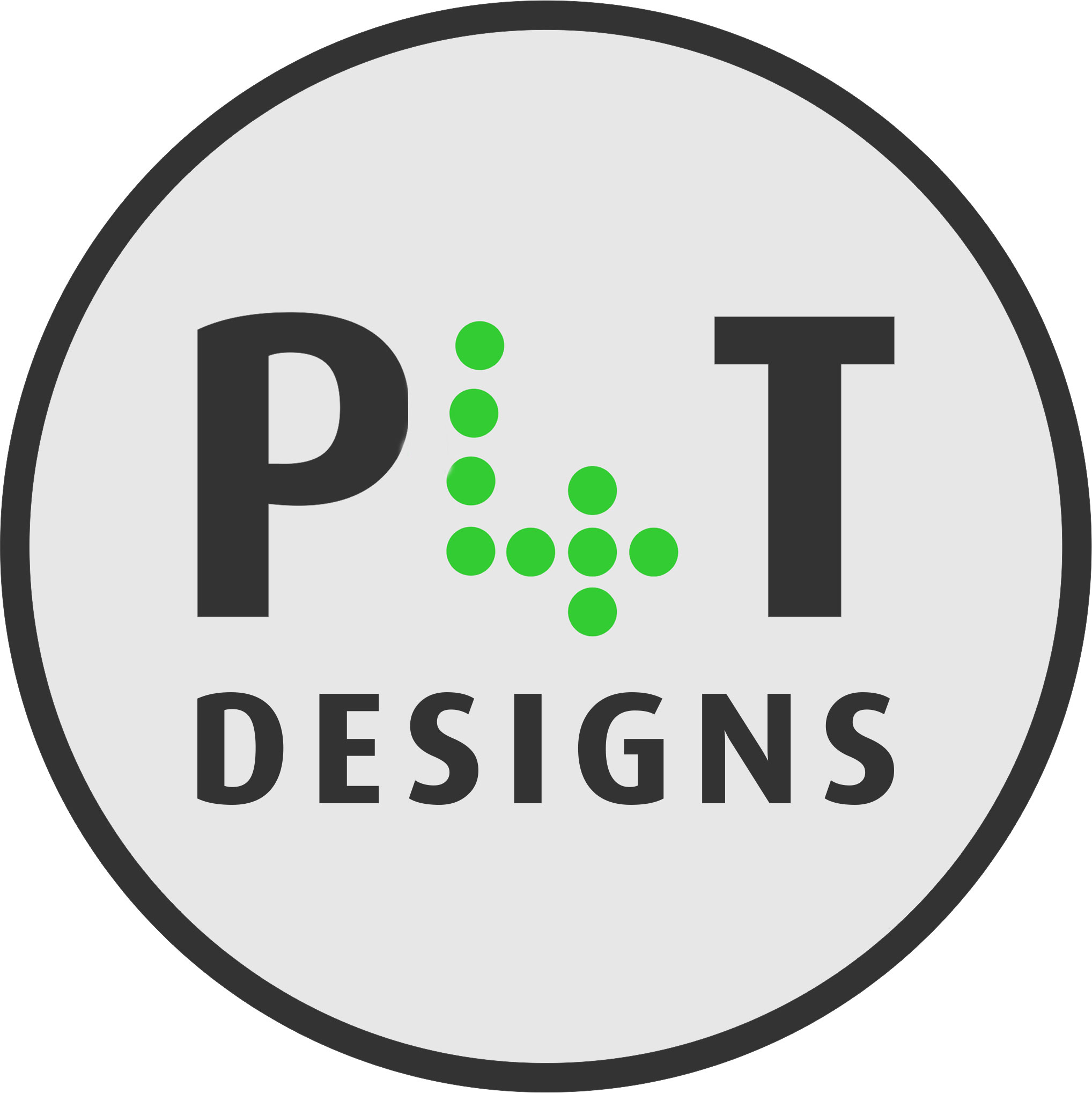
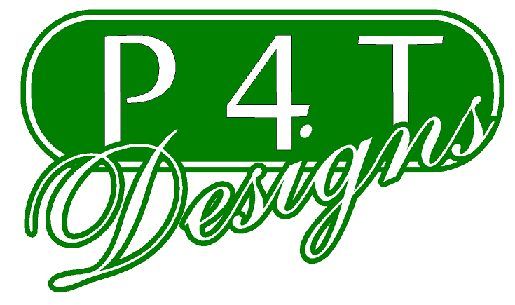
I’ve had a play in photoshop and changed the 4.
Attachments:
-
yeah David…I couldn’t get the capital 4 to work as the adjacent dot always looked too close
-

thanks love the one with the green dots ill get working on it and let you all see what i come up with, Its because ive a newish van that i bought and a smaller one so was going to get the both signwrited :appl: bought an 08 transit sport and an 04 connect both white
-
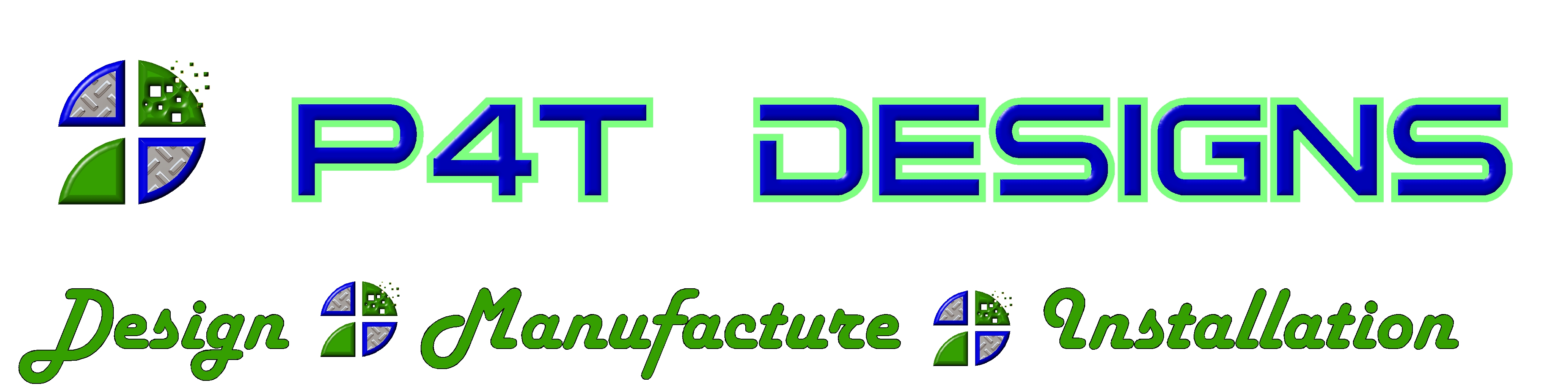
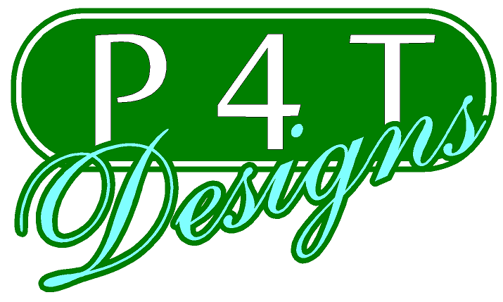
what about this ive spent all day trying different fonts
Attachments:
-
As for the numbers and letters etc
I’m known as p4t as I’ve
P4T VW number plate and P4T PD -

Hi Patrick,
I would drop the "4 " too. I think its making your task extremely difficult.
-

I am not sure if your name is set in stone, but I feel "designs" after P4T repeats itself in the bullet points.
Maybe have it P4T SIGNS then Design, Manufacture, Install etc…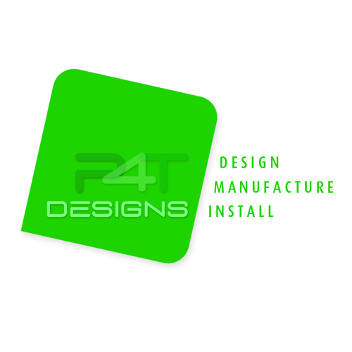
-
It still reads as p four t, or p t four.
Is your business known as PAT designs? If it is then use letters, forget the numberplate connection, your potential new customers wont even know you have a car, never mind know what your number plate is.
You could put your personalised number plate onto your van and let the potential customer make the connection between p4t and pat but let them make the connection in their own time.
-
thanks dteff sorry for the confusion im known as P4T , its like a nickname everyone actually say
the letters and numbers P 4 T when they talk to me so that was my reasoning for keeping it the numberplates came after the nickname -
Robert im going to play with your idea and see where that takes me thanks
-
quote Steff Davison:It still reads as p four t, or p t four.
yes, I agree with you Steff…
to be honest i wasn’t trying to make it look any different from that.
Like you, I just saw it as "P 4 T" it was later in the thread the penny dropped for me that it was PAT.
I think if he tries make it look like an "A" will only confuse matters. ide just let it run as how the customer sees it…
P4T or PAT…
I guess its a bit bit like "ABC SIGNS" or "XYZ SIGNS" or even "ACME SIGNS" -
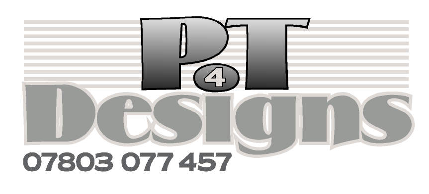
What font did you use robert for the P4T DESIGNS or was it a mixture of cutting
-
I don’t have Signlab on my home computer, so i just used Photoshop Patrick.
I can send you a working layers version of the design in PSD format if you want, alternatively a .jpg.
you’re more than welcome to them anyway mate… -
quote Glenn Sharp:yeah David…I couldn’t get the capital 4 to work as the adjacent dot always looked too close
Good to see you back on the boards Glenn, hope all is well mate. 😀
-

No comment on the layout but you might want to check the spelling 😉
-
sorted went smaller text and spelt it correctly thanks
Attachments:
-
I would try the Design, Manufacture & Installation all aligned to the left under each other, rather then stepped, following the line of the square part of the logo.
I’m at home at the moment so haven’t go any software to tweak it.
-

Yup they’re looking good. And don’t worry about the spelling mistake earlier. We all do it which is why it’s always best to get a fresh pair of eyes to proof read.
-

i think ye would be pretty mad not to just use the version that Rob done, most proffesional looking one on the post,

Log in to reply.
