Activity Feed › Forums › Sign Making Discussions › Graphic Design Help › I wonder if anyone can help me with a design problem?
-
I wonder if anyone can help me with a design problem?
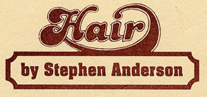
Posted by Steve Thurlow on June 18, 2003 at 2:44 pmHi guys, I wonder if anyone can help me with a design problem, a new client needs a new modern logo for his hair salon, I keep thinking ‘swirls’ & ‘scissors’ but I think that’s a bit old hat these days. The logo needs to be simple, 3 colours max, to be cut in vinyl & used for stationary. There are 2 jpegs, the old logo he’s had since the 70’s (almost back in fashion!) & my first quick attempt at a new logo (my wife reckons it looks like a bakery logo!! ho hum)
Thanks for any input, Steve
Attachments:

 mick collinwood replied 20 years, 11 months ago 8 Members · 14 Replies
 -
14 Replies
-

I think you’re your own worst critic (I like them both…especially the first one).
-
Deleted User
Deleted UserJune 18, 2003 at 3:05 pmThe first by a mile.
2 points.
1/ Adjust the shadow to fall at 4.30 or 7.30 as if you put this on a shop, the sun never shines upwards.
2/ Adjust the base of the lettering to follow the curve properly. The A is OK but the I and R don’t follow.
Attachments:

-

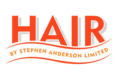
Thanks Jon & Peter for an instant reply, I have taken on board your helpful comments Peter, had a quick tweak of the logo – see what you think. I had to extend the bottoms of letters ‘AIR’ but I don’t think it looks ‘wrong’,
I like it,
thanks again,
Steve 🙂
Attachments:
-
Deleted User
Deleted UserJune 18, 2003 at 4:59 pmLooks good to me.
Just one thing nagging after a second look is the colour of the text line “by stephen etc”
It could look as though it’s meant to be the same orange as HAIR but didn’t match.
Possibly use the grey from the shadow, since it’s not as important as the HAIR (although the customer will think different!).Only nit-picking – go with it!
-
Thanks Peter,
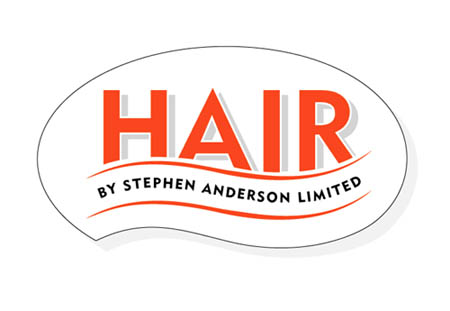
I have just decided the name looked a bit naff so I’ve tried it in Pantone Black!!
Also been thinking about the sign shape, it’s not that big (approx 610mm wide), maybe jigsaw it out of 10mm Foamex (just a thought), so here is the next logo update with the wacky sign shape!I really appreciate your thoughts, it’s great to bounce ideas off like minded people – Thanks again,
Cheers, Steve 😀
Attachments:
-

I think thats great now….just a few small adjustments, and I think it will be fun to make the sign shape abit different too.
-

im with henry.. very smart and that bit different from the norm. 😉
-
Sorry not to have gotten onboard with this earlier – but the end result you have arrived at is smashin’! 😎 Peters points were the key and that shaped profile added last of all was a real inspiration!…well done.
more soon
mikethesign
P.S. Don’t forget to charge them for the new logo and for anyything you gove them on CD for their future use in printing etc.!
-

Hi Steve,
I think the final design you have come up with looks fantastic, and the added interest of the shape will give it the edge in catching the eye.
Can i ask how are you going to fix this i think it would look good as a stand off sign with the existing facia painted grey maybe!!
-
Thanks guys (& Lorraine!) for all the positive feedback, I have been putting this job off for weeks (I know…bad sign maker, tut tut) but since I have been posting my ideas on this board I have got enthusiastic about the job. 😀 😀 😀
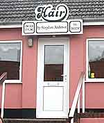
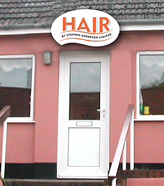
Lorraine, this will be the next problem, fixing it onto a ‘soffit’ (?) board with guttering on it! I have posted a photo of the shop with the old sign in place, this was sign written approx 5 years ago, onto wood, with 2 very rusty brackets holding the sign up. (Horrific!! 👿 ) They are approx 6″ proud of the board they’re fixed to.
Anyone got any ideas of what I can use to fix the new sign in place?… Also I would like to have no fixings on view (screw heads, bolts, 6″ nail heads…) so this means a batten of some sort fixed to the sign back. I’m still thinking of using 10mm foamex.
Also posted a jpeg of what I hope the finished sign will look like.
Thanks for putting up with my ramblings,
Cheers, Steve
Attachments:
-
Hi Steve,
looks like it will need to stand off in some way or other, i’m not sure if you can get male and female locators big enough to stand off, but you could always fix a batten to the existing board and then screw your locators to that alowing you to glue to the back of the sign!! hey presto no fixings in view
-
Steve,
I’m always surprised at just how cheap it is to get one-off steel brackets made at your local metalworkers!…something like a couple of stand off brackets to support such a sign would probably cost no more than £30-40…
screw them into place and then fix a piece of ‘waste’ 10mm foamex to these using countersunk screws leaving you a flat 10mm foam face to fix to – either using nipples and studs to stand proud or simply bond to it flat with either VHB tape (very high bond tape – use only the very best stuff, £30+ a roll) or bond it with a plastics glue (ask your supplier) or builders fixative such as ‘Gripfil’…put some spring clamps on it while it sets and remove them in the morning…or , if you’ve room you could get behind it and screw through the ‘waste’ 10mm board into the face board – being careful noto to break-through!
I’ve no doubt there are numerous other ways – just can’t think at the mo’…!
more soon
mikethesign
-
Hey Mike, You are the Main Man!!!! (<(
Thanks for getting my brain in gear, I have half a roll of the 3M black double sided tape, I used it 4 months ago on a couple of 5mm foamex signs backed onto old metal signs, I checked them last week & they were still well stuck!
About the brackets, in the village we are lucky to have an agricultural metal workers, not sure about 30-40 quid, more like 10 quid & a couple of Stellas!!! (we are out in the sticks in silly Suuffolk!!)
This message board is really helpful, I will definitely be signing up to be a full member asap 😀Cheers, Steve
-
😮 Well done Steve, it will look fantastic!!!
Mick the Brush
Log in to reply.
