Activity Feed › Forums › Sign Making Discussions › Gallery › I just hate this sign…
-
I just hate this sign…
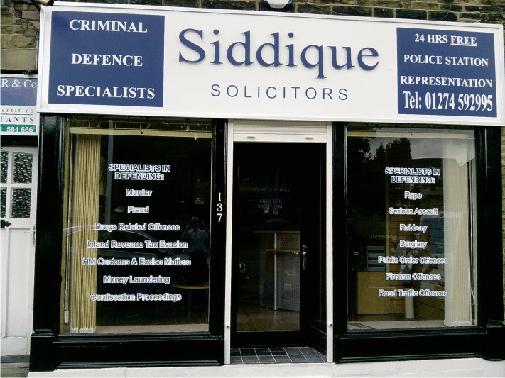
Posted by Stephen Ingham on July 15, 2010 at 8:07 amApologies for the strange title, but am sure looking at the sign you will understand..
We had no input into this sign design at all, customer was very rigid about what he wanted and we did just that.
Please be gentle with your comments
cheers
stephen
Attachments:

 Lorraine Clinch replied 13 years, 9 months ago 21 Members · 30 Replies
 -
30 Replies
-

NEVER have less space top and bottom than between lines. 😳 Looks so ugly sorry.
-
 quote Mike Grant:NEVER have less space top and bottom than between lines. 😳 Looks so ugly sorry.
Beat me to it! First thing I noticed.
Other than that it’s OK – not hideous in the least.
Few minor things that are more manufacturing / execution and frankly only another signmaker will notice.
The white capped screws in the middle of the fascia.
The vinyl join in the blue square. (Narrow roll of vinyl?)Dave
-
quote Andy Regan:It’s ‘Criminal’ that one Stephen. .
…and only they can defend what the made you do…
-

They’re solicitors what did you expect. Hope you stitched them up with the price like they do to us.
-

Did you do a design so the customer could what he could have had?
If there happy and pay, don’t knock yourself to much.
It’s not my cup of tea, design or installation but the customers always right yeah!!!
Matt
-

the stretched telephone number hurts my eyes ………. take it away!!!!! 😮 😉
As long as your customer is happy and he paid you then that’s all that matters.
-

I would have preferred it if you had increased the outer margin spaces in the writing in the two squares. Apart from that I can’t see why you aren’t pleased with it. Well done 😀
-

Hi all, thanks for the comments and not being mean….
Yes the customer was perfectly happy with the finished sign so i suppose thats all that matters.
However its probably not one that will go into out portfolio…
cheers
stephen -

You wouldn’t have had to squeeze the number in as badly if they would have let you leave "TEL:" out.
😀
And there was room to spell out "HOURS".
I kind of have a hard time understanding that entire panel, maybe it’s a UK/US thing.
The middle part is OK, just a shame about those sides.
Love….Jill -

the Customer is Always……………………………………………………………
the Customer.
😉 -
Thanks for your comments, cheryl you are right the customer is always…the customer…
He is happy with it thats the main thing
cheers
stephen -

The biggest portfolio is the shop front, hope it’s out of town…lol jk.
Just could of done with tweaking here and there as per other comments.
Personally I like the window text the least.
-

The spacing does hurt the eyes, and for a few simple slips of the mouse whilst sending the job to cut :lol1:
Its a nice sign that could have been so much more. Also not too keen on the window writing…
-
I must admit i do not claim to be a qualified designer but some things do seem to work better than others, i think it may be down to personal choices…sorry if that insults any of you designers out there….lol
I would like to learn more about designing
cheers
stephen -
You can only imagine the "dodgy" characters they will deal with based on the window text….we had quite a few people looking as we were fitting it…i bet they are going to be really busy…lol
cheers
stephen -
Stephen at least your asking for input with a view to doing the best job you can.
We all learn here every day from the great host of input from everybody, which I for one very much appreciate.
-
So what would be the route to take to get some kind of training in design??
stephen
-

Apart from the spacing in the boxes it looks like something I’d design……………Help!
-

all things are relative – its a lot better than many of the signs in Bradistan
-
If you don’t already have it look for this book:
http://www.amazon.co.uk/Mastering-Layou … 880&sr=1-1
It kind of teaches you how to "arrange the furniture" so to speak.
There are also some other good books by Dan Antonelli.
A quick-n-dirty suggestion for the fascia sign is below. I think we spell defense differently over here.
The main point being, as has been said, tighten up your elements and try not to run things too close to the edges.
Like I did on that right panel but I am blaming it on distortion.
:lol1:
Attachments:

-
Thanks for that jill, i will have a look at getting that book.
cheers
stephen -
 quote Stephen Ingham:So what would be the route to take to get some kind of training in design??
stephen
A friend of mine once said
If You want to be a good photographer look at 10,000 picture’s,
Really look at then,Dissect the pictures in your head figure out why it works or why it looks good
Then look at another 10.000.
I think his comments are relative here….
-
 quote Stephen Ingham:Yes the customer was perfectly happy with the finished sign so i suppose thats all that matters.
Yes and No, On a sign like this I would have done it correctly and would have persuaded them that the layout they gave me was poor/incorrect.
Small signs, I will just do regardless but this size I would strongly advise to do it the correct way,
Never ever seen that Mike Stevens book.. 🙁 I like the cover
-

Thats my book ordered, been meaning to for years!
No excuses for cr*ppy layouts now 😥 :lol1:
-

Think everyone needs a copy of that book don’t they.
At the end of the day you might hate it but if the customer was/is happy then it doesn’t matter.
-

I’ve come across this firm of solicitors before back in my defendant PI days and trust me, the sign is the best thing about them!!!!!
-
 quote Lorraine Clinch:Thats my book ordered, been meaning to for years!
No excuses for cr*ppy layouts now 😥 :lol1:
Me too. long overdue
-
 quote Martin Cole:Never ever seen that Mike Stevens book.. 🙁 I like the cover
The kernings out on the A of layout though 😉
-
well, my copy arrived last week and apart from unwrapping it, it’s still on my desk 👿
I’ll get the time to read it one day. Maybe in my retirement…..about 25 years time, if this government has anything to do with it! 😥Lorraine
Log in to reply.
