Activity Feed › Forums › Sign Making Discussions › Graphic Design Help › how do you think i should layout this van?
-
how do you think i should layout this van?
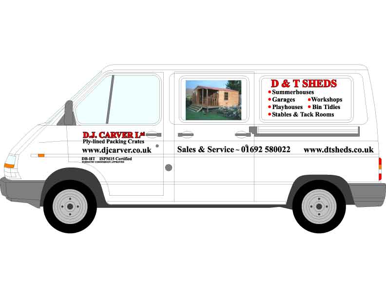
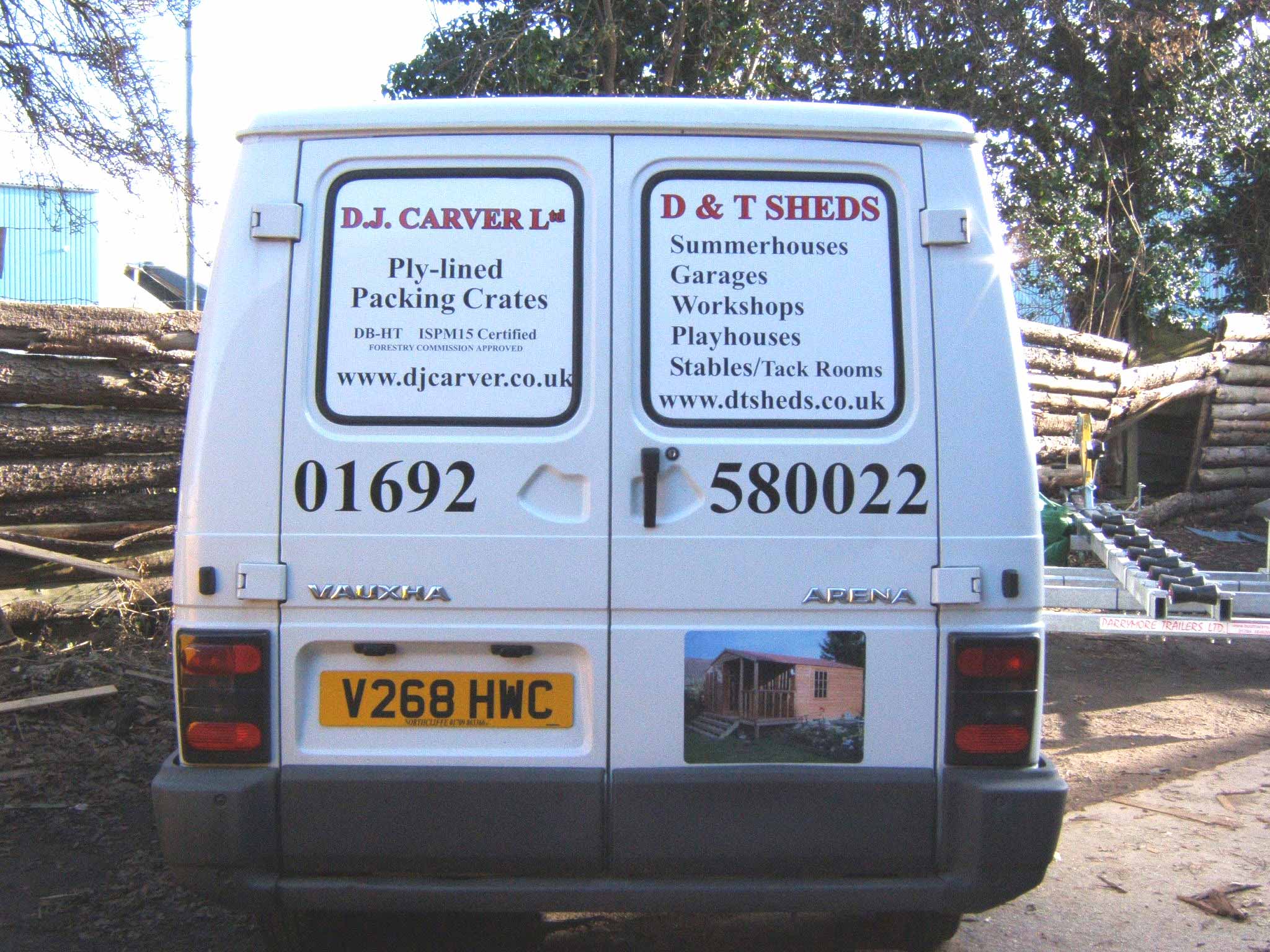
Posted by Lorraine Clinch on November 18, 2005 at 9:12 amHi everyone
After trying umpteen times yesterday, I have now saved the image thru’ Photoshop as a jpeg.
The customer has given the go-ahead with this design, he’s happy with it, but I’m not – it’s wrong, but not sure how.
Any suggestions will be gratefully recieved. I am not looking for redesign, just constructive criticism please.
He has 2 businesses to advertise, and the spec was red & black lettering.
Attachments:
 Lorraine Clinch replied 18 years, 1 month ago 10 Members · 29 Replies
 -
29 Replies
-

I think parts of it look nice and clean and easy enough to read, but the door looks a bit like an add on, as though you had alot of info to cram in a small space. Everything looks a bit cramped. But other than that the design works ok.
-

it looks confusing to me. 2 business is ok if they have to, but I think they would be better to givr business its own definition. I’d rather see the second business in different colours, or even the reverse colours.
I had one customer have similar problem, and we decided to dedicate each side of the van to a single business.
That way each business has the same space. just a thought
-

Hi Shane-I think this is what |I don’t like about the design, the doors are, as Jayne said, much too cramped. However, I do like your idea of reversing the colours, and I’m off to try that now.
BTW what time is it with you now? You must be about due to get some kip, aren’t you? :sleep3:
Thanks for looking at my posts Shane.
-
Hi Lorraine, I always enjoy your posts.
Just got home from work 8:20pm. Eating my cold dinner over the keyboard 🙁 Got an absolute mess on my office desk. Like most blokes, can’t do 2 things at once (eat and type)
I could do with a kip. The wife is recovering from surgery, and is not sleeping, so I’m not sleeping either 😮
Got about 4 hours of artwork ahead of me, then an early start in the morning. I’ll post pictures of that job. Took a leaf out of Phill’s book. Really pleased with the result.
Keep up the good work Lorraine.
-
I’m so sorry to hear that your wife is still recovering, must be really difficult for you at the moment , hopefully all will be good soon.
I hope your cold dinner is a salad 😀 -
quote Lorraine Clinch:I hope your cold dinner is a salad 😀
Chicken!
I have the easy job, this will make 4 months the wife has been ill. Certainly on the road to recovcery now tho.
I try not to give her too much sympathy tho… wouldn’t want her to get used to it 😳
Thanks for your concern 😀
-
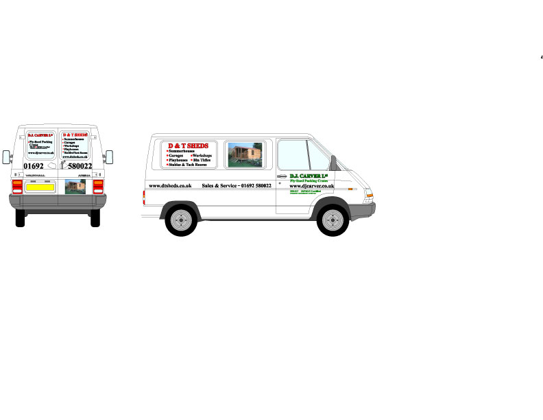
OK, slight changes to door colour only. I’ll see about the back later.
Attachments:
-

other than what shane has said, i think i would personally use the shed alone as an image, remove all the background of the photo to clean it up some, to me it just looks like a photo stuck on, but contour cut i feel it could look smarter perhaps ? otherwise yeah !
-
Hi Hugh
but that’s the idea! If the background is removed, then the building will just be a building. With a bit of sky, grass etc. it gives potential customers an idea of how it might look in their own garden/grounds or whatever.
Well, that’s my take on it, anyway. What do others think? Background or not, and why?
-
na I’d leave the background…. it needs to be there to help the customer imagine how it will look. Only thing I’d do is make sure it fits the full panel, not just sit there in the middle. The panel will then act as a frame. Sitting with white space all around will make it look like an after thought.
JMO of course
-
Shane, my problem, if that is what it is, is that I don’t want to have to trim it up by hand, cos it will look sh1te! So if I have it enlarged too much it might be too big. All I was going to do was round the corners off when I get the prints back. (Am I being cowardly? Probably)
-
I did a job not so long ago on the rear of a van and put a picture on the left hand panel. I printed it overlarge and cut it to suit the panel once id applied it, using masking tape as a guide for the slightly curved edges. I cut the rounded corners freehand and it looked great, Ill try and post a piccy of how it looked
-
You are right Jayne, it does look good.
My concern is, that as I am out-sourcing, if I cock it up I won’t be able to finish the job until I have new prints.I did another van a few months ago, with a picture, and had not asked for it to be trimmed to size, only realsied when I had peeled the back off, and completely b*llsed it up by trimming on the van. (Yet another of those heart-sink moments!)
-
i must admit Lorraine, I outsourced this print as I dont have a solvent printer, just decided to take a chance, but I quite enjoy cutting things freehand, its the mad woman in me I think :lol1:
-
A ruler for the straight lines Lorraine, and masking tape roll as a round guide for the corners. Easy peasy! 😮 😛
Remember, a new blade before you start, and only the lightest touch. Let the blade do the cuting, not your pressure on the blade.
you’ll be right!
-
 quote Jayne Marsh:but I quite enjoy cutting things freehand, its the mad woman in me I think :lol1:
im the same jayne…as i have good competition from ed, hes a wizz with a blade…so i always say to myself when doing similar jobs….’i can do that better than you’ 😀 it works everytime 😉 also confidence plays a big part too….so just go for it lorraine, you’ll be surprised how you get on 😀
nik
-

I’d bin the photo of the shed.
Everyone knows what sheds are, and they have their own little vision of their perfect shed in their head. By putting a specific shed on there some peoples image will be ruined – well you know what I mean.
That would give you more space to play with.
I’d also give more preference to the part of the sliding door that is not covered (the door itself) for the important things.
Go big. Big letters. Big letters good. Not for everything of course. The name and phone number probably. Even though you are using black and red you can still interchange them so as to highlight specific things.
I’d show you what I mean now that I have mastered attaching photos but I can’t get a decent image of your van into my Corel.
Good Luck.
PS maybe you should suggest that he buy 2 vans. 1 for each business!
-

Perhaps you could fade the edges of the shed image out, so as it doesnt look so hard around the edges especially if he is adamant on using that pic?
Bit of a pain having to advertise two companies on one van … especially when they want to keep text to a specific colour/font so you cant really distinguish between the two?
😀
-
I think the layout just needs a bit more balance. Try the web address under the Tel No. and maybe not left-justify everything.
-
Hi Autosign
The problem is that there are two websites, so I put the tel. no in the centre to seperate them. Can’t really see another way out of it!
-

I agree with Simon.
Lose the shed pic totally.
It’s really not needed.
Put one company name on one panel and the other on the other.
I would suggest using a sans serif alphabet like Gill….or purchase Stephen’s Percepta from Letterhead fonts.
This would be more readable (to me)
I would make one company in black, one in red.
They both have about the same value as colors.
Then bracket the phone number with the websites underneath both companies?
Just my 2¢
Love…..Jill -
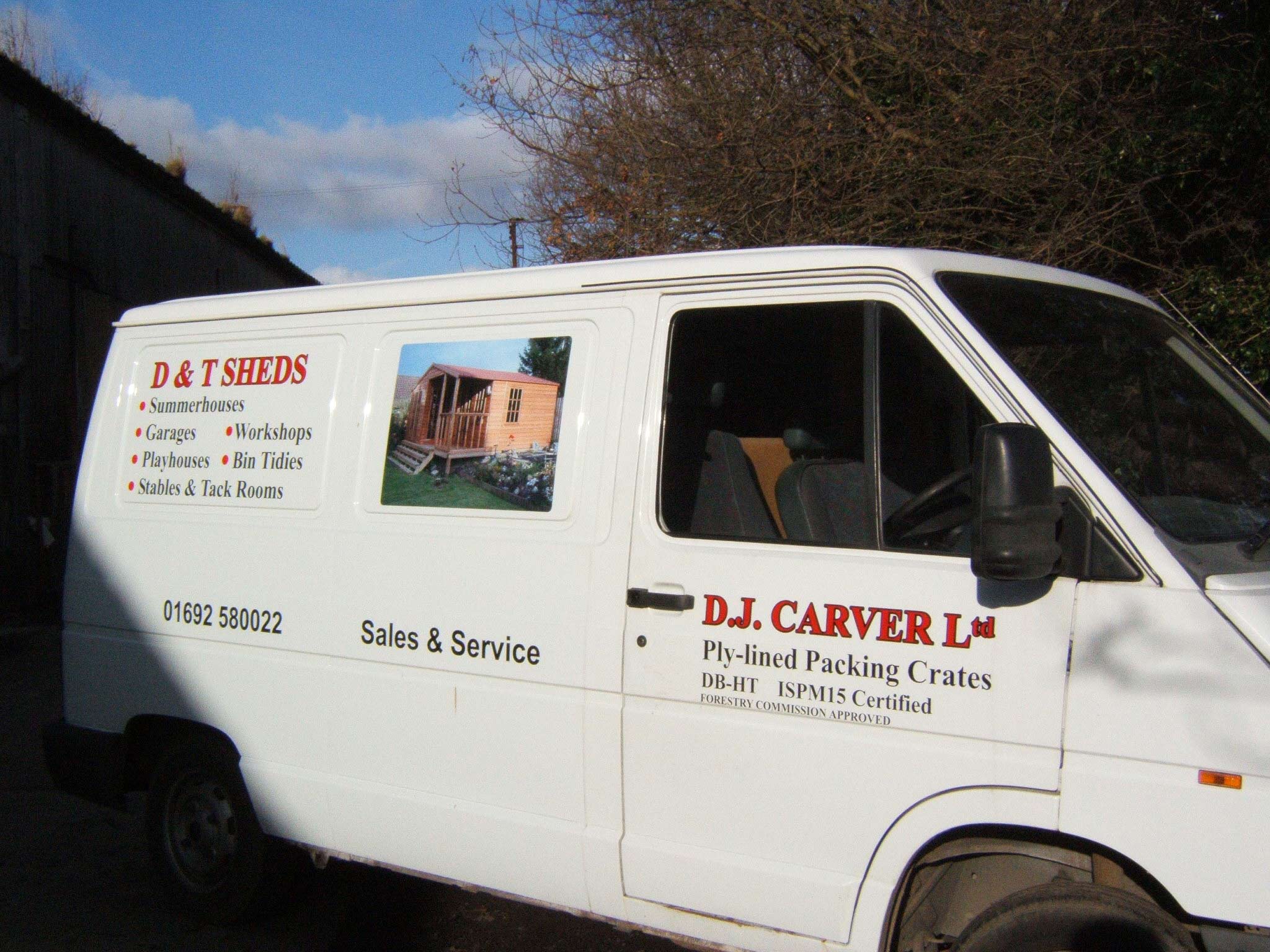
Thanks everyone. I had actually designed the van as Jill says, but the customer wanted the pic. on, so had to find somewhere else for the ‘crates’ ad.
I shall go back to the drawing board.
Cheers all!
-

I agree with Hugh. If you’re putting a picture on I really do think they look much better if you contour cut around so that you only see the shed and not the packground as well.
-
Sounds as though the picture idea is a wee bit controversial, ie. Do, Don’t, Do with background, or Do without!
I will give the customer some more choices, then leave it with him, I think (!)
-
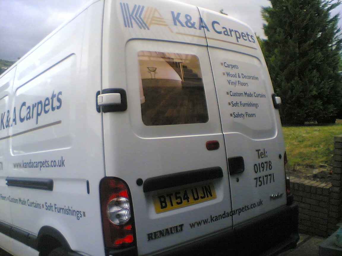
Here’s one I did earlier. The image was contour cut to exclude the background. If the background had been included this would just have looked like a picture pasted onto the van. Personaly I think it looks much better this way.
-
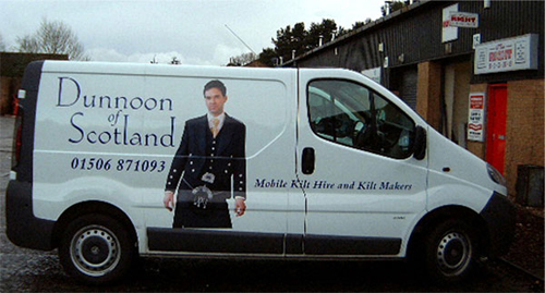
Kilt Hire? I thought you guys had your own family tartan….. I am not very well versed on that stuff. We just have blue jeans for work, and black jeans for good. Of course, we change the belt if we want to look really flash :lol1:
-
Now that I am back on Broadband (Yipee!) I thought I would share some of the work I have been doing over the last few months, starting with digging out old photos…..
As you can see, customer wouldn’t allow much in the way of change, but it does look really good when I see it on the road.
Attachments:
Log in to reply.
