Activity Feed › Forums › Sign Making Discussions › Graphic Design Help › how do i deal with two designs incoroporated into one logo?
-
how do i deal with two designs incoroporated into one logo?
Posted by Angelique Muller on April 26, 2008 at 7:40 pmHi all,
I have a design question to which I did not find an answer in Mike Stevens Layout book.
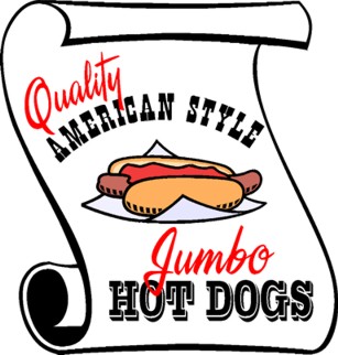
I have just started working on the design for 2 signs that are to go on the front of a mobile chip van. They will be right next to one another…
Customer wants the Cowboy and Western look and the scroll idea etc….So I was just wondering how to deal with this? Would you do one design one and style the next one in a similar way… Or should you see the two designs as one and split them over two panels…. so to speak……
I somehow find it difficult to see two scrolls looking good next to one another and I wonder if I should drop that idea (against customers wishes).Attached is only my first attempt…
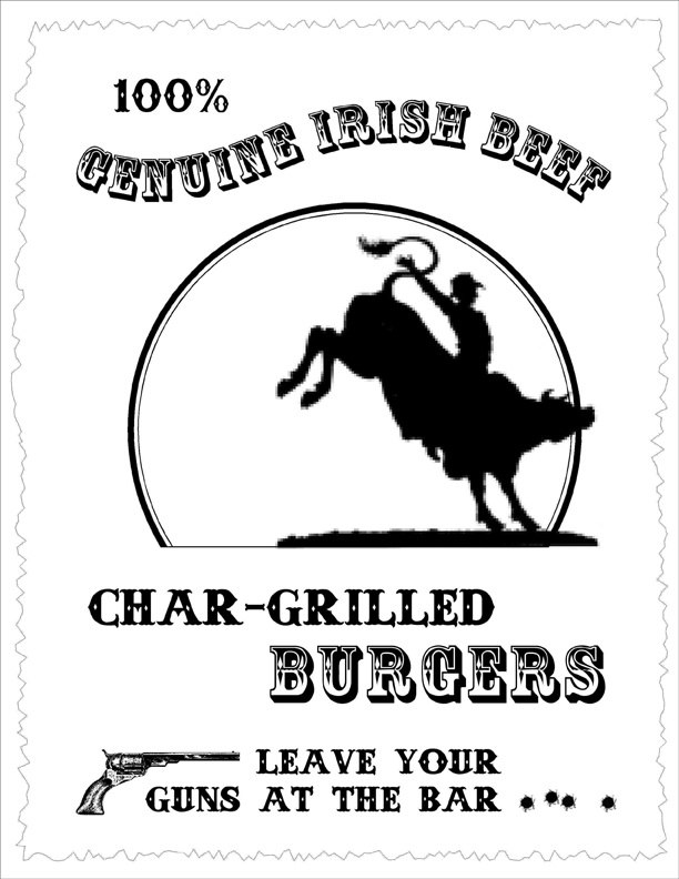
the other sign should say 100% genuine Irish beef char grilled burgers.Any hints/tips are very welcome
Thanks in advanceAngelique
Attachments:
 Angelique Muller replied 16 years ago 8 Members · 18 Replies
 -
18 Replies
-

I can see the two scrolls working ok together Angelique
I think I would mirror the other one though and use the one you have posted to the right of the other one
-
Yeah…..that’s what I meant
It’s hard to say what it would look like in situ but i think that looks perfectly acceptable as a layout 😀
-

Thanks …. that is very kind of you!! I kinda struggle with this western look as it is not ‘my cuppa tea’ at all…..
I am at the stage where I leave a print-out on the desk, and then look at it again in a couple of hours or so. Then I probably decide I hate it and start all over again…..
But in general, in a situation like this: Would you design each sign on their own or do you see them as a whole?
Just curious…… -
I don’t think I’ve ever had this sort of situation before and I certainly don’t consider myself a designer
I don’t see ideas in my head….I generally play with things on screen and see what happens.
I do what you do aswell….I like to leave it and come back to it….the danger with that is that you never stop fiddling
I admire people who see the ideas in their head and just put them down but I’ve managed to get by with a limited imagination
-

Angelique quite like the idea of the two mirrored, I know this is just your draft but I would try to stay with two fonts, you have three at the moment, also not sure what size they are to be,
Lynn
-

I will chime in and say I don’t care for the mirrored/facing look.
Try mirrored/back to back instead. With a "hoop de doo" to beak it up.
Meaning like a pinstripe ornament or another old-time scrolly embellishment.
(I don’t like the hole in the middle)
I also feel the the chosen script is too modern, I think it needs something "beefier" like Ballpark Script or one of the Signfonts.com scripts.
http://www.artandsignstudio.com/fontmenu.htmlI think it has a lot of potential. I would also make the scrolls a bit weathered if possible.
…Angelique…
How are you doing?
Love….Jill -
sorry Jill don’t understand (Try mirrored/back to back instead. With a "hoop de doo" to beak it up. ) that bit. probably every one else will understand it’s just me
Lynn
-
Lynn/Jill,
Thanks for your comments.
I am not a 100% sure what you mean with a hoop de doo…. I went trough my clipart cd but all the pinstripe type things I have are more floral.
I have been doing a search on signs in a Western/cowboy style to get inspiration. I have never done anything in that style before. …..
I see your point about the fonts being to modern. I have a good few ‘wild west’ fonts.. but I don’t like them that much and worry about legibility… I guess I have to put my personal taste aside and stay within the requested style.Thanks for asking how I am doing: Struggling a bit with these last few weeks of pregnancy… I am due in two weeks…. My blood pressure is misbehaving and have doctors instructions to take it easy: and that is hard when there are so many jobs I could get on with.
So I am restricting myself to the odd design work on the computer. It keeps me sane and prevents me from doing other things that I shouldn’t be doing anyway….(that ‘nesting’ thing has kicked in).
The good thing about living in this part of the world is that there is rarely much time pressure on most of my jobs. (I seem to be very lucky compared to most of you out there).. So if I don’t get it done for this summer season (july/august)… oh well. then there is next year…… -
quote Glenn:I don’t think I’ve ever had this sort of situation before and I certainly don’t consider myself a designer
Yeah… but you come up with brilliant designs!!!!!
-

Don’t beat yourself up too much about this layout. If the customer is happy and he is paying then everyone wins.
I think the designs you have posted up would look better and more legible if you put a thin white (background colour) outline around the red lettering to seperate it from the black lettering to stop it merging together.
-

Just thought I’d chip in a few thoughts. I agree with Phill, don’t beat yourself up over this, and the (thin) white outline on the red script would help. I think I would have both scrolls going the same way, but weathered, like Jillbeans said, meaning adding rips and tears to the edges, etc. But I would make each one different. Also, I would look for/create a different scroll that was less curvey so there was less wasted space. And finally, maybe more appropriate clip art for the hot dog and hamburger, they don’t quite match the Western font. Of course you have to balance all this with how much time you want to spend on it, because the customer may love what you have already done.
Good luck!
-
had a play Angelique…….it’s a bit cobbled together but it might give you some different ideas
Attachments:

-
Thanks!
I can see the the shape of the paper working quite well as an alternative to a scroll…….
-
 quote Angelique Muller:Thanks!
I can see the the shape of the paper working quite well as an alternative to a scroll…….
I agree as a scroll is normally associated with biblical/Romans era and not the western look that I think your customer is requesting.
-
I like the straight-on poster look rather than the scroll.
Here are a few links for ideas:http://stewart.gardencity.k12.ny.us/Lea … 0Paper.jpg
http://www.circlekb.com/page/CKCG/CTGY/posters
http://www.crackerbarrel.com/menu.cfm?doc_id=170
(chain restaurant with old-style décor and plain american food)http://www.ghosttownmuseum.com/
http://www.goldenstudios.com/index.htm
(a site that sells "hoop-de-doos")
Love….JillPS
Glad you’re feeling OK, rest up as much as possible while you still can! -

Here’s a very quick sketch I did. I lived in New Mexico for a few years. Here’s my take on it.
Attachments:
-
Thank you all for your ideas and help.
It has certainly helped in terms of getting inspiration.
After the weekend I will try and go back to work… after recent events…. 😀

Log in to reply.
