Activity Feed › Forums › Sign Making Discussions › Graphic Design Help › how can i incorporate these images into this sign?
-
how can i incorporate these images into this sign?
Posted by Myles Brewer on January 21, 2008 at 2:26 pmHi all,
I’m looking for help on how to incorporate these images into this sign without making them look like they’ve just been plonked on there..
I’m working with Flexi 7 v1, any suggestions greatly appreciated
Myles 😀
Attachments:
 Simon Strom replied 16 years, 3 months ago 6 Members · 15 Replies
 -
15 Replies
-

Thanks Neil,
But the border Will actually be a picture frame as that’s also what the customer does & he wanted to use one of his own frames.
It was more how to use the pictures within the sign i was after, Thanks all the same 😀 -
Thanks again Neil,
I had already tried that but still thought there may have been a better way that would look, erm! maybe more er professional or something. I’m not averse to resizing or reshaping or rearranging the pics -

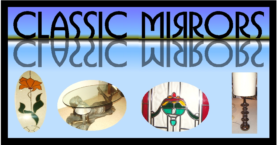
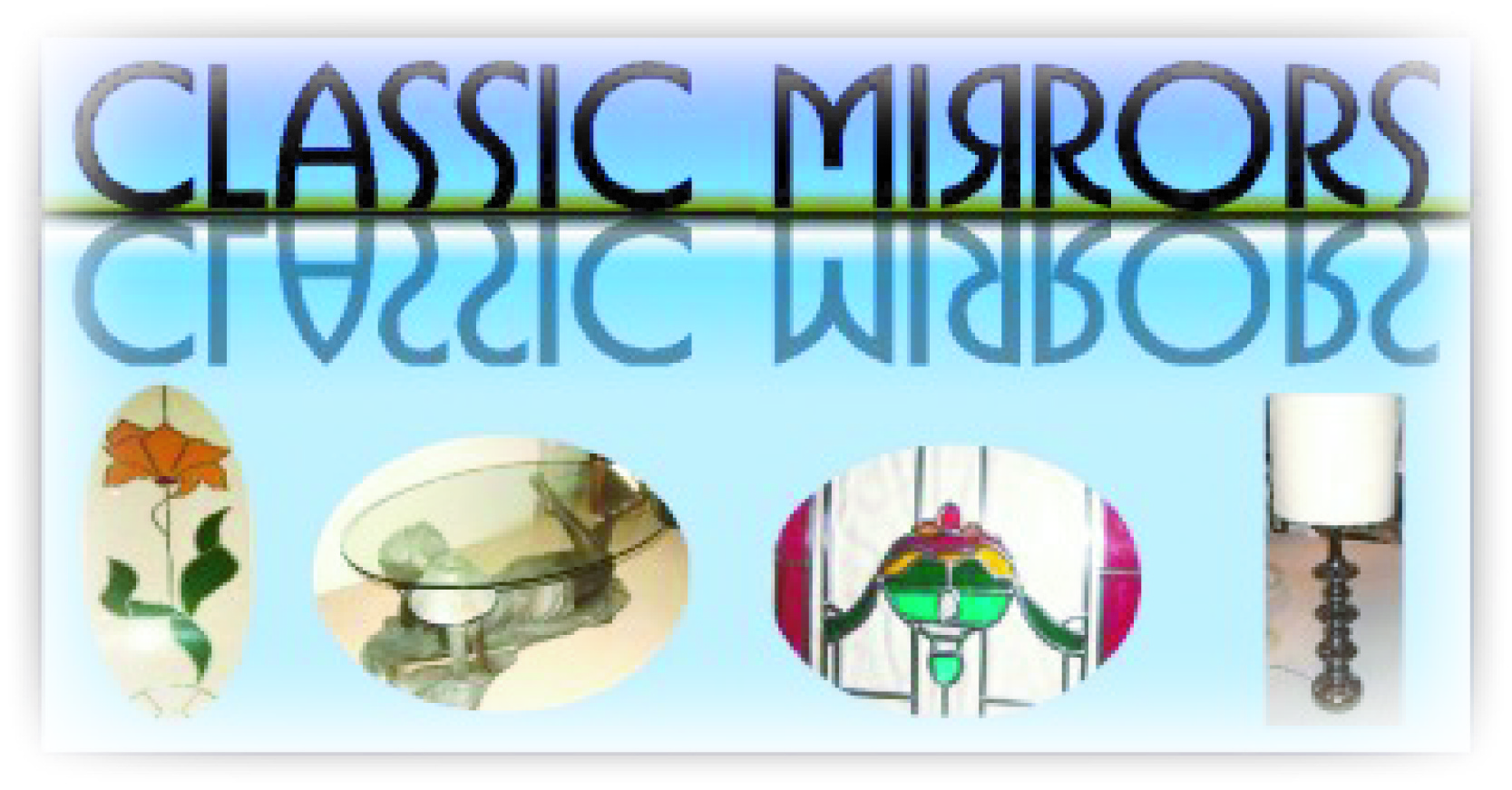
Hi Myles, That’s actually my brother’s name as well. He spells it Miles though. Anyway, some suggestions about the photos (and I don’t know if you have any control over them, or if that’s the way you received them). I think they are cropped and angled a little funny. What I mean is I think that showing the whole lamp would be better. Also a straight on angle might be better for the stained glass door. It’s also a little awkward to have the end of the glass table cropped off. I think it might match your theme a little if you were to match a stained glass type of motif. I wish I had some time to play around with the layout, but we’re slammed at work. Here is a photo of what I had in mind (style wise anyway). http://www.neonsign.com/eng_lightedsign … dglass.jpg If I have time later, maybe I’ll be able to throw something together. Btw, what font is that that you’ve set on top, if you don’t mind me asking?
-
Hi Simon,
Sorry about the delay getting back to you but I’m a one man operation so have to leave the computer to fit etc..
Yes there’s a few of us out there (Myles).. Thanks for the suggestions, I think your right about the pictures , I’ll have to see if I can get some better ones for the finished design, I like the idea of incorporating the stained glass theme in the design (Genius!! 😀 ) I think this works a lot better, what you you think? Also the font is Busorama .
Thanks Myles
Attachments:
-
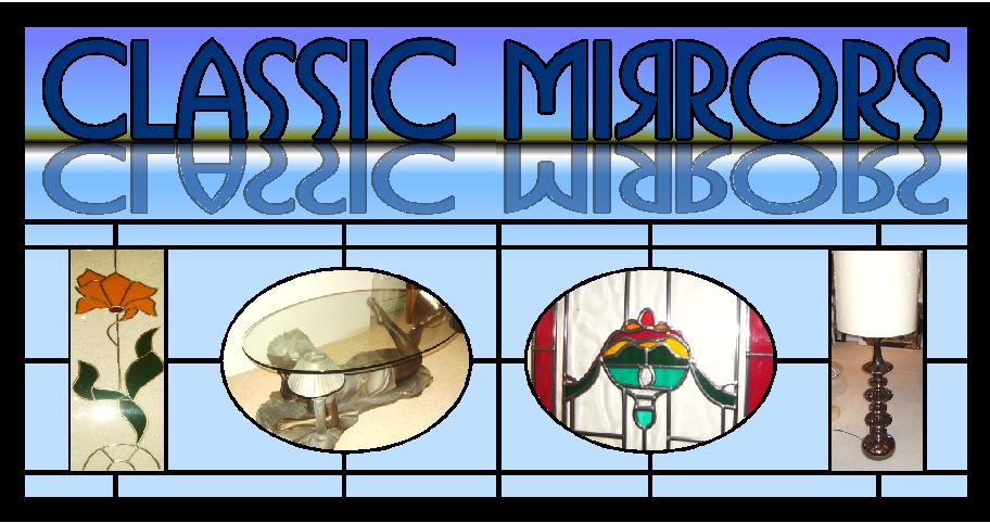
Sorry meant to write back earlier. Wow, much better! I definitely like how you matched up two ovals and two rectangles. It’s a lot more symmetrical. Two more suggestions though.
1.) I think the black border could also be done in more of a stained glass look. It just seems a bit thick and dark around the edge. (although I’m not sure if you meant for this portion to maybe be covered by the frame you were talking about). I think you could still get away with using purples and blues like you have on the rest of the drawing, if you want to stay mostly monochromatic. You also have a lot of room to add some brighter colors around the edge, like some reds or yellows, that you might not normally be able get away with in most lay-outs.
2.) I’m also a little bothered by the reflection under the word "MIRROR". It seems to break the graphic into two to much to me. Maybe you could take the reflected part and give it more of the lead out line with some radiating lines coming off of it (much like real stained glass would have to hold the glass part of the lettering in). Here’s a link of an image kind of what I’m thinking of. Obviously you can put your own spin on it though. http://www.followme-series.org/images/t … etter2.gif
Hopefully you don’t think I’m being to critical. Just trying to help. 😀
-
Oops I really meant the whole reflection, not just the word "MIRROR" but "CLASSIC MIRRORS". Sorry for that mistake. Cheers.
-

I think the reflection colour is way too strong, and the main text needs to be made a tad smaller too. There is too much of a fight for attention going on at the top of the logo. Like what you did with the pictures though.
-

I agree with Harry that the text at the top is fighting with the rest of the layout
I realise that this is probably their logo but in this case can they not drop the relfection.
I was wondering what mirrored di-bond or mirrored perspex would look like with 5mm thick acrylic letters bonded on….I think that would give it some depth & add another feature to it
-

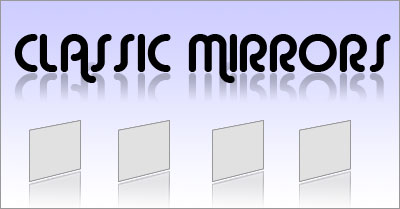
You could soften the reflection with a gradient like I have shown – gives the impression that the logo is sitting on a glassy surface
Attachments:

-
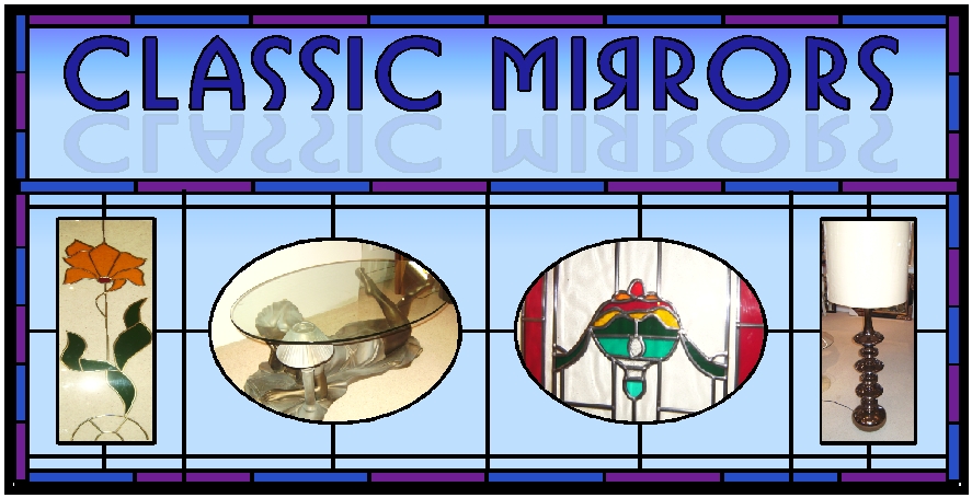
Or you could add the images into the Grey boxes I have shown and carry on the theme of reflections
Attachments:
-
Hi All,
Thanks for your suggestions,Simon: yes the black was just a simulation of the customers frame although I may try to talk him out of it as I think it may be a bit much.. Have taken the suggestion about the stained glass theme a bit further . & no your not being too critical at all, i appreciate your time & input.
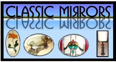
Harry & Glenn: Yes your both right, the top was too messy, so I’ve Increased the kerning slightly, reduced the size & faded the reflection a bit more, i think that helps a lot.
Glenn I wouldn’t want to use mirrored materials as the sign is on a busy roadside & I’d be concerned about reflections of sunlight or car lights causing accidents, Hope that doesn’t sound too daft 🙄Nilay: Thanks I think this works better now too 😀
Attachments:
-
Nice. I think that making the reflection light helped a good bit.
Log in to reply.
