Activity Feed › Forums › Sign Making Discussions › File Swapping › Help with this design please
-
Help with this design please
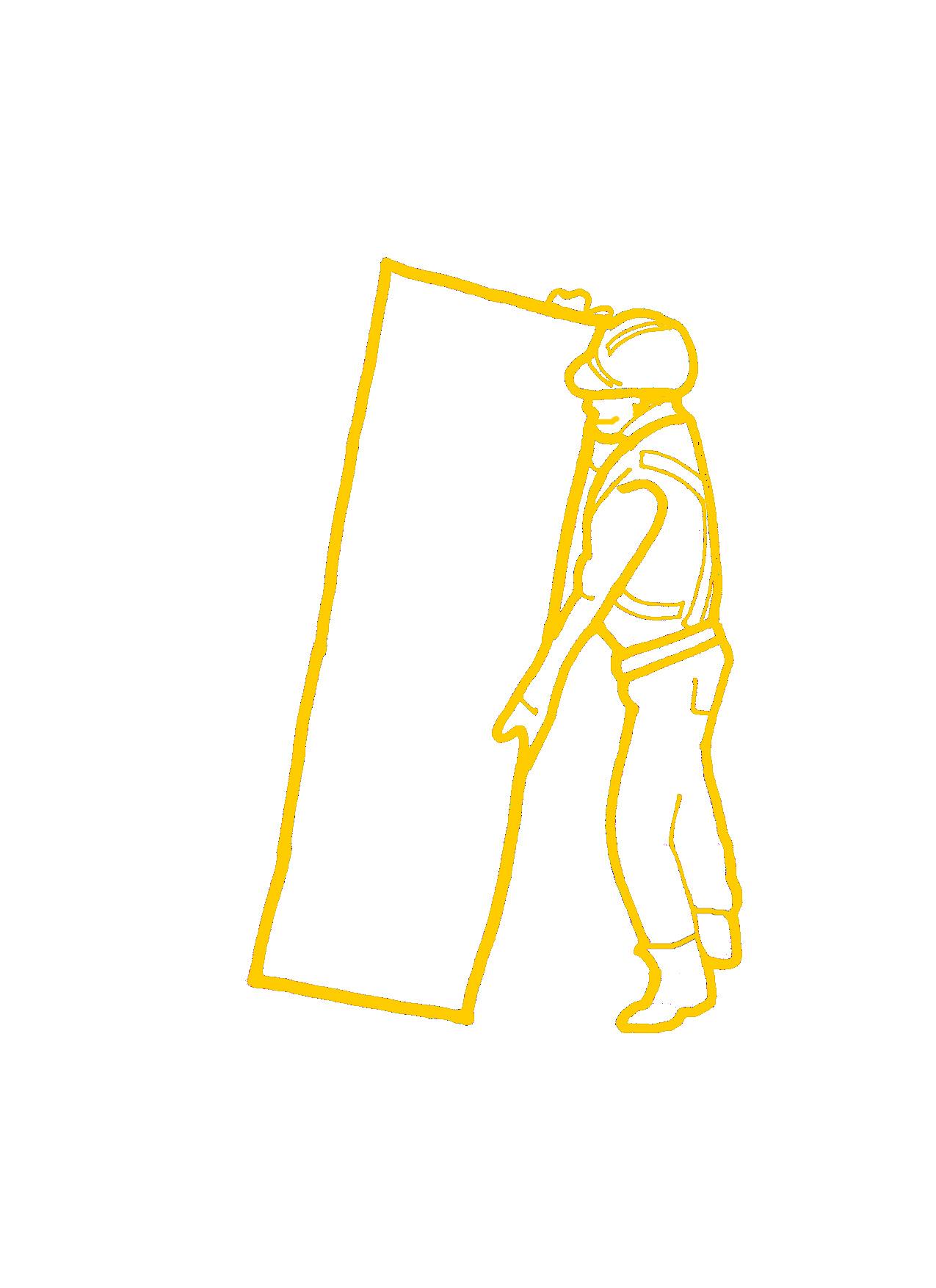
Posted by Phil Barnfield on December 4, 2006 at 12:13 pmMorning all.
Got this "bloke" to convert into vector. Not sure where to start really.
Anyone got a similar vector on their PC? Or does anyone fancy helping me out??Any help would be appreciated. Problem is due to the quality of the image itself…. not particularly helpful at all.
Attachments:
 Phil Barnfield replied 17 years, 5 months ago 7 Members · 17 Replies
 -
17 Replies
-

send it to andrew at vectorwise, he’s a wizz at this sort of thing 😉
-

OK, it’s a rough as…
Only way to get it good I reckon is a total manual rebuild!!
Get node editing… 😕
-

guess all i really need is solid fills – perhaps with cut out bits for some of the white area. Solid trousers, top and hat. Just had a bash myself, and its proper buggered up! 🙄
-
If you just want a basic outline with ‘bits of detail’. Print it out on A4 in black. Get your marker pen & smooth out the edges & fills. Rescan & vectorise in your program (or post for somebody to do). It makes a world of difference having a large scale image to start with…also a LOT easier to modify for little tweaks.
dave
-
yeah, never thought of that – seen it in a demo on here somewhere.
thanks dave, will give it a shot.
-
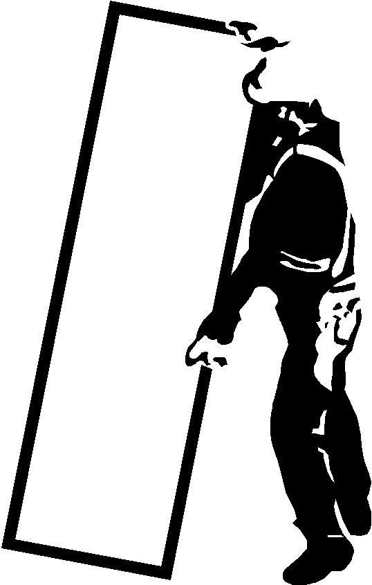
well that didnt take too long 😛
attached final jpg (of which I have a nice enough ai of). Its meant to look a bit comicy (sp) so the odd wavey line looks nice!! hehe.
Thanks Dave for the sound advice, Cheers
Attachments:

-
FFS!
Client not impressed 🙄
He wants any "tradesman" type graphic which can be imposed with the sign to look a bit like the original.Anyone got any vector tradesman type graphics lying around??
-
now added more detail. he might just be ok with this one. 😛
Attachments:
-

Have a look in the yellow pages. Loads of people use tradesman type drawings in there, then nick it.
-

would straighten out the lines on the board he is holding 1st.
small detail but will make a cleaner image.
-

Phil, He looks like the motorcycle cop out of the ”Village People” 😀
Why don’t you go for something very cartoony, must be easier to find?.
-
Ha ha @ Martin…. very true
Just had a browse of local Yellow Pages – nothing unfortunately.
He has emailed me back – we are getting somewhere. Hopefully my final design here will be approved…. had enough of it now!!
Anyone hazard a guess on the font that is being used. I did post a seperate thread but no replies as yet.
Attachments:

-
Much better Phil.
Font hmmm… thought it was ”Review” at first glance but it it aint!!
Surely you could come up with somthing better than that unless customer specificaly wants it.
-

Just had a quick go at vectorizing it Phil but I see you’ve got it sorted now :lol1:
Attachments:
-
nice variant there Kenny. Will see what the customer thinks
Still stuck on the font. With any luck he will let me change it to something else if I ask him nicely. Any suggestions of what looks similar? If you have ttf’s please attach as my fonts library is not very good!!!
-
Not sure about that font. The capital A in Call is different to the A in reliable 😕
At first glance I thought Revue as well but it’s not
-
oh yeah so it is 🙄
hadnt even noticed that myself. So how the hell am I meant to get it right from that…. bloody customers! 😮

Log in to reply.
