Activity Feed › Forums › Sign Making Discussions › Graphic Design Help › help with sign layout for holiday park please?
-
help with sign layout for holiday park please?
Posted by Alistair Richards on June 13, 2007 at 9:21 pmHi,
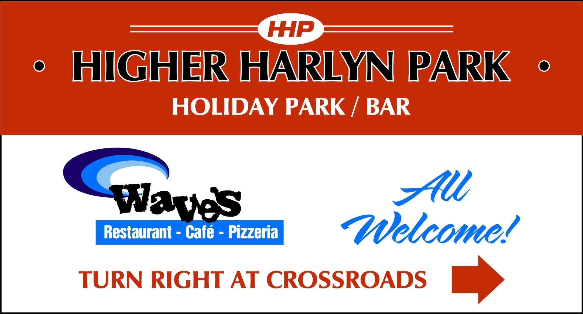
Can someone give me some crit/suggestions on improving this layout please. The sign is for directions to nearby campsite, which has the waves restaurant on site. The waves logo has to stay the same, and the hhp oval thing has too, but everything is free to change. No matter how much I fiddle with it I just can’t seem to get that clean classy look. Guess I’ve just been stareing at it too long.
Any help much appreciated 🙂
Glen Mathers replied 16 years, 11 months ago 8 Members · 13 Replies -
13 Replies

-

it’s definitely disjointed looking Alistair ………….. but the difficulty in making it look right is the awful ‘Waves’ logo …….. 😕
I would look at tying the colours in ………… using a blue within the other text somewhere too so that it’s a bit more balanced. Also, I would move the directions to the bottom of the sign ……….I’ve tried having a go with this ……….. not got anything that I think is quite right yet. It’s that logo……….
does it have to sit at an angle like that too? -

I think the main problem is everything is competing for attention. You need to prioritise the text messages. Maybe make the business name top priority (and leave it as it is), but reduce the size of the waves logo and use a regular (instead of bold) and smaller font for the directions and "Welcome" messages.
-

hi Alistair
as Marcella and Phill has said, you need to balance the layout a bit giving some sort of separation and priority….
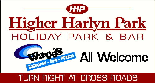
i began to give this a go and just realised i have a couple of things to do and its getting late so I’m just posting this as it is… (sorry for the half baked design 😕 but i literally stopped in my tracks ) ill maybe give another go if this thread is still going tomorrow night, sorry…
.
-

Thanks all,
I can see where you’re all coming from and some good ideas there, got a busy day today, but will have another look at it again tonight. n.b. waves logo doesn’t have to be slanted, and the pizzeria cafe part can be layed out differently.
-
its better, but still needs a bit of work mate… sorry for the short reply… 😳
-

Alister does it have to be maroon can it not be a nice deep red I think Ian’s wasn’t far away just a colour change if possible. jmho
Lynn
-
what size of sign is that alistair?
is the road motorway speeds or country backroad sort of thing?
if it is meant as an advert/direction type sign… surely they have more to offer than a cafe? -
It has to be maroon/dark red really.
It’s to go on the outskirts of a village, small country road, sign is 6’6" x 3’6". They are just trying to promote the Park and Bar, but also to include the advert of the onsite restaurant/cafe, (seperate business but on the holiday park site)
Thanks 🙂
-
sorry ………. did this in Signlab and it looked burgundy there …….. now it looks red! 😳
Attachments:


Log in to reply.
