Activity Feed › Forums › Sign Making Discussions › Graphic Design Help › help with new logo design please?
-
help with new logo design please?
Posted by Bart Van Wassenhove on April 24, 2007 at 8:27 pmHi everybody,
we are about to change our firmname. A lot of people and especially larger companies are telling us that our name "SignBoy.com" gives us a too young (and immature) image in contrast to the work we deliver.
The new name will be "face id!" referring to visual communication and corporate identity.
So we’re also working on a new logo and that’s a very tricky thing, as you probably all know…
Maybe some of you can point us in a good direction for the design.What do we want?:
* off course our name: "face id" (with our without exclamation mark)
* baseline: "all-round reclamemakers" (‘reclamemakers’ being the flemish translation for ‘signmakers’)
* preferred colors: maroon, orange, etc. (but maybe something totally different)
* style: trendy but classySo,anyone willing to give it a try?
Thx a lot in advance!!!Cheers,
bartThe
Martin Pearson replied 16 years, 11 months ago 15 Members · 36 Replies -
36 Replies
-

not trying to be awkward Bart, but the sort of idea behind graphic help and discussion is the poster must offer his own work to be discussed and bettered through constructive criticism and in lots of cases, folk submit their own versions of the work if they feel they have the time.
-

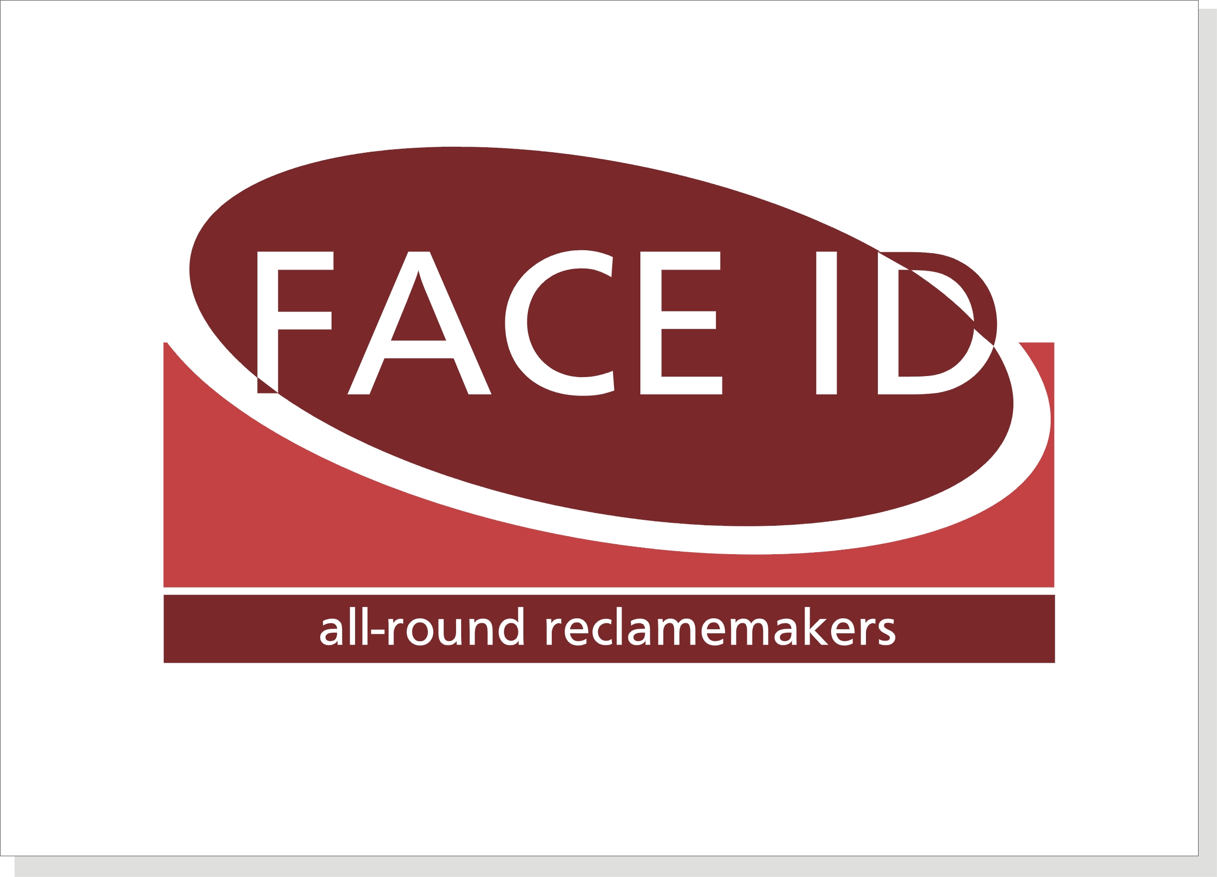
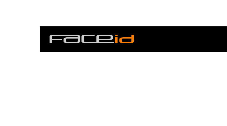
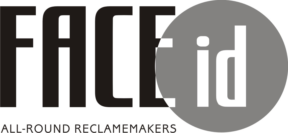
hey Rob,
you’re more than right! This is what i just came up with… 😕
What u guys (and girls off course) think? Any other suggestions…Cheers,
bart -

hey Bart could you post it to see instead of down load. ? thanks
Lynn
-
Bart where are these to go ? vans, cards,letter heads, ??? the more info the more help 🙄 and if it’s vans which ??
Lynn
-
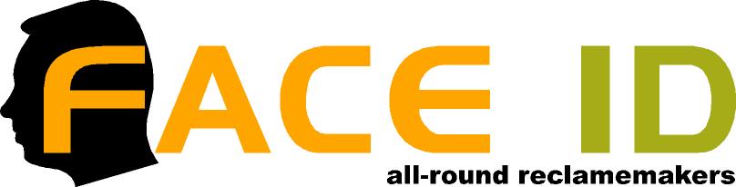
hi lynn,
this logo should be part of our total corporate identity. So we should put it on letters, invoices, businnes cards, van (peugeot boxer), etc.
Before even thinking about all that we want to make sure that the logo itself is strong enough to stand on its own…
Cheers,
bart -
Thanks andy
Looks good and cool! Don’t want to be difficult but maybe a bit too cool 😕
And we really want to add "all-round reclamemakers" because it says what we do :lol1:Cheers,
bart -

A go from me Bart 🙂 The middle colour has changed from orange to pink when loaded mmm 😕
Attachments:
-

Here’s my effort. Like the ones already submitted though
Attachments:
-
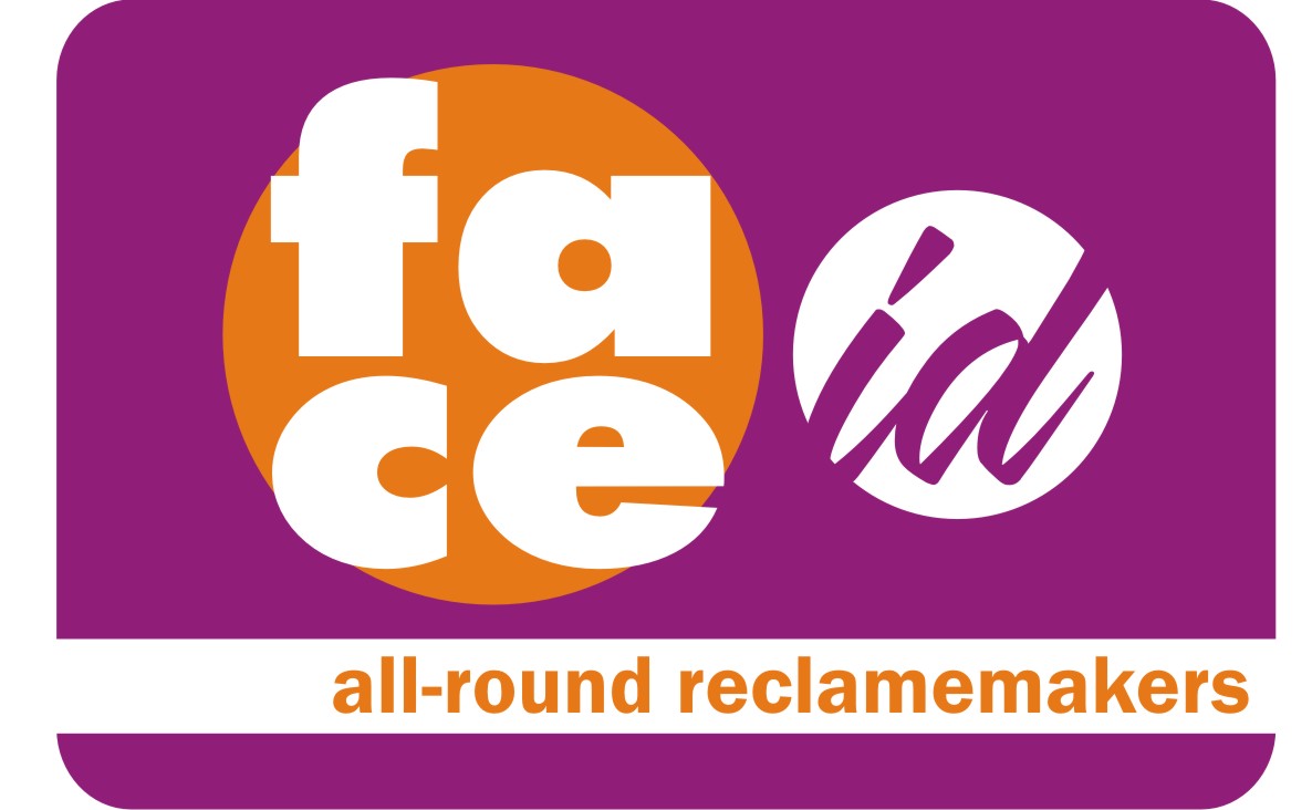
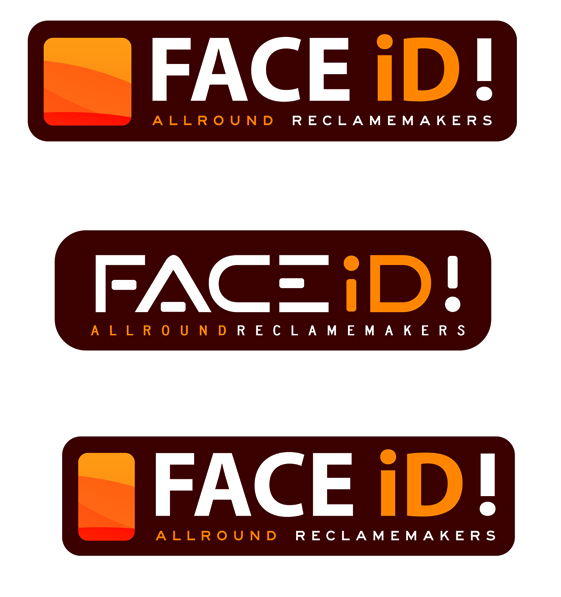
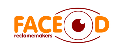
hi everybody,
thanks a lot you all for your efforts! This is a superb community!!!
We especially liked the idea of the barcode (Andy) as a symbol for identity.
So we used it in another try…Please feel free to tell us what you think of it (even if you don’t like it!). It’s better to hear critics now than when it’s too late.
Cheers,
bart
Attachments:
-
by the way: the "face id" is supposed to be said as "face it" 😕 😮
-

Like the idea Bart but I don’t like the text along the bottom with the increased kerning, what if increase the space between each word? To break them up slightly more?
Just my 2p’s worth
Tim.
-

that’s better Bart, I like the font you’ve used in the logo
-
I like those Bart, probably the top one,
just not 100% sure on the bar code having the curve around the D.
very nice though.
-

I think the last type is a wee bit Fiesta XR2…kept the bottom bit though…a wee bit of work maybe 😀 but moussaka ready in 5 minutes 😀
Attachments:
-

Another idea to help get your creative juices flowing
Warren
Attachments:
-

i like it bart 😀 especially the top one….and im with martin, loose the bar code it takes the look away of the company name…..and as tim has suggested loosing it will tighten the kerning of the smaller lettering 😉
nik
-
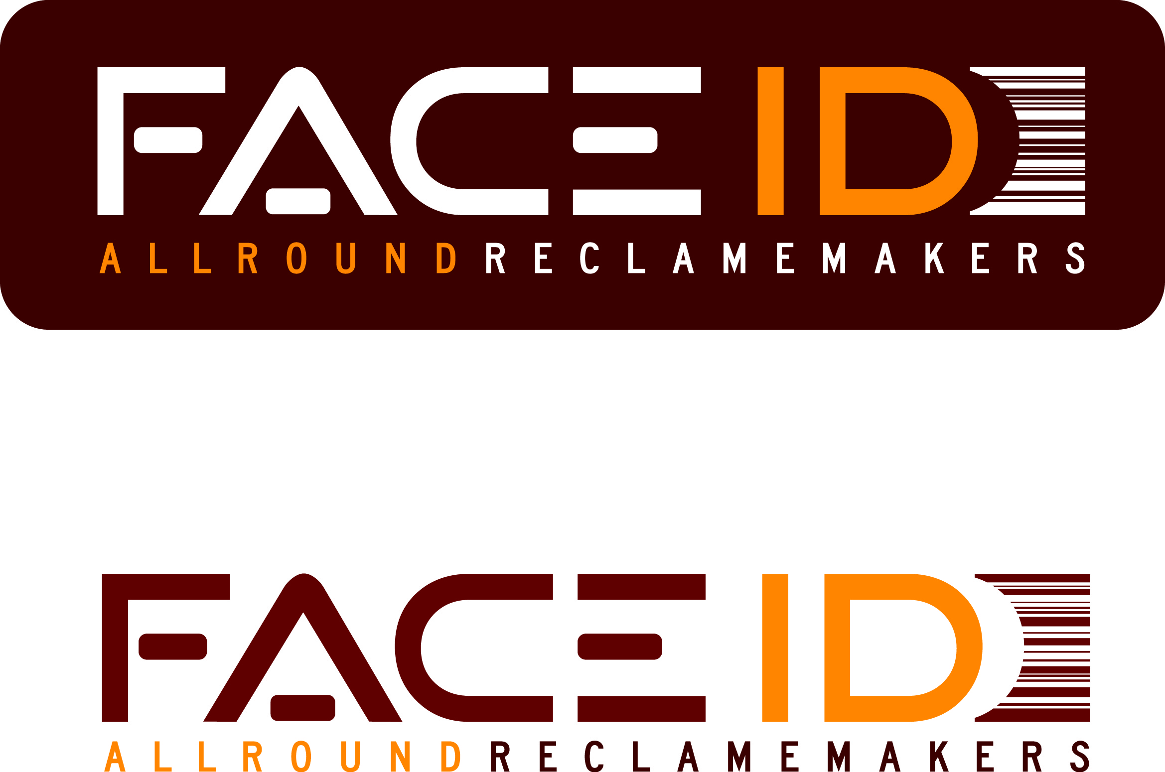
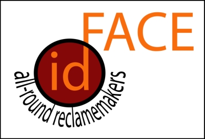
Hello everybody,
it’s been a while but wer’e back…
thanks again for all your efforts and ideas!
We’ve come up with a few changes in the creation of our logo. Please tell us what you think of it 🙂Cheers,
bart
Attachments:
-

bottom one is best for me.
I didn’t like the font spacing on the middle one
Looks good – clean and modern
John
-
like those too……but when i looked at it first…i thought it resembled a company dealing in photography 😕
nik
-
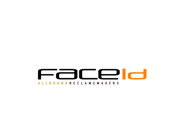
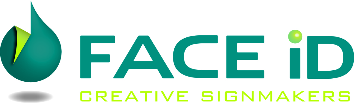
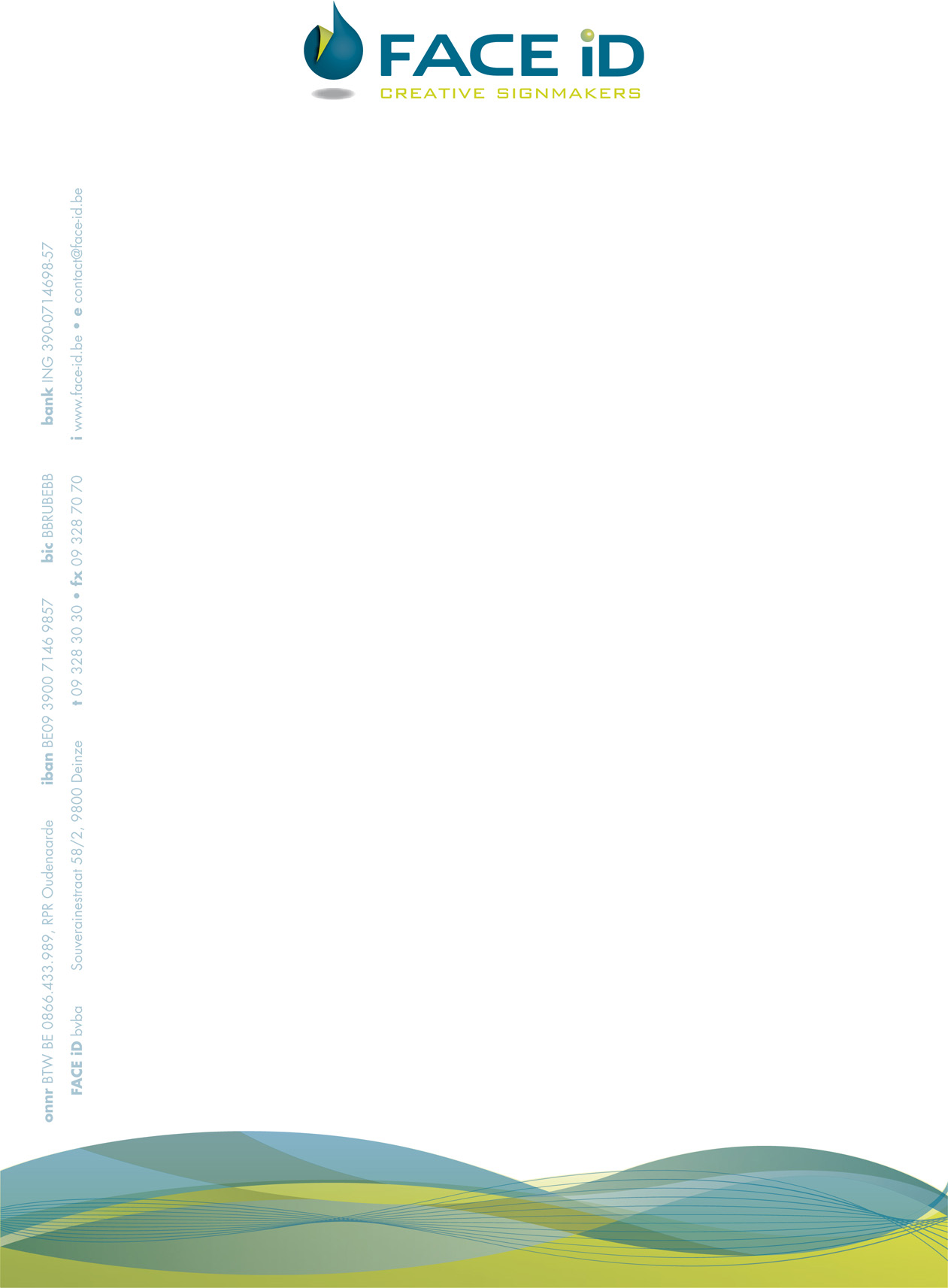
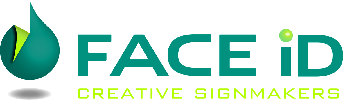
hi again everybody,
first of all we’d like to thank everybody who has made the effort of helping us with a design or comment.
After a lot brainstorming, designing, and re-designing we finally found our new identity in the following logo!
Hope you all like it 🙂 Any comments appreciated 😀Cheers,
bart
Attachments:
-
I like the colours choice Bart. It has a calming effect 😀
-
it’s not working. Logo colors should be like in the letterhead :lol1:
-
Good to see you got it sorted Bart, I often wonder at the thinking that goes into these kind of logos….I was wondering could you tell me what the shape to the left represents and the thinking behind it? Hope that makes sense.
-

Thanks for the update Bart, it’s nice to see how things turn out when someone asks for help. Your final Logo is a million miles away from what you first posted.
-

Prefer the final logo design especially now that you have dropped the "all round" tag line. First impression was that you made round stickers!
It is a very clean, crisp logo and says exactly what you do…..why elaborate, it just confuses.
-
Thx for the comments, everyone.
Harry, the special shape represents an ink drop (printing) with an incision and a peeled corner (plotting) 🙄
-
quote Bart Van Wassenhove:Thx for the comments, everyone.
Harry, the special shape represents an ink drop (printing) with an incision and a peeled corner (plotting) 🙄
I figured that! 😳
-
We know you did Harry :lol1:
Funny think is that most of the time I am sure that the shapes and symbols some designers use don’t represent anything at all. Then the customer not wanting to appear really ignorant doesn’t ask 🙄 🙄

Log in to reply.
