Activity Feed › Forums › Sign Making Discussions › Graphic Design Help › Help with etched glass design
-
Help with etched glass design
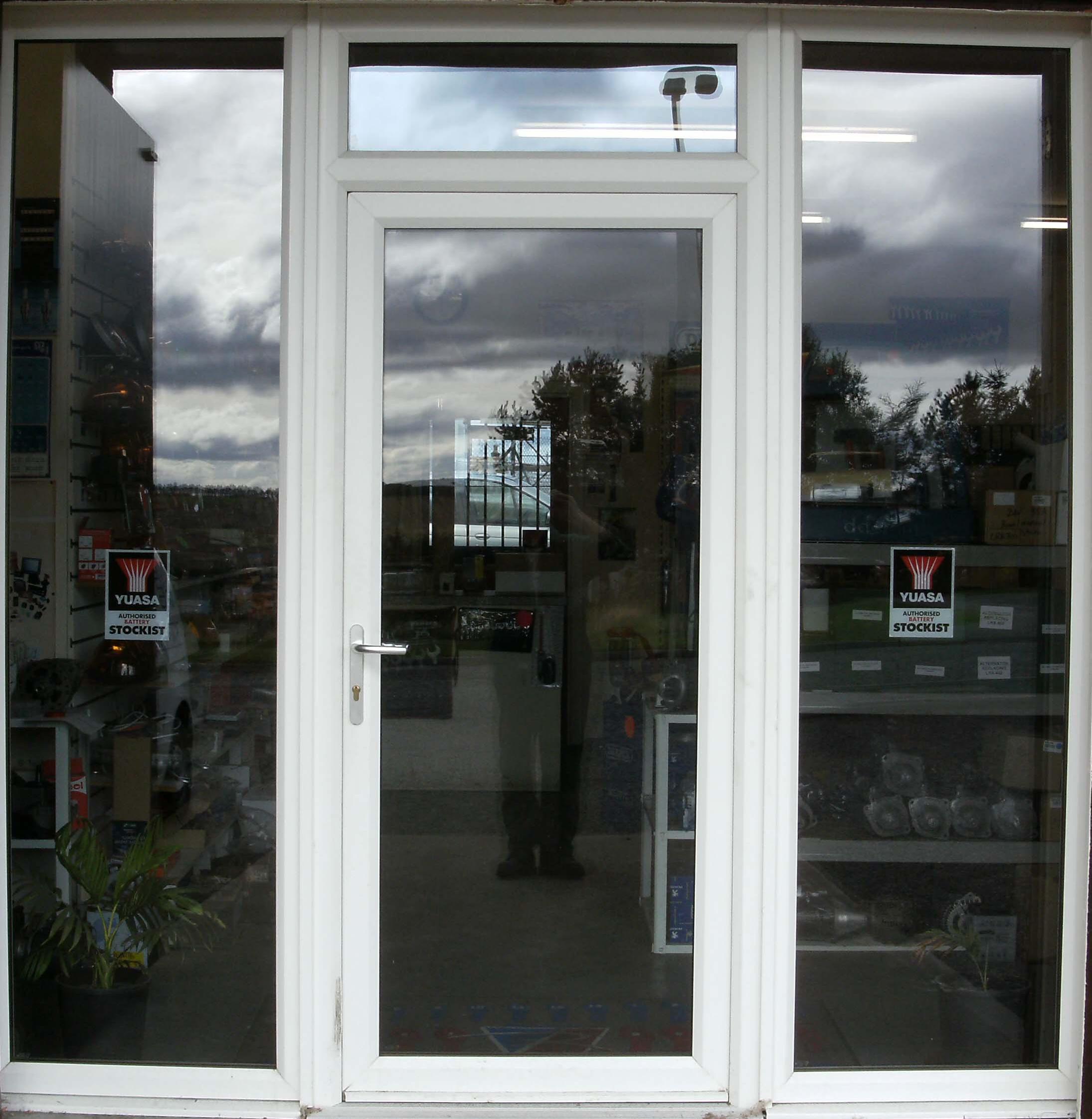
Posted by Martin Gray on September 24, 2009 at 11:55 amHi
Am pulling my hair out with trying to design something on to these doors. As it a ladies gym the customer wants something classy yet modern but @ the same time wants privacy. not asking for much i know!
Please any ideas mite even get my brain working
Thanks Martin
Attachments:
 Colin Bland replied 14 years, 7 months ago 13 Members · 28 Replies
 -
28 Replies
-

that name lends itself to something like this for me (hope this works!)
Attachments:
-

Yep, do a search for vector swirls or floral elements and you’ll find plenty of stuff like that which would look nice.
-

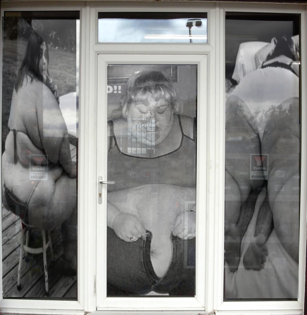
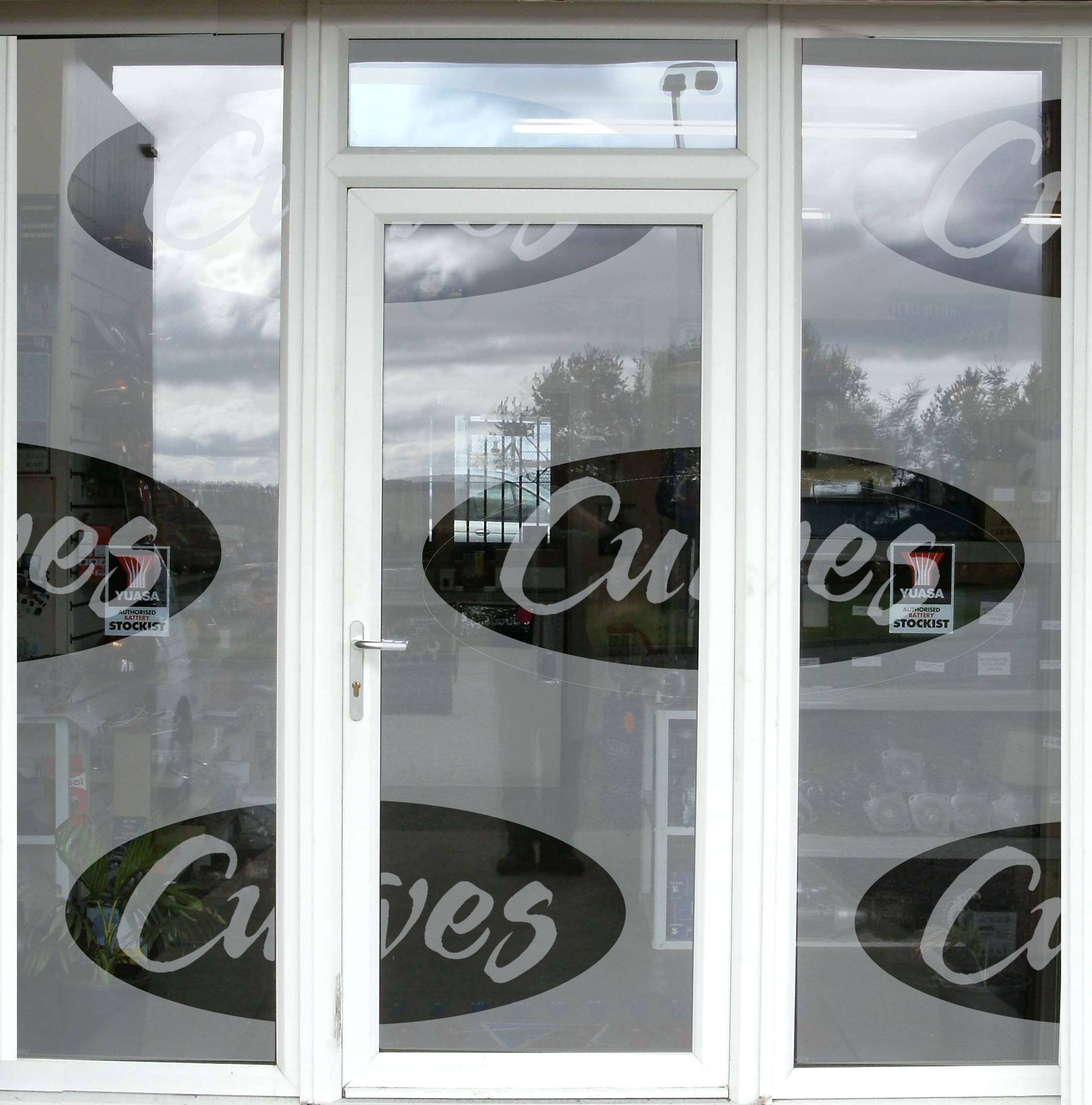
I was thinking something like this would get people into there.
😎
Just kidding!!!!!!!
Love….Jill
PS yeah scrolls or anything feminine.
Attachments:
-

Haha Jill very funny :lol1:
Thanks Malk was trying something like that last night. but could not find any images i liked. was trying to do something with shapes but they always ended up looking like a prison 😕
Martin
-
Hiya sorry for being a pain, fit do you think of this?
Attachments:
-
It’ll do.
For some reason I can see nipples in the swirls. -
Ive been looking at this image so long i probably do to :lol1
-

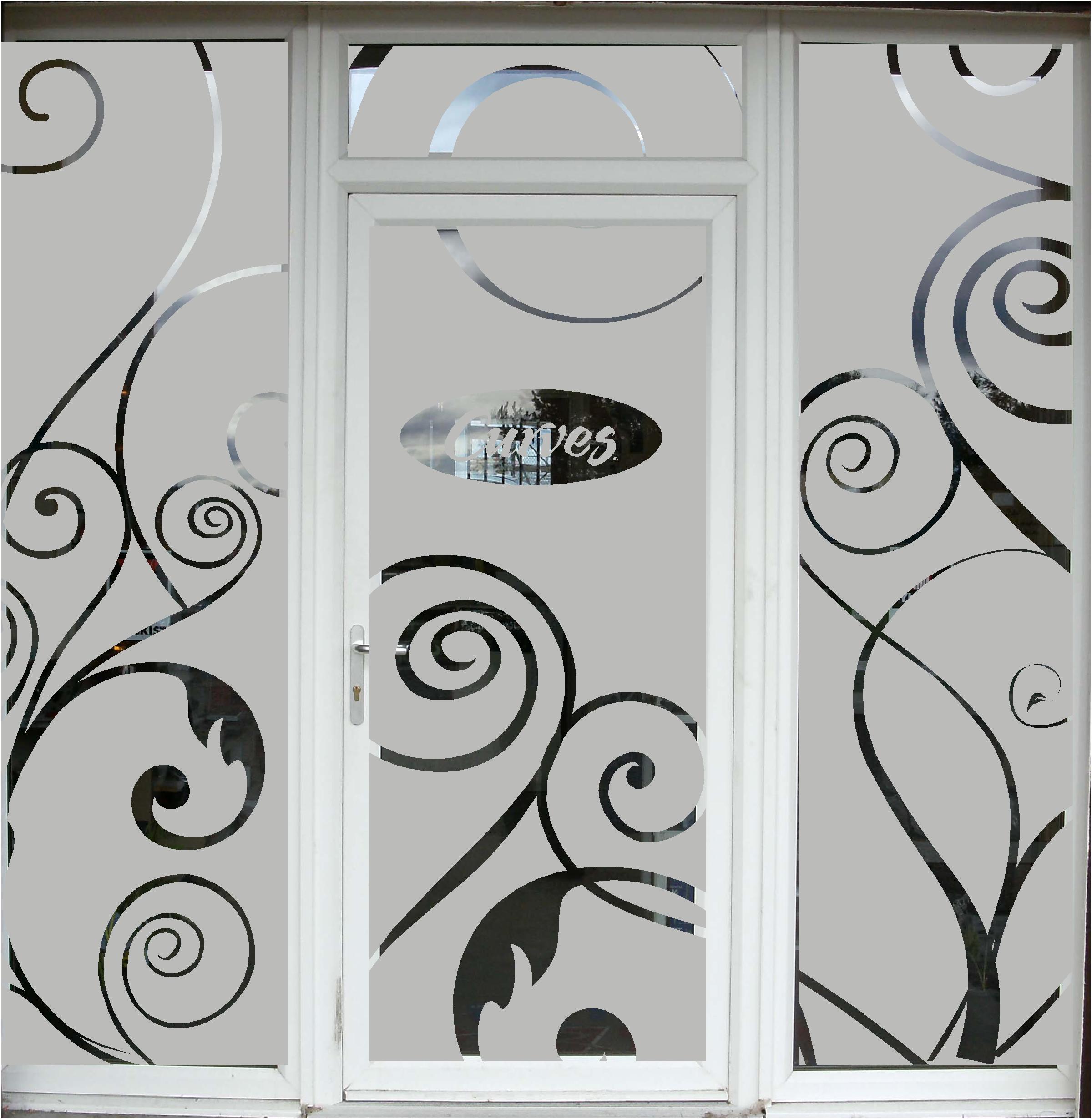
i dont actually like this but for some reason i could not for the life of me come up with what i had in my head using photoshop???? I dont mean i didnt know how to use it just could remember some functions to achive what i was after so i decided to forget it. :lol1:
anyway… this is a HEAVY looking etch design with very little thought… just to chuck in another angle. :lol1:
Attachments:
-

why not do something based on the classical ‘hour glass’ figure, simple sillhoutte/outlines forms around the windows?
Hugh
-

As Jill drags yet another thread down into the gutter…… :rofl:
:love:
-
Sorry Mike.
😳
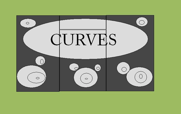
I actually think Rob is on to something.
I mean with the Curves logos.
But you could always put a Mr. Whippy on there.
:lol1:
Subliminal, you know. -

Ok – "Spanner in the works" time .
Curves is a franchise that has very strict rules on how their signage should be set out. (Margin spaces, colours etc). I did signs for a curves franchise a few years ago and will see if I can dig out their guidelines and specifications and post them for you tomorrow.
Otherwise – be careful what you come up with – try and ensure it fits within their criteria. Your client should have given you these specifications and guidelines before asking you to come up with ideas that may not comply with the group ideal 😕
-
Thanks for all your replays folks. the thing is i dont even like my own design! al have a play around with it tonight and put something for you to have a look at. 😕
Thank you for your design Rob but after reading the guidelines i received from Phill the logo is ment to stay the registered colour. If the customer wants something different will @ least i warned them.
Hugh i think there is i fine line with using a sillhoutte dont want it looking like i strip joint 😀
Martin
-
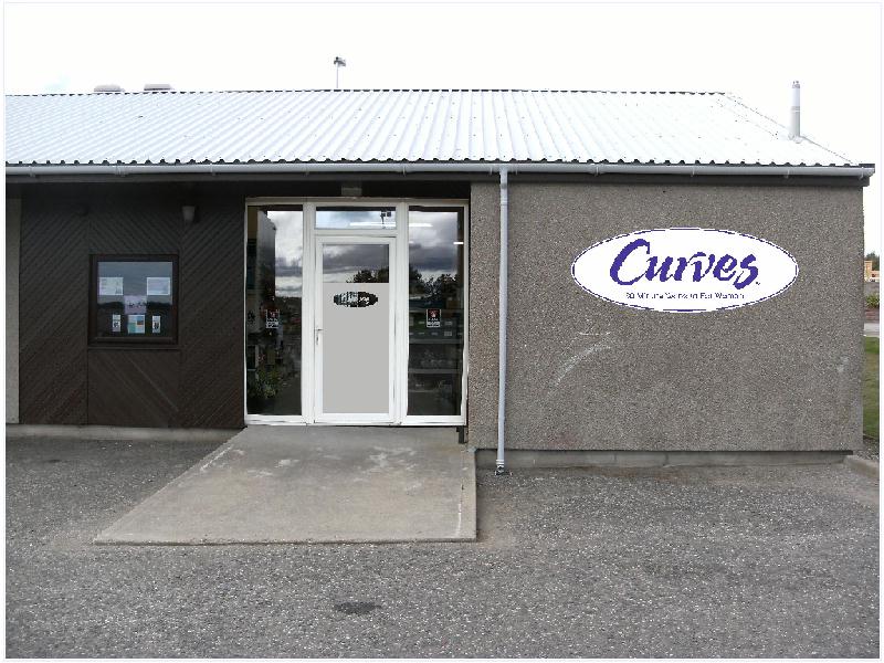
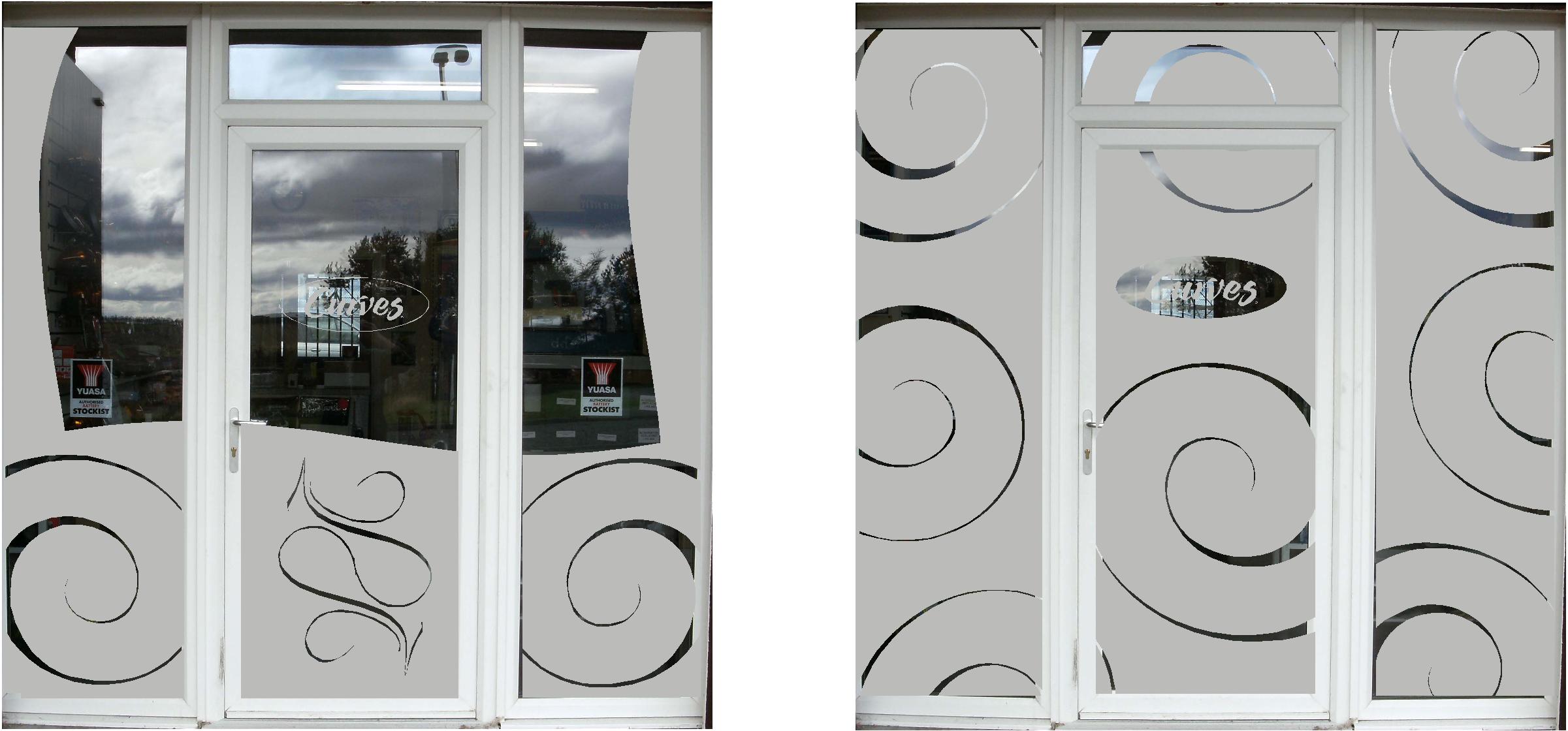
Hi folks am back. 🙂
Think am just going to e-mail the 3 images to the customer. Just wanted your opinion before hand.
Thanks Martin
Attachments:
-

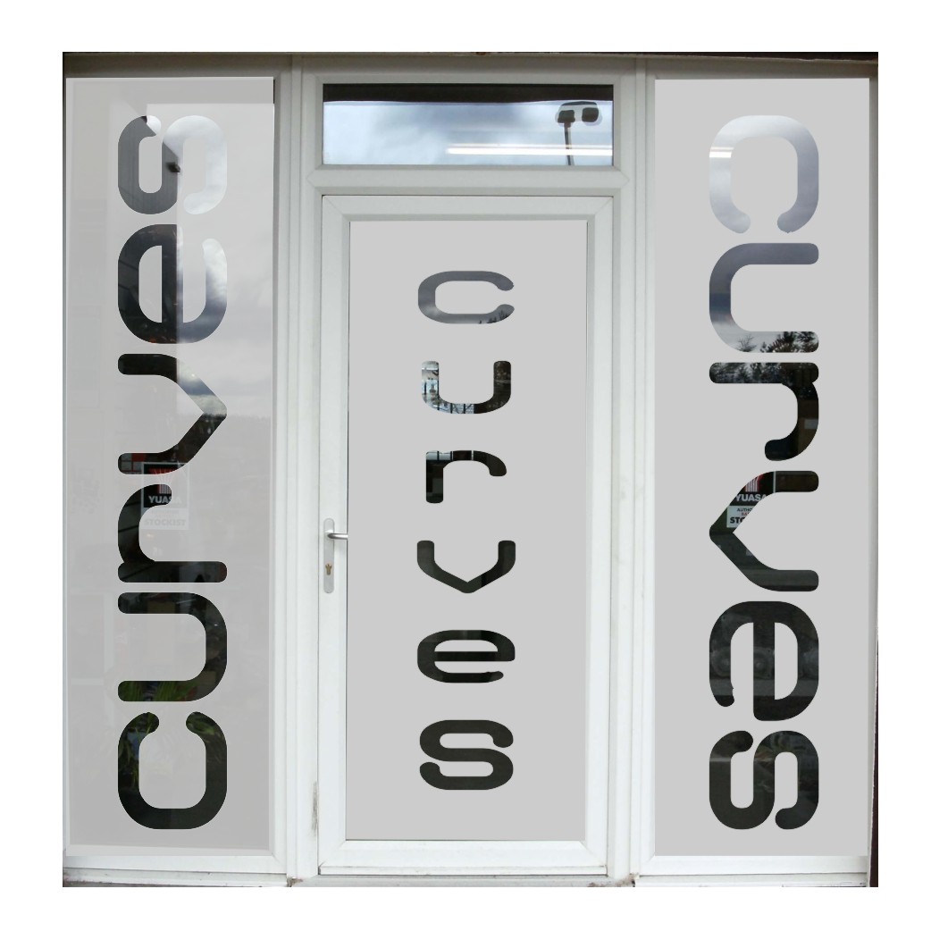
I was struggling with this one…..this is the best I could come up with……
not the best font but I’m limited on my laptop
Attachments:
-
Nope – can’t do that I’m afraid :police2:
Curves graphics standards strictly state you cannot bastardise their logo and must only use the logo in it’s correct context.
Sorry, but rules is rules, it’s the law you see :police3:
-

Martin, how about inverting the etch and stretching logo across top half of windows with swirl design at bottom and in top corners, that should stick to the brief by maintaining privacy…..?
Chris.
-
My illustrator pc is busy cutting, sorry….
Attachments:
-
Yes Jill, you’ve obviously planted the nipple, I mean seed. (:)
-
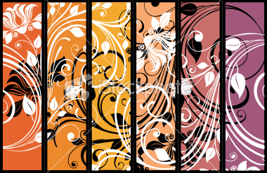
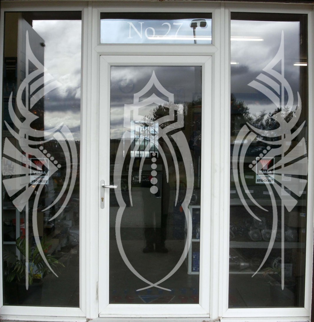
I was thinking something more like this, all it is are VectorArt scrolly things. I put the street number on the transom just to be old-fashioned.
Attachments:
-
This is what our local one’s look like………MMmmmmmm battered Mars bar’s 😀

-
That’s what some of Pittsburgh looks like after the G20.
Mmmm I could go for something deep fried. -
Been looking at this thread
Jill and Rob can you explain the technique that you use to keep the reflection on the glass when you have applied the etch on the visuals.
Mine allways end up looking like they are applied on the outside on my visuals
Thanks
Colin
-
I just use the interactive transparency tool in Corel 12.
You can choose the "uniform" option then mess with the slider to get the opacity you want.
Log in to reply.
