Activity Feed › Forums › Sign Making Discussions › Graphic Design Help › Help with design on Van?
-
Help with design on Van?
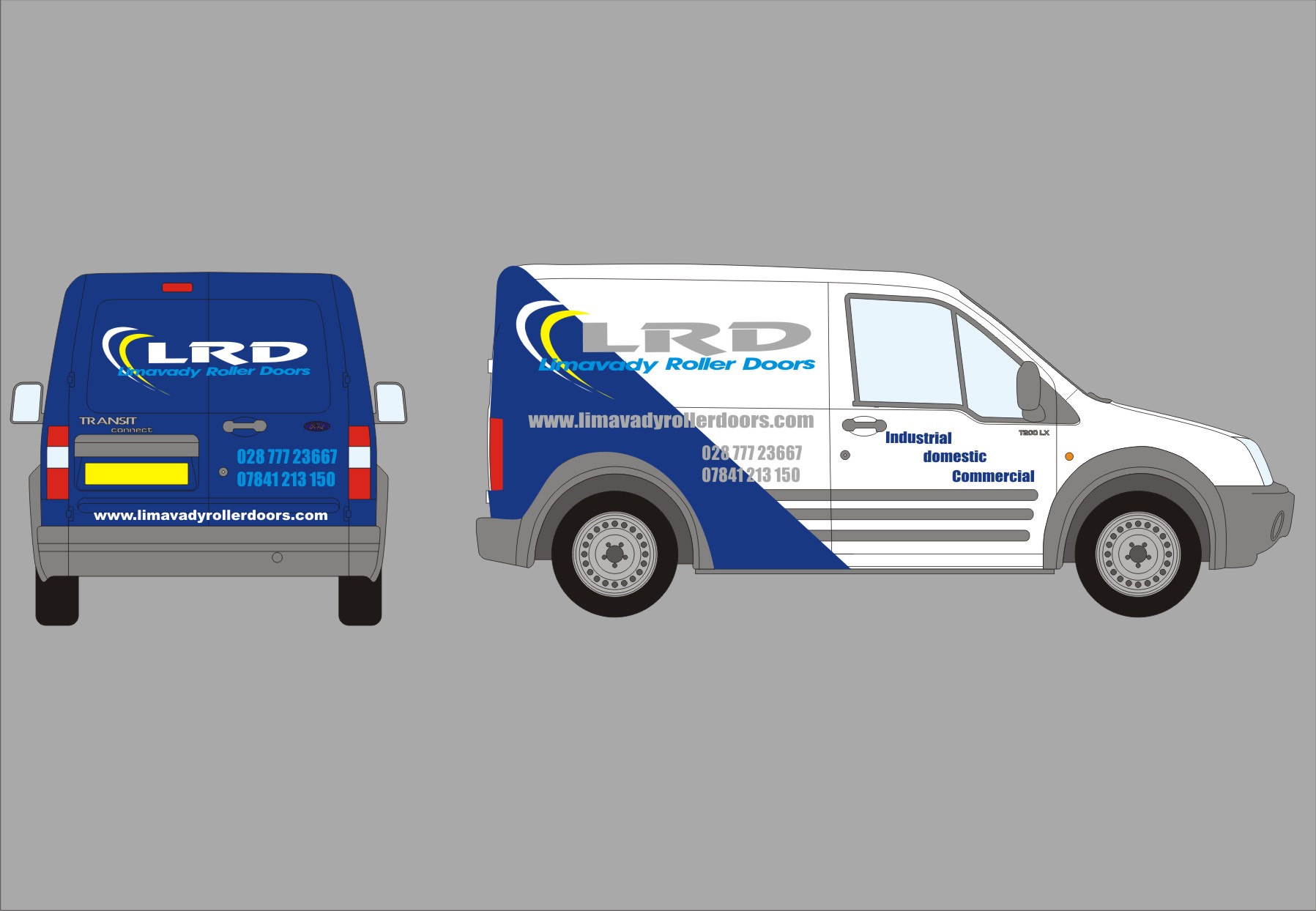
Posted by TimDouglas on August 16, 2010 at 2:32 pmHi folks looking for some inspiration on this ford connect van please, Its white and he wants the rear blue and half blue on sides , i have had a heavy weekend and cant get a decent design for the customer, any ideas welcome, Logo is happy but other colours may be added to jazz it up a little
Thanks Tim
Attachments:
 Bob Clarkson replied 13 years, 8 months ago 5 Members · 7 Replies
 -
7 Replies
-

Too many fonts, too, and you are stamping on Revue.
I would not put a fax number on a van.
And try running the logo straight.
Love….Jill -

updated with advice ,
Tim
Any more improvements that i can make ?
Grey is a silver colour?
Attachments:
-
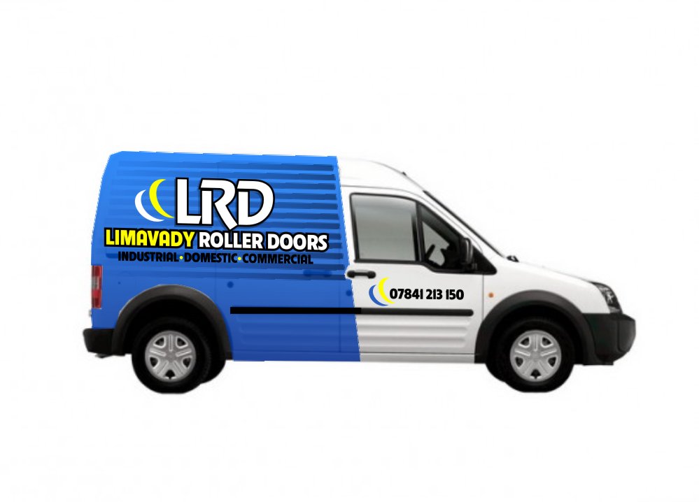
Here’s a quickie suggestion
(I don’t have the proper van but they all look the same to me)
Attachments:
-

Huh! – i like jills blue shape alot. TOOOOO many cars have the pointed "triangle" shape.
Jills shape is slightly offset, and its looking nice. AND using the two moonlike logo pieces with telephone number is nice.Good luck with it.
-

Hopefully I’ll have software where I can post my ideas too, in the near future. But I agree, the whole loads of phone numbers thing really can be a nightmare. I will often do the mobile numbers slightly smaller, assuming it’s second in line that is, just to give people a chance to register divisions in what can look like just a mass of numbers. I’ve had it with partnerships where they both want their home and mobile numbers on the van, Four numbers, who someone is and what they do really is going to take a minute to read, let alone lay out nice.
-
Just wanted to add, I prefere Tim’s second one to his first, and Jill’s works very nicely, (even though she admitted it was only quick, so a little unrefined I guess) but either way it makes it look like it would be a national company, whether it is or not. Running it straight, may appear to be less thought or effort, but it’s certainly nicer.
I know you’ll have all already thought of this, but remember the over engineered door runner on the other side before you go too far. 😕 I know not all Connects have it, but you can guarantee it’ll be there if you don’t want it to be..
PS please don’t anyone ever take a comment I may make as being over critical or unfair, I’m very new to this forum and hope I can fit in well. I have worked for the last 25yrs with no outside input, and am in an area of the country were you seldom see good work. I really feel I can help and be helped through this forum.
Log in to reply.
