Activity Feed › Forums › Sign Making Discussions › Graphic Design Help › Help with design layout for roadside sign please?
-
Help with design layout for roadside sign please?
Posted by Roger Weichert on November 9, 2007 at 7:26 amHi,
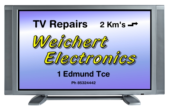
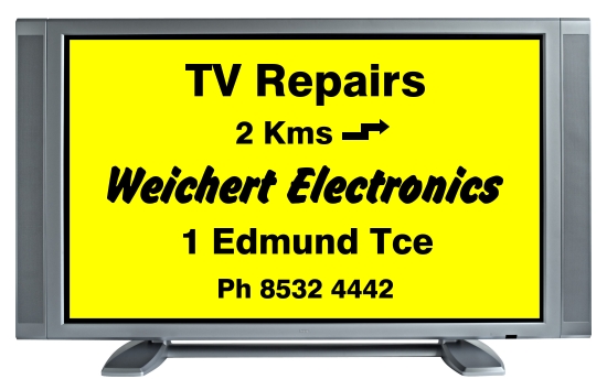
Just looking for some feedback please, and any more ideas for the design and layout of this sign.
Will be 2 x 1.25 metres, backlit, and located behind a large window on a busy road … 60 km/hr traffic.
Here are a couple of variations I have been playing with … be gentle please. 🙂
Thanks, Roger
Attachments:


 Roger Weichert replied 16 years, 6 months ago 6 Members · 15 Replies
 -
15 Replies
-

First in………
Prefer the colouring in the bottom image, however if this is a drive-by advert should you not focus more on the service provided and phone number rather than your company name?
The ‘s is not required after Km even if there are multiples
Break up your phone number into logical digit groupings of no more than 5 digits, most people do not register more than 5 digits and remember them.
You are probably not in the market for ad-hoc business (i.e. people dont drive around with a broken TV on the chance of driving past a repair centre) and as such your phone number becomes important.
-

Hi Roger, I like the bottom one too! as Graeme says – enlarge the telephone number.
-

Roger…….I don’t want to sound blunt but I doubt anyone would be able to read either option very clearly as they drive past
I think the layouts are a bit all over the place…neither centre or left or right justified…..I don’t think the eye would know where to look if you caught a glimpse of the sign at 60 km/hr
I would stay away from the effects you have on the name aswell….it looks good close up but is totally lost at a distance (hence the reason I suspect you needed to blow it up to show us)….it would look much sharper without them
I would simplify the layout…..loose the effects & beef the name, address line & telephone number up a bit 😀
-

Thanks for the feedback guys. I will put together another draft taking your suggestions into consideration.
Hi Graeme, you wrote
quote :“however if this is a drive-by advert should you not focus more on the service provided and phone number rather than your company name? “Ok. Makes sense. Probably the main reason I did it this way was because the business has been here for over 25 years and is already pretty well known … and this was an attempt to keep the name in front of the locals without having to advertise in the local papers every week.
quote :“The ‘s is not required after Km even if there are multiples”“Break up your phone number into logical digit groupings of no more than 5 digits, most people do not register more than 5 digits and remember them.”
Thanks, I will change that also.
Hi John … thanks too. I shall enlarge the number.
I appreciate the input. 🙂
Regards, Roger
-
Hi Glen.
Thanks for your input too. I always enjoy reading your posts and seeing your suggestions for improvements … and blunt is good … no point beating around the bush. 🙂
quote :I think the layouts are a bit all over the place…neither centre or left or right justified…..I don’t think the eye would know where to look if you caught a glimpse of the sign at 60 km/hrPoint taken, I will have a go at tidying it up.
quote :I would stay away from the effects you have on the name as well….it looks good close up but is totally lost at a distance (hence the reason I suspect you needed to blow it up to show us)….it would look much sharper without themYeah … I sort of had that feeling myself, but was trying to be too arty-farty. And coz I’d spent so long trying to create the effect, I didn’t want to let it go!!!:roll:
quote :I would simplify the layout…..loose the effects & beef the name, address line & telephone number up a bit .Yep, ok. I’ll have another shot.
Thanks again, Roger. 🙂
-
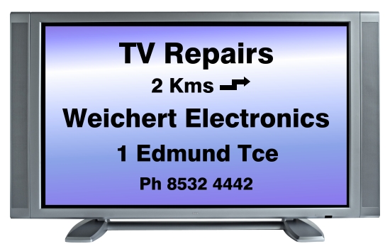
Another coupla shots.
I have no idea what font to use for the name. Any suggestions?
And sorry Glenn, first of all I called you David, then I misspelt your name. 😳
Attachments:
-
The bottom one does it for me Roger…..probably not the most exciting sign in terms of using your creativity & design satisfaction but in my opinion simple does it in this case
-
Thanks Glenn,
quote :probably not the most exciting sign in terms of using your creativity & design satisfaction but in my opinion simple does it in this caseYes you’re right, it makes good sense. Like I wrote earlier, I had spent a lot of time learning some creative techniques which I wont end up using for this print, but I’m sure they’ll come in handy soon enough.
Thanks again for everyones help. 🙂
Regards, Roger
-

This is how it looks to me:
You are relying on special effects to convey a message, when you should think about the text itself.
Use an arrangement that people can read when they are driving past.
What is the main thing you want to sell?
Love….Jill
PS
Just realized this is for a backlit sign, so the retro TV might not be so hot.
Remember to keep it simple, keep it bold and legible.
Attachments:
-
Hi Jill,
Thanks for your input and I appreciate you going to all the effort with your example.
quote :You are relying on special effects to convey a message, when you should think about the text itself.Yes, that was true, especially in my first couple of efforts.
Graeme, John and Glenn pointed out the error of my way 🙂 … and that it wasn’t going to be easy to read, especially driving past at speed.I guess I am just trying to work out the best way to get the message across to potential customers … and remind previous ones, that the business is still there.
(?) Now this question is being asked with the utmost respect, so please don’t hear me arguing, I genuinely want to understand this subject.
I understand that the most “effective” ? “easily read” ? sign … is one with black writing on a yellow background … and then progressing down through various other colour schemes to ones which are less “effective”
So my question is … at what point and where, can we add other elements to give some individuality or uniqueness … without taking too much away from the message we are trying to convey?
eg. I just added the TV as a border because I thought the sign needed a border (and a TV seemed relevant 🙂 ) and the rest of the sign looked pretty boring, so I put a fill in the background.
quote :Use an arrangement that people can read when they are driving past.I had assumed that that meant the text had to be relatively standard and consistent, but from your example I see that the text can look a lot more exciting than what I’ve done, so thanks for that.
quote :What is the main thing you want to sell?Well, I live in an overgrown country town where everyone knows everyone else, or so it seems, and as the business has been here for 25 years and is already fairly well known, I want the sign to remind people driving past that the business is still here … and if people who are new to the district see it, and the sign has caught their attention … I want them to ask their friends, or workmates or neighbours “who is this Weichert Electronics who is advertising up on …?”
From my experience since being in business, just about all of my new customers come from referrals, but only after they have had their tv breakdown and then asked someone else who they would recommend to fix it.
Sorry for the long reply … so many questions 🙂
Thanks again.
Regards, Roger
-

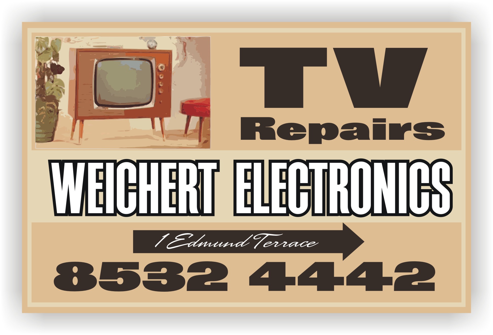
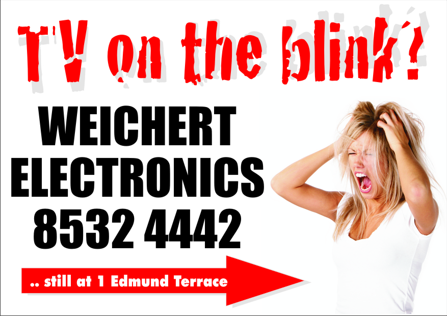
This is my take mate.
Something eye catching, the graphic tends to grab the attention, then they’ll possibly stop and read the sign. Not a lot of text, as they won’t have the time to take too much in if they are driving past.
Attachments:
-
I like that Shane. Thanks 🙂
quote :Something eye catching, the graphic tends to grab the attention, then they’ll possibly stop and read the sign. Not a lot of text, as they won’t have the time to take too much in if they are driving past.That’s my take on it too. I understand that people wont read all of it the first time they see it, or would even care less, unless they happen to have a crook tv at the time (unlikely).
The fact that the sign will be on the main road through town, that most of the town uses regularly, means that it will be in their face, day in and day out … with the hope being … that when they do need my services … my business will come to mind. 🙂
As I said above, this is an overgrown country town, so anything unusual is going to stand out and maybe even be talked about. So as long as it is tasteful, it should have some effect. ?
Just thinking … if it isn’t tasteful it would probably have more effect, especially around here … but I aint going there. 🙂
Thanks again.
Regards, Roger
-
I like that Shane
Roger …I hope you don’t feel like I have given you dodgy advice….I was really trying to offer ideas based around your concept.
Seeing Shane’s design obviously shows you can take this which ever way you want to.
I do think that your TV idea would look much better in the flesh than it does on here…once it was backlit I think it would be extremely effective 😀
-
Yup, Shane nailed it.
It’s simple, eye-catching, and effective.Signs don’t have to be just lines of text.
When I drew up my suggestion I forgot the part about it being backlit so the colors are all wrong!
While I agree that yellow with black lettering is always the most readable, sometimes it ends up looking like a traffic sign.
And you know how people ignore those.Shane’s sign could also be made with a picture of a crabby old housewife in curlers holding a beat-up remote (or rolling pin)
His suggestion has punch and humor rather than being stale-looking.
Love…..Jill -
Hi Glenn,
You wrote
quote :I hope you don’t feel like I have given you dodgy advice….Nope, not at all. You really helped me see that the way I laid out the text initially, was all over the place like the dog’s dinner.
I have a couple of different versions on the fridge to glance at from time to time, to see if I can think of any improvements, and after you pointed out the issues with the text, it became really obvious … whereas before I thought it looked fine.
quote :I was really trying to offer ideas based around your concept.Which was just what I was asking for, so thanks again for your input. I feel like I’m learning a little … just a bit too slowly for my liking. 🙂
Hi Jill,
Thanks for your reply too.
quote :Signs don’t have to be just lines of text.I know I’m missing something, but asking lots of questions is helping, even though a lot of them seem dumb after the event!
quote :While I agree that yellow with black lettering is always the most readable, sometimes it ends up looking like a traffic sign.
And you know how people ignore those.Yeah. That’s exactly what the thing looked like when I was finished, so I went fishing around trying to come up with something that would liven it up … without detracting too much from it’s effectiveness.
quote :Shane’s sign could also be made with a picture of a crabby old housewife in curlers holding a beat-up remote (or rolling pin)
His suggestion has punch and humor rather than being stale-looking.Yes, there are a few ideas that come to mind too, but I really like what Shane has done. It’s the sort of thing that would get some attention … and if the people don’t get it the first time they glance it … they’ll look a little harder next time they go past just to see what it’s all about. (well I would hope anyway 🙂 )
Thanks again for every ones help.
Regards, Roger 🙂
Log in to reply.
