Activity Feed › Forums › Sign Making Discussions › File Swapping › Help !!! What font is this?
-
Help !!! What font is this?
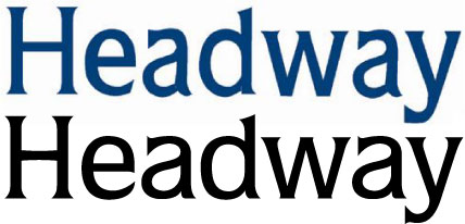
Posted by ruth on August 27, 2003 at 2:29 pmPlease take a look at this text and tell me if you know the font used and further if you could lend me a copy of that font I’d be eternally grateful. I’ve got the vinlymaster font detective and dispite it’s 5000 fonts I drew a blank.
Thanks in advance
Ramjam
Attachments:
 Mike Brown replied 20 years, 8 months ago 4 Members · 13 Replies
 -
13 Replies
-

I might be wrong but I reckon this text started life as Fritz Quadrata Medium and is a very badly done bastardisation of that font you can, if looked at closely, see the bits filled in on the a
-
I might be wrong but I reckon this text started life as Fritz Quadrata Medium and is a very badly done bastardisation of that font you can, if looked at closely, see the bits filled in on the a and d we get this annoying problem every day of the week
Steve -

I beleive it’s one of a family or fonts called ‘ITC Quorum’… 😉
-
JUST A MINUTE…. ROB… HELP… MY POST COUNTER IS BROKEN IT IS STUCK ON 296!! HAS BEEN FOR AGES IIT SHOULD READ 327,547 1 MORE THAN YOU!!
-

It certainly looks like Mike is right, there a good glyph map at http://www.adobe.com/type/browser/pdfs/QUOQ/QuorumStd-Medium.pdf
Whatever it did really start out like it looks pretty appalling now, I always find it quite worrying when people turn up with something like that, should you reproduce what they have, or set it in nice clean crisp type 🙁
-
That’s great guy, you sure know your fonts. Perhaps I’m missing something but what makes this font so bad? I can read it which is more than can be said for many fonts.
If anybody could ‘lend’ me a copy I’d be grateful, ramjam@battling.com
Thanks again
Ramjam -
I have it only as a dedicated *.VEF Signlab font – sorry… 😕
more soon
mikethesign
-
What makes it SO bad?
…there is generally a lack of consistency in stroke weight and curve smoothness
…the vertical stroke of the “a” doesn’t look like one continuous stroke, especially where the bowl connects
…the “c” finial is the wrong shape, as are the tails on the “a” and the “d”
…the serifs at the base of the “y” and the top of the “a” don’t appear to bracket nicely
the “H” just looks too light next to the “e”
…the vertical stroke of the “d” looks to be neither vertical nor parallel
Sorry about that , but badly drawn letterforms and dodgy knockoffs of perfectly formed fonts really get my goat.
BTW, I may have this as an Adobe Type 1, at work, or if it’s not too much text, I could set it and mail it as outlines??
-
Thanks Richard, I really had never examined a font in that way before. I tend to just go with what looks nice and suits the mood of the sign and the weight of the element concerned.
This particular font is already a part of the logo, and I need to type another word and a telephone number in this font. Could one of you guys take the trouble to send me an AI with
Headway Pembrokeshire
01437 765 764That would solve all my problems without me needing to install such an ugly font. following Richard’s assasination I’d never write a sign with it unless I really didn’t like the customer.
This post has been most instructive, thank you
-
While I have to say that I don’t really like Quorum (I see it was designed in 1977, perhaps it’ starting to look a little dated?) my criticism really was of the shape of the letters in the sample image, not of the original font.
The fact that both the “a”s have the same errors suggests that it has been vectorised, but without referring to the original font.
-
OK…where’s Edit gone? 😮
Let’s see if this is a better size 😳
Attachments:
Log in to reply.
