Activity Feed › Forums › Sign Making Discussions › Graphic Design Help › Help required with a poster
-
Help required with a poster
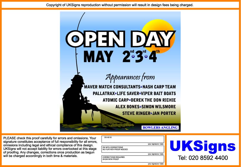
Posted by Kevin Flowers on April 21, 2009 at 6:55 pmHi
put this together but just not happy with it any help, suggestion much appreciated. EPS file attached if you fancy having agoKev
Glenn Sharp replied 15 years ago 10 Members · 17 Replies -
17 Replies

-

you are right kevin you forgot to put Hughs name on there 😀
-

Must it have a white background?
It just looks very bland and uninviting to me.
I think there is too much use of a casual font as well.
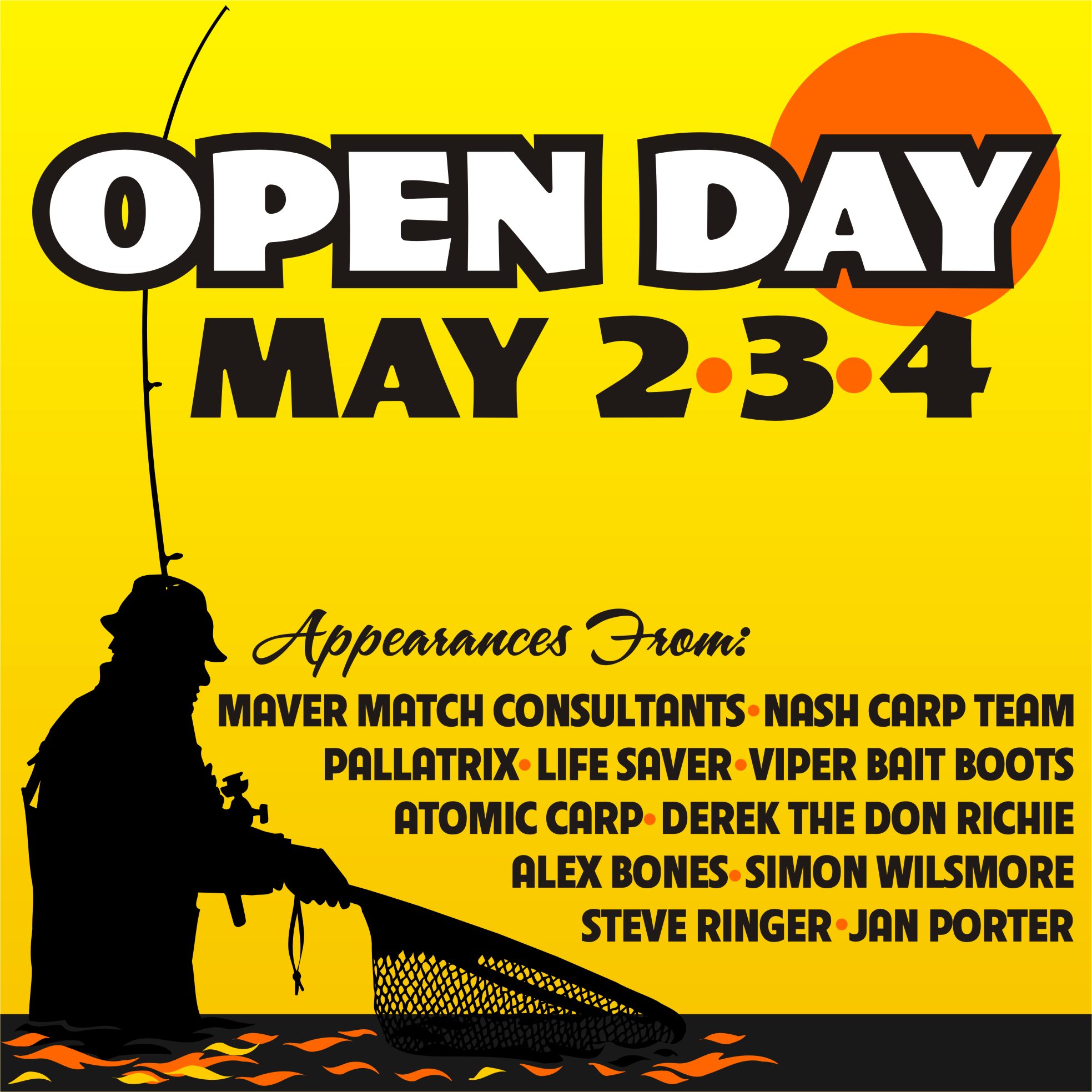
here it is with only a few tweaks.
Love….Jill
Attachments:
-

Jill
thank you very much, hope you don’t mind i have done a version of your design. Opinions pleaseKev
Attachments:
-

I liked Jills but yours is an improvement of the first
Lynn
-

Yep big improvement on your first Kev…
But I like Jill’s, the warm yellow/orange background works really well
-
I like Jills better too, but thought it was bad enough nicking her ideas without just stealing the whole design.
Kev
-

Im sure Jill will be flattered, otherwise she would not have posted……….She is in the UK soon, so poss payment in BEER……….Yup I like Jills design too, very warming and draws you in……..Think in addition to the colour, Jills font choice is softer…….
-

Jill has demonstrated that you don’t need the 2nd 3rd 4th
Just 2 3 4 is understandableBut a great improvement on the first
-
quote John Singh:Jill has demonstrated that you don’t need the 2nd 3rd 4th
Just 2 3 4 is understandableBut a great improvement on the first
John
i know that as soon as i show it to the customer he will ask for them, i’ll have a look at font choice when i’m on the main computer tomorrowKev
-
I know what you mean Kev
If the customer insists then its no big deal -
Kev feel free to use the whole idea.
But what you did looks far more inviting than the first one. I like how you did the water.
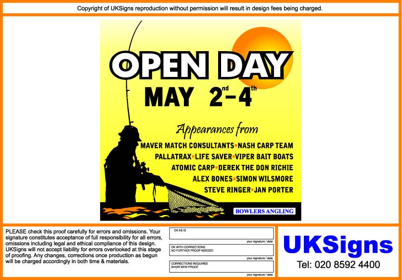
I didn’t think you needed the rd, th, etc.
My header font is a beta from Art & Signfonts called "Truckin".
They are also going to be releasing a font called "Jillbeans" real soon but it’s rather homely.
hahaha
Our Opening Day was just this past weekend, my younger son had a blast fishing for trout.
No problemo, I like it when a man listens to me!
It’s a rare thing. -
Thanks Jill,
here’s what i’ve got. This is for a opening day at a retail shop just done loads of signs for it will try & post some bits up soon.Kev
Attachments:
-
I wanted to put something down in the black panel on the bottom.
Glad you did!
PS
You also solved the rd and th dilemma nicely! -

I like that last one Kev……….I think the only thing that niggles me a bit about it is that the text runs too close to the fisherman. I think if you increased the margins slightly (left & right) it would make it just a little bit less cluttered
Looks good though and nice idea Jill 😀
Log in to reply.
