Home › Forums › Sign Making Discussions › Graphic Design Help › Help required with a poster
-
Help required with a poster
Posted by Kevin Flowers on 21 April 2009 at 18:55Hi
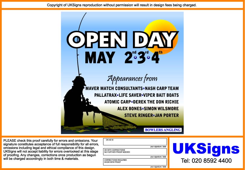
put this together but just not happy with it any help, suggestion much appreciated. EPS file attached if you fancy having agoKev
Glenn Sharp replied 16 years, 7 months ago 10 Members · 17 Replies -
17 Replies

-

you are right kevin you forgot to put Hughs name on there 😀
-

Must it have a white background?
It just looks very bland and uninviting to me.
I think there is too much use of a casual font as well.
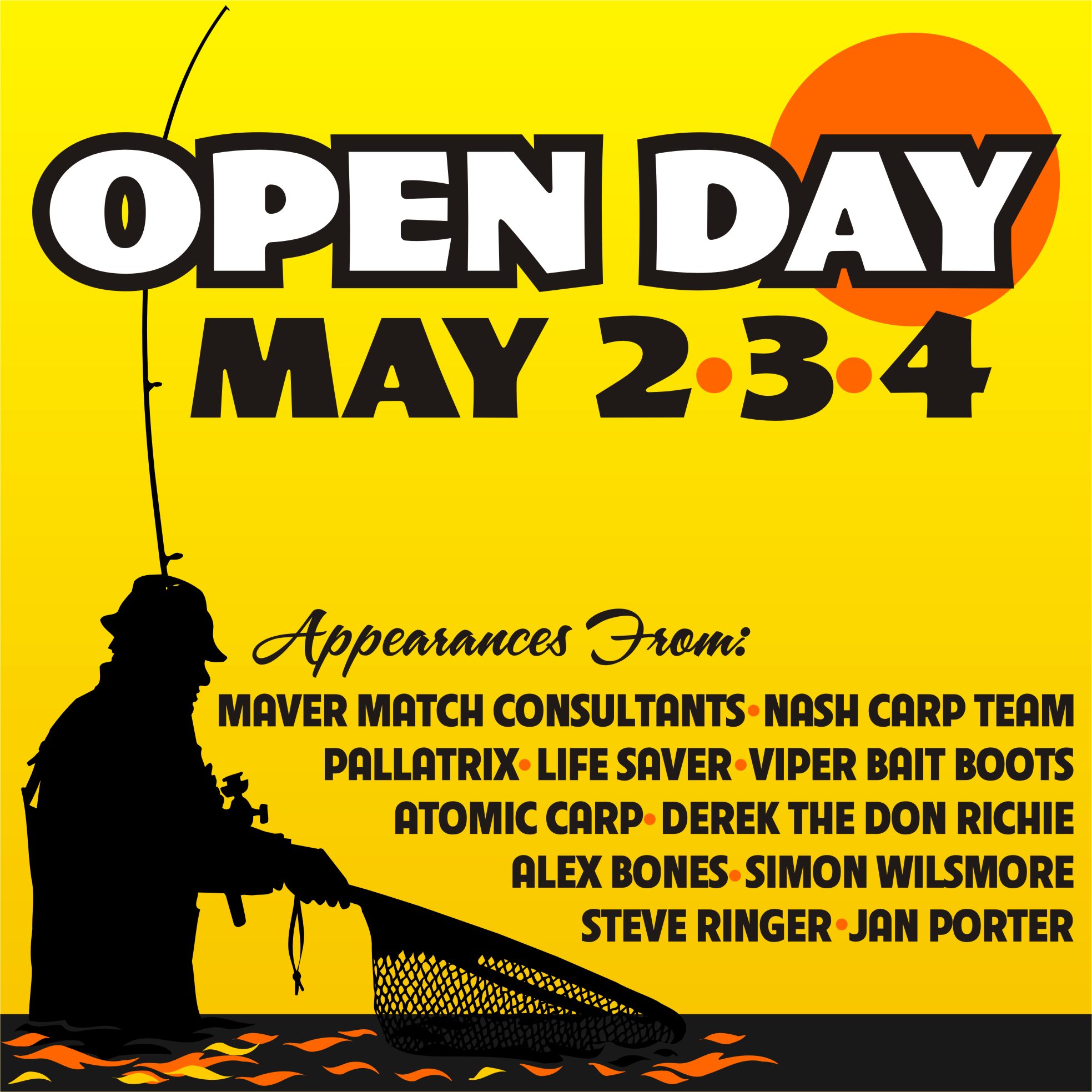
here it is with only a few tweaks.
Love….Jill
Attachments:
-

Jill
thank you very much, hope you don’t mind i have done a version of your design. Opinions pleaseKev
Attachments:
-

I liked Jills but yours is an improvement of the first
Lynn
-

Yep big improvement on your first Kev…
But I like Jill’s, the warm yellow/orange background works really well
-
I like Jills better too, but thought it was bad enough nicking her ideas without just stealing the whole design.
Kev
-

Im sure Jill will be flattered, otherwise she would not have posted……….She is in the UK soon, so poss payment in BEER……….Yup I like Jills design too, very warming and draws you in……..Think in addition to the colour, Jills font choice is softer…….
-

Jill has demonstrated that you don’t need the 2nd 3rd 4th
Just 2 3 4 is understandableBut a great improvement on the first
-
quote John Singh:Jill has demonstrated that you don’t need the 2nd 3rd 4th
Just 2 3 4 is understandableBut a great improvement on the first
John
i know that as soon as i show it to the customer he will ask for them, i’ll have a look at font choice when i’m on the main computer tomorrowKev
-
I know what you mean Kev
If the customer insists then its no big deal -
Kev feel free to use the whole idea.
But what you did looks far more inviting than the first one. I like how you did the water.
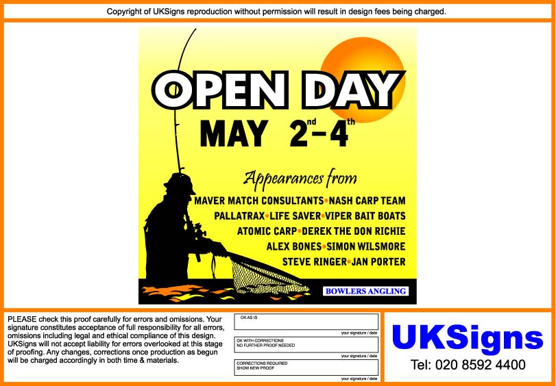
I didn’t think you needed the rd, th, etc.
My header font is a beta from Art & Signfonts called "Truckin".
They are also going to be releasing a font called "Jillbeans" real soon but it’s rather homely.
hahaha
Our Opening Day was just this past weekend, my younger son had a blast fishing for trout.
No problemo, I like it when a man listens to me!
It’s a rare thing. -
Thanks Jill,
here’s what i’ve got. This is for a opening day at a retail shop just done loads of signs for it will try & post some bits up soon.Kev
Attachments:
-
I wanted to put something down in the black panel on the bottom.
Glad you did!
PS
You also solved the rd and th dilemma nicely! -

I like that last one Kev……….I think the only thing that niggles me a bit about it is that the text runs too close to the fisherman. I think if you increased the margins slightly (left & right) it would make it just a little bit less cluttered
Looks good though and nice idea Jill 😀

Log in to reply.