Activity Feed Forums Sign Making Discussions Graphic Design Help help please with shop front design?

  • help please with shop front design?

    Posted by Hugh Potter on July 7, 2007 at 8:28 am

    hi all, have got a job to rebrand an existing shop which has just been taken over by new owners,

    they sell kids clothes, but are moving away from the ‘market quality’ clothing, to the brand names (quick silver etc) you see on the high st, there is currently no shop in my town supplying this, so people shop in the big towns nearby,

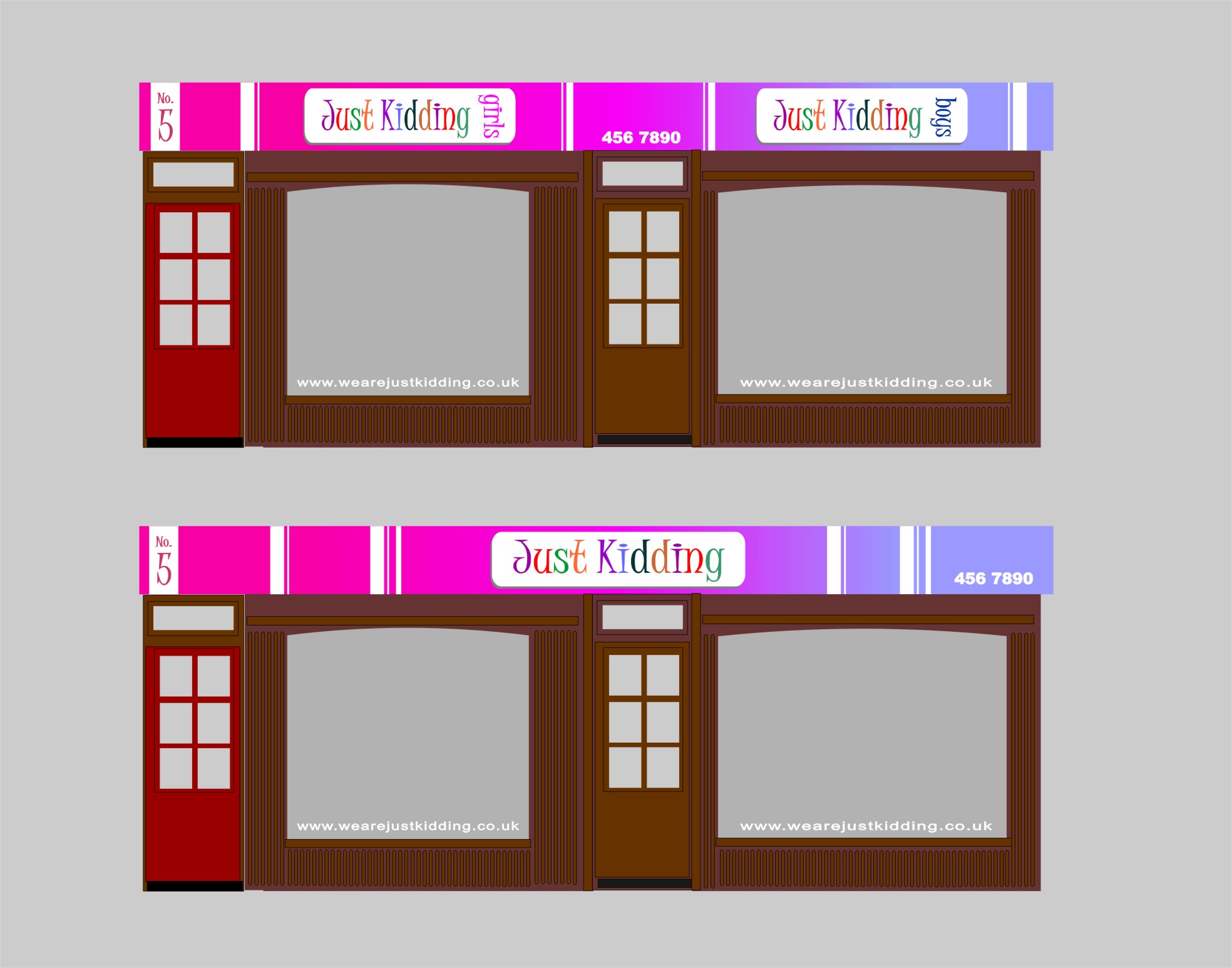
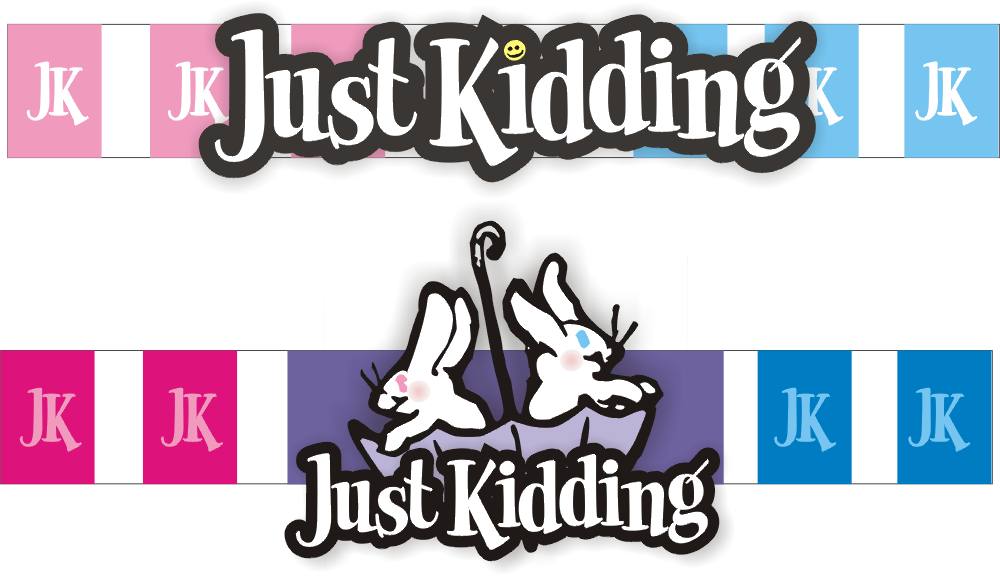
    their internal deco idea’s are set now, white walls, with vertical strips (uniformly random 😮 ) on each side, boys (blue stripes) and girls (Pink stripes) on opposing walls, and a violet on the end wall for babies clothing etc.

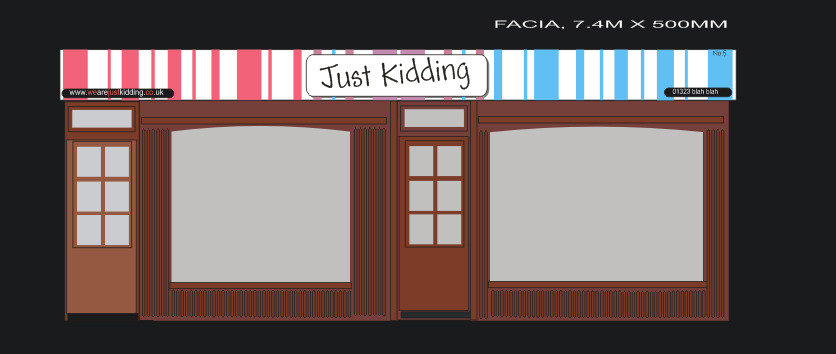
    they want to try and convey this image to the outside too, the building is part of the towns ‘conservation’ area, ie the buildings are old and listed. this means the building itself cannot be messed with, but the sign can pretty much be what we want, well, looking at surrounding properties, this seems the case.

    ok, the design below is just a rough idea we arrived at after a long discussion during the initial meeting yesterday,

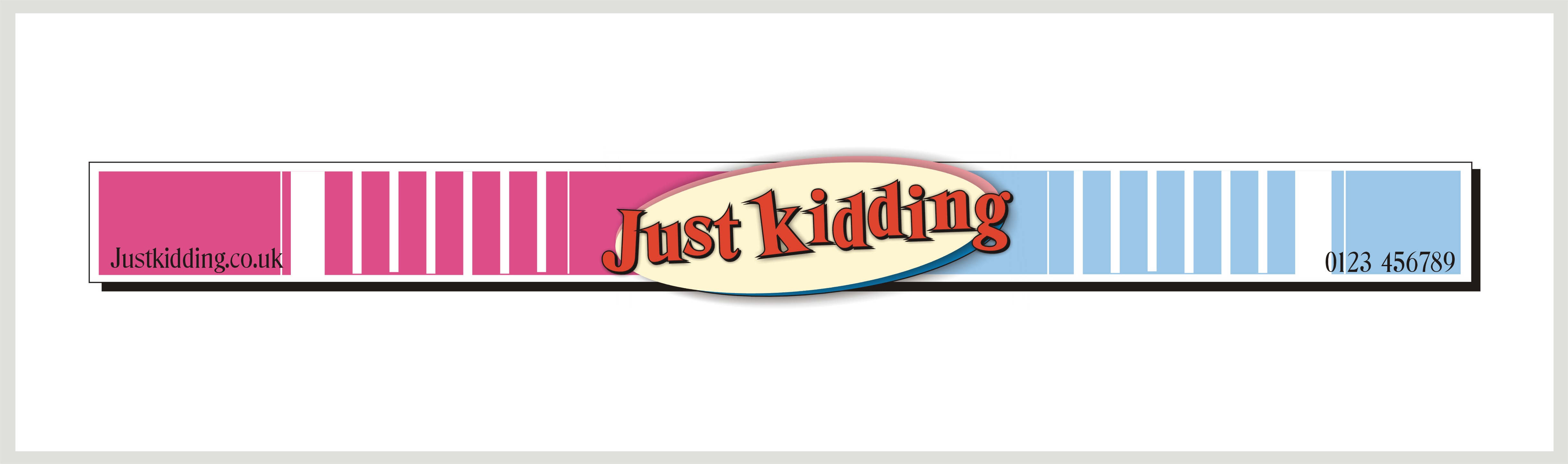
    vertical stripes on the white rear dibond panel, reflecting the colours inside,

    the name ‘just kidding’ needs to be in a child-like font, but legible, the font they showed me was hard to read, so for now, i’ve substituted it for ‘andy’. single colour on white seems easiest at mo, purely to keep it from being too busy or clashing with the rear panels,

    the panel the name is on, is going to be on stand-offs, aprx 25mm, this is so lighting (prob ledeon) can be retro fitted when they’ve sought permission.

    basically the customer wants modern, high impact ‘city’ signage, his budget isn’t enormous, but i know for the right sign, they’ll go further,

    i would like to give them what they want, obviously.

    print is not out of the question, infact anything that gives this sign an advantage over the rest is a good thing, but i’m not very good with fancy effects in photoshop / corel photo etc,

    any suggestions would be appreciated.

    both ai (ver6) and cdr12 are attached for your perusal !

    thanks.

    Hugh

    Saph-D replied 16 years, 10 months ago 6 Members · 9 Replies
  • 9 Replies
  • Glenn Sharp

    Member
    July 7, 2007 at 2:58 pm

    A couple of options Hugh…….I haven’t got a great choice of fonts on my laptop at home but I’m sure you get the idea


    Attachments:

  • Martin Cole

    Member
    July 7, 2007 at 5:21 pm

    just a play around Hugh, might be of some help 😕


    Attachments:

  • Hugh Potter

    Member
    July 7, 2007 at 5:31 pm

    thanks guys,

    i like your first one glenn, has got me thinking !

    Martin, looks nice, i wanted to go oval with the name panel to begin with, mainly because i’m doing a rectangular stood-off panel around the corner ! they wanted rect’ but i think i’ll show them that !

    all ideas much appreciated !

    thanks again.

  • Lynn Normington

    Member
    July 7, 2007 at 5:37 pm

    george 🙄 that would be Martin then :lol1:

    Lynn

  • Hugh Potter

    Member
    July 7, 2007 at 8:07 pm
    quote Lynn:

    george 🙄 that would be Martin then :lol1:

    Lynn

    that’s what i said, George ! 😳

  • Hugh Potter

    Member
    July 9, 2007 at 10:39 am

    ahem, :crazy: bump :crazy:

    off to see the customer again in the morning, any further idea’s welcomed.

    ps, Martin, yours is really growing on me, especially the center piece, hope the customer will reconsider the oval option ! thanks !

    ta Hugh

  • Jill Marie Welsh

    Member
    July 9, 2007 at 12:51 pm

    In typical Yank fashion, I think the shop name needs to be bigger.
    Here are two ideas…neither that great!
    🙂
    Love….Jill


    Attachments:

  • Hugh Potter

    Member
    July 9, 2007 at 1:08 pm

    i like what you’ve done with the pink and blue stripes in the background Jill, looks smart. the name idea looks good too, just not sure as they’d be able to go so big on the facia (permission wise, not physically).

    thank you for the input,
    Hugh

  • Saph-D

    Member
    July 13, 2007 at 1:11 pm

    Hi Hugh,

    Have you seen *Zachary* font ? it is very child-like

    Saph

Log in to reply.