Activity Feed › Forums › Sign Making Discussions › Graphic Design Help › help please with designing my new logo?
-
help please with designing my new logo?
Posted by LeeMorris on November 11, 2006 at 3:08 pmWell here is an idea for a name i designed, i spent ages changing it different ways . 3d letter, shaddows, shades, etc. but i think if you get to fancy it makes it hard to make out the name.
Well feel free to tell me how bad it looks.not sure if these letters are possible with a cutter with the change in shade
If anyone wants to have a go at designing it feel free
Cheers
LeeLeeMorris replied 17 years, 6 months ago 8 Members · 31 Replies -
31 Replies

-

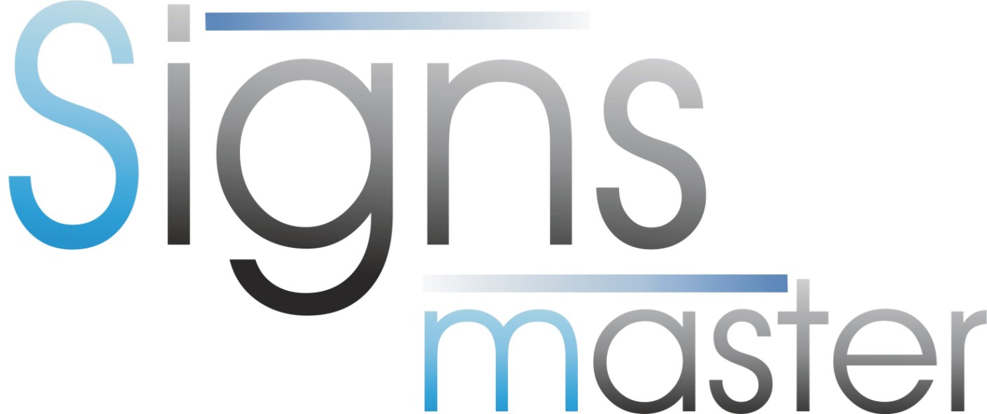
I think you’re right to keep it simple, and your first effort is not too bad. It is hard to design for yourself. That said, I don’t like the font. It’s far too common, it is actually the default font on my design software!
The fades you have used could not be made in cut vinyl alone, you would have to print.
One tip for logo (or any) design: work in black and white first, until you get the design you are happy with, then add colour.
Now I’m no great logo designer, but one thing I do is try to have some contrast. For example, this is the same basic thing as one of your logos, but using the contrast of a script and a more formal font together.
Attachments:

-

I’m 100% with Andy’s comments.
Your design seems very "ho-hum" to me.
Not that mine is much better.
And I’ve got to admit that your chosen name reminds me of self-abuse!
😳
But that’s just my dirty little mind.
A blend is possible on cut vinyl…you cut it, do not weed it, and spray a fade with Krylon aerosol paint. Let dry, then weed.
Wait at least a day before masking and apply wet.
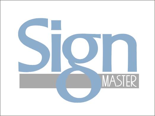
Here is what I came up with…not keen on the colors tho.
Love….Jill
Attachments:
-

Not alf bad Andy and Jill!!
I just find it a bit an ambitious name for someone just starting out with no experience,
-

Ok
some good points theredesign in black before adding colour
font
Name i know is a bit cheesy and i am a beginner, i’m open to ideas.
I think names are best not to complex or people can’t be bothered to read them
colours i do like blue and silver
I have a 206 xsi which i think would look really good with some silver writing on it.
all ideas welcome
Thanks for the input
Lee
-
The more i look at the logos the more i like them
Both good but i’m liking Andy’s more with a bit of colour would work well i think.
What fonts are they Andy
-

both designs could easily be altereed to read "Signs By Lee"
i know many companies use "master" in the name but i think its over used and a bit dated.
not saying by joe bloggs, by simple simon etc isnt… just… well… you know….
this is your business name… think long and hard, you cant change it like a hair do. 🙄 -
 quote Robert Lambie:both designs could easily be altereed to read “Signs By Lee”
i know many companies use “master” in the name but i think its over used and a bit dated.
not saying by joe bloggs, by simple simon etc isnt… just… well… you know….
this is your business name… think long and hard, you cant change it like a hair do. 🙄I like both logos and the other comments here mate.
Signs by Lee is a really good suggestion.
Lee, all of these sign guys and gals are top of their game. We are really fortunate here that we have some top class operators that offer free advice.
Best advice I can give mate is to look around at all the signs you see, make a decision in your mind what you like and don’t like about the designs you see, note how they have been designed etc.
Jill and others don’t usually stick to the free font list, but buy sign fonts that are striking and different. I do too now, following their lead.
I think both Andy and Jill have demonstrated how the same words can look so much better with the application of a well placed font.
Just my 2c’s. A good sign is not just a case of going to Corel and choosing one of the fonts on offer. It takes a bit of thought, otherwise your designs are no different to what mum and dad will do on publisher. And if they think they could do it, they aren’t going to pay you to do it for them, if you know what I mean.
Thats how most of the newbies got started here in the first place.
Sorry to go on,
Cheers
-

Just my tuppence worth, but ‘sign master’ is probably meant to evoke expertise & perfection of a subject that has been mastered, a tall order to live up to when you’re just starting out. I know it’s "just a name", but you’d expect ‘Eddie’s Fast Signs’ to be fast, ‘T.G. Signs & Designs’ to have design skills and I bet "Signz of London" isn’t in Glasgow.
Besides, I have a similar feeling towards it as Rob, ‘master’ is probably past it’s best, over used in this and in almost all fields of industry. Much like ‘expert’, ‘king’, ‘doctor’, ‘express’, ‘land’ or other validatory tag put onto every retail outlet & service you can shake a stick at. First thing I thought of was ‘Morrisigns’ or ‘Lee Signs’.Shane’s comments are good too, actually most of the comments from the members are wise & insightful – comes from years of experience by staying in business. Like most thing in life, money, knowledge or other things "It’s not what you’ve got – it’s what you do with it". Some of us may have software, plotters & printers that run into thousands or 10’s & 100’s of thousands of pounds – but without the skills to present a quality product that somebody will buy, it’s just a toy.
Use your resent investment of your membership & spend a day or two trawling the threads. Reading hints, looking at portfolios, seeing how products & suppliers get rated. This could honestly save you YEARS of hard work and bitter experience.
Dave
-
quote David Rogers:Just my tuppence worth, but ‘sign master’ is probably meant to evoke expertise & perfection of a subject that has been mastered, a tall order to live up to when you’re just starting out. I know it’s “just a name”, but you’d expect ‘Eddie’s Fast Signs’ to be fast, ‘T.G. Signs & Designs’ to have design skills and I bet “Signz of London” isn’t in Glasgow.
Besides, I have a similar feeling towards it as Rob, ‘master’ is probably past it’s best, over used in this and in almost all fields of industry. Much like ‘expert’, ‘king’, ‘doctor’, ‘express’, ‘land’ or other validatory tag put onto every retail outlet & service you can shake a stick at. First thing I thought of was ‘Morrisigns’ or ‘Lee Signs’.Shane’s comments are good too, actually most of the comments from the members are wise & insightful – comes from years of experience by staying in business. Like most thing in life, money, knowledge or other things “It’s not what you’ve got – it’s what you do with it”. Some of us may have software, plotters & printers that run into thousands or 10’s & 100’s of thousands of pounds – but without the skills to present a quality product that somebody will buy, it’s just a toy.
Use your recent investment of your membership & spend a day or two trawling the threads. Reading hints, looking at portfolios, seeing how products & suppliers get rated. This could honestly save you YEARS of hard work and bitter experience.
Dave
-
Looks like thats a bad idea then
Sign by Lee just doesn’t seem right.
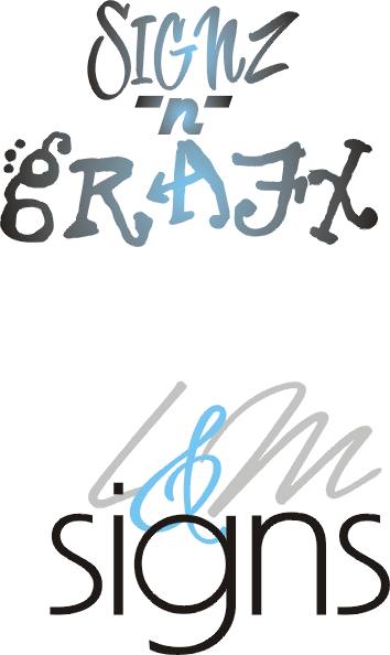
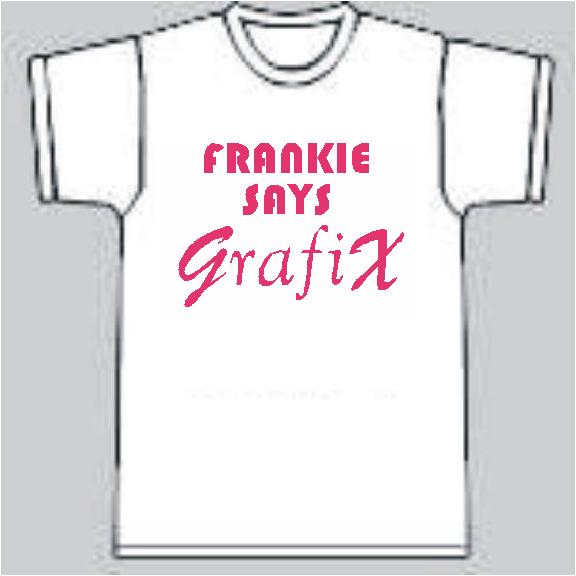
What about
SignZ & GrafiX
-
quote leemorris:…….What about
SignZ & GrafiX
Depends on the market you want to attract & image you want to project.
Get the market right & it can be great…get it wrong, yeh. Enough said.
It has worked really well for some members here although I’m personally not a fan of such things as ‘txt spk’, phonetics or…dyslexia 😉 except as a very specific design element.
If you get a killer logo to incorporate it in it can look really slick & professional giving you a design edge to sell with – if not, it’s just a gimmick from the guy that can’t spell.
Seriously, do a web search or Yellow pages to check out the names of the companies in yours & other areas, it’ll give you an idea as to how the market works in terms of company names.
-
quote leemorris:What about
SignZ & GrafiX
erm… sounds a bit cheesy to me. sorry 😳 You may already find it is used anyway. It is here anyway.. 😕
Morrisigns… very clever dave. You should do signs for a living mate…. 😉
-
…as a consumer I would be leery of buying a sign from someone who couldn’t even spell the word.
It IS cheesy, and more 80s than Wham!
Blecch.
Try "Lee’s Signs" or "Morris Signs" or "L&M Signs" (that way you get to use a cool ampersand)
Simple, to the point.
Any time I see the word Graphics I think of cheap vinyl stickers sold at the flea market…sorry.
love…Jill -
quote Jill Marie Welsh:…as a consumer I would be leery of buying a sign from someone who couldn’t even spell the word.
It IS cheesy, and more 80s than Wham!
Blecch.
Try “Lee’s Signs” or “Morris Signs” or “L&M Signs” (that way you get to use a cool ampersand)
Simple, to the point.
Any time I see the word Graphics I think of cheap vinyl stickers sold at the flea market…sorry.
love…Jillcome on Jill, don’t beat around the bush, tell us what you really think :lol1: :lol1:
Wham… wow… forgot all about them…..
-
Wake me up, before you go-go….
OK, which one would you rather buy a sign from Shane?
:lol1: :lol1: :lol1:
Attachments:
-
quote Jill Marie Welsh:Wake me up, before you go-go….
OK, which one would you rather buy a sign from Shane?
:lol1: :lol1: :lol1::praise2: L&M Ms Welsh definately…..
…. and please… no more singing… can’t get that darn tune out of my head now…. all that hair …. and white threads… what were they thinking…. 😕
-
Aha! (oops another 80s band)
What a great name!
(sorry about the ear worm Shane)
Attachments:
-
Well i think i best leave the name for now or i’ll end up named chedder.
Lee
Attachments:


-
Lee, no discouragement is intended. you are obviously incredibly keen to get going – and long may that drive continue as it’s basically essential to running a GOOD sign company. It’s easy to sit back & stay with the same concepts, designs & ideas that got you into the marketplace or be so concerned with an image it overtakes the rest of your business, that’s why there are some companies with 70’s & 80’s names & logos that creep along and others that have no consistency from year to year, redesigning logos in readiness for the next yellow pages ad. Get something that can stand the test of time. It might not be fancy, it might not be colourful – just so long as the name is memorable & the design says quality, service, reliability, honesty etc. As I’ve said before – what market do you want to attract and where do you want to be in a year, doing £50 transit liveries, £5 sunstrips & taking £20 to stick "£6995" on the sides of dealership Corsas? Yes, people do do that!
It’s NOT an easy game to get into, no I lie…it IS easy to get into. The hard part is STAYING. Get a reputation for good service regardless of your prices and your business will grow, people value a job well done, on time & with no fuss above getting jerked around for a dirt cheap job that comes in black, block text…get a reputation for just being cheap – well, reputations stick, good & bad.
You ARE going down the correct route, so good on you!! – making enquiries first, THEN getting kitted up. It irks a lot of people when "Hi, I’ve got a plotter where do I buy vinal and perpex from?" is swiftly followed by "I bought ‘brand x’ vinal for 50p a metre but it peeled of my mates van when he washed it". You have a marvelous resource here in the form of the archives. Looking for resources there can REALLY help a new start as it helps us who are more established!
Dave
-

Everyone chases every bit of work when starting. The trick is to work out which ones are profitable for you and learn to say no!
As for the name, I like the individual touch and came up with a variation on what others have suggested.
Colin
Attachments:

-
i would try top settle on a name before trying anymore designs mate.
-
..definately nix the "7 Signs" idea.
It sounds like either:
#1 You are a Satanist
or
#2 You’ve only made seven signs
😉
love….Jill -
quote Robert Lambie:i would try top settle on a name before trying anymore designs mate.
My thoughts too Lee. Name first, then a design. Makes it easier for us all to help with a design if we have a name to work with… 😉
I’d stay clear of numbers because although I take Jills comment (better than 666 though 😮 ) it may also imply that you only do 7 types of signs. You’ll be forever explaining what you do 😛
-
Like the above posts – settle on a name, or at the bnare minimum the sound/’feel’ of one. It can be complete nonsense – just so long as people remember it!!
I’ve robbed my artwork graveyard & thrown together a few ideas in my tea break.
Sort of a starter for 10…
Dave
Attachments:
-
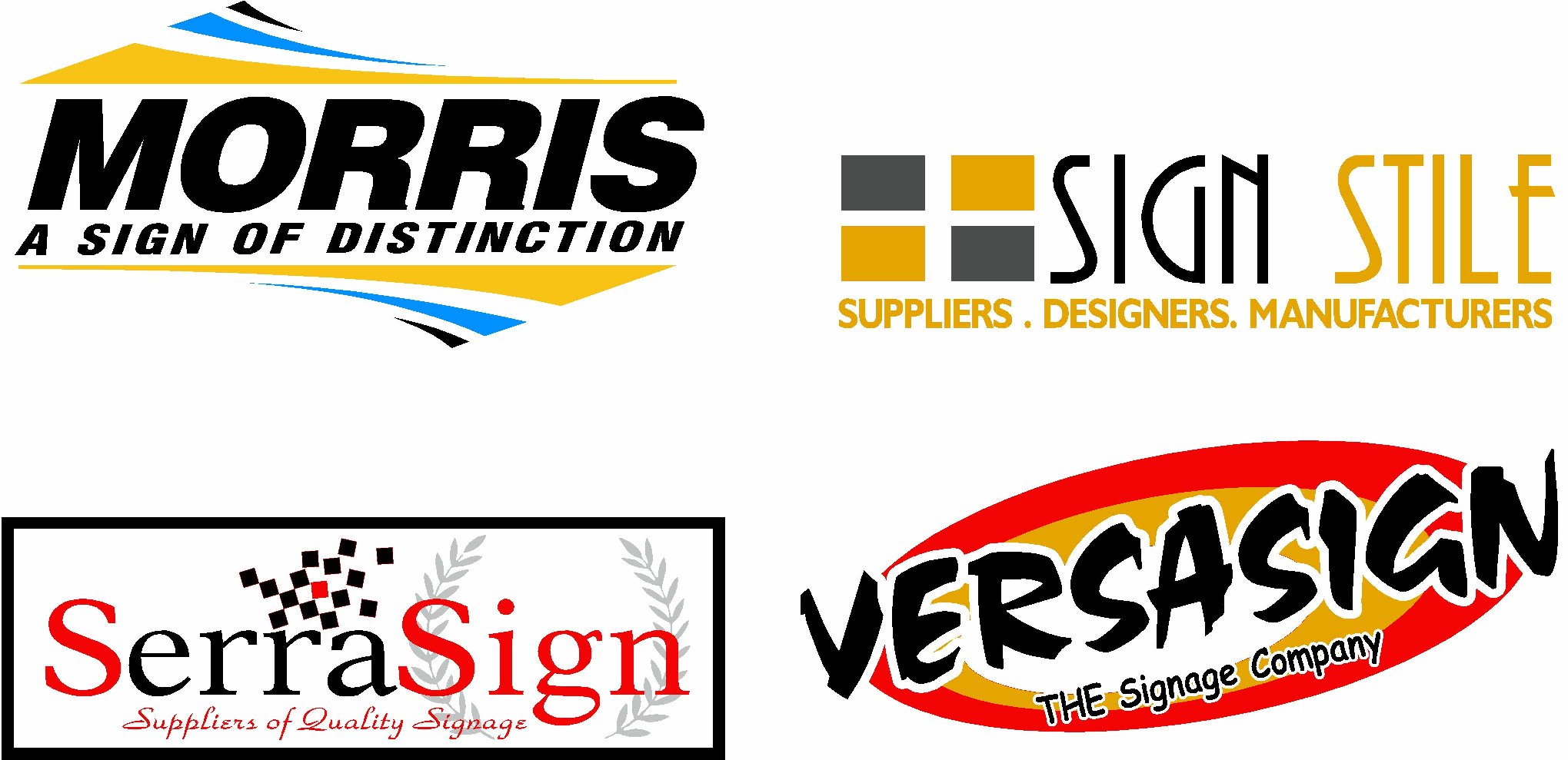
Thanks for all the ideas .
Really liking the serra sign and versa sign.
I think i will prob get the Graphtec 610 cutter , still not sure on software


Log in to reply.
