Activity Feed › Forums › Sign Making Discussions › Graphic Design Help › help please trying to get a traditional look?
-
help please trying to get a traditional look?
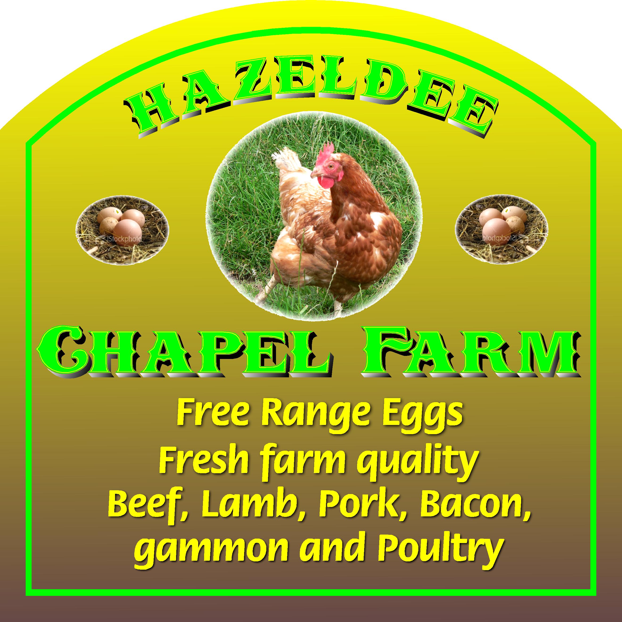
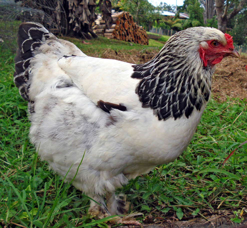
Posted by Peter Normington on July 13, 2007 at 9:52 pmI am trying to get a sort of traditional look to this one,
The farmer is very old fashioned, but his produce is second to none.
the chicken is his own and the eggs will be as well, so they have to stay.
just asking if I am on the right track, and for any suggestions on improving. I still have to do some work on the shadows etc.Any help comments welcome, and please ignore the caps and lower case errors,
I copied the unmodified pic!Peter
Attachments:
 Jill Marie Welsh replied 16 years, 10 months ago 10 Members · 22 Replies
 -
22 Replies
-

Printed Terry,
But I would like to try and paint it as a project, when we go to Wales,
May be to much for a novice like me, but with the help of the experts, maybe would be a good learning experience?
Peter
-

I like it……curve the text a few scrolls offset drop shadows strokes + strokes on shapes gold red incl graduated fill
Attachments:
-

a background of Burgundy brown or green will all work with the beige text
and look traditionalwhatever blows yer frock up ..
I would outline the pics in the background colour before setting
them on the black panelTerry
Attachments:
-

the chicken is his own and the eggs will be as well,
Now that is a scientific breakthrough!
:lol1: :lol1: -
 quote Andrew Boyle:Ye Cannae Shove Yer Granny Aff a Bus! 😀
shut yer p@ss :lol1: :lol1: :lol1:
nik (thats what i used to sign) 😉
-
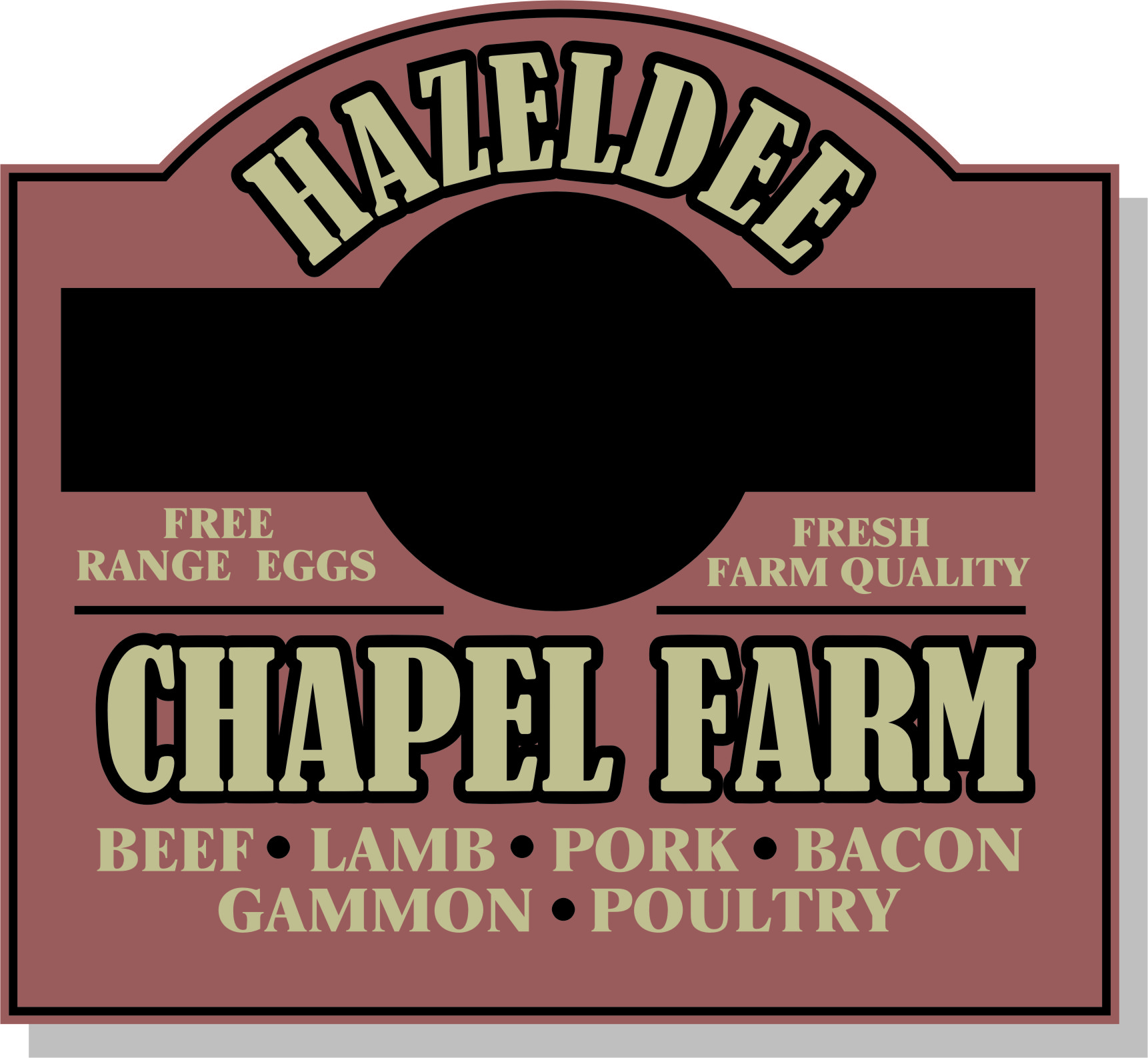
Thanks guys for the suggestions, I showed farmer Doug some alternatives based on your input, which I though were an improvement on my design.
any way he has now made up his mind, and I will post a picture of the actual sign when I make it.
By the way this is what he has at the moment…Peter
Attachments:
-

Peter, your color combos are kind of odd (in my opinion) for a farm sign.
I would try to get a clip art of a good looking chicken, or filter the photo so it doesn’t look so much like a photograph.
As has been suggested maybe a nice rich burgundy rather than icky green.
After seeing his existing sign it looks as if he wants to emphasize the eggs, so my idea may not be so hot as it features a rooster.
Here’s a little something I threw together with a Stevo panel design.
Usually the panel shape should fit the text and pictorial better than what mine does.
I figured if I helped you with your first Letterhead panel I should help you with this one too.
Love….Jill
Attachments:

-
That’s lovely Jill, Thanks.
I agree about the green.
The green I am actually using will be a darker shade that it looks in the picture,
I thought my colour choice was in keeping with the theme though?
browns (earth) yellows (sun, hay/staw) and green for the obvious.Farmer Doug has taken some pictures of his own eggs (yes Karl, I know:D ) as he wants actual pictures, I did try to talk him out off it though.
He is calling round later to change a few details, and although he has now agreed the overall design I may show him some different colour combos as suggested.I did put a border/line round the pictures, as suggested by Terry, but Farmer Doug thought it made his hen look caged, rather than free range!
Jill, I have decided to try and do a panel based on this when in Wales,
as the meet is on David’s farm, it may give me some inspiration!Peter
-
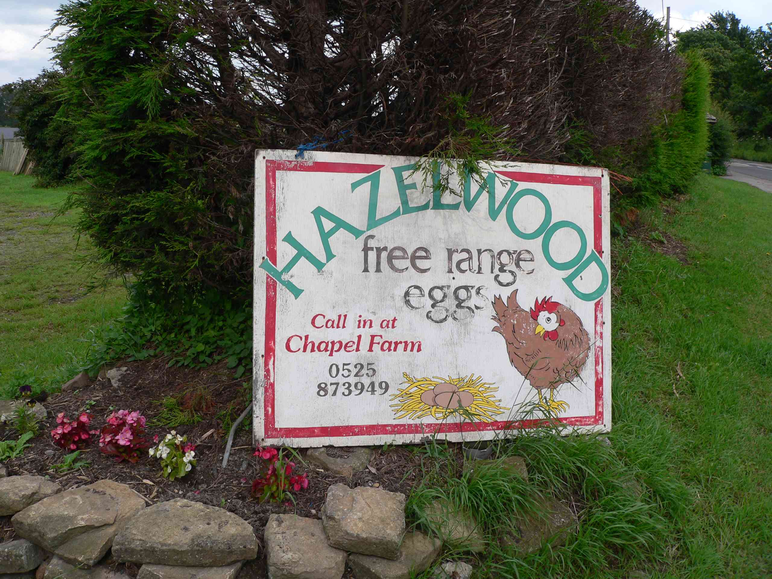
Peter-I’m nosy-can’t help but wonder why he’s changed from ‘Hazelwood’ to’ Hazeldee’?
Sorry 😳 🙂
Babs -
He breeds cattle and his name is D Hazel.
his Breed line was Hazelwoodbut a divorce meant asset distribution, his ex got most of the stock so he has renamed the line.
Peter
-
 quote Jillbeans:I would try to get a clip art of a good looking chicken,
Does such a thing exist? 😮 :lol1:
-
I think ive got one in my cluck art
nice one Jill you ole letterhead you
-
Peter, another thing I might suggest is to use an older-style font for the sub copy if you are going with the font you chose for the header.
You say you wanted colors from nature and that makes sense, but not so much in practicality as it can be hard to read with all muted tones.
Try putting a nicer border around the pictures, not just a line, and see how that goes. I know he wants them to look free, but does he also want them to look just pasted onto the sign?
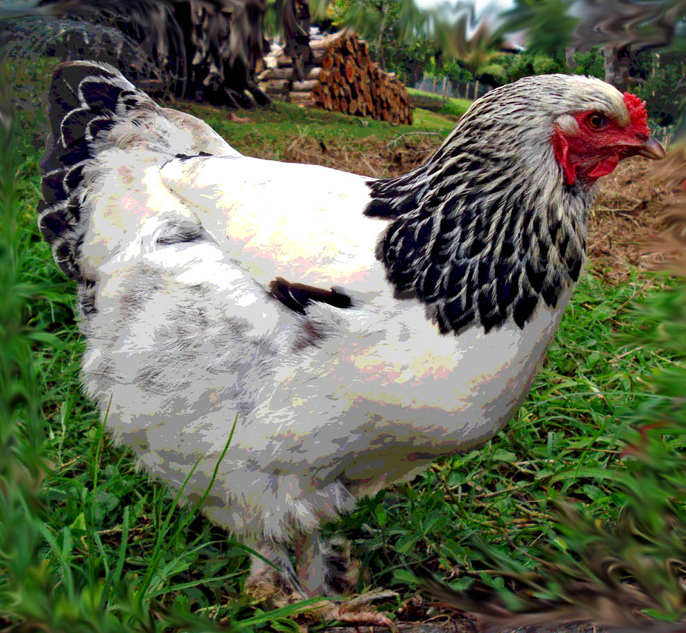
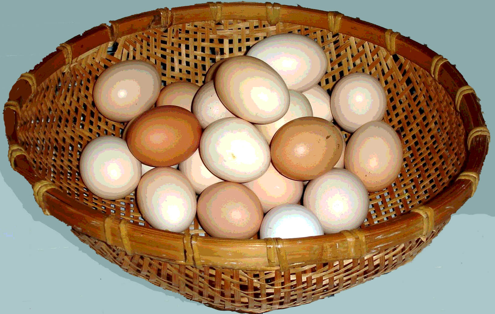
Here is what I meant by doctoring up a photo.
I took them into Photoshop and posterized them, then on the bird I smudged the edges, On the eggs I took out the dirty-looking floor.
Even putting his eggs in a basket or old crockery bowl would make a nicer picture.
🙂
Love….Jill
PS
I was wondering about the name change too.
PSS
Notice I only used "FARM" once on my version.
Attachments:

-

What about no pictures of chickens on the sign but separate pictures of his chickens around the base of the sign and on the grass to look like a load of ‘free range chickens’ walking around.
-
I thought of that too.
You could apply pictures to primed painted thinner plywood and jigsaw around them.
As long as the edges are sealed up well they would last a long time.
Neighbor kids might snitch them tho.One of the coolest farm signs I saw was down low in Scotland and it said TATTIES on it. It was a DIY sign but very charming.
Love….Jill -
Thanks Jill, I see what you mean,
I am going to have a play around with your suggestions later, just for my own benefit, unfortunately its to late now for this job. Anyway Farmer Doug is very please with what he is getting. I did try and steer him towards something a bit different though.I think the moral for me, is to show the idea to you guys, before the customer!
Thanks again all, for your input, I will try and put up another version later for your perusal.
Peter
-
Yes. always run it before us first Peter.
We have better eyes for signs than a farmer does.
(usually)
Here’s one last idea before I get to work.
(stevo panel again)
Love….Jill
Attachments:


Log in to reply.
