Activity Feed Forums Sign Making Discussions File Swapping Help Please – Remedy single font – yak

  • Help Please – Remedy single font – yak

    Posted by John Gregson on November 5, 2007 at 2:40 pm

    Hi All,
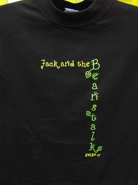
    I need some text set in remedy single if anyone has it. Horrible font but my client insists. Could you supply, as a coreldraw file or a pdf with all fonts converted to curves, the following text:

    Jack and the ( set normal, reading left to right in lower case apart from the letter J which is in caps )

    Beanstalk ( set reading down the page one letter below the last and so on in lower case apart from the letter B )

    SMSP 07 ( all letters in CAPS )

    I would normally buy the font but I can’t see me using this font again – ever!

    Cheers John

    John Gregson replied 16 years, 5 months ago 2 Members · 5 Replies
  • 5 Replies
  • Jamie Wood

    Member
    November 5, 2007 at 8:56 pm

    Here you go….and you’re right, it is bleeding horrible.

    Cheers,
    Jamie.


    Attachments:

  • John Gregson

    Member
    November 6, 2007 at 10:07 am

    Hi Jamie, Thanks for that, just what I needed. I really appreciate it and your pints get warm just sitting here.

    Cheers John

  • John Gregson

    Member
    December 7, 2007 at 9:32 pm

    Hi Jamie,
    Thought I’d post a pic of the finished T’shirts. The font/layout and colour scheme were stipulated by the customer.

    The order of print was:
    Print Yellow then Green, wet on wet, flash dried in situe then print both colours ontop again.

    Only took 1 month to get the go-ahead from customer, then all of a sudden it turned into a rush job – as per normal.

    Thanks again for typing out the text.
    Cheers John


    Attachments:

  • Jamie Wood

    Member
    December 8, 2007 at 9:25 am

    Hi John,

    Thanks for posting. Good job…it actually looks better than I
    thought it would using that font!

    Cheers,
    Jamie

  • John Gregson

    Member
    December 8, 2007 at 10:21 am

    Hi Jamie,
    The pic really doesn’t do it justice – the colours are so vibrant on the black and the majority were kids sizes so that explains the choice of font. I think they were going for that hand drawn look.

    I was suprised too with how good they looked from a basic design when I printed the 1st one off.
    Cheers John

Log in to reply.