Activity Feed › Forums › Sign Making Discussions › Graphic Design Help › help please i would like my logo design changed?
-
help please i would like my logo design changed?
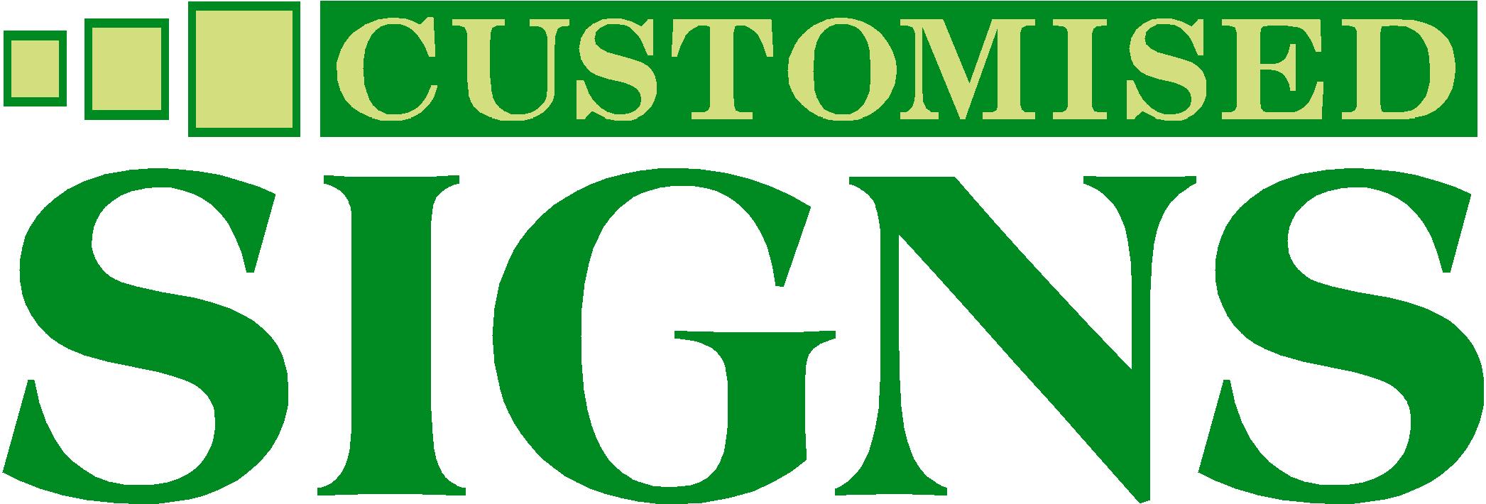
Posted by Scott.Evans on May 26, 2008 at 5:03 pmi show the logo i have been using at present in pic one.
i would like to change it, i want my new logo to be remembered with my old one as i have lots of signs up all ready and don’t want to be changing them all.
i would like the logo to look good Incorporated in a wrap.
after iam happy with my logo i will start designing my wrap.
😀
Jason Xuereb replied 15 years, 12 months ago 11 Members · 24 Replies -
24 Replies
-

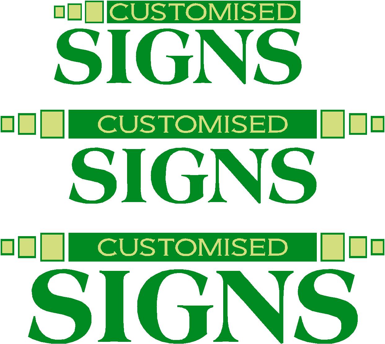
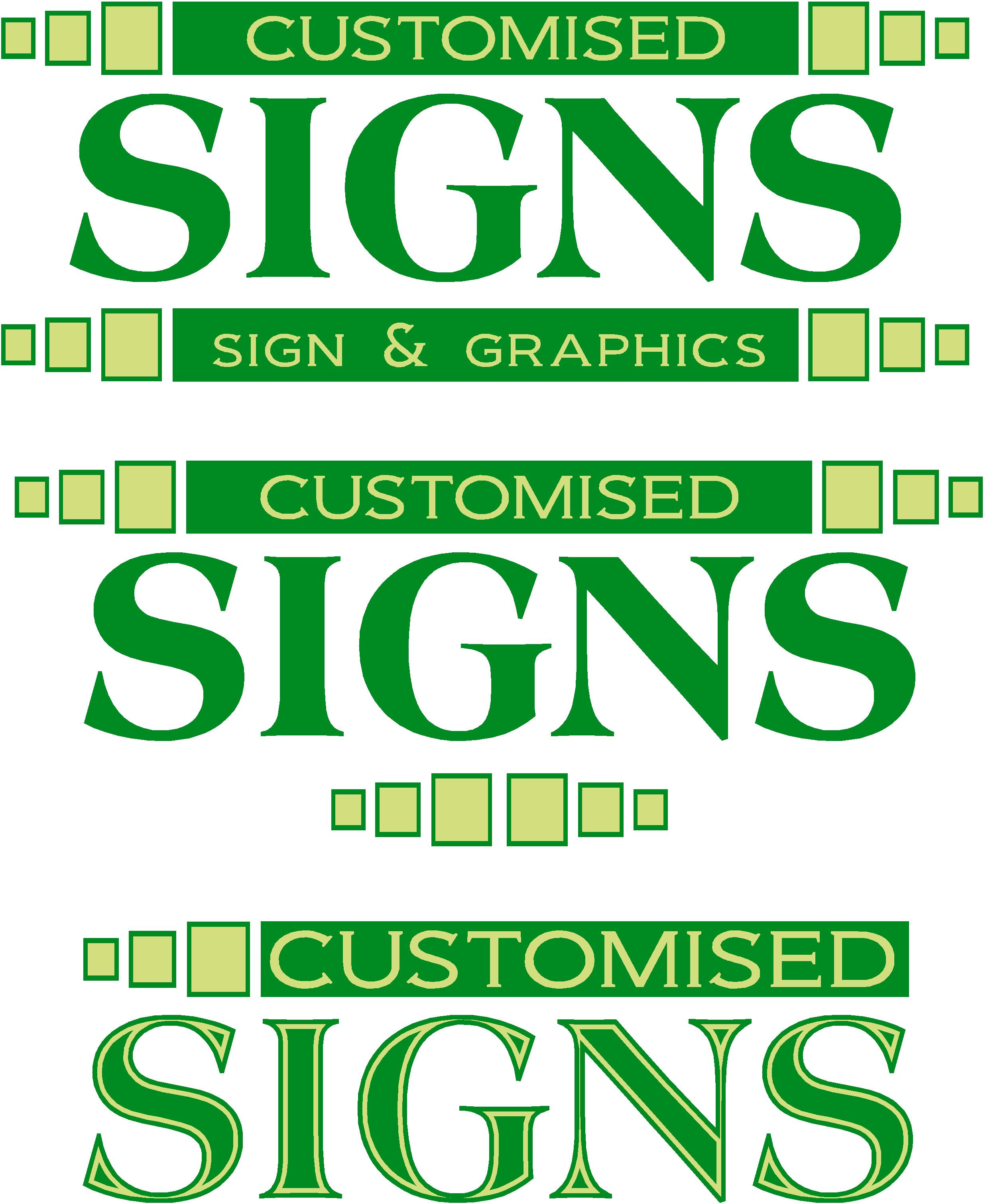
starting to put some ideas together.
all advice will be took on board.
Attachments:
-

I don’t think there’s too much wrong with that one Scott…
I think the only thing that hit me straight away was all the serifs
If it was me, I think I would try a simpler non serif font for the ‘customised’ text….and give it a bit more breathing space within it’s block
-
hi glenn see what you re saying.
what you think with this one
Attachments:

-

Hi Scott
I like the one in pic 1 more than the others.Lee
Attachments:

-

Scott – you say "incorporated in a wrap". Wrapping what?
Most logos can be made to wrap…of sorts…it’s all down to placement for the end result.
If you have a mock-up of your vehicle – it might be easier to see the potential merits or pitfalls in any particular design / placement combination.
Dave
-
hi david
wrapping a vivaro.
my current logo i cant seem to make it look right in the design. -

Scott,
I bet now you’ve said you can’t get your current logo to look right on a wrap, you’ll get at least one or two examples on here soon of how it mightn’t necessarily look bad but actually quite good.
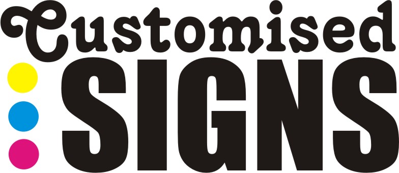
That said, if you are absolutely determined to change the logo I personally think the last example on 4.jpg looks really good.
Cheers!
Gareth
-
Scott,
I bet now you’ve said you can’t get your current logo to look right on a wrap, you’ll get at least one or two examples on here soon of how it mightn’t necessarily look bad but actually quite good.
That said, if you are absolutely determined to change the logo I personally think the last example on 4.jpg looks really good.
Cheers!
Gareth
-

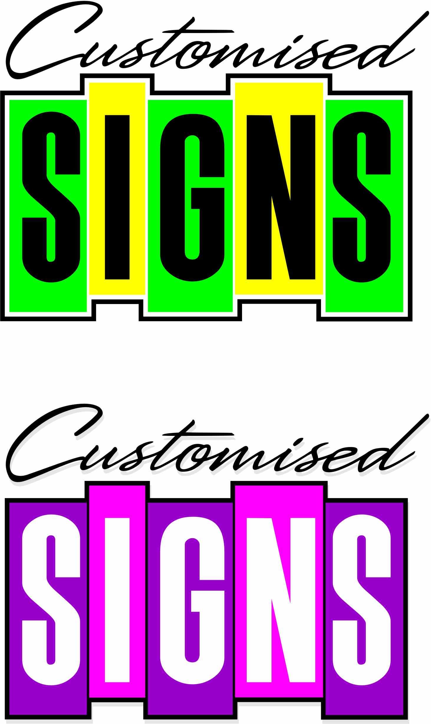
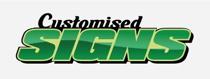
Tried a new color combo.
You could lay chrome vinyl over the customised to make it ‘customised’ 😀
Attachments:
-
first of all thanks for all youre replies.
Gareth-
Ive tryed lots of different ways to make it work on a wrap but just Cannot quite seem to get it. all feel free to have a go.Karl-
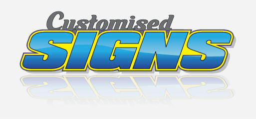
i like the the 2nd logo with that font "signs"Ian
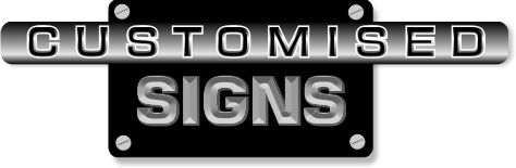
i can see where you are trying to keep the square in the design, but i am more for losing it now with a new logo unless i can cum up with a way to put it on a wrap.Jason –
that looks very good i like the fill in the "signs" with the blue.i was thinking of using one of the aurora designs with my vivaro wrap.
have any of you used the designs from aurora? if so what you think.will start adding some fills and 3d effects to my logo now. i think iam going to stick with this one>>>>
Attachments:

-

i personally think you shouldnt, i agree with glenns reply, its all fonts with serifs, which take away the look of the most important word "signs" cant give any layouts tonight, not got signlab on lappy, try waiting a couple of days for more suggested layouts 😉
nik
-
yes i definitely will nicola.
iam fitting up in Leeds tomorrow and Friday so will have a look at what you all think when i get back and start putting things together.thanks for all youre help
-

I’m sorry but there is nothing about that which says "customised" to me.
It’s rather sedate and bland.
I’d scrap it and move on.
You need something young and dynamic, but eye-catching.
The word SIGNS would do better in a sans-serif.
Here is something a bit retro. I know you’ll hate the pink version!
Love….Jill
Attachments:
-
I’ve got the firestore from aurora.
I’ve also see the half wraptrue graphics and they are of very high detail.
Also there duo chrome cd is full of nice high resolution files.
Enjoy.

Log in to reply.
