Activity Feed › Forums › Sign Making Discussions › Graphic Design Help › help needed with vehicle layout please?
-
help needed with vehicle layout please?
Posted by Neill Hague on June 5, 2007 at 3:29 pmHi all
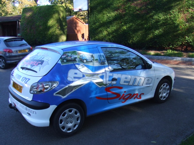
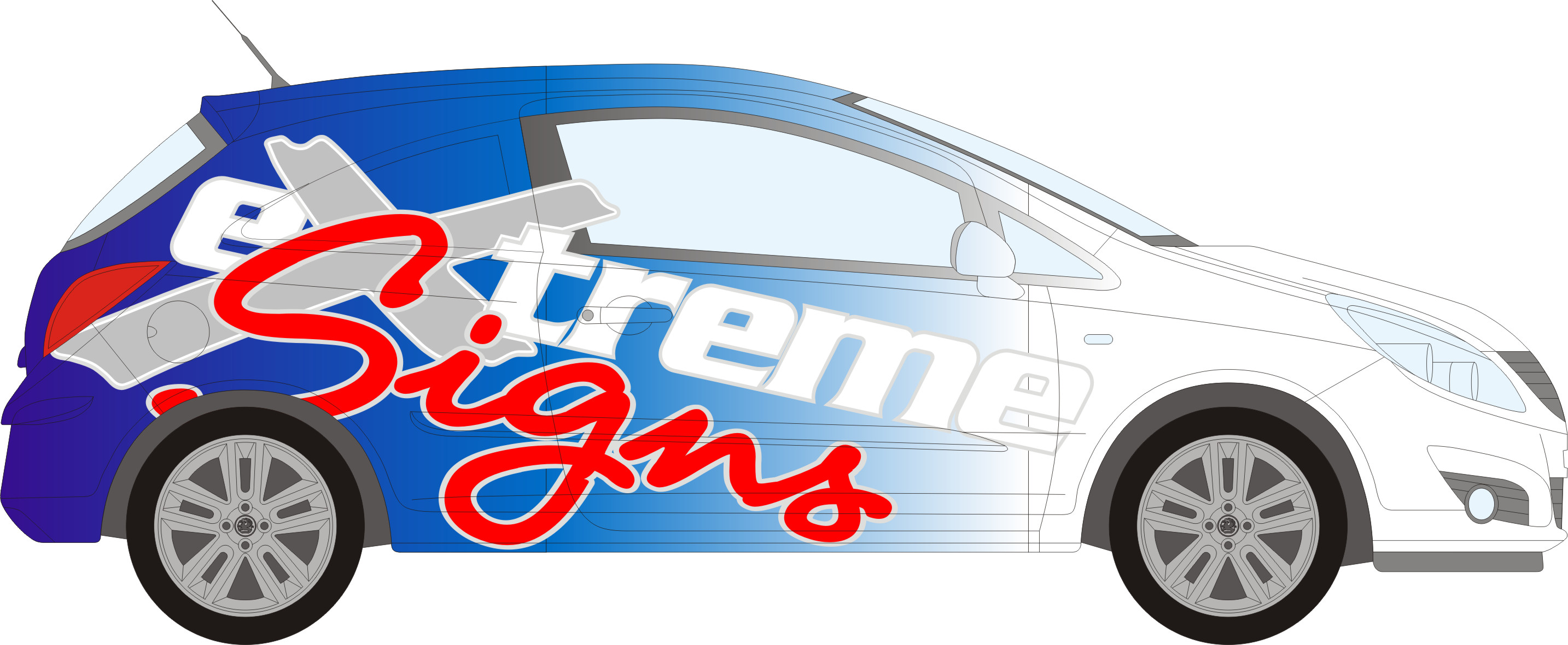
We have just ordered a new Corsa van & I could do with some suggestions/ advice please. I have attached a photo of our current 206 van, we like this but would like to liven it up a bit. Also attached a quick layout I did in Corel for the Corsa.One idea we had was to incorporate lightning bolts into the design, but my Photoshop skills aren’t the best at the moment (got to go on a course soon).
If anyone has any suggestions or ideas I’d love to hear ’em
thanks
Neill
Robert Lambie replied 16 years, 10 months ago 17 Members · 26 Replies -
26 Replies
-

My advice. . and it might not be what you want to hear. . . Leave it as it is !
Less is often more !
You have a cracking design. . forget the pictures of your work as per 206 and
do as per layout shown. . its uncomplicated, eye catching and will get you noticed. Customers can have a proper look at your portfolio later. !Anyway thats just my thoughts. .. look forward to seeing the finished van ! 😀
-

I would agree with Dave i love the old livery and people in and around your town are used to seeing it about. I would keep it the same
rich -

Hi Neill
Personally I like both of them just as much as each other. I also think that they are so similar it will still be recognised as the same company. I always feel that the word "signs" should either be big or bold so stand out as what you do.
Saying that I like the new design 5.376% more :lol1:
cheers
Warren
-

Great……………
I prefer the second one……….the type works better?
Cheers
Andrew
[tried to download ai but didn’t get it]
-

I prefer the layout of the second one but prefer the font you’ve used for "signs" on your existing van
Great eye catching design though
-

I like the second one more. Typeface and layout.
The change is not going have negative impact at all in my opinion. It’s a minimal change……………. only a signmaker will see the difference! 😉 -

I quite confortable with both… i must admit my collegues have actually tinkered with our logo to give it a new year look, although it was just background colours and some tidying up it still looks the same, just re-branded.
-

yup….the second one for me too….lose the pics and make sure you show a little more of extreme in the fade.
-

iam with harry with this one plus it in keeping with the vauxhall VXR theme
impressed
chris
-

Thanks for all your comments, much appreciated.
Now a new problem to contend with, looks like we have to get a silver van, a white one will take 2 months to arrive, & we need to have a new van by the end of the month.Looking at the front bumper, it might be easier to paint it white than wrap it. Or maybe incorporate silver into the design
back to the drawing board
Attachments:

-
if its going on to a silver van i might try printing to clear rather than white and will solve the bumper colour
chris
-
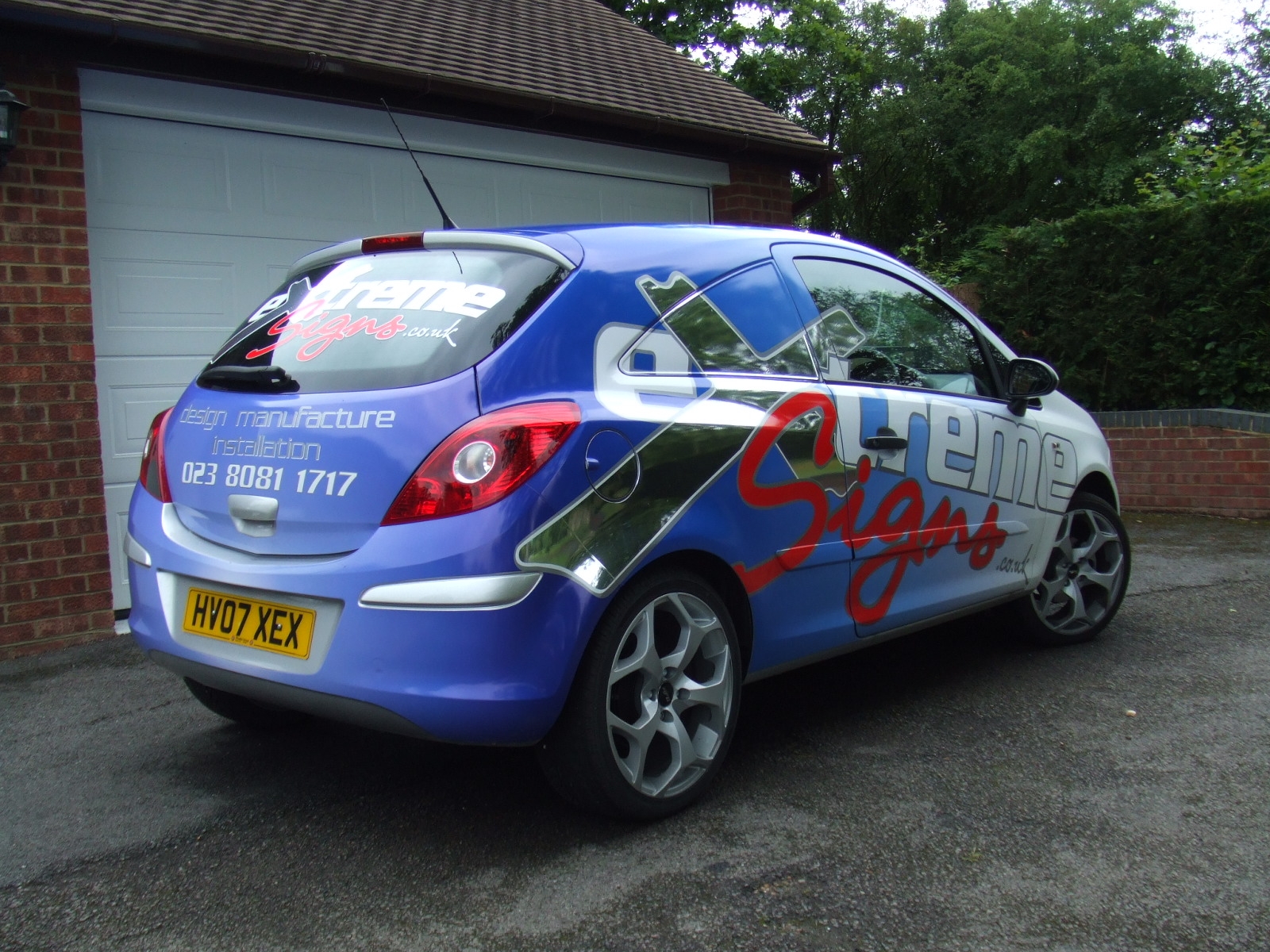
Hi all
as promised here are a couple of pictures of the finished van.
printed Avery Easy apply on our Jetster XL, wrapped it, then Mactac 9800 vinyl text/logos fitted on top.got to do the Renault Trafic now to match
thanks for looking
Neill
Attachments:

-

:thumbsup: very smart indeed …time for me to sort out my vans now me thinks
-
excellent………..looks as if you’ve really taken your time with it..
Cheers
-

No I’m not jealous…….
wish I could do half as good with my truck,
Peter
-
thanks all for your very kind comments.
The best thing was I didn’t have to fit it!
The van arrived the day before I went on holiday, so printed/cut all the bits & the guys fitted it while i was away.thanks
Neill
-

looks really good neil… good for you mate, i am sure that will bring you in plenty work! :thumbup2:
Log in to reply.
