Activity Feed › Forums › Sign Making Discussions › Graphic Design Help › help needed please with my company car layout?
-
help needed please with my company car layout?
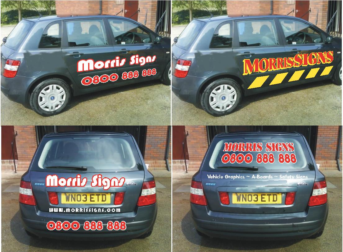
Posted by LeeMorris on April 16, 2007 at 6:40 pmWell some of you my know i have been trying to come up with a design for my car, i tried 3 different designs and this is what i got to at the moment.
Not the best photos
The letters are silver and bright yellow.
Nothing flashy just simple and to the point
Lee
David Rogers replied 17 years ago 12 Members · 24 Replies -
24 Replies
-

Lee I would get rid of the MS I don’t think those fonts work well together, also it doesn’t lead any where on one side it’s at the front the other the back ?? and not near enough to the graphic to mean anything.
Lynn
-

hhmm… must say Lee, doesn’t do much for me 😕 The two fonts don’t marry together very well at all unfortunately.
True: Its not flashy, and it is to the point, but I’m not sure it has the ‘wow’ factor that would encourage people to chose your company over the guy down the street, that has got something ‘flashy’, but also to the point….
Thanks for showing us though…
-

i have to agree mate…
as constructive crit:
i would loose the large MS, and try to focus on the name more.
the rest is fine as it is, as you said, its to the point.
if nothing else i would use the same font for "morris" as you have "signs" but i wouldn’t use anymore than a letter space between them as they are too far apart and almost disassociating themselves from each other. as you have them in complete different colours they could almost be read as one word and still read right.. -

Lee sorry but like the others have said it does nothing to make me remember you or want to use your services no matter how good you may be. I’m also not keen on the "signs" at the end of your list of services either, they are all signs of one type or another and this on the end to me just looks like you couldn’t think of anything else to put. I’m sorry I cant be a bit more helpful, hopefully someone else will be able to give you a few more pointers. I know you don’t want it to be to loud so to speak but as this is going to be one of your major advertising tools there has to be something to help sell your business.
If you like the large MS which most people have advised you to drop why not try and make it more prominent but less noticeable!!! Use a colour close to the colour of the car and do the MS as large as you can at an angle on each side with the other graphics over the top if you see what I mean, just another idea that may or may not work for you.
-

Sorry, but it all looks thrown together and incohesive.
Also, why did you not capitalize the "G" in Vehicle Graphics?
I’d go back to the drawing board, Lee.
Dad always said, if you are going to do something, do it right.
You want to put your best foot forward to attract potential customers.
Love….Jill -

Have to agree with everyone else on this Lee. Why have you used times for the majority of the copy? chuck that font away now or I’ll get the font police onto you!!!!
I would have used something like futura for the secondary copy and raised the dots between each item up so they run on the horizontal centre.
I would also have kept the name and tel number to the door and above the bump strip.
This sign game is quite tricky but you’ll get there but it helps to make a good initial impression with your own vehicle.
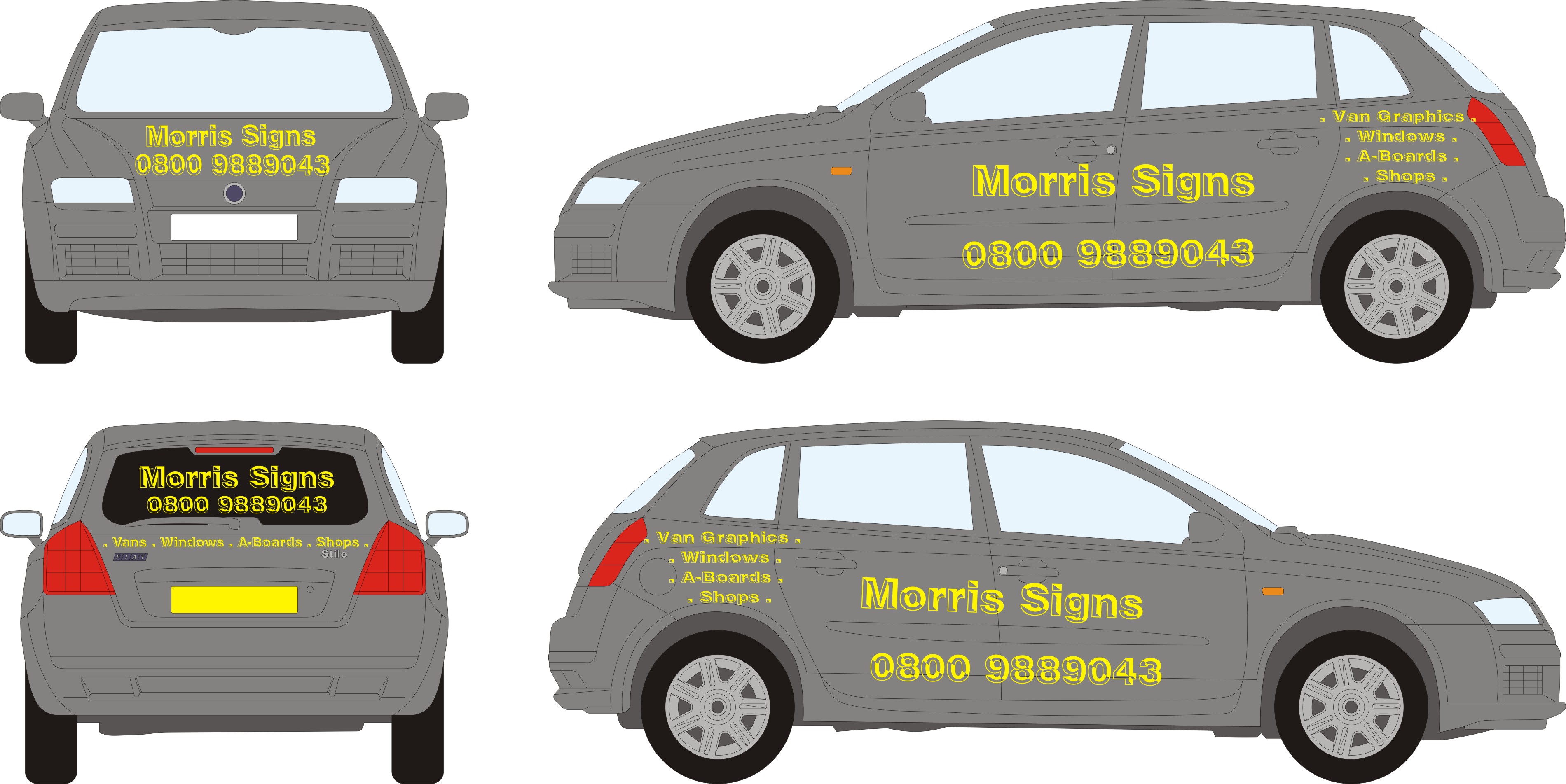
Just added a little design to get you started, might not be to your taste but it might help.
Neil
Attachments:

-

Thanks for all the comments although they hurt.
I have tried 3 different styles so far and what looks good on paper doesn’t always look good for real.
Will have to take another look.
Lee
-
 quote leemorris:Thanks for all the comments although they hurt.
I have tried 3 different styles so far and what looks good on paper doesn’t always look good for real.
Will have to take another look.
Lee
Just keep at it Lee, you’ll find something you like =). If I had a dollar for every time a design i loved was shot down, I would be a rich man. Eventually I only had one feeling left and he died lonely lol now I have none so you can’t hurt my feelings my picking on my designs =P.
-
I did the Morris and Signs that far apart because the key hole is in the way
Also i did have the name and number above the door but they look to squashed. -

Sorry Lee mate… doesn’t work for me either.
To be honest where I work I surrounded by designers and they slate my design work, so they get the best jobs now which saves me from getting slated and i stick to other things.
-

Lee, look at my lovely old people carrier on a previous post. I thought this was the best design anyone ever did and then after asking for constructive criticism on here realised that the tel no was too big, the ‘signs’ didn’t read (gns what?) and the colours were all wrong. That taught me to think I was the best designer ever!
Stick at it, or if you prefer, leave what you have done if you like it. If you like it, sod what everyone else thinks. You could get into a right muddle trying to please everyone else and never pleasing yourself.
-
That should read ‘taught me not to think I was the best designer ever’
-
 quote Gareth Lewis:You could get into a right muddle trying to please everyone else and never pleasing yourself.
that’s very true. Not everyone has the same opinion of what looks good.
But take on board the crits and try again. Instead of making things further apart to avoid a lock or whatever, just trim the vinyl around them (even if it means you lose a smidgen off a letter) it usually looks better 😉
When you look at other peoples designs they vary widely in how they see a ‘good’ design. Everyone has different tastes, but simple things like getting a balance on a design and having good negative space is important. 😀 -
Lee, don’t let it get you down, everyone has to start somewhere and designing for yourself is much harder than designing for someone else. If you don’t already have it I would start by buying "Mike Stevens" book, probably one of the best books on layout and design you can get, in my opinion well worth the money.
-
Also, its a greyish car, not a white van with plenty of space, our guys find it easier to work with white backgrounds as its easier.
When I think about what I would do, I keep thinking small and subtle due to what the car is and mainly that colour, getting a colour to work with grey and then trying to design something to it. Although I would end up with White and text.
-
Dave, just my opinion but I would stay away from white as much as possible, I just think that white tends to make things look cheap so I would rather use something like silver or cream instead. In this case Lee’s car is quite dark in colour so silver or even gold would work OK, there are also quite a lot of Grey colours that would probably work quite well.
-
yep.. i did think about the silvers.. anyway, i am digressing
-
Dave wrote:
anyway, i am digressing
Dave sorry to hear your not well, I hope you get better soon :lol1:
-
quote leemorris:Thanks for all the comments although they hurt.
Lee
Lee, take the criticism on-board mate. No one hates you, but to grow in this industry, you have to learn by your mistakes (and those of the others). Much better that your peers give you some gentle prodding here, than the customer think that you don’t have anything to offer them, and go somewhere else.
First impressions count in this industry. In this instance, that’s going to be your vehicle signage.
This forum gives you access to some red hot designers / sign peeps, but as some have said, you don’t have to take the advice if you think it does not work for you. That said, if the larger % don’t like it here, you can bet that will relate to the client base too. That will amount to no income in general terms, so you want to get the vehicle right first.
You can still make it simple and to the point, but negative space and font styles are an important ingredient to even the most basic sign.
Welcome to the sign game 😛
-
 quote Shane Drew:………Welcome to the sign game 😛
Kinda sums it up! Can’t please all the people all of the time…, but it’s not the best example of your work that’s been posted. Maybe a bit of impatience to get something on the car!
Like most others – not my cup of tea. I appreciate you are just starting out, but in all honesty, take a step back & be as dispassionate as possible about your own work. Would YOU be impressed and recommend it?
Your car will be the first point of contact for many of your potential clients, it should absolutely smack of the VERY best you can offer. It’s YOUR chance to make a mark.
Like a few of the good comments (learnt from years of experience) – white can LOOK cheap unless you use it carefully. Just ‘go to town’ of the design, throw in a few ‘design elements’, whether you make yourself a logo for the bonnet, do chevrons down the sides, rainbow chequers…. it NEEDS to be memorable enough to stick with them – yet classy enough to generate business!! Tough one I know, but you’ll crack it.
Dave
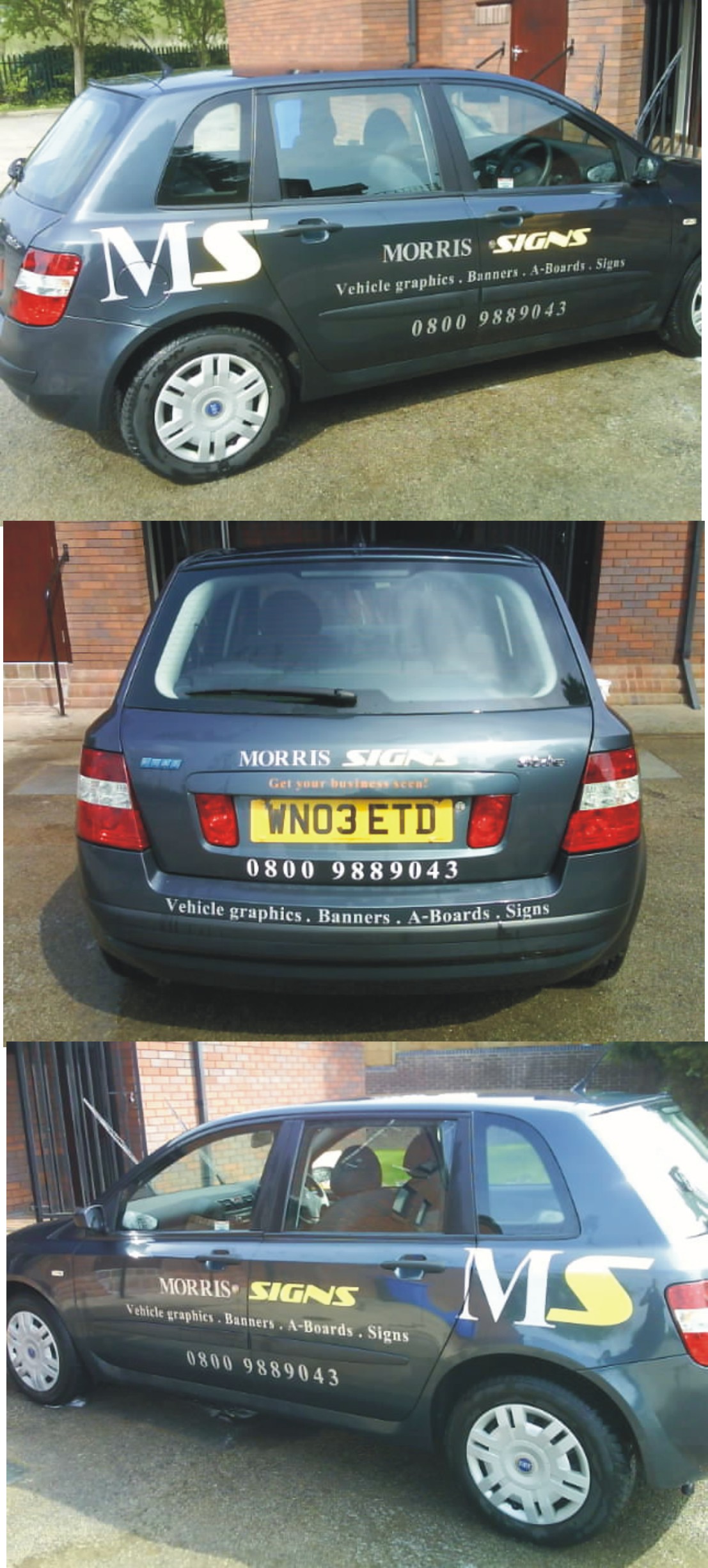
ps. Added a REALLY quick mock-up. Basically – who you are, what you do & how to contact you. Big, bold, ballsy…now is not the time to be subtle!!!
pps.
quote leemorris:……I have tried 3 different styles so far and what looks good on paper doesn’t always look good for real.Will have to take another look.
Lee
Why not try a digi photo & superimpose artwork. I do this for nearly all of my vehicle clients and without fail it make life, and the sale easier!! Some nice ‘square on’ pictures will give a good feel on a ‘real’ car.
Attachments:
-
Gareth i think your right you can’t please everyone all the time.
I knew it was still not right but didn’t really think is was this bad.
Any other ideas would be great although i don’t like flashy to the point that it looks cheesy.
Lee
-
Just been having a play with different fonts and layouts
This is a pain of a car to do there isn’t much room on the doors because the part by the handle kicks out about 4 inches and the text doesn’t look right over it.Any ideas would be great
Cheers
Lee
Attachments:
-
Lee, might I suggest you photograph YOUR car & superimpose the designs. It will allow you MUCH more detailed ‘tweaking’ and highlight any areas that may look off limits on an outline as feasible, or vice versa – eg. handle recesses, door strips. Will also give you ‘photorealistic’ impressions and save you design time as it WILL look like the layout – not ‘near enough’.
If I were doing this for myself, (CAD outlines are great for ‘impressions’) it would be done it on a photo of the real car.
Dave
Log in to reply.
