Activity Feed › Forums › Sign Making Discussions › Graphic Design Help › help needed please with church poster layout?
-
help needed please with church poster layout?
Posted by Roger Weichert on September 27, 2007 at 12:23 amHi,
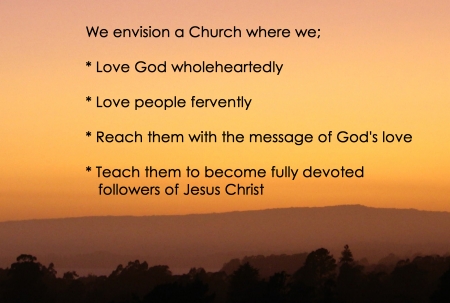
I’ve been asked by my local church to print a couple of posters 5 foot by 4 foot, to hang in the main auditorium.
The background will be a sunset in the clouds type graphic, with an area faded enough for the text to stand out. (five lines of text)
The font they asked me to use was “Century Gothic”, but when I pointed out that it is very fine and would be hard to read from any distance, they said just choose what I think will work best.
After reading all the comments in the threads about the ones not to use (comic sans etc) … I wondered what you guys would recommend using. 🙂
Thanks, Roger
Roger Weichert replied 16 years, 7 months ago 7 Members · 12 Replies -
12 Replies
-

hi roger…a wee layout of the design you have in mind would be a great starting point for folk to help you out….your post was like a bit of a ‘blank canvas idea’ and i bet you get loads of them from customers 😀
nik
-

Thanks Nik,
You’re right, 😀 and this is the area I feel least confident with.
Actually, now that I’ve tried lots of fonts, the century gothic is growing on me.
Anyway, I’ve attached a couple of files. I hope they appear ok.
Attachments:
-
Thanks Shane,
I was having trouble reading the century gothic while I was experimenting. It was getting lost in the clouds. 🙂
Now that I’m using a lighter, more even background image, I’m a lot happier with the results.
Thanks again.
-

1 for me aswell…but would it not look better centred ?
-

1 is much easier to read. Simple is best. IMO, centred would be less interesting.
"Love people fervently"??? Sounds a bit scary 😮 :lol1:
-
Thanks Glen and Bill,
Glen I tried it centred, but then it seemed to need an additional line for the third point, so I went back to this one.
Bill,
quote :“Love people fervently”??? Sounds a bit scaryHadn’t thought of it that way 😀 Wonder if they have?
Thanks for the input.
-

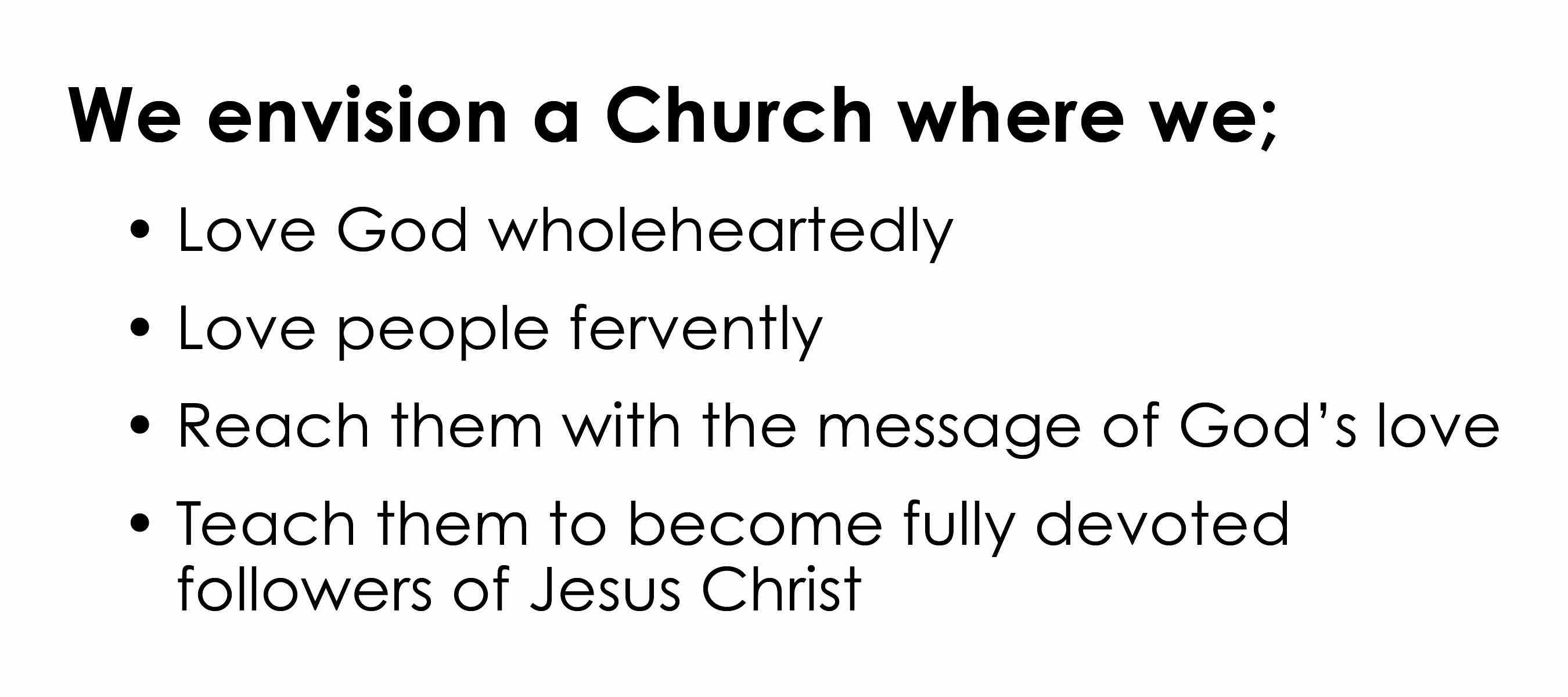
Here’s my take on it. I used Century Gothic Bold and Century Gothic. I would have used Kabel but I only have the Kabel Ultra. I think bullets look a little better than asterisks.
Attachments:
-
Hi Simon,
Thanks for that. In fact I’ve just come back from a friends place, and they had suggested something very similar, that I highlight the top line more, or increase the font size a little.
At least they didn’t bag these attempts like my last (which I wasn’t game to show here!!) 🙂
My top version is already (all) in bold, so I’ll try increasing the font a little on the heading.
I didn’t like the asteriks either, but I’ve been using Corel PhotoPaint and I haven’t been able to work out how to get bullets, and still use that font.
The learning curve has been steep enough already, but I’m going to persevere. All the help here is encouraging me heaps.
Thankyou to everyone.
Roger. -

I liked the initial one…looks real "churchy".
Bullets are easy!
Just make a circle, convert it to curves, and break it apart.
Love…..Jill -
On windows you’ll use an Alt key with a four digit code to get extra characters (accents and diacriticals). The one for bullets is Alt+0149 . On a mac, the key combo for the Bullet Character is Alt/Option+8.
-
Thanks Jill,
I’m not sure exactly how to do that, but I’ve found the book (if all else fails :oops:) so I’m sure your suggestion will head me in the right direction.
And thanks for that extra info Simon, I was about to try and start again, this time using Corel Draw, but maybe I wont have to.
Will tackle it in the morning … it’s already past midnight here and all these 2 and 3am mornings are catching up 😕 .. plus I’m going dancing tomorrow night .. need to conserve some energy.
Regards to all.
Log in to reply.
