Activity Feed Forums Sign Making Discussions Graphic Design Help Help needed please on making this design more Legible?

  • Help needed please on making this design more Legible?

    Posted by Gordon Forbes on November 5, 2007 at 6:10 pm

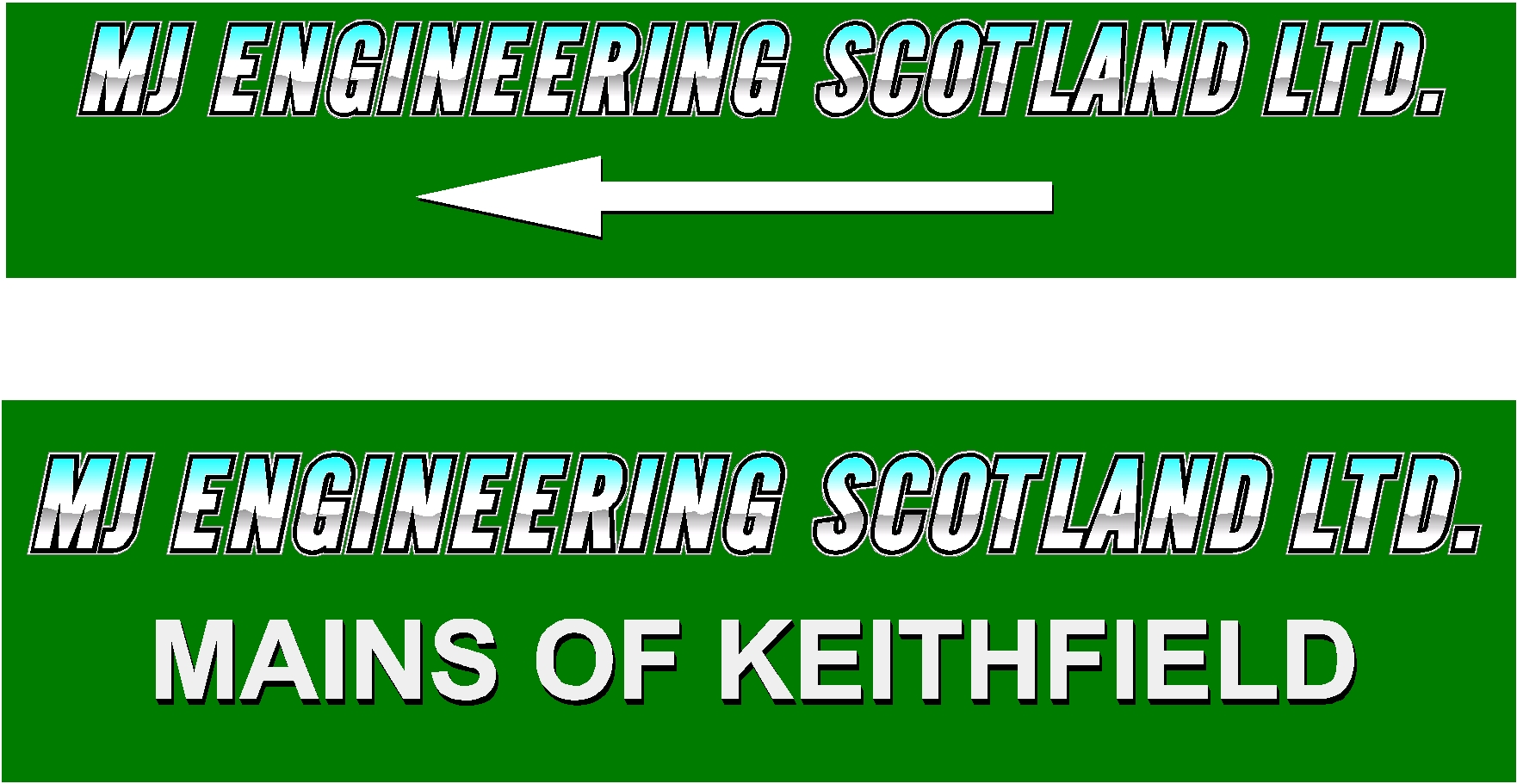
    I did three of these signs for these guys and they erected them themselves and they aren’t happy in spite of being very pleased until they were erected.
    The problem is that the the lettering from the road side passing in a vehicle is not legible.
    Ideally I would like to keep the backgrounds the same colour ie green, but not essential.
    What font and colour / vinyl or outline combination would make this a lot more legible. The larger signs are 1200mm by 300 smaller is 1000 by 200 mm
    Thanks in advance for anyone who takes the time to help.


    Attachments:

    Gordon Forbes replied 16 years, 6 months ago 5 Members · 8 Replies
  • 8 Replies
  • Robert Lambie

    Member
    November 5, 2007 at 6:15 pm

    first, ide loose the Scotland ltd mate… if really needed make it extremely small.
    also loose the outline and blends… make arrow head only…
    personally, ide say the signs are too small… ide also make them white reflective backed if at the road side. in the evening these signs will disappear in green.

  • Simon Strom

    Member
    November 5, 2007 at 6:25 pm

    I agree with Robert. Also typically (I’m not sure what size your copy is right now) but at least 3" (75mm) or greater is recommended for signs that are going to be viewed from a moving vehicle. It also helps to give the copy a little bit more open kerning than you would give for smaller signs. What font are you using by the way?

  • Gordon Forbes

    Member
    November 5, 2007 at 6:26 pm

    I will do that but they did say they wanted Scotland as that is their name.
    I suggested white reflective already.
    I will do a few samples for them and see what they agree to.
    Thanks for a start anyway Rob

  • Jill Marie Welsh

    Member
    November 5, 2007 at 6:35 pm

    Forbie, here is my opinion…
    While the chrome effect is cool, that, combined with the italic all-caps font is the trouble.

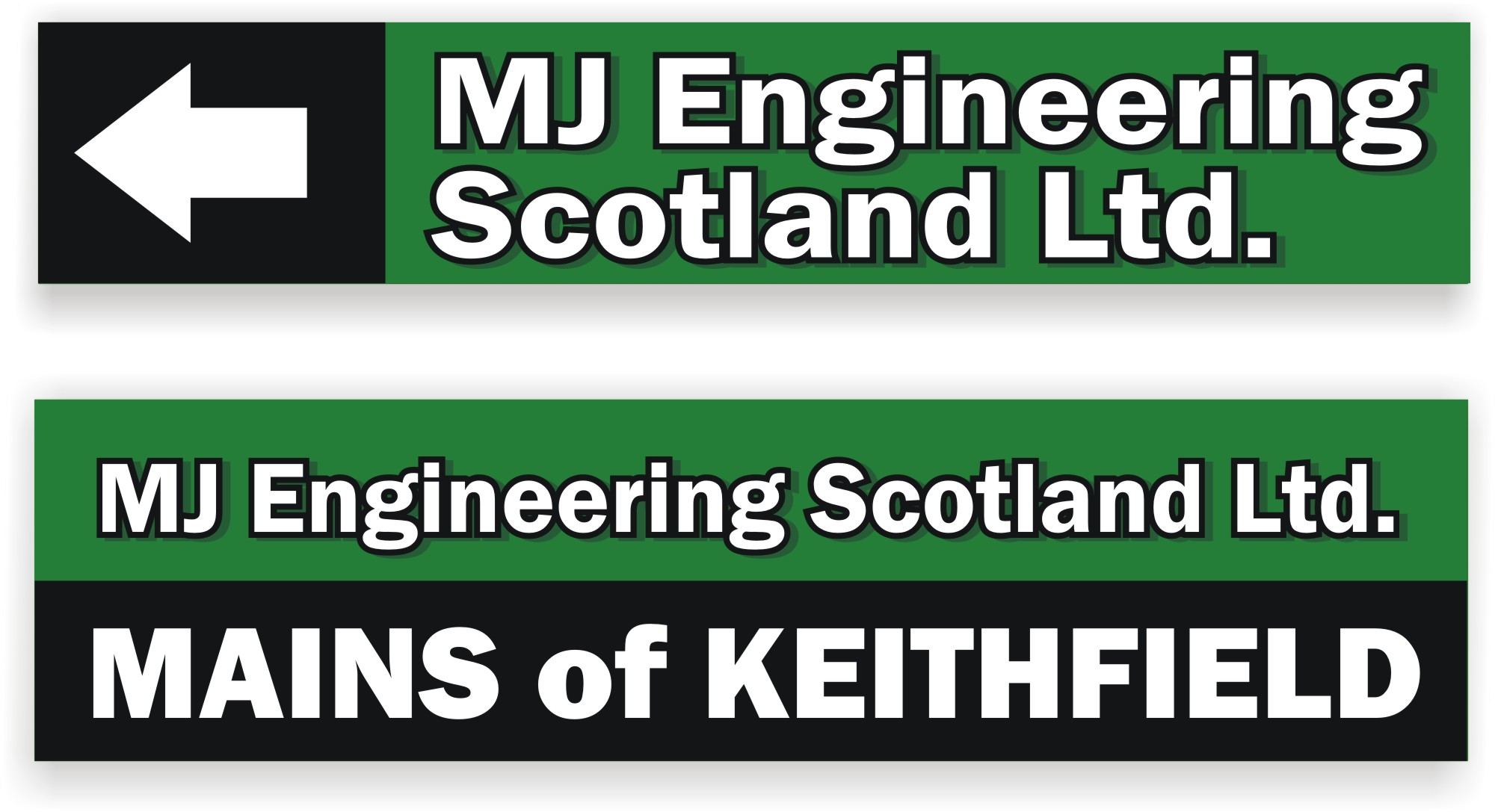
    Try using caps and lower case, and breaking up the first sign into two lines.
    This is just two different weights of boring old Franklin Gothic.
    I could have used a bit more negative space around the edges!
    The drop shadow is optional.

    Love….Jill


    Attachments:

  • David Glen

    Member
    November 5, 2007 at 6:42 pm

    Forbie, anything remotely silver or chromey will disappear from certain angles and lighting.

    Jill is on the nail with the all caps comments.

  • Robert Lambie

    Member
    November 5, 2007 at 8:30 pm

    Had a go at trying to explain what i meant a bit better mate…
    I have kept the green back as that’s what you have… but by adding one colour, i.e. reflective white and reverse weeding it you could easily achieve this with very little materials used to achieve.

    Most companies include the "Scotland ltd, England ltd etc" only for legal reasons. seldom do they go by the full name. as long as its included… it keeps them in the right.

    Fonts not great i know… only have about 15 fonts on this system at home… 😕

    [c][/c]

    .

  • Gordon Forbes

    Member
    November 5, 2007 at 10:49 pm

    Thanks a lot for your help. The difference and impact even one colour and typeface can make is clearly shown.
    Thanks for your input
    I like both Rob’s final and the contribution from Jill.

  • Gordon Forbes

    Member
    November 5, 2007 at 10:53 pm

    Simon copy is 3 1/4" on the original signs and is Eng Gothic

Log in to reply.