Activity Feed › Forums › Sign Making Discussions › File Swapping › HELP! Inspiration needed
-
HELP! Inspiration needed
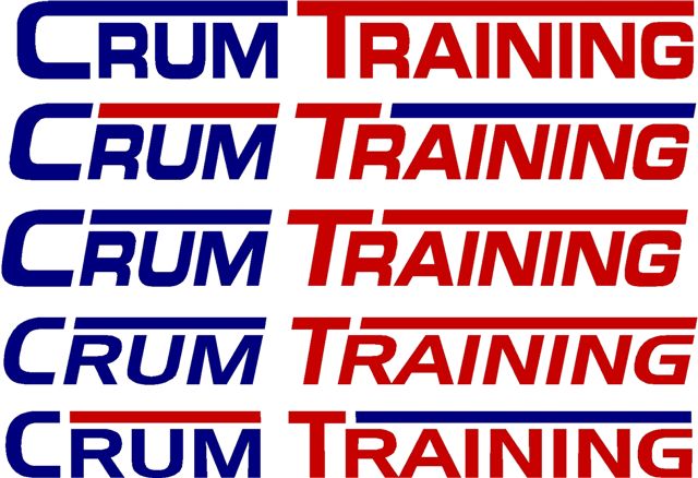
Posted by Marcella Ross on December 19, 2005 at 4:24 pmI’ve got a car to do for a customer who has a driving school. Name and number to go on the vehicle only. Cheap and cheerful. BUT, this is the logo he suggested….. not nice. Wrong in every way. 😮 So I’m looking to tweek it a bit or suggest something different but not too far removed from what he wants. Trouble is …. my brain isn’t engaging on this one. I’m too busy singing jingle bells! 🙂
Any suggestions oh kind folk of the sign world ……?????
Attachments:
 Nicola McIntosh replied 18 years, 4 months ago 12 Members · 29 Replies
 -
29 Replies
-

CRUM Training! 😮 Sounds like a bad joke. Crummy or what!
Good luck with this one Marcella! Can’t persuade him to get a new name, can you?
(Sorry, not much help, am I)
-

Oh Marcella, that is sooooo bad !
I’m own and run a large driving school franchise.
The name needs to say what the business “is” and “does” !!!!
Unfortunately there are no “L’s” to play with in the name. Most driving school’s highlight the L by making it red 🙁
Perhaps you could chop the letters up a bit and make the down leg of the T and the line underneath it look a bit like a red L 😕
Cheryl
-
Looking at it again….
join the T with the bottom line, to make it look like an L.
Split the T and the line above training. Keep T in red and all the rest including the top line and “raining” in blue
😕 Cheryl
-
 quote Cheryl Tissington:The name needs to say what the business “is” and “does” !!!!
Unfortunately there are no “L’s” to play with in the name. Most driving school’s highlight the L by making it red 🙁
Cheryl
I know what you mean! nothing there to tell you it’s a driving school. I can’t think of what to add to it to make it look so.
-
I working on something now for you…..back in a minute 🙄
-
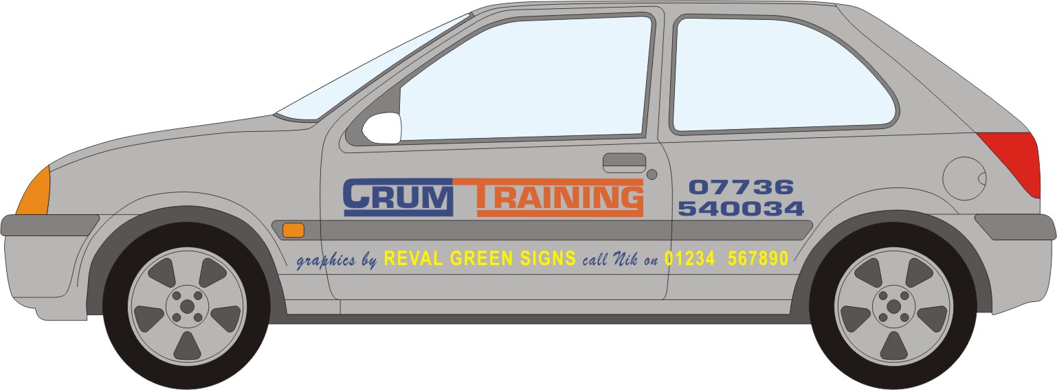
How about something like this ?
Make the lines look like roads with white road markings on them.
And the T more like an L
Hope this helps you a little bit.
Cheryl 🙂
Attachments:

-

so..
what the heck’s the L got to do with it?
is it something like “learner” to identify and inexperienced driver?Can you Just add “Driving School” underneath it..??
-
quote steve geary:so..
what the heck’s the L got to do with it?
is it something like “learner” to identify and inexperienced driver?Can you Just add “Driving School” underneath it..??
😀 Yes, drivers under tuition here must display a red ‘L’ plate on the car!!! He’s got those on his roof box so they’re there already. The rest of the box is blank waiting for a logo to go on.
This is just one of those jobs that really doesn’t get you excited is it! Nothing quite hits the spot.
I think looking at the bad logo is just making me lose the will to live…. -

Steve every one here learning to drive has to have an ‘L’ plate displayed on the vehicle front and rear, lot’s of driving schools try to incorporate the L in thier logo.
Lynn
-
OK, here’s another one …… any better? I suppose it kind of resembles his …… !
Attachments:

-
I sort of liked Cheryls with the road thing it goes some way towards what he does !!!!!
Lynn
-
I thought the one with the dashes in it got a little busy…
sell them on something totally different… their existing logo needs to be gone, not improved.
Attachments:

-
That’s better Steve. I think it’s different but similar in a way to his idea that he may go for that, or certainly more along those lines. I HATE the way he wanted the extension on the ‘M’ and the ‘G’ in particular, but this type of idea at least keeps his choice of colour and still looks linear.
Thanks! 🙂
-

Marcella,
Are you sure this is a driving school and not a sex therapist who has put an R in copy by mistake?
-
😀 😀 😀 good one Dave!
Well, I have shown him two options, his own and a slight variation on Steve’s design. He said it was very striking and really gave him something to think about…. it looked great!!!! But, he told me it had taken a year for him and his daughter to design the other so he thought he’d rather go with his own design…. 😮
I should have known …………
Oh and em ……. I won’t be putting my name on his car either……. 🙂
-
 quote Marcella:Oh and em ……. I won’t be putting my name on his car either……. 🙂
ohh….you not even going to send them one of your stickers then marcella :lol1: 😉
nik
-
😀 😀 😀 No Nik….. I’m not sending him one of my ‘stickers’…. I’m sending him one of yours!!!!! 😀 😀 😀
-

did you tell him to stick to his day job 😮 it takes L of a long time to learn graphic design :lol1:
-
quote Marcella:😀 😀 😀 No Nik….. I’m not sending him one of my ‘stickers’…. I’m sending him one of yours!!!!! 😀 😀 😀
:rofl: :rofl:
nik
-
:lol1: :lol1: :lol1: :lol1: :lol1: :lol1:
i’ll get ye back marcella……..just you wait 😀 😉
nik

Log in to reply.
