Activity Feed › Forums › Sign Making Discussions › Traditional › Gold Leaf honours board
-
Gold Leaf honours board
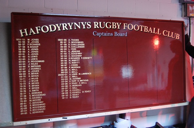
Posted by Neil Davey on January 28, 2011 at 8:40 pmThis was a complete refurb of an old board.
We removed the existing names and finish then wood grained the board to match the woodwork in the rugby club. You can’t really see the graining in this photo but
it was a pretty straightforward horizontal grained effect.
Gave it around 8 coats of waterbased clear varnish and then got to work with the brush.
All 23 3/4 leaf bar ‘Captains Board’ which is 1Shot white.
Attachments:
 Neil Davey replied 13 years, 3 months ago 4 Members · 8 Replies
 -
8 Replies
-

I don’t want to sound stupid here, but why so many columns??
-

????? It’s an 8′ x 4′ board Bob.
Personally I never paint the names any bigger than 3/4 inch.
So they’ll get around 150 years on there. I know I won’t be around when the board gets full but that’s not going to be my problem!!!
There are many honours boards in this part of the world that date back to the mid 1800’s and certainly many date back to the early 1900’s.
It’s history after all. -
I agree with the letter size, and I’ve done bowling greens and golf clubs and churches that date back to pre 1800s, but they’ve usually used a number of boards by the time we get to the present.
I’ve also back dated names on new boards to around 1875, but I usually only leave a max of around 25yrs or 25% of the board clear unless a different amount is specified by the customer so it doesn’t look bare for what is probably going to be the life time of the board.
Personally I hate painting or gilding honors boards, and unless obligated in some way will never do them. This type of work was almost a specialty of the guy I done my apprenticeship with, a true master, matching his work was neigh on impossible for the likes of me.
-
I know where your coming from Bob.
This is how the customer wanted it, I was called in to redo the existing lettering carried out not too long ago.
They weren’t happy so i refurbed the whole board.
I do lots of honours boards though and on many of them I’ve carried on the privies sigwriters style to keep some continuity.
It’s about the only regular job I do with a brush nowadays so I really enjoy doing them.
Attachments:

-
Then you’ve done exactly what they asked, but a whole lot better..
-

I love to see stuff like this.
I have never had to do anything like these and would probably hate it if I really had to do them, but maybe not.
I remember seeing the ones in Scotland by Stewart McLaren, and the ones Arthur Vanson has done in England.
Pure class all the way.
I think there would be something satisfying about doing those, maybe with some good tunes playing in the background.
I like both the before and the after Neil but yours is far neater looking.
Love…..Jill -

You should have used your new gear Neil and printed it.
😉 😉 😉
Lovely stuff! Patience doing all those names.
-
quote David-Foster-:You should have used your new gear Neil and printed it.
😉 😉 😉😀 That would have been a lot quicker David.
Jill, I find it’s the kind of job you have to get in the right frame of mind to do and
just settle into it, good sounds are always a good idea and then quietly paint name after name after na………..zzzzzzzzzzzzz 😉I commented on the previous lettering, it wasn’t bad but it was painted in a bronze type paint, the customer wanted gold leaf.
Also there were spelling mistakes, two different lettering styles used for the names and as you see the list runs off at an angle as it goes down the second column.
Overall the heading had a nice loose artistic style about it which I liked, maybe the Captains Board is a little on the large side.
Thing is, this is on show in the club lounge and I think they wanted a more formal board with gold leaf to give it some prestige.
Log in to reply.
