Activity Feed › Forums › Sign Making Discussions › Gallery › Gallery: Shop Signage – Merk Waardig
-
Gallery: Shop Signage – Merk Waardig
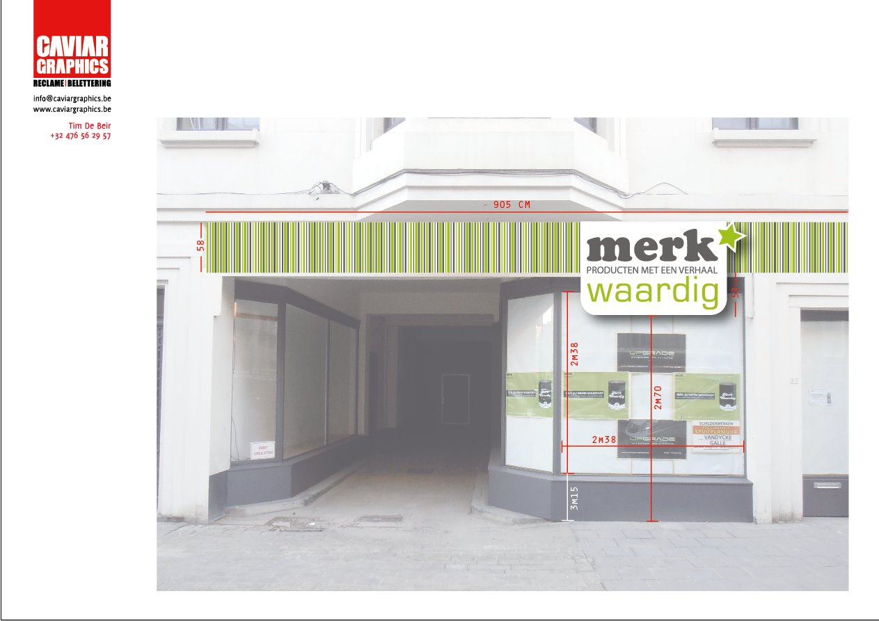
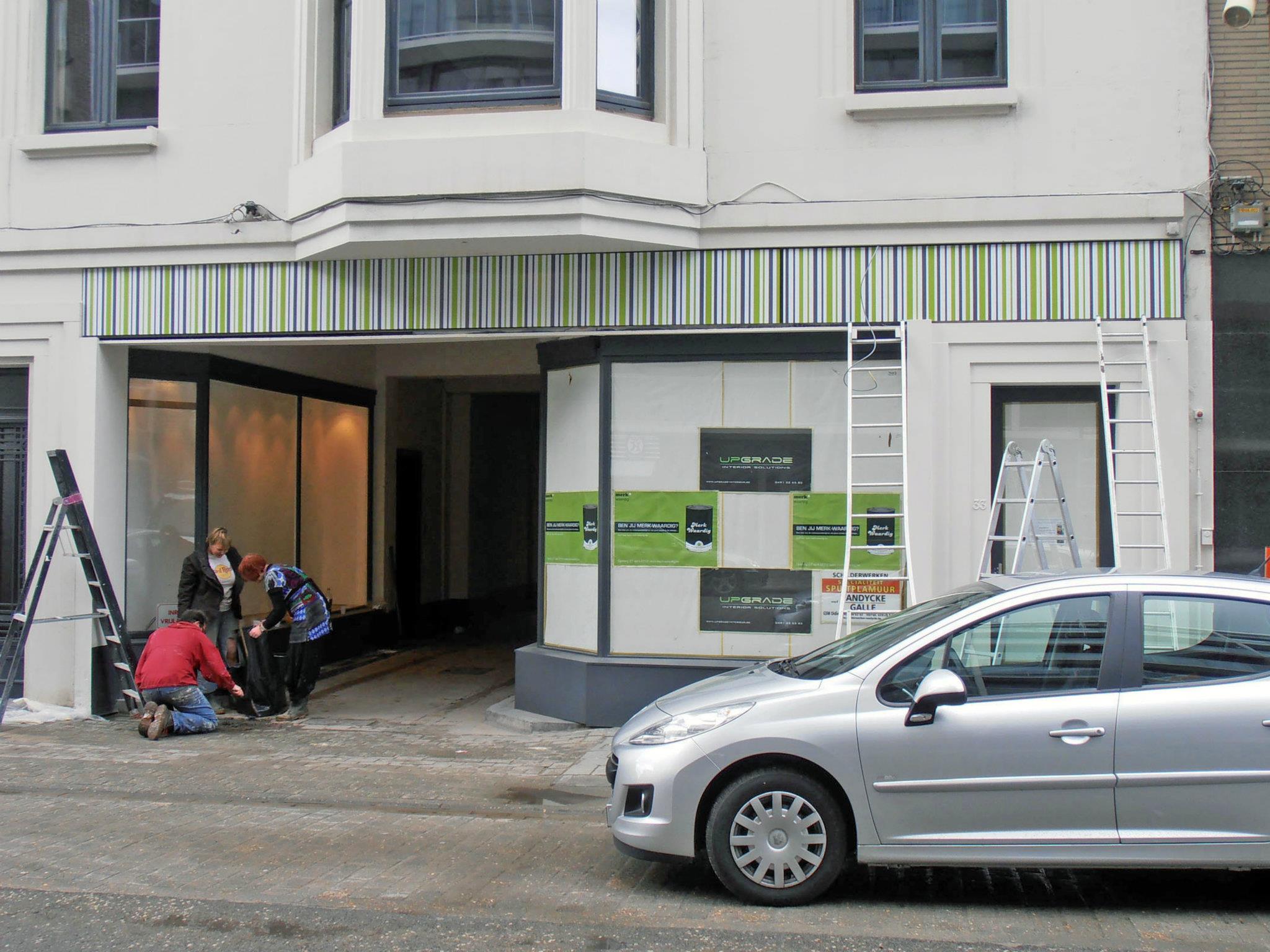
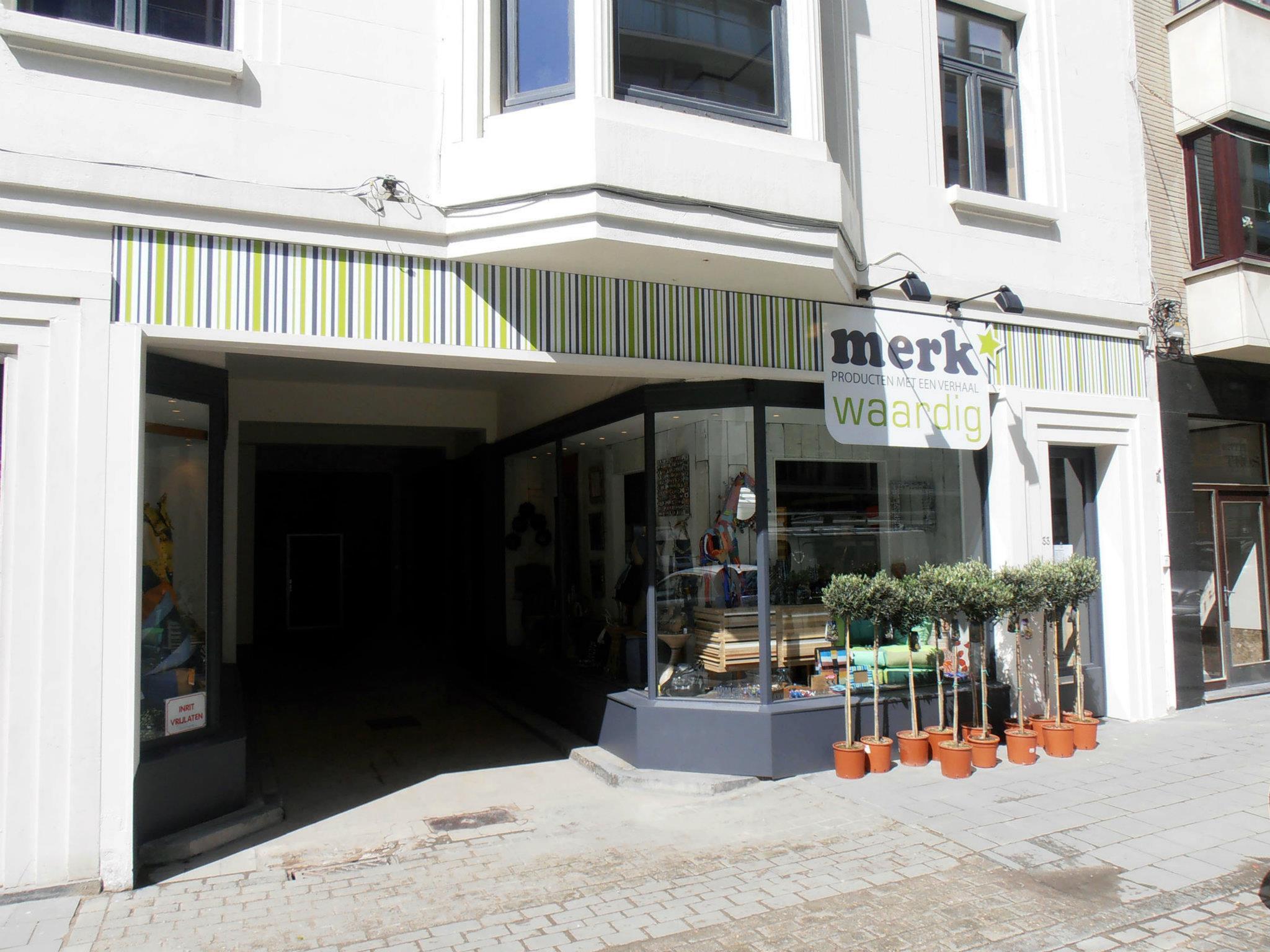
Posted by Tim de Beir on August 7, 2012 at 3:01 pm‘designed’ new shop front with very limited budget (-1200 pounds) and did also complete installation. Alupanel 3mm with fullcolour prints, and digital contour cut.
3D lettering inside shop.
Attachments:


 Robert Lambie replied 11 years, 5 months ago 3 Members · 5 Replies
 -
5 Replies
-

Really like the overall work on this Tim. Hate the cutter of how the shop is laid out, but love the wall graphics etc. 😀
The fascia is very striking and different. as way of constructive critisism and is again maybe just my self preference, but i would have reduced the size of text on the raised panel to allow for more white space there. not keen on the star, but i think thats because its adding to the slight cutter of graphics in that area. however, as i say, on the whole i really like it.oddly enough, i am working on a design right now that has a striking resemblance to that. 😮 :lol1:
thanks very much for taking the time to post you work Tim.
-
congrats Tim, great work… youve made the short list mate.
-

wow I am surprised 🙂 I guess it is the category shop front? or UKSB newcomer?
ps : this shop has been overtaken by an investment group and I am now busy with another shop front upgrade…
-
No short listed entries have been put into catagories as such, just yet.
even the catagories listed when we first announced the contest are not set in stone, we may add more, or even rename others to best suit what has been chosen.well done mate. 😀
Log in to reply.
