Activity Feed › Forums › Sign Making Discussions › File Swapping › Font ID Please.
-
Font ID Please.
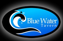
Posted by Jill Marie Welsh on December 9, 2009 at 5:44 pmAnybody recognize this?
Thanks.
Love….Jill
PS
Here’s their site:
http://eatbluewater.com/Jill Marie Welsh replied 14 years, 5 months ago 5 Members · 10 Replies -
10 Replies
-
I can’t see it that well either.
It’s one of those
"the logo is on the website" type jobs, a $35 poster.
:lol1: :lol1: :lol1: -
I just thought that the T looked familiar but, looking again, I’m not sure about the W.
Probably best to ignore me because I don’t have my font books here at home to check properly. 😀
-
Jill looks like Book Antique, dont know for sure but the menu looks good 😀
Lynn
-
it’s not Garamond John the W has a serif in the middle
Lynn
-
I would forget Garamond Jill. I think Richard is right with Palatino.
-
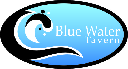
Palatino is close but I only have a couple. Rough draw and saved as corel 10 for you to give you a start
-
Wow thanks Chris.
I owe you one!
I’ve messed with this about an hour yesterday afternoon, redrawing/tracing, and it was a real pain and I wasn’t even finished yet.
Big hugs!
Log in to reply.


