Activity Feed › Forums › Sign Making Discussions › File Swapping › font id please
-
font id please
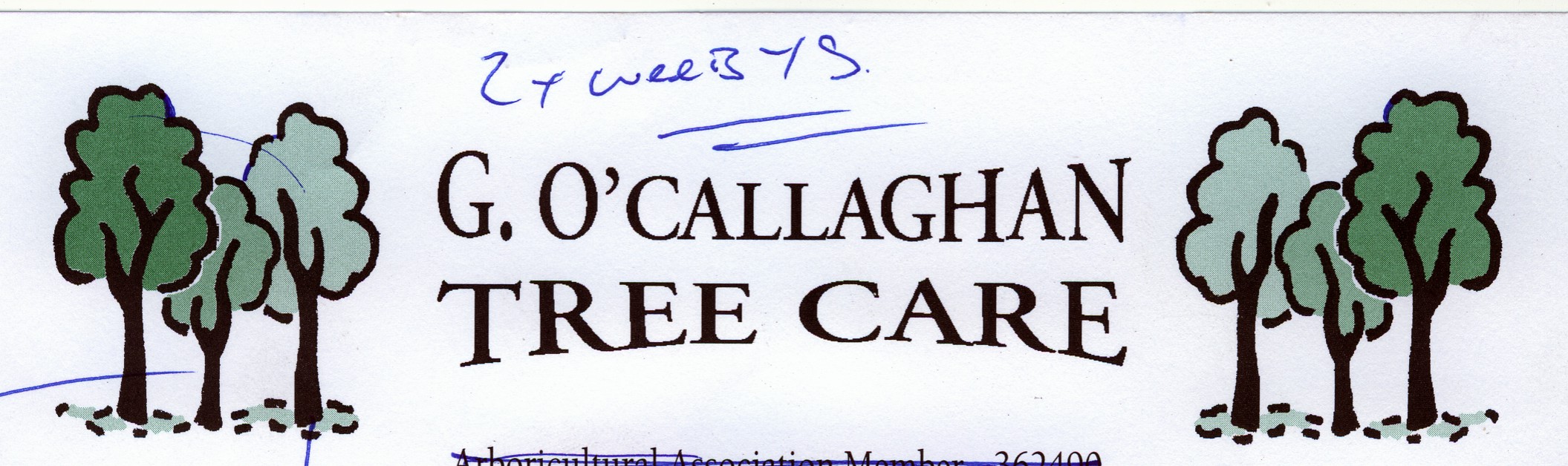
Posted by Paul Goodwin on February 24, 2005 at 6:19 pmHi all
seems to be the day for font recognition 🙂
looked through my database and i cant find one with the same ‘
can anyone name this font please?
Attachments:
 Paul Goodwin replied 19 years, 2 months ago 10 Members · 25 Replies
 -
25 Replies
-

Looks suspiciously like Times Roman Bold with modified R’s. Even if its not, it’d be quick to alter the R’s and get a near as match.
I’m hoping you don’t mean the handwriting above the logo though 😉
Cheers, Dewi
-

have you tried Garamond?
that would be where I’d start looking. 😎
-
Not Times Roman 😳 Close, but no cigar 🙁
Cheers, Dewi
Attachments:

-
LOL Good try Dewi, my money’s still on Garamond :you:
-
Hi Guys
Tried times Roman and loads of variations ect
Looked through nearly 3000 of the buggers and i can’t quite get the right one. is it me being picky??
-
try this font
-
here’s the offending font “Garamond”. I can’t believe you didn’t recognise it Mort 😉
-
Hi again guys
thanks James but the apostophy wasn’t quite right
andrew for some reason teh cursed apostrophy doesn’t look like that im my version of garamond?
thats what put me off 🙁
Attachments:

-
 quote Mort:the apostophy wasn’t quite right
Try a comma.
James Kelly.
-
I asked the wife 🙂 english wasn’t one of my strong subjects :lol1:
and apparently one of her’s either 😉
-

If the apostrophe isn’t quite right, but you have a good match on the rest of the text then use that font but substitute the apostrophe for another font!
or as James says have a look at the commas as well and just nudge them up!
-
Mort, theres a (ai) of the text under the jpeg
in case you need the file that is
-
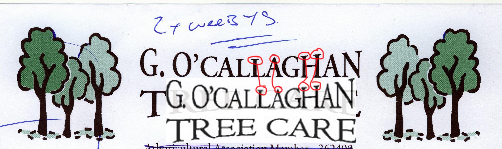
Here’s what I’m talking about!
The text part is in a font called Centaur – in order to get the correct shape “R”
the Apostrophe – ‘ and the dot/full stop is in a font called Felix Titling in order to get the round stop as Centaur’s is diamond shape and the correct looking apostrophe as again the Centaur one is like Morts Garamond one.The distortion isn’t quite right as i only did it roughly
Attachments:

-
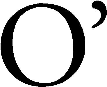
I’ll have to disagree with you on this topic Budone.
Look at the serifs on “Centaur” compared to Morts original imal posted earlier.
If you use Garamond (Original) the apostrophe is as shaped in morts original artwork also if you look at the image below, you will see the difference between the serifs.
I’ve also attached the image showing the apostrophe.
Attachments:
-
Thanks Andrew
any idea why my version of Garamond has a different ‘ ?
i’m wondering now if there are any other fonts i have that are weird, as before i have missed finding a font i have that someone else has easily found but is slightly different. if that makes sense?
Which way is the door?
Found it !!!!! (>)
-
Mort the thing is Garamond.ttf will have a different apostrophe, but look through the Garamond family you will find it. (if you have them). I think that the VEF of this font also has the apostrophe the way you need it but not sure as i cant check till work tomorrow.
Also there are two versions of Garamond.
Original and Garamond New
Hope that clears it up for you. 😮
-
ahh i see
cheers Andrew 🙂
Make sure thedoor doesn’t hit me on myAr*e on the way out
-

Mort I don’t know what you used to write the text but check your settings in windows as you can change the type of ‘ in preferences I’m sure of it.
Goop.
-

Mort….
I think Forbie is right. I don’t know about PCs, but on Macs we have an option to select what they call “smart quotes”, which gives a whole lot nicer shape to those puctuation marks.
-
My sample wasn’t the definitive, I just chose the fonts as they seemed pretty close in order to knock up a sample to show Mort how you can use different fonts for different parts to get the desired effect – otherwise i would have posted the .ai file for use.
Having said that although the serifs and apostrophe in the garamond original font is identical, the “R” is not! So by combining font’s and adding your own little bits of modification you can add the personal touch – and of course make it harder for people to copy if they don’t look outside the box as it were!
-

Just noticed Guys, the R’s are wrong. The original has a curved base to the stem while Andrews is squared off.
Sorry I can’t help come up with a better alternative at the moment 🙁
-

Hi
Quick look through the signlabs book comes up with Gal.vef similar to ITC Galliard CC.
The font changes some what between the bold, italics etc but I’m sure it’s so close a match that you could make it fit.
Hope it helps.Steve
-
thanks guys for all your help, it’s realy appriciative and shows what a great community this realy is.
I found how to turn the smart quotes on in word docs ect but not in windows xp it’self 🙁 but i have found another version of garamond which does have that curl in the apostrophe.
the differance is so slight that i doubt the customer will notice or even mind if he does, just me being picky i suppose 🙂
again you guys have been invalubale to me 🙂
now onto another font ( hehe only joking 😀 )


Log in to reply.
