Activity Feed › Forums › Sign Making Discussions › File Swapping › Font id please
-
Font id please
Posted by John Childs on June 25, 2007 at 8:50 amI thought this was going to be an easy one, but after checking my listings for over an hour I can’t find the right font.
Any idea?
Attachments:
 John Childs replied 16 years, 10 months ago 7 Members · 18 Replies
 -
18 Replies
-
 quote Warren Beard:close but no cigar
Yeah, I’ve found quite a few like that. It’s driving me nuts. 😀
Thanks for looking though.
-

Most of it looks like Optima… maybe close enough to get away with 😉
Andy 😎
-
Andrew,
My version of Optimaa doesn’t have the 8s and 6s sticking above the rest of the numbers. Is there a different version?
-
-

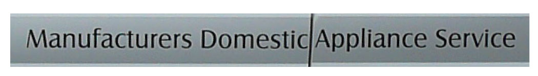
John, what is the bulk of the text like, maybe we could get a name off that, it may be that they used the same font for the numbers?
I’ve gone dizzy whizzing through my fonts. 🙄 -
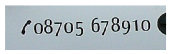
Unfortunately not Nick.
There’s text as well, I just thought the numbers would be easier to identify. 🙁
Attachments:
-
quote Andrew Ritchie:baselines have been altered to photo.
Very clever Andy. Why didn’t I think of doing that? :banghead:
That’ll do for the phone number, the text as well unless we can find something closer. 😀
-

it is similar to Optima but the ‘f’ is different for a start.
-
quote Nick Minall:Is that the best pic you have John?
Unfortunately yes Nick, although unusually this potential client is fairly close, only about eight miles away, so I can go get a better one no problem.
Perhaps I’d better do that.
-
 quote John Childs:quote Nick Minall:Is that the best pic you have John?
Unfortunately yes Nick, although unusually this potential client is fairly close, only about eight miles away, so I can go get a better one no problem.
Perhaps I’d better do that.
It would help John
-

Andrew…. congrats on 500 posts :lol1: 😉 took you long enough
-
Good enough Nick.
I’ll use Castle for the text and Andrew’s Optima for the phone number. 😀
Many thanks all.
😀
Log in to reply.
