Activity Feed › Forums › Sign Making Discussions › File Swapping › FONT ID for very skinny text thank you
-
FONT ID for very skinny text thank you
Posted by Jean Oakley on November 21, 2016 at 10:03 ammorning everyone, this is my latest font to be stumped with. I thought it was century gothic (in red) but as you can see its not quite right. The k is different and the whole weight of the text is a little on the heavy side. All suggestions welcome, many thanks jean
Attachments:
 Jean Oakley replied 7 years, 5 months ago 6 Members · 10 Replies
 -
10 Replies
-

Hi Gill, thank you for your comment the font
Avant garde book has not got the k right also the centre of the w is lower on the tracing. I had looked at that one and also Aubum which is again close but not the correct font. -

Your original match looks good- couldn’t you use that and just edit the ‘r’ slightly?
-
Hi Nick, if you look at the two next to each other the w is lower in the middle, the r is not quite right, the h and t are longer at the top the g has more space with the tail and the k is not the same. The text overall is slightly heavier. I could and will if no one comes up with the font ID alter what i have now. The issue really is i have a telephone number also in this font so would need to alter that aswell. Its not needed for a week so i have the time but thought id give the uk sign experts a challenge first :thumbsup:
-
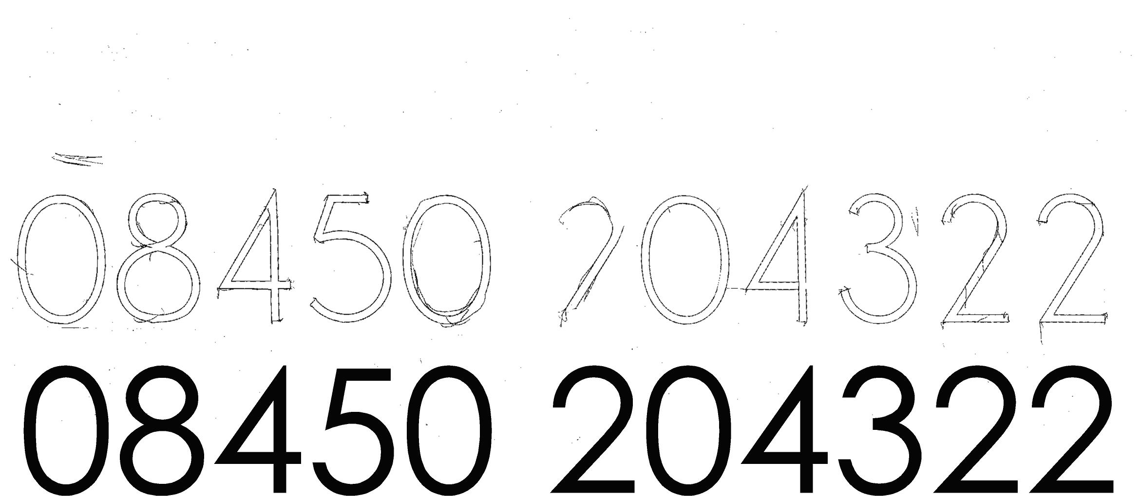
Heres the telephone number if it helps anyone with identifying the font, thanks everyone
Attachments:
-

Century Gothic WGL Regular?
second thoughts maybe not
-
 quote Chris Windebank:this could be the one
Champagne & Limousines font
http://www.dafont.com/champagne-limousines.fontCorrect.
-
chris / Jamie thank you guys very much, yes that is exactly the right font im looking for. Job all sorted and ready to fit next week. :claps: :claps:
Log in to reply.
