Activity Feed › Forums › Sign Making Discussions › File Swapping › Font help please
-
Font help please
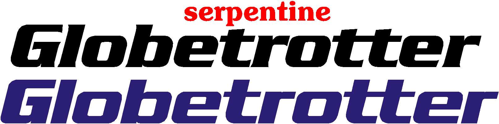
Posted by John Simpson on June 12, 2007 at 1:03 pmI need a font as close to the "Globetrotter" logo as possible please.
thanks Julie not John
Attachments:
 John Simpson replied 16 years, 10 months ago 7 Members · 15 Replies
 -
15 Replies
-

Serpentine Bold?
(just guessing until Nick comes along to save the day)
😉
Love….Jill -

Serpentine Bold Italic but I only have it as a Gerber font, Sorry 🙁
If you want a line of text setting up, let me know.Dave
-

Sorry that serpentine is not quite right as below, any other offers please.
ta julie
Attachments:
-

OK next time I will read the post….and put brain in gear..lol
Font NOT logo …………dam Homer days 🙄 🙄
-
Thanks Tim, but customer (lorry driver) wants his name on lorry in the globetrotter font, or close as poss.
Thanks anyway.
Julieyou just beat me to it 😀 😀 😀
-

it is indeed and Harry Cleary just asked for that font last week. 😀
I have a few variations of it but not that precise one though 🙁
-
Thanks Jamie, Marcella: I didn’t know about Harry’s question………I wasn’t here was i , i was busy working………on my tan 😳
john -

I can do you an AI file of the name if you need it.
Cheers,
Jamie. -
Thanks for the offer Jamie, will let you know tomorrow as i am at home now.
-

I don’t think that "Serpentine Sans Bold Oblique" is exactly right the "t" has a taller top on it in your font and the "r" looks wrong.
(well the one I have looked at anyway)
Nick.
-
Thanks Nick, yes i noticed that as well but if you noticed Julies 1st post the customer wanted near as poss, so have shown him this morning & he is happy with it.
Thanks anyway.
John
Log in to reply.
