Activity Feed › Forums › Sign Making Discussions › File Swapping › Fonr Id Please
-
Fonr Id Please
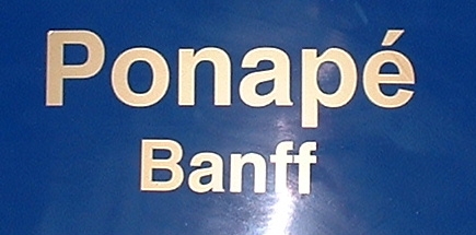
Posted by Dave Bruce on June 12, 2006 at 4:23 pmAnyone got an idea on this one. I don’t normally get stuck with fonts but don’t seem to have this one on my system or I am too tired to see it.
Thanks
Dave
Attachments:
 Richard replied 17 years, 11 months ago 4 Members · 5 Replies
 -
5 Replies
-

It looks like a weight of good old Helvetica to me.
Maybe with a lump out of the top of the "p".
-

Yer Richard, I have quite a few that were so close, and yes I could alter one of them to suit but I do like to find the culprit.
Cheers
Dave -

Could it be that it is actually incorrect, as that "p" looks very much like the results when a plotter is set to the pen mode.
Just my opinion
Phil
-
 quote Phil Halling:Could it be that it is actually incorrect, as that “p” looks very much like the results when a plotter is set to the pen mode.Phil
It does, but if that were the case I would have expected the "n" to display the same feature.
I also think it’s Helvetica, but with a drawing problem.
-
The plotter offset is definitely not right. All the internal corners look very odd, and I seem to see someting a bit odd at the bottom of the inside of the "o" too.
If the start/end point of the "p" was right at the top, and they weeded from right to left, perhaps they were lucky it was a cold day and the vinyl tore quite tidily down to the junction with the vertical stroke. Instead of ripping the top straight off…
I’m still convinced it was meant to be Helvetica (or one the of the countless nockoffs, 3sansb, heavyb, swiss etc.)
Anyway, I think I’m starting to ramble now, I must finish my post from last week about fonts and logos (spin)
Log in to reply.
