Activity Feed › Forums › Sign Making Discussions › Graphic Design Help › Florists Shopfront Sign – help with design please?
-
Florists Shopfront Sign – help with design please?
Posted by JohnMoyles on June 2, 2009 at 4:57 pmHi all,
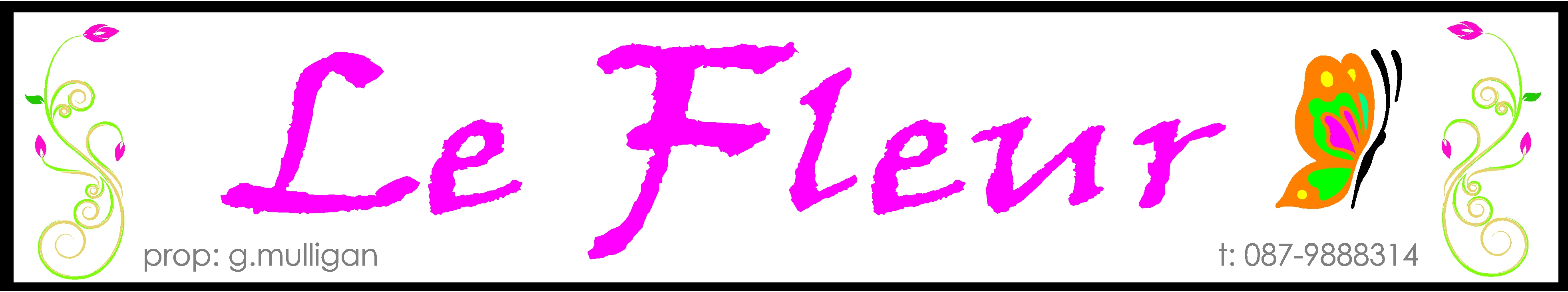
I’m doing a flat panel dibond sign for a new florist that’s opening just down the street from me – I’d really like this one to look good as i’ll have to look at it every day!The customer has asked me to incorporate a modern floral design and a butterfly if possible (not necessarily the ones i’ve used but something along those lines). The name is ‘Le Fleur’ and ‘prop. g.mulligan’ and ‘t: 087-9888314’ are also to be used.
I’ve spent some time on this but I’m not happy with where I’m at so if anyone has any ideas / constructive criticism please feel free to contribute!
all the best,
John.
Attachments:
 Peter McGarry replied 14 years, 10 months ago 12 Members · 30 Replies
 -
30 Replies
-

i don’t have ime to have a bash right now but, if they want somehting more moden looking how about the ‘roxy’ / surf flowers? (hybiscus?) just a very simple outline in a very pale colour,
I agree about the font too, something nice and light, but not too thin or fancy to read!
i’ll have a go if i get five mins.
tbh, i don’t mind the flowers you’ve used, but do stay away from that font! prob a less impactive colour too,
maybe a panzy type flower, two colours, simples!
-

Here’s my input hope it sparks a few ideas off 😀
Attachments:
-
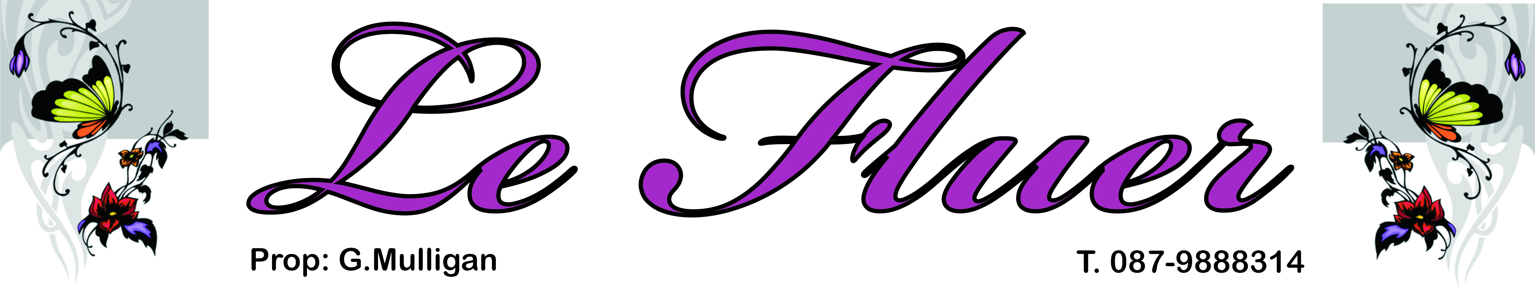
ok, found 5 mins!
i think i’d even consider making the flowers to the left more subtle too.
Hugh
-
quote Neil Speirs:liking Hugh’s
lol, thank you! it always amazes me how i can knock up something i really quite like the look of, in only a matter of minutes, when it’s not for me or my customers!
-

Thanks for all your input guys. John & Hugh – I really appreciate you taking the time to upload your ideas. Do you mind if I show these idea’s to the customer and make up something similar if she decides to go with it? The customer is calling in again tomorrow afternoon.
-

Good one, Hugh.
Very elegant.
John, send Hugh a nice container of bait and use his idea.
If using yours, do not use that font or that color and make the butterfly facing in toward the lettering.
But I suggest taking Hugh’s idea and running with it.
Love….Jill -

why do we need to have a french name?
why not just "the flower(s)"
sorry, I just think it pretentious to use foreign language in signs, trying to be posh…
I think hugh has nailed it though.
Peter
-
 quote :why do we need to have a french name?
why not just “the flower(s)”
sorry, I just think it pretentious to use foreign language in signs, trying to be posh…
So they can charge more 😀
Le Signe Fabricant.
-

Hugh’s first one for me too.
quote Peter Normington:why do we need to have a french name?why not just “the flower(s)”
sorry, I just think it pretentious to use foreign language in signs, trying to be posh…
Peterthey are very cosmopolitan in Mayo, Peter. Ever since the Armada 😀
-

Hi
Hugh as it spot on, wasn’t being abrupt earlier just didn’t have time to put something up and was dead against that font.Kev
-
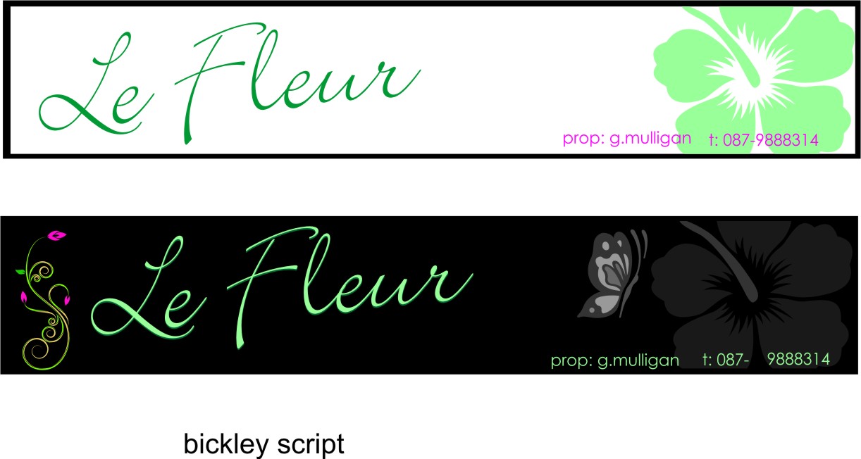
Here’s a quickie while I’m waiting for dinner to finish cooking.
Still prefer Hugh’s but wanted to say please no "t."
Attachments:

-
Thanks everyone, that is looking good too Jill. Do you mind if i let the customer see your design as well? She might be spoiled for choice tomorrow!
-
Sure. But I still think Hugh’s is nicer.
The script I used is a brand new one called Louisiana.
http://www.fontshop.com/fonts/designer/ … _oliveira/
The butterfly was just something I Googled. -
thanks Jill, will let you guys know what the customer decides on.
-

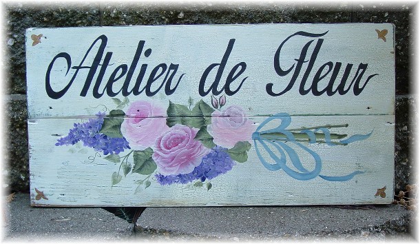
I didn’t get time to have a go but I think I would have tried something down this route……distressed background with water colour effect flowers
Attachments:
-
quote Glenn Sharp:I didn’t get time to have a go but I think I would have tried something down this route……distressed background with water colour effect flowers
is that one you made earlier? nice affects!
I like Jills too, I know yours, Glenn, is prob harder to make, but Jills just works for me!
-
I wish Hugh
No, I just googled ‘French Shop signs’ to get some inspiration and I thought that style was quite fitting
-
Thats the style I thought would suit it too Glenn…..quite easy to create that crackle base John.
-
…and now Glenn has to go and post that…
To me, a hand-painted sign will always be most fitting for an old building.
But I also like a real modern sign on the face of a nice old shop. -
The customer has just been in and loved Hugh’s second design (i.e. the one with the black background).
So thanks everyone for helping me out here.Hugh – if your ever in Mayo – I owe you a few pints!
Thanks again,
John. -
quote JohnMoyles:The customer has just been in and loved Hugh’s second design (i.e. the one with the black background).
So thanks everyone for helping me out here.Hugh – if your ever in Mayo – I owe you a few pints!
Thanks again,
John.you’re welcome mate,
does mayo have a coastline (too lazy to look it up!)? whats the fishing like there? might see you for a pint of the black stuff on the beach!
Hugh
-
We have miles of it Hugh….. I’d get here quick though if I were you – its the first time we’ve seen hot weather in about 5 years!!!
-
lol, would love to get over, might treat the mrs to a week over there in the autumn.
cheers,
Hugh -
you won’t regret it Hugh….fabulous county…..loads of great beaches and pubs and Mr Moyles is an animal to buy drink by all accounts! 😀
-

Can recommend Enniscrone – Are the seaweed baths still there ?
Log in to reply.
