Activity Feed › Forums › Sign Making Discussions › Graphic Design Help › Fishing lake sign help
-
Fishing lake sign help
Posted by Stephen Ingham on September 10, 2009 at 9:21 pmHi all, am looking for a little help with the sign for a fishing lake and gundog training school.
Any thoughts and advice appreciated
cheers
stephenMark Jahn replied 14 years, 7 months ago 7 Members · 19 Replies -
19 Replies
-
Might be an idea to post up an ai Stephen, would be easier for people to give their suggestions
-
Hi, thanks for the reply….i have tried posting what i have got so far..but it keeps rejecting it
cheers
stephen -
Stephen is that there existing Logo or something that you have done for them ?
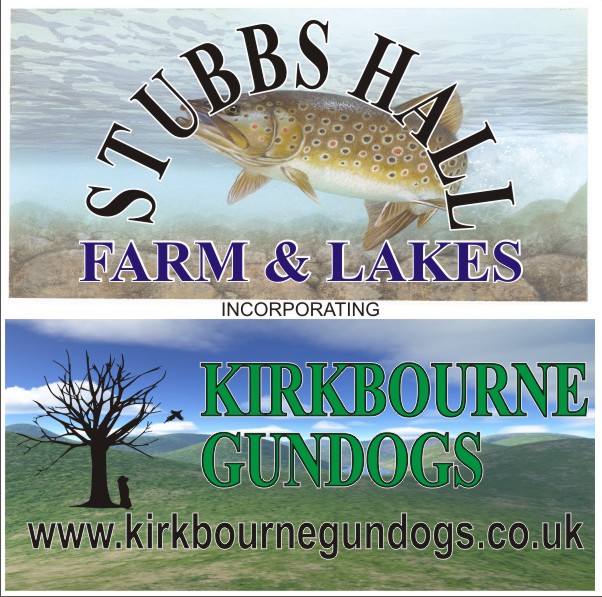
Not sure how it would work but if you can it might be an idea to try and fit a coarse fish such as a carp in as well as the game fish as the fishery have both fly and coarse fishing lakes.As an angler my first impression was that it was just a fly fishery which might stop a lot of anglers checking it out.
-
Are these to be two separate signs? It looks like two different companies but maybe they’re paired together?
-
No time now, but will probably draw something up a little later to see if I can help. Also how will you be making this? Can it be bitmap, or does it have to be all vector?
-
-
Stephen, I only mentioned it because it is two very different styles of fishing and most anglers don’t do both. The original drawing had a large space where another fish could have easily been placed.
-
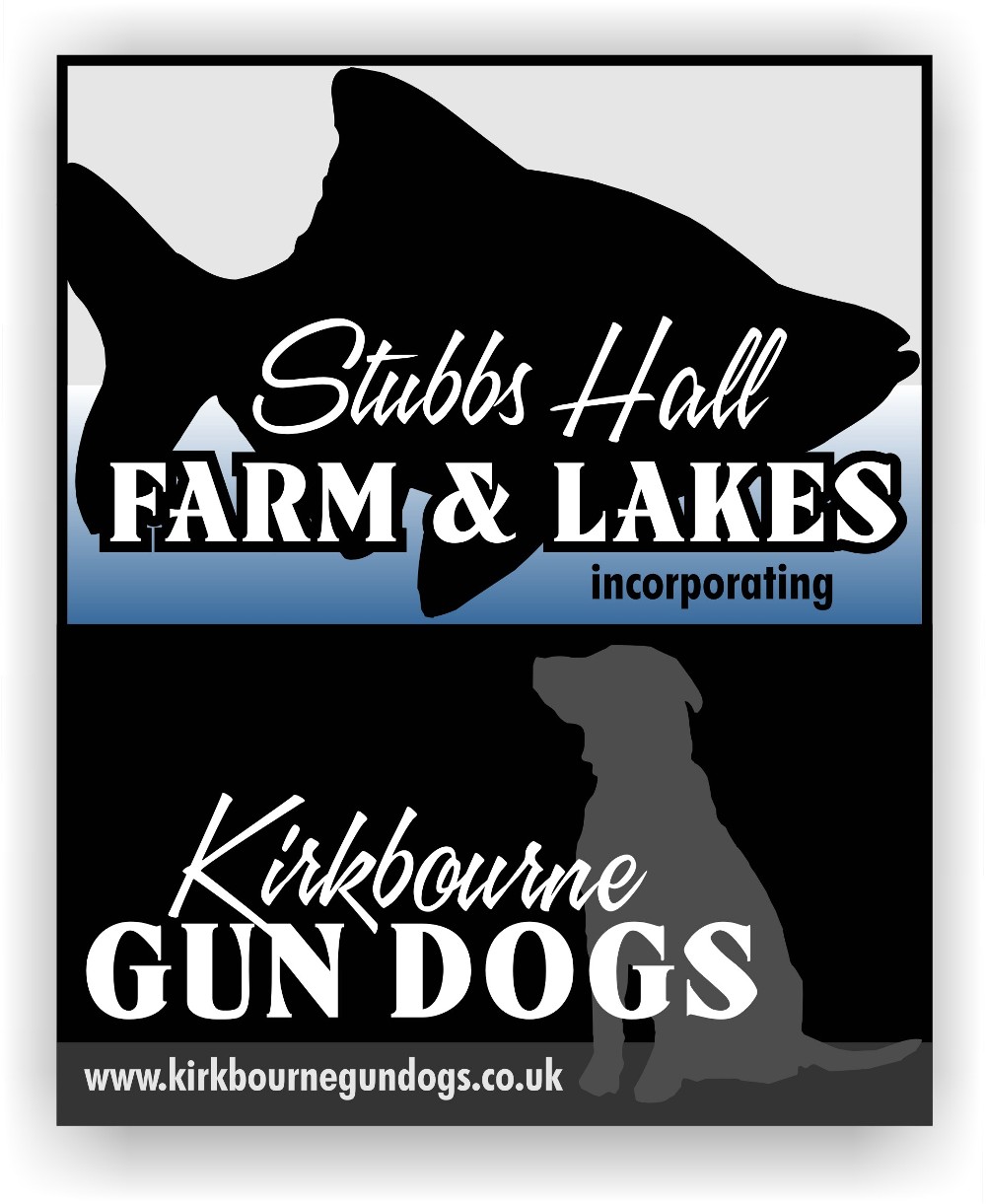
I think it is a little bit busy.
Because you are trying to incorporate two businesses onto one sign, I would keep it simple.
I think I’d use the same fonts on each part.
On the top portion of your layout your arch is really tight.
That makes the name hard to read.
I think you should highlight farm and lake rather than the Stubbs, the same for the dog part.
Love….Jill -
Stephen – Martin has hit the nail on the head with the fish image. As someone who was carp fishing for a number of years I would have turned the car around if I’d seen the trout on the sign. If the customers lake is coarse/carp etc I would tailor your vector or bitmap to that.
Jill…I always love the way you work magic with those fonts.
-
Thanks Mark.
If you ever come over this way I will take you to Linesville:
http://www.roadsideamerica.com/story/2204 -
It’s amazing the difference from first design and one with the backgrounds on Stephen. (I agree with Jill about the text layout though)
I bet I couldnt even catch a fish in Linesville, lol!
-
Hi, thanks for your replies.
Me not being a fisherman i am not aware of the issues you have brought up about the difference in fishing….apologies for my ignorance.. 😳
However, if i were to go with something on the lines of jills design what about the fish silhouette?
Cheers
stephen -
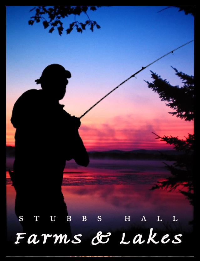
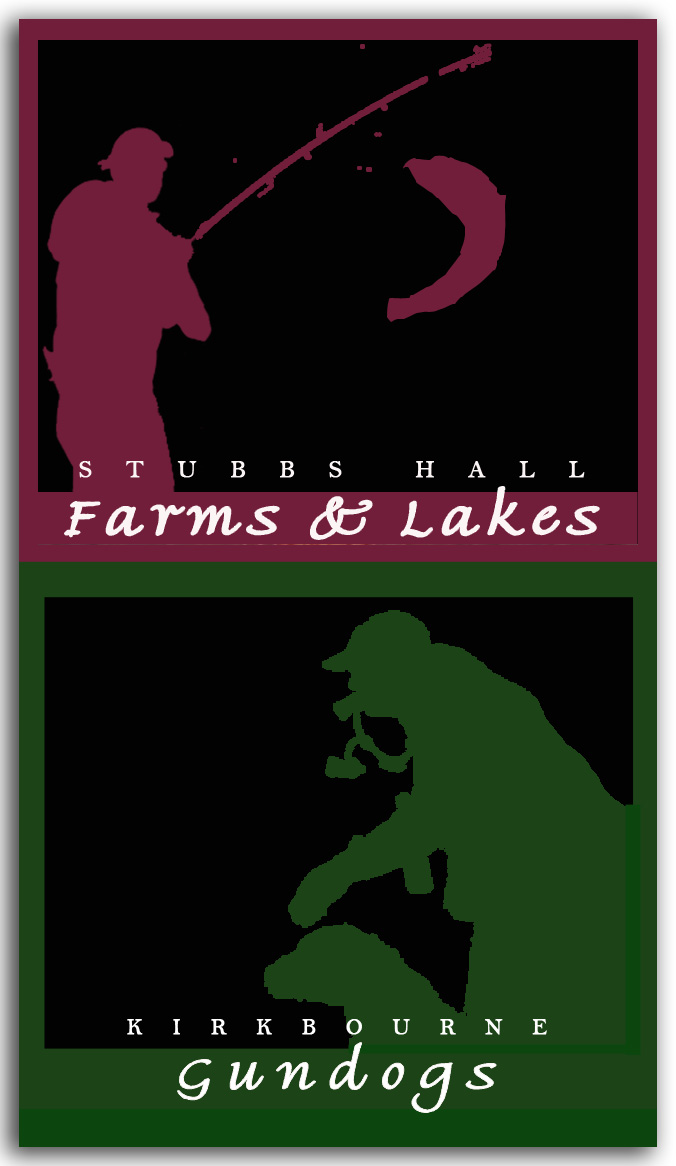
What about the the subject being the fisherman instead of the fish or would that be another coarse/game issue?
-
-
Hi Chris, that looks brill, i really like that, although i would probably agree a bit poster like…good though
cheers
stephen -
I love that last one, and would just make the name bigger.
Excellent idea to focus on the fisherman (or woman) rather than the fish. -
-
Yeah Jill, gave that some thought….should I say fisher[person]?
I only went with fisherman cos the pic was of a male
😉 -
I’ll hold you to that Jill 😉
That looks a fantastic place to visit.
Log in to reply.


