Activity Feed › Forums › Sign Making Discussions › Gallery › first full wrap
-
first full wrap
Posted by Terry Beech on August 12, 2010 at 9:10 pmMatty Goodwin replied 13 years, 9 months ago 5 Members · 7 Replies -
7 Replies
-
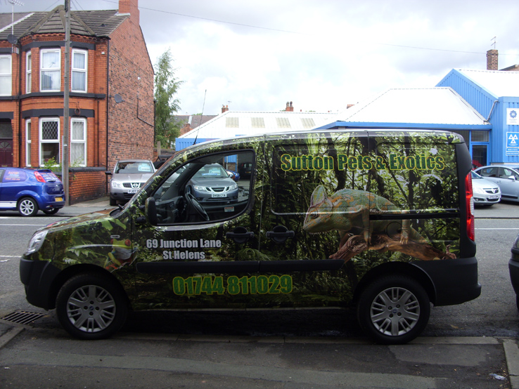
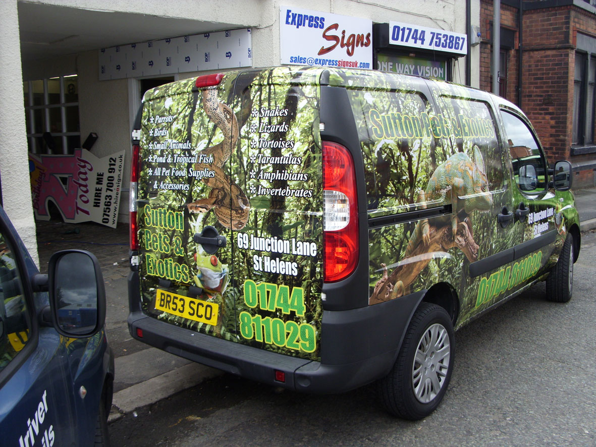
Sides look good but the back is way to fussy to read. That phone number on the back is too large and looks ugly.
-
Name lacks contrast and would have looked better in plain white.
When using Impact I always enlarge the stingy ampersand.
Huge-ass phone number but the customer may have requested it and at least there is no "Tel:"
I like the background OK.
Love….Jill -
hi Jill sorry what do you mean by "using Impact I always enlarge the stingy ampersand." (?)
-
The ampersand which comes with Impact is a lot smaller than the other letters, I dunno why.
I love Impact but I hate its ampersand.
stingy=small -
hi terry,super job just wondered how much time that took
-
hi john sorry about the delay answering you it took 3days
-
Phone number on the side not in line with the door text, too busy on the back but LOVE the back drop image!
3 days too long to fit but just my feedback..
Matt
Log in to reply.


