Activity Feed › Forums › Sign Making Discussions › Gallery › Feedback on my vehicle graphics please?
-
Feedback on my vehicle graphics please?
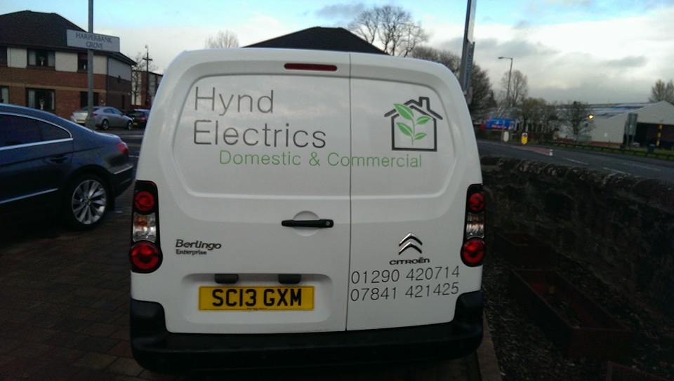
Posted by David Mitchell on April 13, 2014 at 5:59 pmalways looking to learn, these are the first few vans done using my new graphtec cutter that i have been annoying everyone about!
😀
Attachments:


 Peter Munday replied 10 years ago 6 Members · 7 Replies
 -
7 Replies
-

Hi David
thanks for taking the time to post you work up mate.
Not knocking your work in anyway and meant in a constructive manner…
at a glance i would say the first thing going for you is you haven’t fallen into the normal newbie to vehicle lettering pit. which is super-size everything, stetch and condense everything to fit blah blah blah…in general you are keeping it clean and legible, which is good!
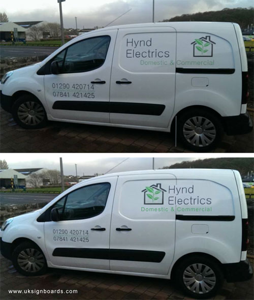
i dont have time to go through both or outline everything but i have "tweaked" your layout on one van in photoshop to give you a twist on your work.
just my self preference / view of course but..1, the logo and name appear disjointed. so in mine i have reorganised.
2, the numbers on the door are too big and need down sized a bit.as i said, just a quick change and to me presents itself a bit better.
your layout on top.
my layout below…
gives you a better idea what i am on about. 😀.
Attachments:
-

Spot on by Rob.
Just simple layout rules that make for a more pleasing design.
Start looking at magazine and newspaper adverts to get familiar with the basics of layout.
On the other van for instance, I would have not had the text on the rear in the same font as the company name.
-

thanks guys! exactly what i was looking for Rob.
the Hynd job i was giving a " as it appears on the business card" in the future il play around a bit more with it.
are there any books on layout etc ? or is it just an experience thing.
and John i totally agree, now the jobs done! although the picture is grainy, and its clear to me as i know what it says, its far froom the most legible font.
What do you do if the customers happy with design, and finished product , but you are not 100% ? would u change it or let it go and move on ?
-

he’s a genius is Rob….he can even make the sun come out on a dull day 😎
-

You wont do yourself any harm buying a copy of Mike Stevens book Mastering layout.
-

Just don’t mention "Negative space" as your customer will think you are talking out of your arse.
Peter
Log in to reply.
