Activity Feed Forums Sign Making Discussions Graphic Design Help Feedback for revamped logo please

  • Feedback for revamped logo please

    Posted by Angelique Muller on April 30, 2011 at 8:32 pm

    Hi All,

    I am slowly getting back to work and currently have a few little design things to work on (something I enjoy, but not very good at…….).
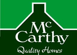
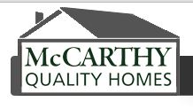
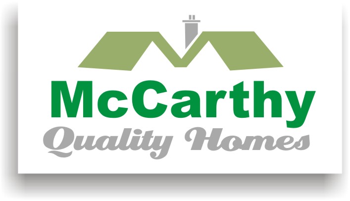
    This first one is for a friend of mine (a builder who has just started out on his own). He has asked if I could redo his current website logo. He is not happy with it as it is in the shape of a sixties bungalow (that translates as: poor quality/cheaply build). He would like something with a more traditional Irish building, and something saying ‘High quality and energy efficient build’.

    So far I have not come up with a lot. The traditional Irish building would have a big chimney on the gable end and I have been trying to use that. I thought that by using green I could hint to the energy/eco side of his business. But overall I think it is pretty boring.

    I would really appreciate if some of you could give me some direction/ideas on this.
    Thanks


    Attachments:

    Harry Cleary replied 13 years ago 5 Members · 7 Replies
  • 7 Replies
  • Harry Cleary

    Member
    May 1, 2011 at 2:45 pm

    I think your first one has something going for it. Here’s a quick go from me.


    Attachments:

  • Angelique Muller

    Member
    May 1, 2011 at 3:01 pm
    quote Harry Cleary:

    I think your first one has something going for it. Here’s a quick go from me.

    Thanks for that Harry… the second one is the design that he wants to change.
    I like what you did: the ‘M’ with the two roofs.

  • Craig.Tiley

    Member
    May 1, 2011 at 6:03 pm

    Really like Harrys one! 😎

  • Martin Pearson

    Member
    May 2, 2011 at 4:48 pm

    Yup another vote for Harry’s design.

  • Simon Strom

    Member
    May 2, 2011 at 7:20 pm

    Agreed. The open design of Harry’s makes it more modern looking IMO. I’m liking it!

  • Angelique Muller

    Member
    May 3, 2011 at 7:55 pm

    Well… that is unanimous then!
    With your permission Harry, I might take your suggestion and work with it. I might just try a few other fonts with it.

  • Harry Cleary

    Member
    May 3, 2011 at 8:59 pm

    😀 no problem Angelique. Yeh, a nicer main font would be good.

Log in to reply.