Activity Feed › Forums › Sign Making Discussions › Graphic Design Help › Farm shop sign
-
Farm shop sign
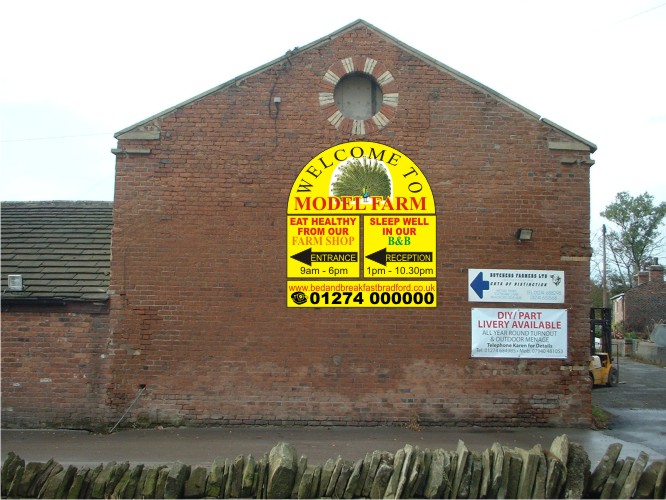
Posted by Stephen Ingham on October 19, 2009 at 1:12 pmHi all, can anyone give me some help and assistance on the attached design?
Any help is much appreciated
Cheers
stephen
Attachments:
 Peter Dee replied 14 years, 6 months ago 3 Members · 3 Replies
 -
3 Replies
-

I’m not keen on the colours ………. it needs to look more ‘earthy’ and wholesome rather than loud. Maybe dark green, burgundy, cream maybe a small splash of orange… something along those lines. All I see when I look at it is phone number and arrows 😕
I like the shape though. 😀 -

Must it have arrows? Is it too hard for your average Joe to figure out where to go?
Because smaller signs could be placed for the B&B registration area, etc.
Marcella is 100% right about the colors.
You want something inviting rather than looking like a used car lot.
This to me seems almost an upscale place, design for that crowd.
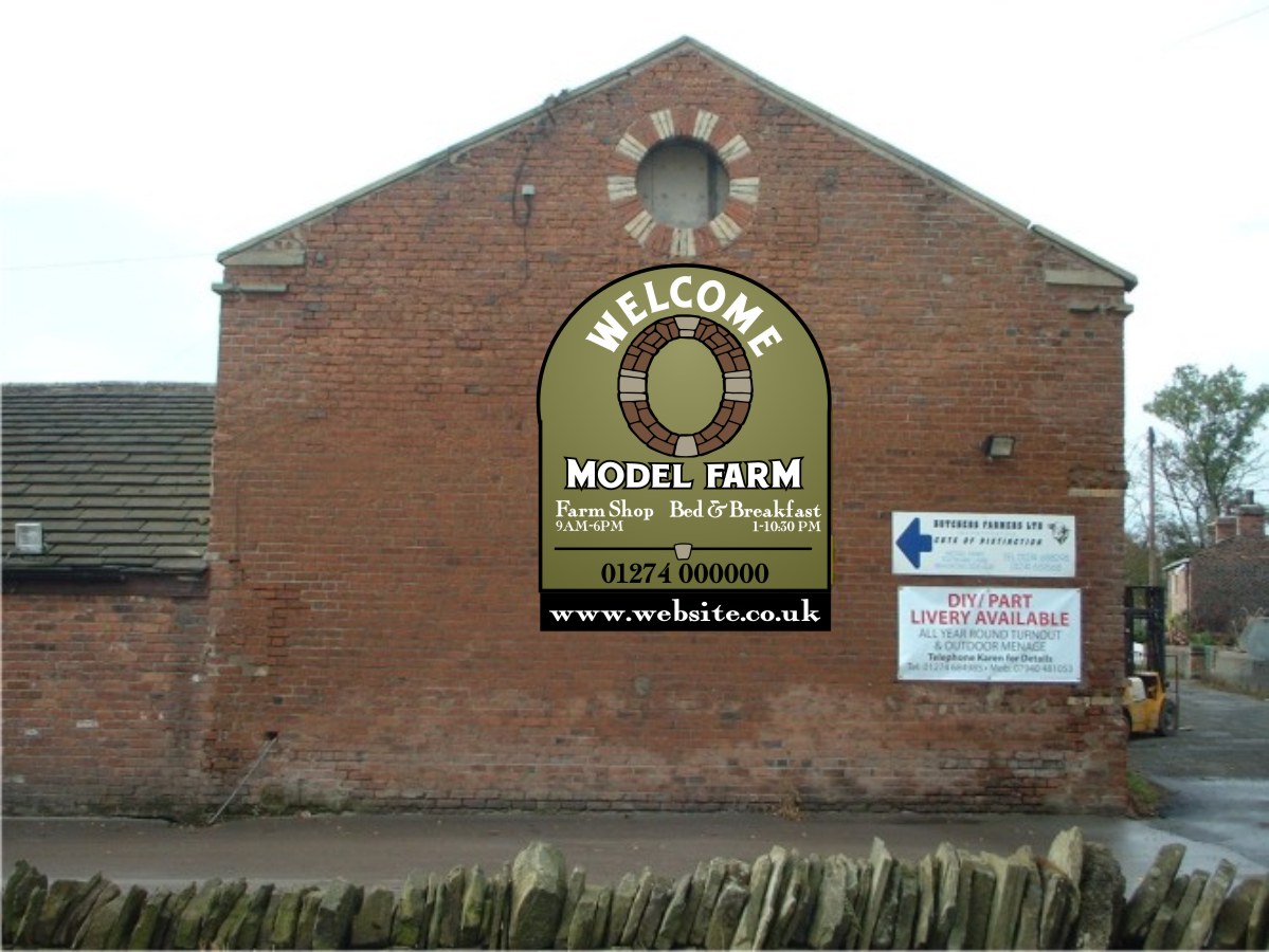
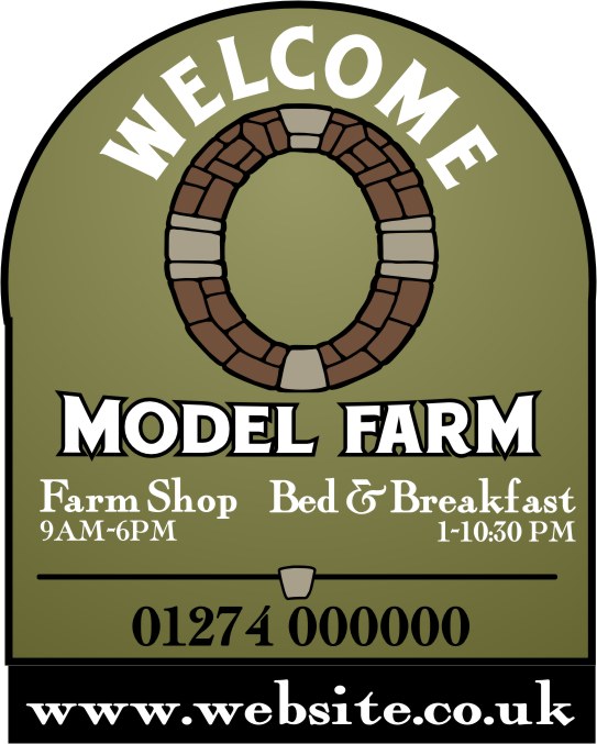
And the circular window in the structure could be reflected as some sort of icon, which I did poorly here using clipart.
I hate Corel for arching text, but you see what I mean.
Love….Jill
Attachments:
-

Personally I would try the top with a Pent shape to harmonise with the roof line.
Also, the logo on the sign is competing with the circular pattern in the brickwork above.
Yellow is gaudy and highly visible but horribly out of context.
I might try dark green on a cream background.
Log in to reply.
