Activity Feed › Forums › Sign Making Discussions › Graphic Design Help › Family reunion design?
-
Family reunion design?
Posted by Jill Marie Welsh on June 14, 2010 at 4:58 pmOk you might remember my asking about Liverpudlians.
https://www.uksignboards.com/viewtopic.p … liver+bird
It was suggested to use the Liver bird as a symbol, and I thought it was a good idea but do not want to step on anyone’s toes.
(sports logos, legal stuff etc)
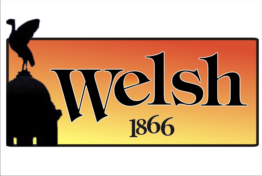
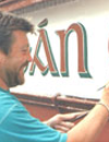
This is what I came up with.
I used 1866 because that’s what’s in the record book.
Originally had it in black but wasn’t sure.
Surname is Welsh.
Does it look totally like crap?
Not sure about the colors or the oval.
Admittedly it is a quickie, I put it off because I was stumped.
This will be for small printed decals and perhaps a T-shirt.
Thanks.
Love….Jill
PS
What they are using on their Facebook page is I think distorted Times Roman.
Attachments:
 Lynn Normington replied 13 years, 10 months ago 10 Members · 20 Replies
 -
20 Replies
-

Looks good Jill, just alter the kerning on 1866 slightly.
Ever thought of doing this full time, could go a long way…… 😀
-

This was the other idea I had.
I actually think both are kind of lame efforts.
😳
Attachments:

-

I actually love the first one, really like the black against the orange 😀 The second one looks good too, difficult choice. I agree on the Liver Bird theme…just had a read of your original post. The first design appears more bold and attention grabbing, the second a bit more subdued. I suppose it depends on the customer and what kind of look they’d prefer. Not really any suggestions there Jill is there, just some praise and appreciation! :lol1:
-
Well thank you.
The customer is me, it’s for my family reunion.
Here’s the Kate and Edith version.
(have your cake and eat it too)
The ship is actually supposed to look similar to the weather vane on the top of St Nicholas church, where my great-great grandparents were married.
I think this might be a bit much though.
Now that I look at it I will definitely take the transparent drop shadow off of the name.
Attachments:

-
Really like this one Jill, I think it’s nice you have the weather vane/church symbolism in there as well as the Liver Bird. This is my favourite 🙂 I am attached to that orange still though. Decisions, decisions hey… I did read about your Aunties in your original post, just thought you were very friendly with your customers 😉 Silly me! I’m sure sometimes we ourselves are the hardest customers to please!
-

I like the one above Jill, outline on the first two is to heavy IMO
here’s another effort
Attachments:
-
I like the colors in that one, Martin.
You are 100% right about that outline.
What about a different font?
Here’s another effort then I will stop till tomorrow, I think it is getting too pretentious looking for my crew.
😳
Attachments:

-
Ok I showed them to my daughter and she hated them.
She is my worst and most honest critic.
She liked the liver bird but not the ship, and she hated the alphabets.
Also the colors.
So I went back to the drawing board.
Better/worse or should I hire my cousin the "graphic designer"?
Attachments:

-

Ignore the kids Jill…..what do they know…. :lol1:
I really like the first one…bold, eyecatching and…well just right on. On a T shirt it will look great.
-

Hi Jill,
Just throwing in another suggestion, how about using a silhouette of the skyline. Something a bit like this
http://www.google.co.uk/imgres?imgurl=h … s%3Disch:1or this
http://www.google.co.uk/imgres?imgurl=h … s%3Disch:1
Steve
-
Jill,
why don’t you go all out and design a family crest/coat of arms thing, something over the top like this-http://www.nehrt.com/Images/FamilyCrest.jpg
but unique for you family. That’s what i would do, incorporating the liver bird, the ship at the top or something and the name ‘Welsh’ in a scroll at the bottom. If you did that, you’d have to be careful it didn’t look too much like the liverpool badge. I would have done a design suggestion of what i mean but i was busy and it would have been cr*p anyways.
Liam
-
Thanks for the suggestions.
I actually have a fridge magnet with the Welsh crest on it.
Bought it in Ireland, where we supposedly hailed from.
(although the bride on the marriage license was English)
Can’t find the damn thing!
The motto was something hilarious like
"Transfixed but not Dead"
which is actually quite appropriate if you knew my family.
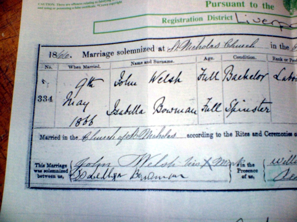
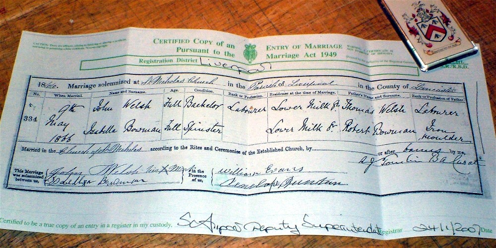
edited to add magnet and license.
If you look real close you can see that my g-g-grandfather was illiterate, he signed with an X.
Attachments:
-
Jill, done this the other day and forgot to post it, just a different slant on it, don’t know whats happened to the birds, quite like the line effect 😉
Attachments:
-
That passed the "Rachael" seal of approval.
I will have to tinker some more and see what I can do with your suggestion.
😀
Thanks Martin. -
Hi Jill,
"Welsh" is a very common name in Ireland especially the west. But it denotes a person originally from Wales ( in the mists of time!) The Irish for Welsh is "Breathnach" I can send you on the old irish spelling and font if you want to add to your design
regards
mike -
Sure!
That would be really interesting.
(I have always been told the Welshes were from Galway)
Anyway my sister, who never cared a thing about genealogy, joined ancestry.com and has been telling everyone we came from Wales.
But she never sent to Liverpool for this marriage certificate.
I did that following things my dad had written down from his dad, always being into my heritage.
It is the only tangible proof of when this particular branch was founded.
I know John was from Ireland and I know Isabella was from Liverpool.
Here is their 1880 census listing (John is shown as divorced!) after they settled in Pittsburgh.
http://digital.library.pitt.edu/cgi-bin … burgh_1880
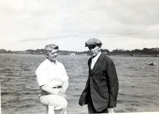
And here is a picture of their son, Robert, on the right.
He was my great-grandfather, moved out to Ohio and had a slew of kids.
They called him "Foddy", is that an Irish term for grandfather because I never heard it anywhere else?
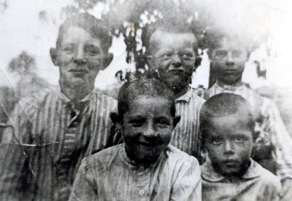
My grandfather Robert is in the right rear in the other pic.
I have a piece of their barn door in my cellar.
Then my uncle Robert, who was killed in the army at age 18, is on the rear left.
My dad, Regis, is the fussy baby.
There were 17 kids in dad’s family.
This is probably worse than having to see home movies!
Sorry.
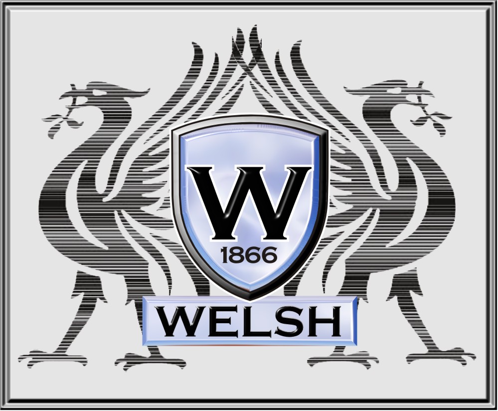
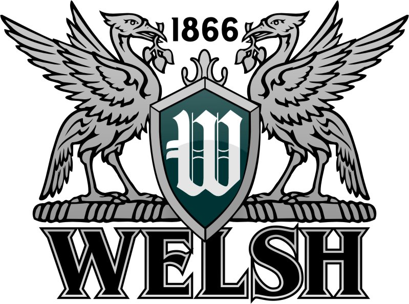
And lastly the latest idea.
Attachments:
-
Hi Jill,
Never heard the name"Foddy" I’ve attached the old irish spelling of Welsh
the dots denote the H accent – breathnach (Welsh/walsh) means foreigner in old irish
slainte
mike
Attachments:

-
Your last design is bang on Jill, IMO
Love that little lads face in the second photo 😀
-

I like that as well but I also liked the first one with the strong colour
Lynn
Log in to reply.
