Activity Feed › Forums › Sign Making Discussions › Graphic Design Help › Does anyone think this layout works?
-
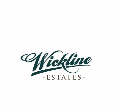
Does anyone think this layout works?
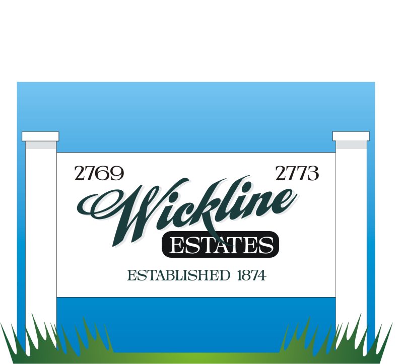
Posted by Jill Marie Welsh on August 5, 2008 at 11:28 amHave to make a low-budget sign for a family friend.
They need to identify both street numbers as well as the date in which their homestead was built.
There is a farmhouse on the site as well as a cottage.
This will be painted on pre-painted white MDO, they will install.
(the reason they are doing it is because a number of big expensive homes has been built on the ridge above their "holler")
They did want a pictorial but I told them no.
Love….Jill
Attachments:
 Andrew Boyle replied 15 years, 9 months ago 11 Members · 15 Replies
 -
15 Replies
-

I would prefer to see the downleg of the K disappearing behind "Estates"
Brilliant none the less 😀
Attachments:

-

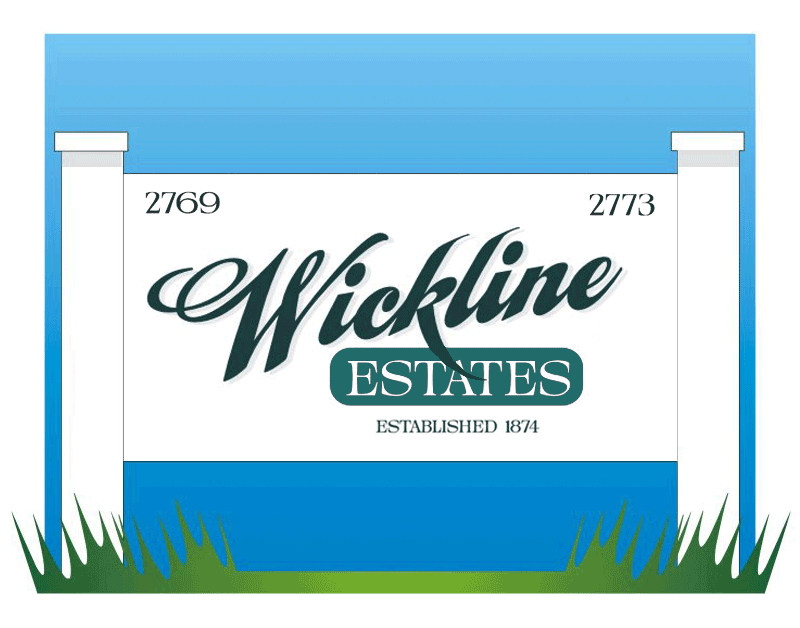
i like it too Jill… very smart…
I’ve altered it a little and done a visual to try explain what i had typed up badly, so deleted it. :lol1:
anyway… just a slight tweak on things from me.
edit: i would maybe open the kerning and slightly drop the height on the word ESTATES.
Attachments:
-

The "k" was bugging me too.
I can see how switching the colors around can help this.
Thanks!
Love….Jill -

I much prefer the ‘Established’ being centered to the ‘Estates’ looks far more balanced.
Love the look of it though Jill, lets see a pic when it’s done 🙂
-
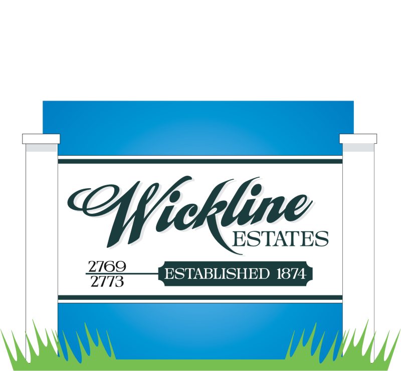
Here are two more versions.
The one with the VectorArt panel was just a simple throw-together.
I didn’t want to lose the "k".
Also asked on another forum, the street number layout was suggested there.
That way I get to keep the script.
Thanks for the input!
I cut both of these from masking and now I need to make up my mind which to use.
Love….Jill
Attachments:
-
I like Wick3 but am not over keen on the street numbers but I don’t know why, it’s not the font just something… 🙄
I know these are budget but a router grove in the posts or round finials would make a nice touch.
Great ideas as usual Jill.
Tim.
-

wick3 gets my vote apart from the 2 nos being on top of one another
all of the nos and established to go in the banner
chris
-

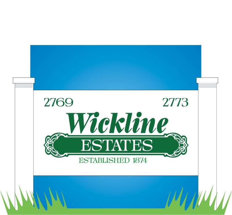
Hi Jill!
I like number 3, but have you tried changing the color of the estate box from deep green to a lighter green? -

I prefer 3 but again its the numbers poss because of the sizing due to the different number widths etc also I think the line could be shortened to identify the numbers as a sep entity. I also agree with Simon on the estate box colouring.
-

I like the original if the "Established" was centred on the "Estates" as in Roberts version.
It reminds me of the Back to the Future Hillvalley sign. lol
-

I prefer the ‘established’ centred below the estates too. 😉
-

not sure about this …..but I would be thinking design the logo and then design the sign….don’t know how to edit non vector stuff…rubbish
😀
Attachments:
-
I like that, Andrew.
Just finished that darn thing last night.
Customer keeps calling inquiring about the sign
(a friend of my Mom’s and she gave him my home phone number!!!!)
(:)
He even went round her house asking about it.
Ended up using the boring vectorart paneled one.
Love….Jill -
No worries Jill…Hope you got paid 😀 Not been on the boards for a wee while so missed things I like…..Cheers
Log in to reply.
