Activity Feed Forums Sign Making Discussions Graphic Design Help does anyone have better suggestions for logo please?

  • does anyone have better suggestions for logo please?

    Posted by Marko on January 26, 2006 at 1:22 pm

    Hi
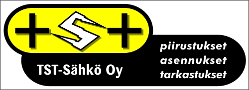
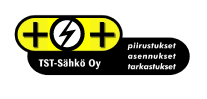
    Here´s a logo for a electrician shop, that three youngish guys are opening.
    What do you guys think of the design and so on.
    If you have any ideas, please share.


    Attachments:

    Andrew Boyle replied 18 years, 3 months ago 5 Members · 6 Replies
  • 6 Replies
  • Paul Rollason

    Member
    January 26, 2006 at 1:56 pm

    Hi Marko

    Are they set on useing the yellow and black?

    I think a light blue would look more electrical but this is just a personal preference.

    Also you have two + signs, I would put a + and a –

    What do you think

    paul r

  • Carrie Brown

    Member
    January 26, 2006 at 2:03 pm

    I thought the + were an alternative for “T” and the electric looking s in the middle is an “s” … to stand for their name … TST ..??

    I could be wrong though?

  • Marcella Ross

    Member
    January 26, 2006 at 2:08 pm

    I think you’re right there Carrie, that’s what I thought too.

    I think the design is quite nice….. but again I’m not struck on the yellow too much.

  • Marko

    Member
    January 26, 2006 at 2:08 pm

    Paul:
    They cave me no instructions on colour nor design. It´s just that yellow and black are really effective together. This said, I´ll try the blue…

    Carrie;
    Yes, that´s the idea I was thinking.

  • Paul Rollason

    Member
    January 26, 2006 at 2:40 pm

    Ahhh

    Well spotted Carrie

    I didn’t see that

    I’ll get me coat

    paul r

  • Andrew Boyle

    Member
    January 26, 2006 at 2:51 pm

    not sure about the S

    like it though….. I like the yellow


    Attachments:

Log in to reply.