Activity Feed › Forums › Sign Making Discussions › Graphic Design Help › dinky strumpet
-
dinky strumpet
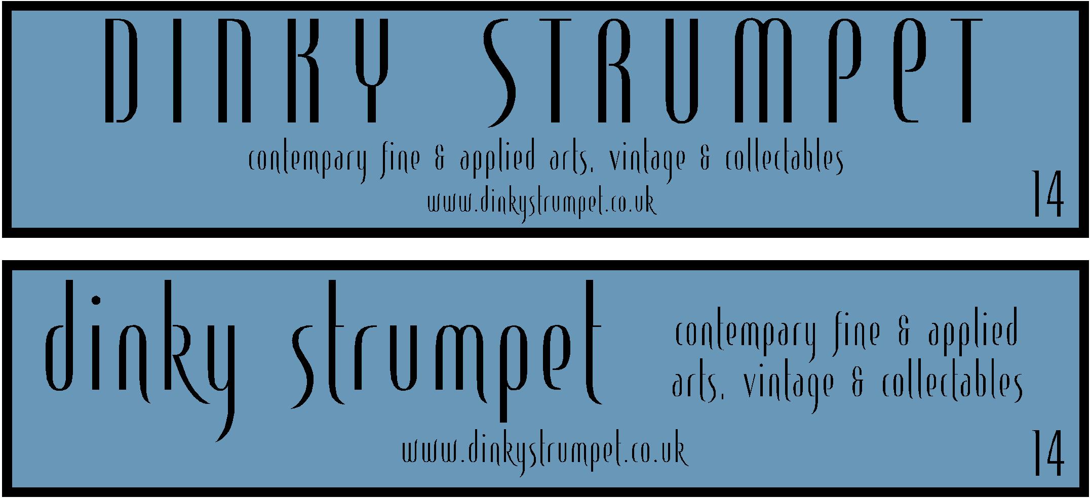
Posted by Peter Normington on January 25, 2010 at 10:55 pmNeed a bit of inspiration on a simple design
font is customers choice (leterheads angel)
colours are to be light blue with silver text although I am recommending black or even gold as a better alternative,
the quote is for flood coated dibond, and one colour text, but would like to have, within these very tight constraints any suggestions that would improve something so basic…Peter
Attachments:
 Liam Pattison replied 14 years, 3 months ago 9 Members · 18 Replies
 -
18 Replies
-

the smaller text actually irratates my eyes trying to look at it. 😕
what are the sign dimensions peter? -

Rob 3500 x 600mm
I had the same problem, but customer is hooked on the font, which was my fault for asking her to choose from letterheads…I was thinking trying to just use it for the name, and something else for the description.
My original suggestion was rejected,
and although working to a budget, I would like to do the best for the client, without spending hours of toing and froing.Peter
-

I actual quite like the font and think it suits in both cases, though feel same as Rob the wee text def. needs to be something different.
I also think a dark brown would be good for the text, a good contrast and suitable for the purpose.
-

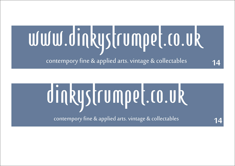
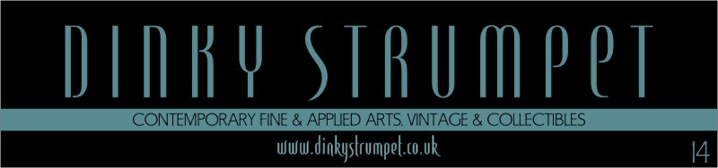
I like the font too but only as the main writing….quick layout to throw an idea into the pot. (don’t have the font or anything like it on this computer.)
Attachments:

-

Don’t have this font Peter, otherwise i might have a go.
Doesn’t help much, sorry!
Liam
-
-
Definitely needs a different font for the smaller text. I’m sure they will agree if you show them two versions. Maybe a thin outline on the main text to make it stand out a bit more.
-

Lettering needs a bit more breathing room.
Try reversing out the colors for more impact.
Try switching the laundry list to all-caps in that same font.
Here I used A&S Sign Gothic.
Try a reverse panel to give some grounding.
A border is not really needed.
We spell collectibles differently, but I do think you’ve spelled contemporary wrong.
Letterhead fonts are great but the person will usually choose the least effective of them if allowed to see every one.
ahhaha
Love….Jill -
I think Jills got it, i just had the idea of using the web address as the name, i sometimes try to convince people to combine the two so i don’t have to put a website on as well. Maybe this is one of the no no’s like red on black or something but here’s what i mean,
Liam
Attachments:
-

Am I the only guy who thought this thread was about a small female who new how to show a guy a good time, or is it just my dirty mind 😳
Bob
-
Thanks Jill and Harry for the layouts,
and the others for input, I will do a couple more based on your suggestions Jill I think you are right about the spelling, client supplied the copy and I hadn’t spell checked yet 😳Peter
-
 quote Bob Scullion:Am I the only guy who thought this thread was about a small female who new how to show a guy a good time, or is it just my dirty mind 😳
Bob
no but i didn’t mention it for that reason. 😀
-
She might only be able to entertain very small men, making her quite popular.
🙂 -
It is anique name though, just googled, and only found on uksb!!
Peter
-
quote Peter Normington:It is anique name though, just googled, and only found on uksb!!
Peter
I always thought strumpet was either a prostitute or a stroppy bolshy woman with low morals and dinky obviously meaning small. I think its a cool name though and will cause folk to discuss.
I tried a layout last night but went and crashed I had used Agatha and that looked pretty cool too as its ‘antiquey!’
I think Jill’s is great but maybe slightly too contemporary for the purpose, which is odd because Jill – you normally go for a traditional look.
-
Thanks Nigel, I do like that, but the client has bought angel font and it must be used 🙁 I also quite often add the .co or whatever to the main name its a great way of saving space from clutter
Peter
-
It sounds like an interesting shop Peter, would like to have a look in there.
Liam
Log in to reply.
