Activity Feed › Forums › Sign Making Discussions › Graphic Design Help › desing help please: vauxhall car of the week
-
desing help please: vauxhall car of the week
Posted by Richard Urquhart on June 21, 2008 at 5:06 pmHi all, having a week of designs and some this is the second I would like your help with.
I like the design in black and white with a grey outline any suggestions of ideas
thanks in advance RichPeter Dee replied 15 years, 10 months ago 18 Members · 51 Replies -
51 Replies
-

or may be with the cut off logo a little smaller to miss text
rich
Attachments:


-

Rich , if thats the space much smaller, couldn’t see a grey outline
Lynn
-

how will the work be produced rich, cut vinyl or print?
what sort of overall size will it be? -
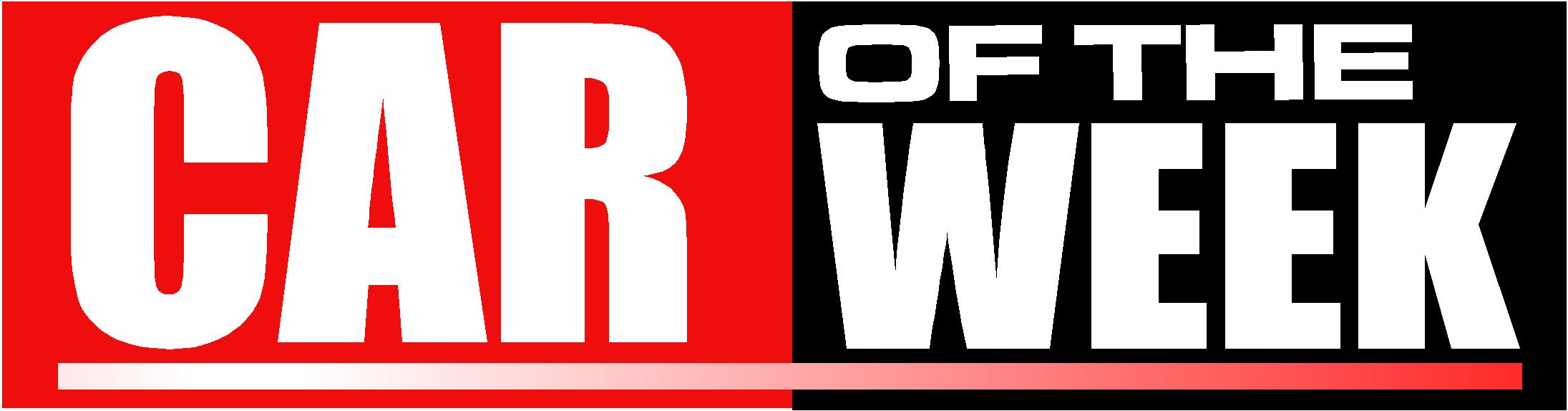
Sorry Lynn I removed them as i didnt like them
rob its going to be printed as the logo is full colour
size its for a head board around 800m x 200mm approx
Rich -
Harry I like that good idea. Phil what dont you get ?
the sign sits on a swinging headboard advertising the car of the weekrich
-

If it said "Car of the week" I would get it.
But it says "of the car week" so I don’t get it 😕
-

If Car is the only word capitalised and the ‘of the’ is set behind ‘week’ it will work fine I think.
-
Graphicly I prefer Harrys suggestion. It looks better works well as a graphic and is pleasing to the eye. But the words being in the wrong order create "tension" in the layout.
However, this "tension" may well add interest and cause people to look at it for longer to interpret the message – which may in itself be an effective attention grabbing tool.
…..Just make sure you pass this bullshit onto your client when you are explaining the "concept" on Monday Richard.
😉
-
Phil thanks for the input I’m good at bullshitting so all should be good, in the mean time if any one else wants a play feel free
Rich😀 😀
-
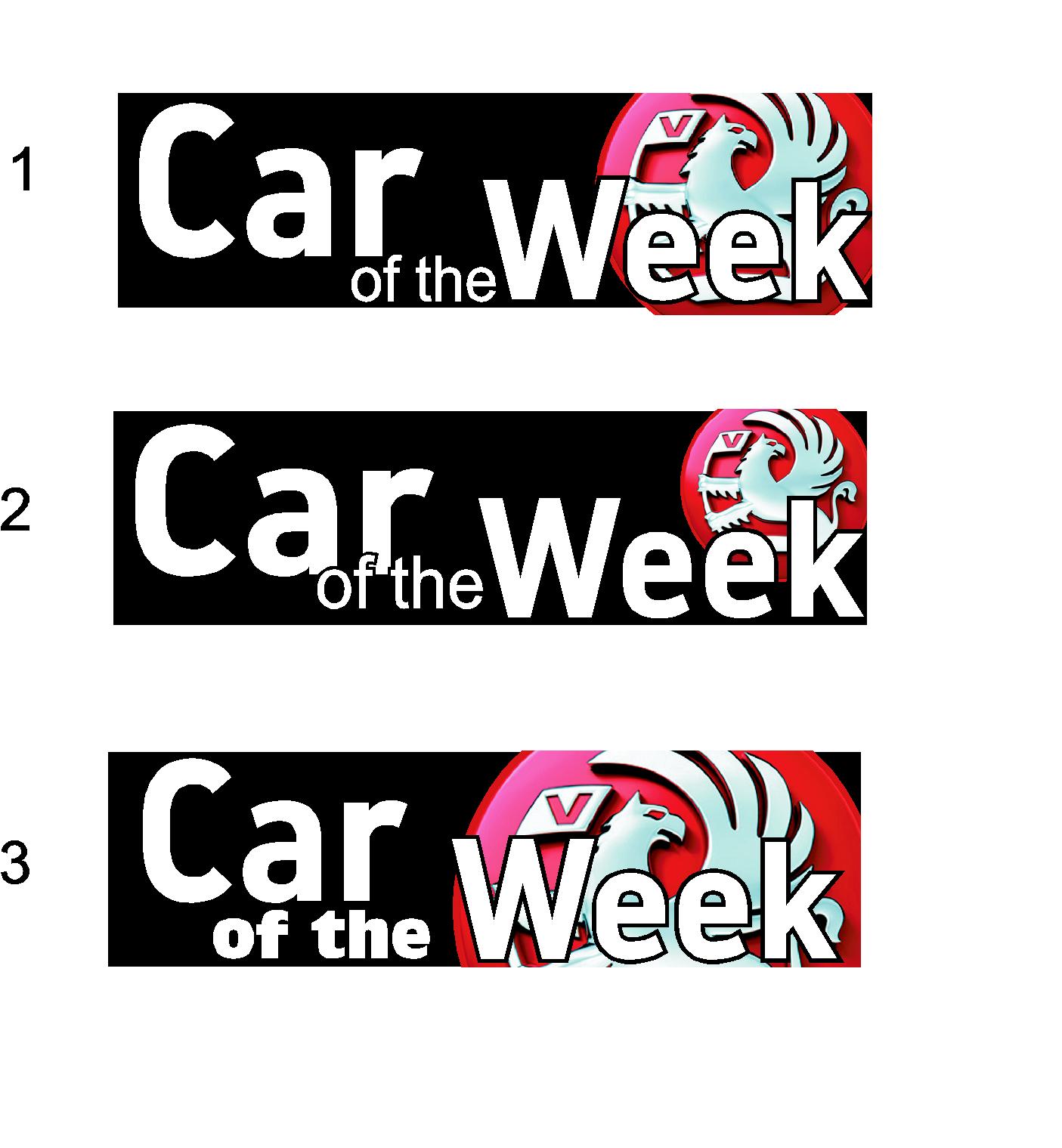
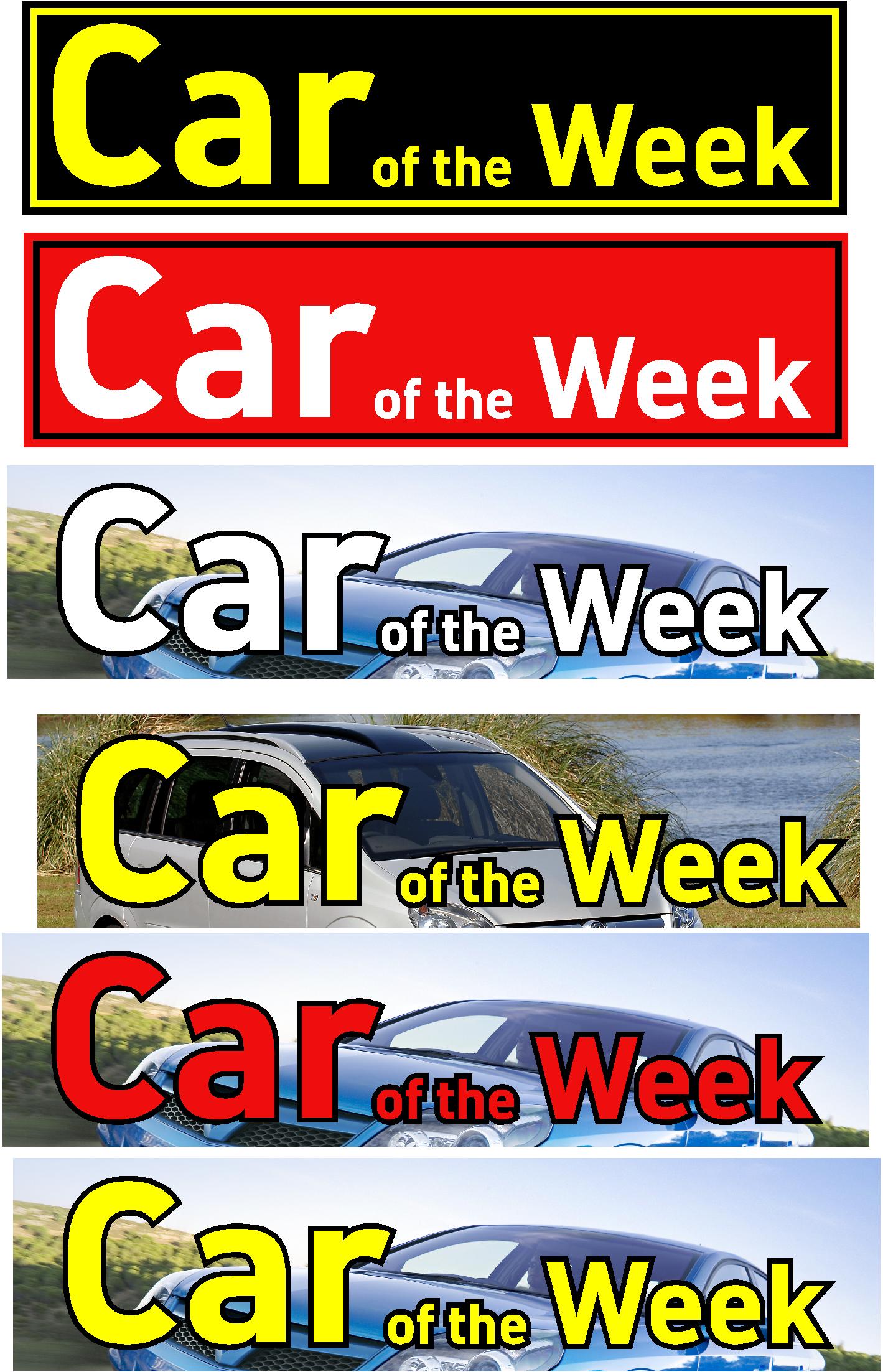
pick a number any number 2
please help who thinks number 2 is the way to go???
I need to get this finished now so pick a number
Thanks Rich 🙂 🙂
Attachments:
-
oh come on !!!!!!!!!!
its not hard just pick a number you like best
thanks Rich 🙄 -

3, but maybe 2,
not the 2 you picked as I dont like the red on blackPeter
-

not too keen on any of them, find them a bit hard to read, but will go for 2 (not the first 2) as its the more readable of them all 😀
nik
-

by anychance are you allowed to put text over the logo? logo guidelines etc
-

Richard, Why is a bloke with your experience having such difficulty over such a basic sign (?)
-
With having loads on at the moment my mind id all over the place. I have sent them to my customer and will see their reaction
thanks for the help -
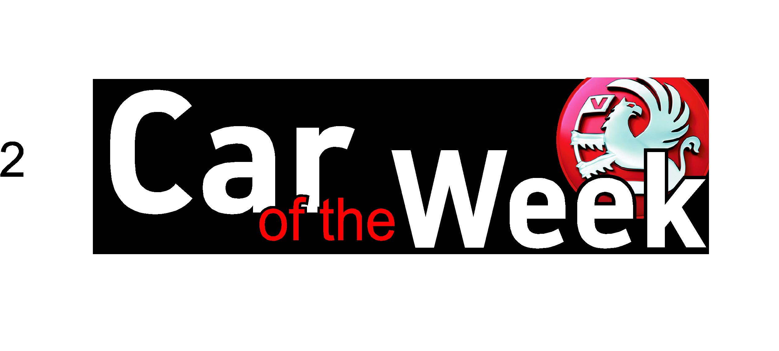
driving me mad this is any ideas as customer is not happy
Attachments:
-

Richard,
I’m sorry for not offering a sample but to me that reads as ‘Car Week’ at a quick first look.
-

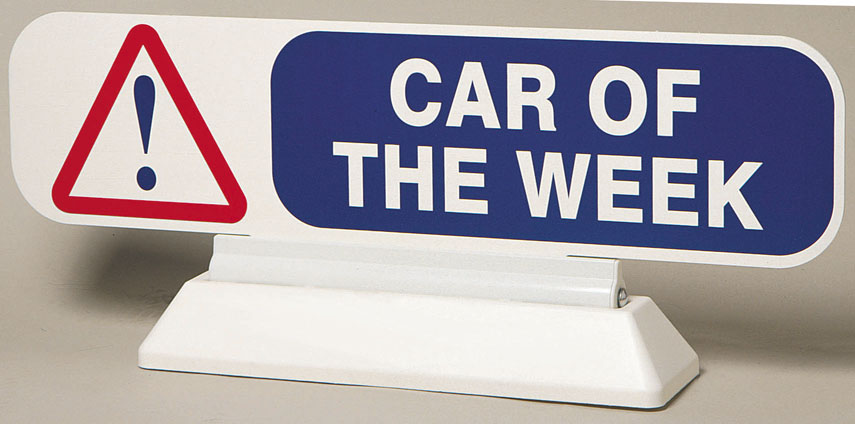
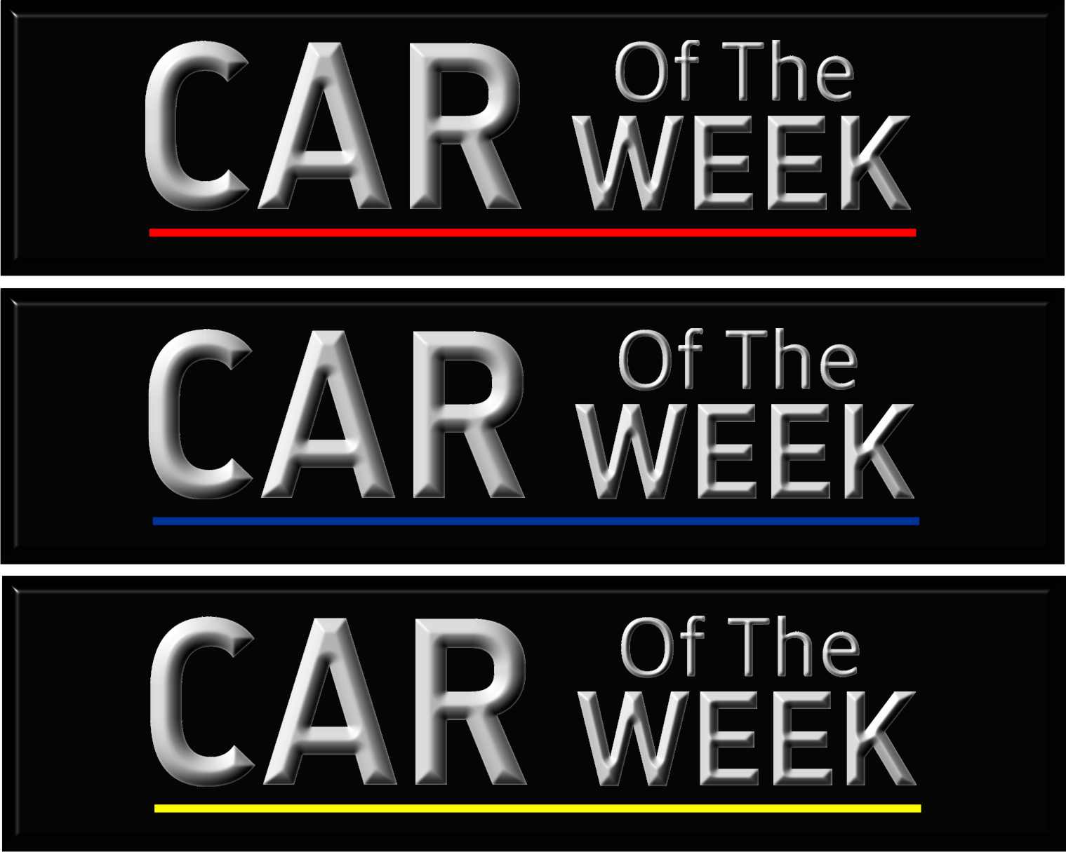
Hi Rich
I think that your ideas are pretty good. The attached picture shows what the competition is doing so don’t be too hard on yourself…
Martin
Attachments:
-

I would make it simple as possible.
I agree with Phill about the wording.
I don’t think you need a logo, if you are at a dealership most folks are aware of what kind of car they sell.
Love….jill
Attachments:

-
thanks guys and girls
gosh this is a hard one its only a £100 job but i get loads of work from them.
Attachments:
-
what is it made from rich, are you supplying the board mate?
-
foamex panel from old sign
digital print on face
matesize 770mm x 200mm
-

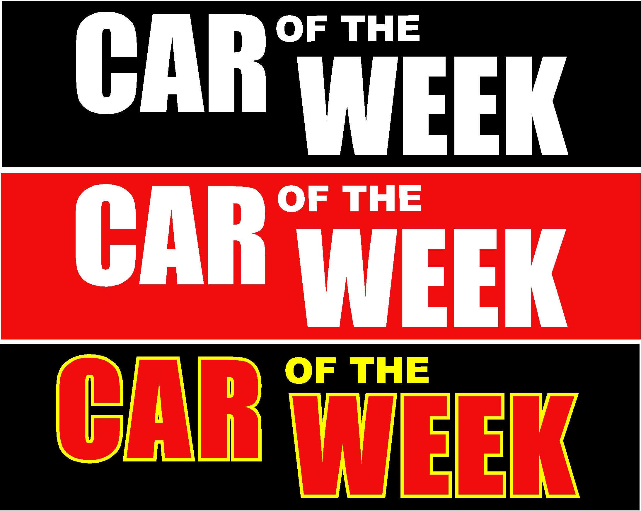
Here’s my idea. It could be tweaked a little more.
Attachments:

-
Forgot to hit attach after browsing for the file. Sorry. Here it is.
Attachments:

-
Hi Simon sorry been told not to use the logo as its up for revamp soon. I have really run out of ideas as the customer wants something with impact but classy looking !! I really have given it my best shot and run out so need some help please please. i have sent over this last set to see what he has to say
please help rich
oh he didnt like the font on my last take or jills font
Attachments:
-
Yeah that’s cool. I think the new logo is suppose to look like the attached image. Personally I like the red one a little bit better. I don’t know when it will be officially released for use or where you would get a higher resolution file. I might play around with it a little more later, if someone doesn’t offer up something that will suffice first. I hope you get it sorted though Richard.
S
Attachments:

-
simon
thanksneil that may be so but I did say the customer didn’t
thanks rich
this is up for any new design -
 quote Richard Urquhart:simon
thanksneil that may be so but I did say the customer didn’t
thanks rich
this is up for any new designoops, so you did 🙄
must learn to read the whole of posts :banghead:
-
Ok I couldn’t resist one more. The silhouette of the car obviously wasn’t done very well, but it was quick. I probably would have gone into the silk fabric background and change the color to be a little lighter and warmer to contrast with the cool blue on the car more.
Attachments:

-
Hi Simon your input is very helpful and you have given me another idea. I did think of doing what you have just done but I have a feeling the customer may relate the picture to the car its on and things wont tie in !!
Going to have another play right now, as I said many thanks for having a go
Rich -
Just to give the customer another idea.
Attachments:
-
Glen like the effect but a little hard to read, how did you create that effect
thanks rich -

Hi Rich,
Have you found any inspiration yet?Steve
Attachments:

-
the first ones are fine….but i need to see the showroom style, the signage outside and the materials… all it is a little sticker, should be able to knock something up from using the designs that you have.
-
Sorry Rich
the more I look at the words the more I think it of it as a non advert,
dont use any reflections though. 😀
Attachments:
-
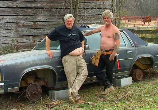
Just a little bit of fun now. They are SE US rednecks after all. Oh wait, is that even politically correct for me to say?
Attachments:
-
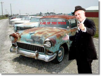
P. S. that’s some really funny stuff guys. I’d buy a car off of ’em.
-

Well this being my first ever post 😀 I thought I’d try this logo. Hope it gives you some ideas Richard.
Cheers
John
Attachments:

-
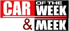
John thanks for your input and it looks great, however customer has now approved another design
very plain but also very dealership
Attachments:

-

I can’t believe the effort that’s been put in here to end up with that one!
Customers spec: I have really run out of ideas as the customer wants something with impact but classy looking !!
Well you certainly got the impact bit 😉
Not sure about the capital "T" in "The"?


Log in to reply.
